

When companies beg, borrow, and steal from celebrity figures, it harms everyone.
If you can’t properly classify your system, then how do you determine the most effective strategy for it?
Naming things is hard. Sometimes, classifying the things you’ve just named is even harder.
As a content modelist, I’ve had my fair share of battles with the process of classification. I wouldn’t exactly say it’s more of an art than a science — but then again, not even the periodic table is systematically flawless. So in a way, I guess Rick was right when he told Morty that “sometimes science is more art than science.”
Just like in the realm of content modeling, you have to deal a lot with classification when building design systems; defining components, naming and categorizing them, establishing patterns, crafting viable strategies. Classification is at the very core of design system work.
And yet, I haven’t exactly found an abundance of classification systems or frameworks for design systems out there. Sure, we have implicit terminology to roughly describe components, but I’ve struggled to find something comprehensive. Something that encompasses a clearly defined direction and properly classified attributes of a given design system. Something that describes the differences between systems.
Which is why I created my own framework. It’s been useful for me to create a recognizable mental model of distinct approaches to architecting design systems. I hope it can provide some usefulness for you too.
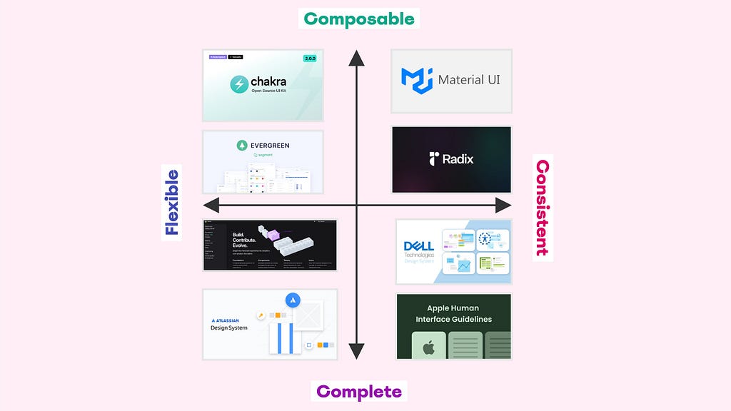
Introducing the Design System Attributes Framework

The Design System Attributes Framework serves as a structured approach for classifying design systems based on four key attributes:
- Flexibility. Refers to the ability to customize and style elements, layouts, and interactions to suit specific product (or project) needs and brand identities.
- Consistency. Refers to the uniformity and coherence of elements, patterns, and interactions across products and experiences, ensuring that similar elements or interactions appear and behave predictably across different parts of a product (or across different products within a brand ecosystem).
- Composability. Refers to the degree to which components and elements can be combined and arranged to create new and varied layouts and interfaces, as well as the degree to which building blocks are broken down into smaller parts.
- Completeness. Refers to how exhaustive elements and components are, to cover a wide range of use cases and scenarios through an extensive set of properties and configurations.
The reason why I chose these particular attributes is because they are quite common (and often misinterpreted despite being pretty clearly defined) and because they live on different ends of a spectrum. Many design system builders claim to build “flexible and consistent” components, but in reality, that’s practically impossible. There are ways to leverage one if you emphasize the other, but generally speaking, you sacrifice consistency by accentuating flexibility and vice versa.
Same thing goes for composability and completeness: you either build with a “composable” mindset, or a “complete” mindset. It will inevitably affect how you architect your system and structure your components. Composers gravitate towards breaking down components into smaller pieces, thinking about how to assemble and disassemble them efficiently. Completionists gravitate towards building bigger, more rigid components, thinking about how to configure them effectively.
Personally, I think it’s crucial to acknowledge these distinctions and make purposeful choices based on them to be able to craft viable strategies for the design system you’re building.
The Design System Attributes Framework is essentially a graph with two axes: an x-axis with Flexible on the left end and Consistent on the right end, and a y-axis with Composable in the top and Complete in the bottom.
By plotting the four key attributes on a graph with two axes, the framework provides a visual representation that helps teams understand where their design system falls within the spectrum of attributes.
The main purpose of this classification is to aid in identifying the strengths and weaknesses of a design system, guiding decisions for further development and maintenance.
Observing the key attributes on the two-axis graph, four distinct categories (or quadrants) emerge:
Flexible-Complete
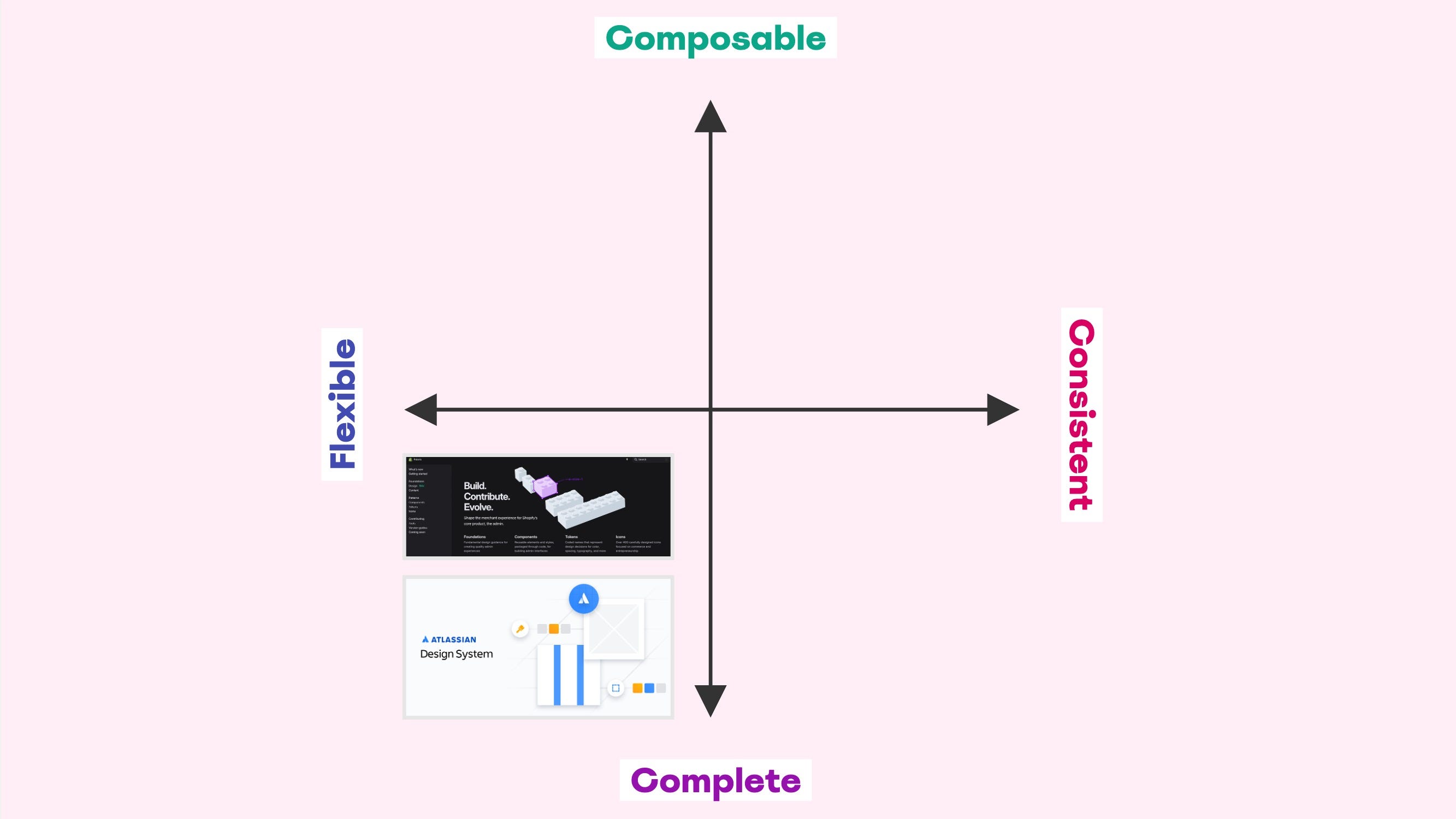
Design systems in this category offer a comprehensive set of unopinionated components and solutions, allowing considerable customization and adaptation.
Key Characteristics:
- Comprehensive design resources, adaptable to varied contexts, supports customization and innovation.
- Components are designed to be highly adaptable, allowing designers and developers to modify them extensively to fit various needs.
- While there is a set of exhaustive components offering an extensive set of properties and configurations, the guidelines for their use are flexible, permitting significant alterations.
- Encourages users to experiment and adjust components as needed, promoting innovation while still offering a complete solution.
Examples of Flexible-Complete design systems:
- Atlassian Design System. Supports a wide range of use cases and allows for customization to fit specific product requirements, but generally emphasizes completeness over composability.
- Shopify Polaris. Includes a comprehensive array of components while allowing significant customization to cater to the unique branding and functionality requirements of different Shopify stores.
Flexible-Composable
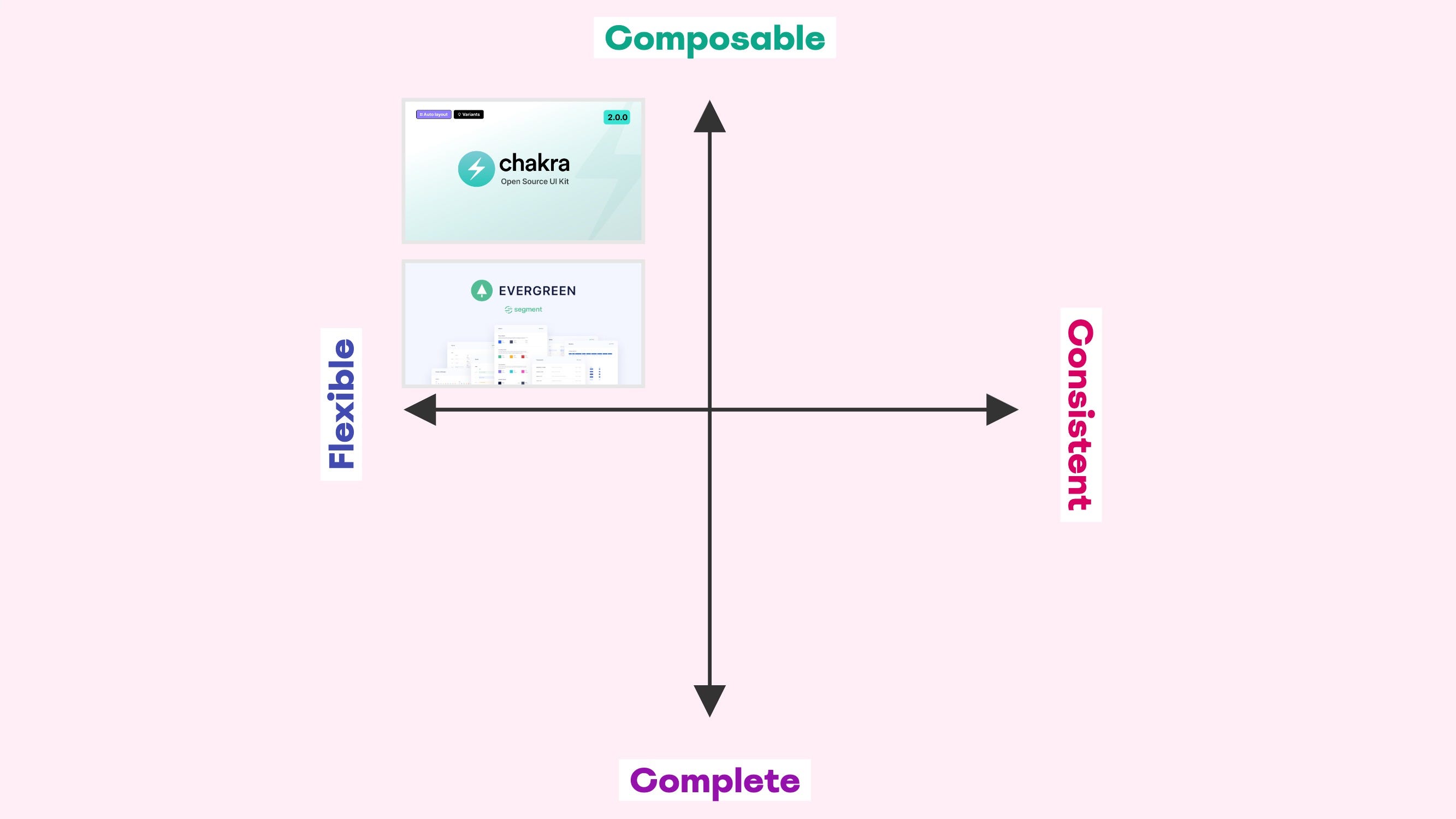
Design systems in this category offer modular and unopinionated components that can be freely combined and extensively customized.
Key Characteristics:
- Elements and components are broken down into smaller parts to support a high degree of modularity.
- Components can be adapted and customized to fit various needs and preferences.
- Guidelines are flexible, allowing for creative combinations and extensive modifications.
- Encourages experimentation and unique implementations.
- Suitable for products (or projects) requiring diverse and innovative design solutions, adapting to various styles and contexts.
Examples of Flexible-Composable design systems:
- Chakra UI. Known for its modular and highly customizable components, it offers a lot of flexibility for developers to create unique designs by combining and customizing its components.
- Segment’s Evergreen. Designed to be highly composable and adaptable, with components that can be customized and extended to fit various use cases.
Consistent-Composable
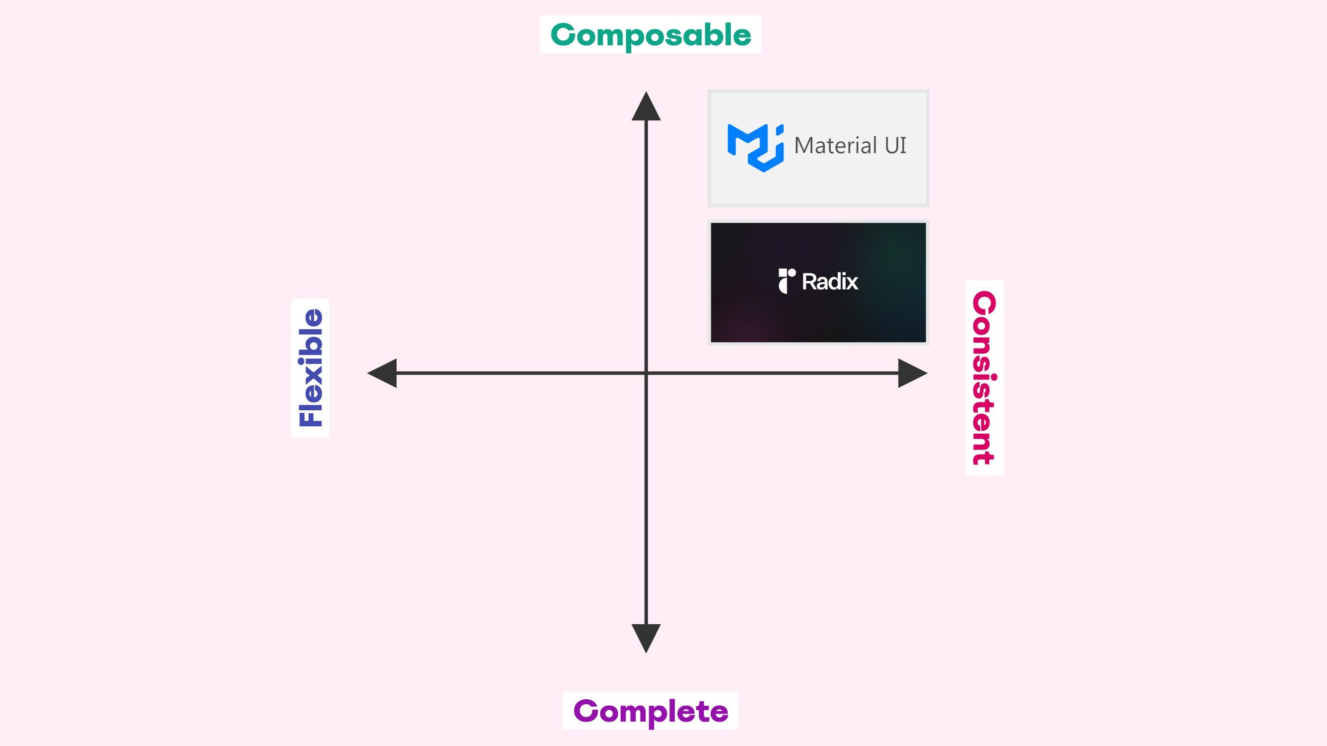
Design systems in this category provide modular and opinionated components with strict adherence to design rules to ensure uniformity.
Key Characteristics:
- Modularity with uniform standards; components are designed to be highly modular and can be combined in various ways. However, they adhere to strict design standards to ensure a uniform look and feel.
- There are stringent guidelines and rules that ensure each component fits seamlessly with others, maintaining a cohesive design language.
- Users can reliably predict how components will behave and appear when combined, leading to a consistent user experience across different applications.
- Often used in environments where maintaining a strong, recognizable brand identity is crucial.
Examples of Consistent-Composable design systems:
- Material UI. Based on Google’s Material Design guidelines, it provides modular components that adhere to strict design principles to ensure consistency. It allows for composability but maintains a uniform look and feel.
- Radix UI. Emphasizes consistency in design patterns and accessibility features across its components. Each component follows strict guidelines to ensure uniformity in appearance and behavior, leading to a cohesive user experience.
Consistent-Complete
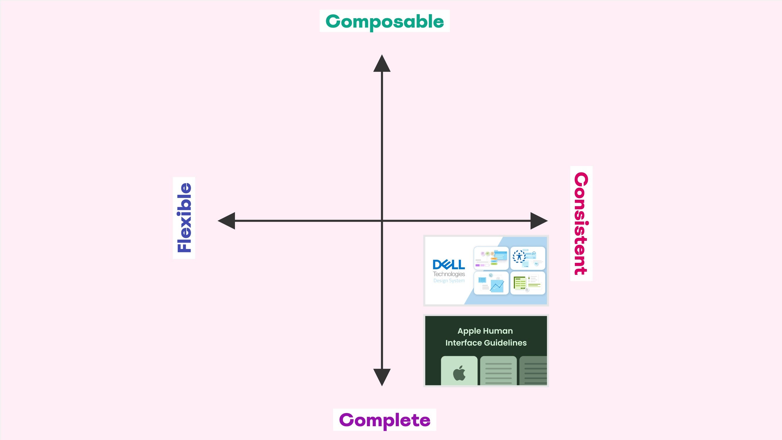
Design systems in this category provide a comprehensive set of highly opinionated and exhaustive components and design patterns with strict guidelines to ensure uniformity and cohesion across all implementations.
Key Characteristics:
- Comprehensive and prescriptive, includes a full suite of components and templates designed to cover all typical use cases.
- Components and their usage are governed by stringent rules to maintain a consistent look, feel, and behavior.
- Ensures a seamless and cohesive user experience across different applications.
- Components tend to be quite complex due to the amount of properties and configurations.
Examples of Consistent-Composable design systems:
- Dell Design System. Provides a comprehensive set of components and design patterns with strict guidelines to ensure a consistent brand experience across all Dell products. It is designed to cover a wide range of use cases and the components are exhaustive and configurable rather than composable.
- Apple’s Human Interface Guidelines (HIG). Offers a complete set of design resources and guidelines with strict adherence to Apple’s design standards, ensuring consistency and coherence across all Apple products and platforms.
Summary

To reiterate the famous Rick and Morty quote, science is sometimes more art than science. While the Design System Attributes Framework is neither art nor science, it has consistently helped me navigate the intricacies of design system strategy.
Since the categories are figments of my own mind, the examples of design systems that fit those categories are based on research I’ve conducted myself. You might therefore disagree with some of my classifications. And that’s perfectly fine. If the framework can help you with the classification in any way, creating mental models that work for you, then it has succeeded.
For me, the three categories Flexible-Composable, Consistent-Composable, and Consistent-Complete fit my mental model immediately while working on the framework, but I struggled a bit with Flexible-Complete. Until I studied a few design systems in detail and noticed some distinct traits.
For example Atlassian’s design system. Like basically all modern design systems, its components are composable to some extent (I can hardly even imagine what a 100% non-composable design system would look like), but the system is clearly the child of a group of completionists. And while the components gravitate towards being big and exhaustive rather than small and composable, flexibility generally outweighs consistency. The lack of a Card component is a pretty good example of that:
“Atlassian uses dozens of distinct card-like components across products. Therefore, rather than providing a strict component, the Atlassian Design System empowers and supports you to build your own card components in ways that are consistent and will scale over time.”
So is the vast amount of customization options. Arguments could probably be made that the system might as well be classified as Flexible-Composable, but to me it’s quite clear that composability isn’t emphasized. Completeness is. It depends on how you hear the beat, and it’s not a hill I’m prepared to die on.
As a side note, since the framework is a two-dimensional graph, it can be used to map design systems on a more granular level than I’ve done in the examples provided in this article. Those are simple enough to convey the overall purpose of the framework.
I would for instance place Radix in the top right corner of the Consistent-Composable quadrant, and Material UI closer to the middle, bordering Flexible-Composable. I would do this to visualize that although they belong in the same quadrant, Material UI is leaning more towards flexibility than Radix is; both emphasize consistency over flexibility, but to different degrees.
If you work with design systems in any capacity, I would love to hear how you classify your specific system according to the Design System Attributes Framework.
May the system be with you! 😊
Henrik is a product manager within the tech industry and especially nerdy about design systems, content modeling, data structures, and mental models. If you are too, then let’s connect on Linkedin!
How to classify your design system—a framework was originally published in UX Collective on Medium, where people are continuing the conversation by highlighting and responding to this story.
Leave a Reply