
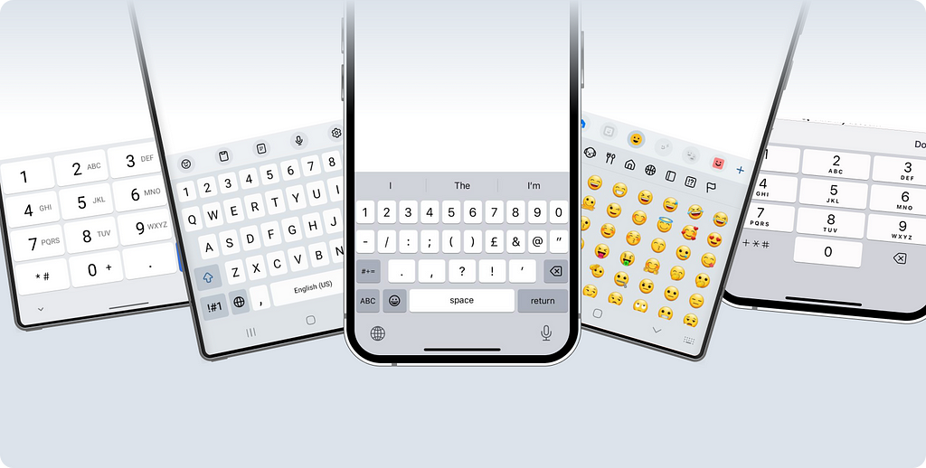
A guide to iOS and Android keyboards.
When Designing interfaces for mobile applications, designers often leave keyboards “out of the picture.” However, this is quite an interesting topic, as the correct (use of the keyboard) keyboard use is what any user expects from an interface.
There aren’t a ton of materials on this topic. So, I dove into documentation, analyzed the market, and had some long chats with developers (thanks for your patience, folks!).
- What affects the look and behavior of keyboards
- The different types of native keyboards in iOS and Android and how they behave
- Comparing keyboard use in similar situations
Proper use of keyboards is an integral part of designing user experiences. Usually, the developer independently decides which keyboard to connect depending on the purpose of the input field. Still, it will also be helpful for the designer to know what keyboards exist and to influence these decisions when necessary.
What determines the keyboard’s appearance?
To get a grip on keyboards, let’s look at the factors influencing their appearance and behavior, specifically:
- Choice of input field type
- Phone model
- Screen property settings
- Choice of action button
That’s an extensive list! But as they say, you can eat an elephant one bite at a time?, so let’s break it down piece by piece.
Choice of input field type
To ensure the best user interaction, the developer specifies the type of input field. There are quite a few types — about 50 on iOS and around 30 on Android.
The input field type determines the corresponding keyboard appearance, for example:
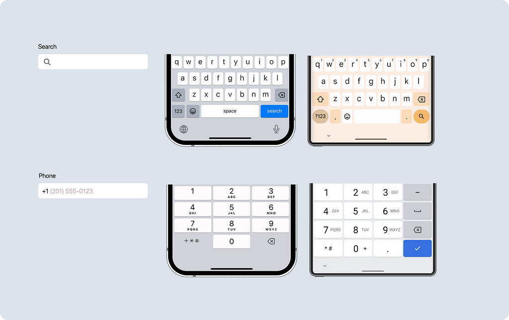
- A password input field triggers the standard keyboard and masks the input.
- An email input field triggers the regular (keyboard on Android but a special keyboard on iOS) Android keyboard but a special iOS keyboard. This unique keyboard features extra characters like “.” and “@”.
- A phone number input field brings up a keyboard with numbers and symbols like “+”, “*”, and “#”.
Besides the type, the input field can specify the order of actions during input, such as performing auto-correct for spelling errors, turning off the suggestion bar, or capitalizing new sentences.
Setting up the action button
Most keyboards come with an action button. And guess what? You can tweak it! Let’s look at both platforms separately since there’s much to cover.
What’s up with iOS?
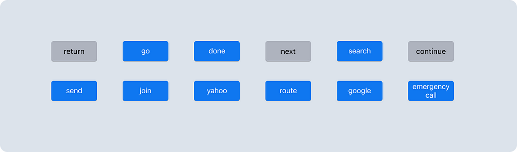
In iOS, you can currently choose from 12 different action button types. Here are some of them:
- return — The default. Depending on the input field, it can move to the next line, switch to the next field, hide the keyboard, or do nothing at all.
- next — Switches to the next input field or step.
- continue — Moves to the next step.
- search — Initiates a search.
You might notice that sometimes the button is gray, and other times it’s blue. This depends on whether the action has a disabled state. If the button has different states, it will be blue when active. Unfortunately, you can’t customize this behavior separately — it depends on the chosen button type.
Common types like return, search, and next are used frequently. Others, like yahoo, route, and emergency call, are rare creatures in the wild.
You can also customize the action that occurs when the button is clicked. I couldn’t find a complete list of these actions, but through some experiments, I discovered three:
- Moving to the next line (used in multi-line input fields).
- Moving to the next input field (handy in long forms).
- Moving to the next step or initiating an action (great for single fields where the user moves to the next step after filling it out).
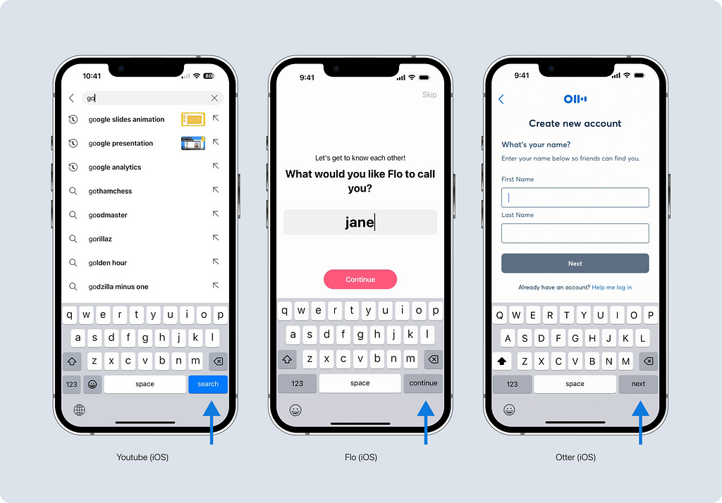
Using these buttons correctly can make navigation smoother for the user. For example, in the YouTube app, the search button takes the user directly to the search results screen. In the Flo app, the continue button quickly moves the user to the next step, and in the Otter app, the next button switches to the next field.
What about Android?
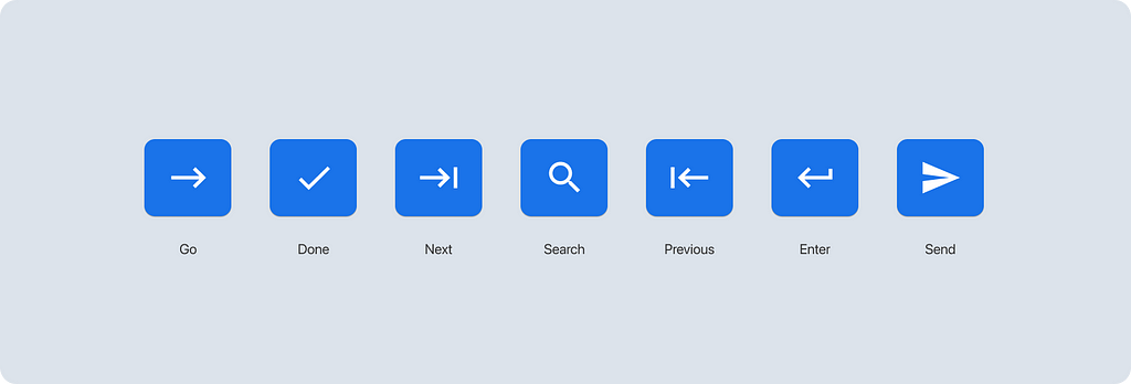
Android also has different action button variations — there are 7 options. Unlike iOS, Android uses symbols:
- Go — A right arrow. Initiates the user action, like navigating to a URL.
- Done — A checkmark. Completes the action, like submitting a form after filling out the last field.
- Next — A right arrow with a bar. Switches to the next field.
- Search — A magnifying glass. Sends a search query.
- Previous — A left arrow with a bar. Switches to the previous field.
- Enter — A bent arrow ⏎. Moves to a new line.
- Send — An envelope. Sends something, like an email or message.
In Android, the button mechanism is more clearly defined. You can set the button to “default,” and the platform will decide which button fits best based on the situation.
The appearance of the button, including its shape and color, will vary depending on the phone model.
Phone model
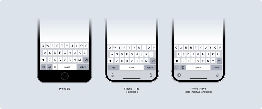
In iOS, native keyboards look pretty similar, but there are some minor differences — the layout of the keys depends on the phone model and the number of languages enabled. For example, the keyboard is shorter in height on older phone models. Additionally, if the user has multiple languages enabled, the keyboard needs a way to switch between them, so the emoji button moves up next to the space bar.
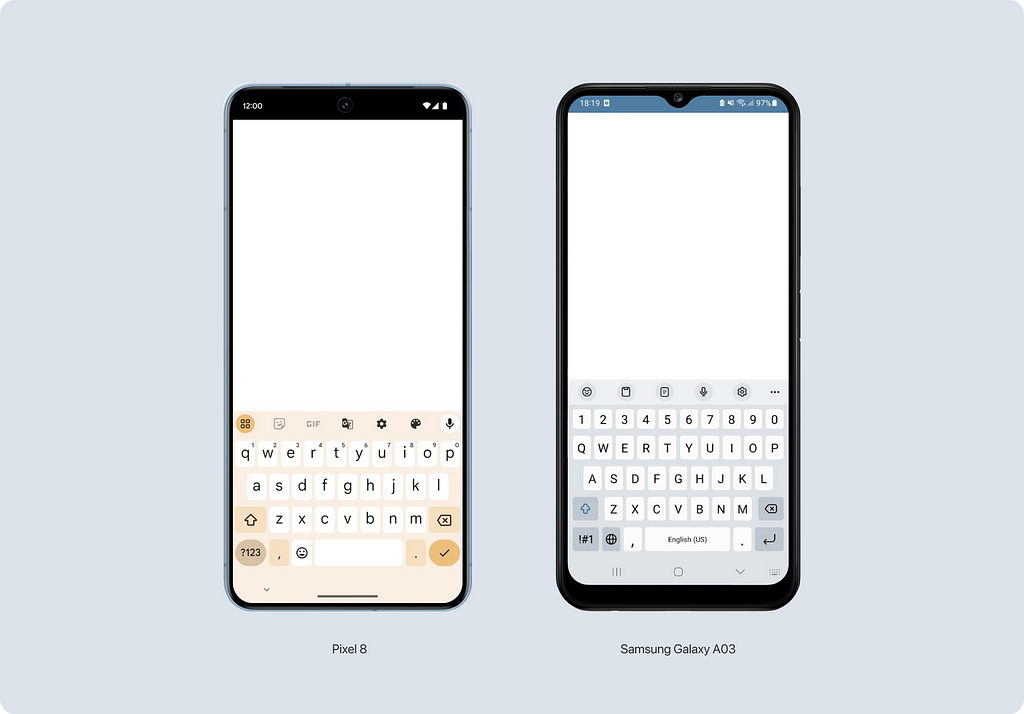
In Android, things are more complex. There’s a lot of a big variety because the platform is flexible and allows customization. This means keyboards can look different depending on the manufacturer. For example, the keyboard on a Pixel phone looks quite different from the one on a Samsung Galaxy A03.
Configuring screen behavior
On each screen, you can configure how the keyboard will be hidden (or not). In iOS, the keyboard can be hidden in various ways:
- Interactive — If you scroll down and your finger touches the keyboard, it will hide. Example: Telegram.
- On drag — A minimal swipe or scroll hides the keyboard. This behavior can be found in apps like YouTube or Gmail.
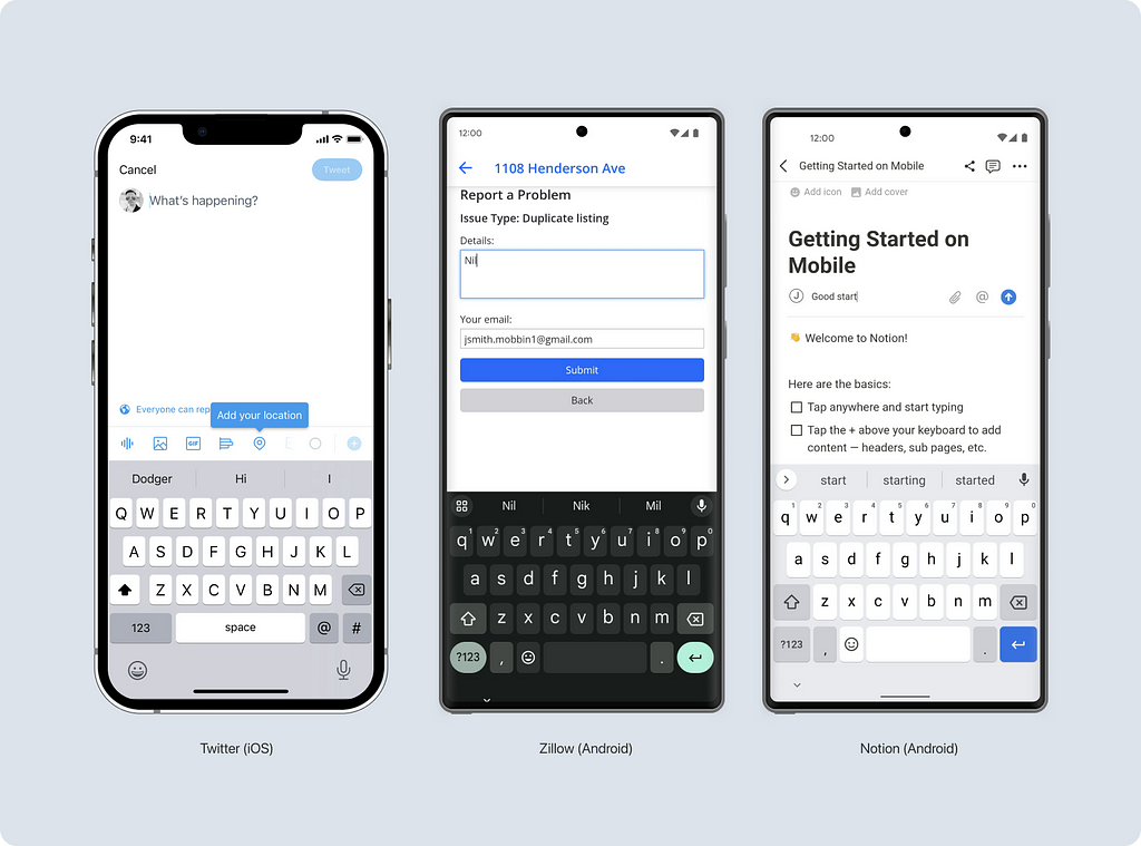
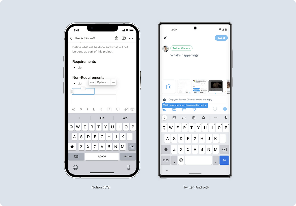
You can also choose not to hide the keyboard at all. This behavior can be seen in the Notion app.
In Android, there isn’t a specific way to customize the hiding of the keyboard. A down arrow at the bottom of the keyboard can be clicked to hide it.
Are there cases of incorrect keyboard usage?
Of course, there are. During my research, I encountered many instances of incorrect keyboard usage, but I won’t focus on bad examples in my article. Instead, I want to show you more good examples and interesting solutions.
Now that we’ve covered what influences the appearance of keyboards, let’s delve into the types of keyboards, starting with the most common one.
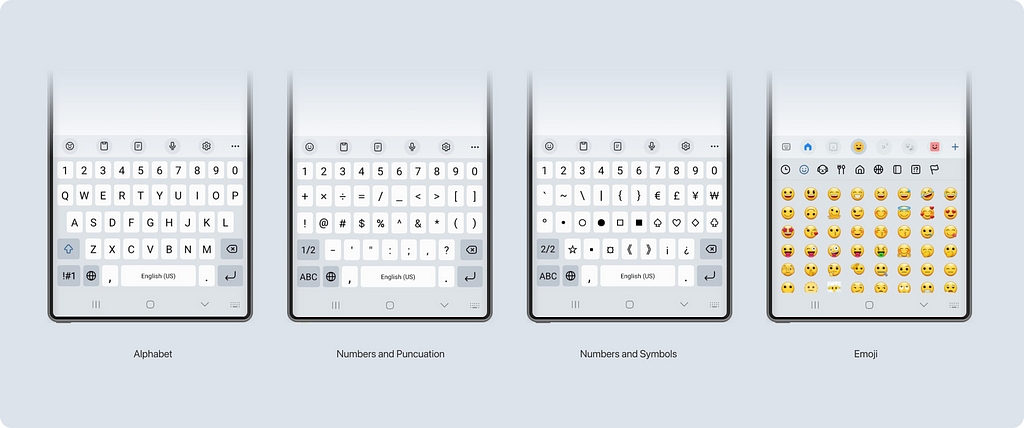
Standard keyboard
The application area of the default keyboard is expansive. We use it in everyday tasks, such as chatting with friends in a messenger or emailing colleagues. It covers all the basic needs for free text input.
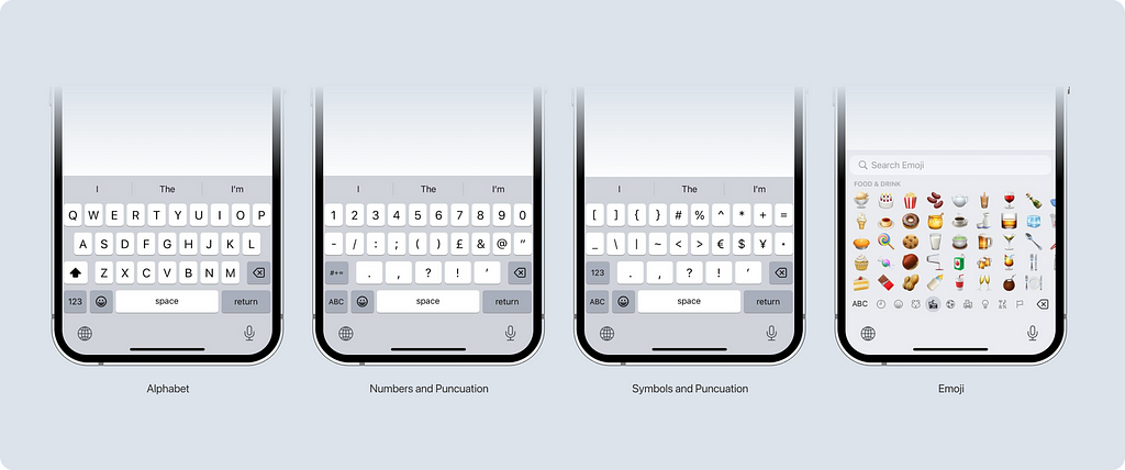
Default keyboard for iOS
You can find the standard keyboard in almost any application. It offers sets of characters including:
- Letters (as we’ve already established, there can be multiple languages)
- Numbers and punctuation
- Additional symbols
- Emojis
- And voice input
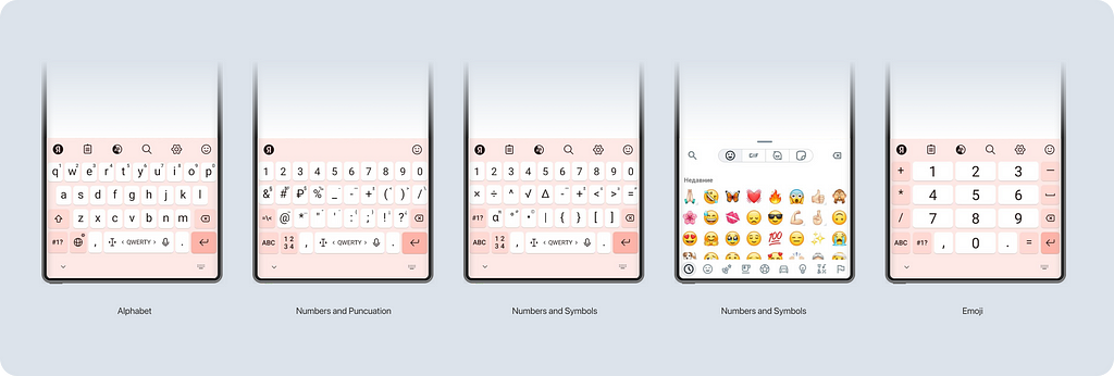
Default keyboard for Android
As mentioned earlier, the appearance of the keyboard on Android devices can vary in design and depend on the phone model. Sometimes, even the functionality changes. For example, the keyboard on the budget-friendly Samsung Galaxy A03 model only has 4 modes.
Meanwhile, on the Tecno PHANTOM X2 Pro, the keyboard has an additional mode with numbers.
Examples of usage
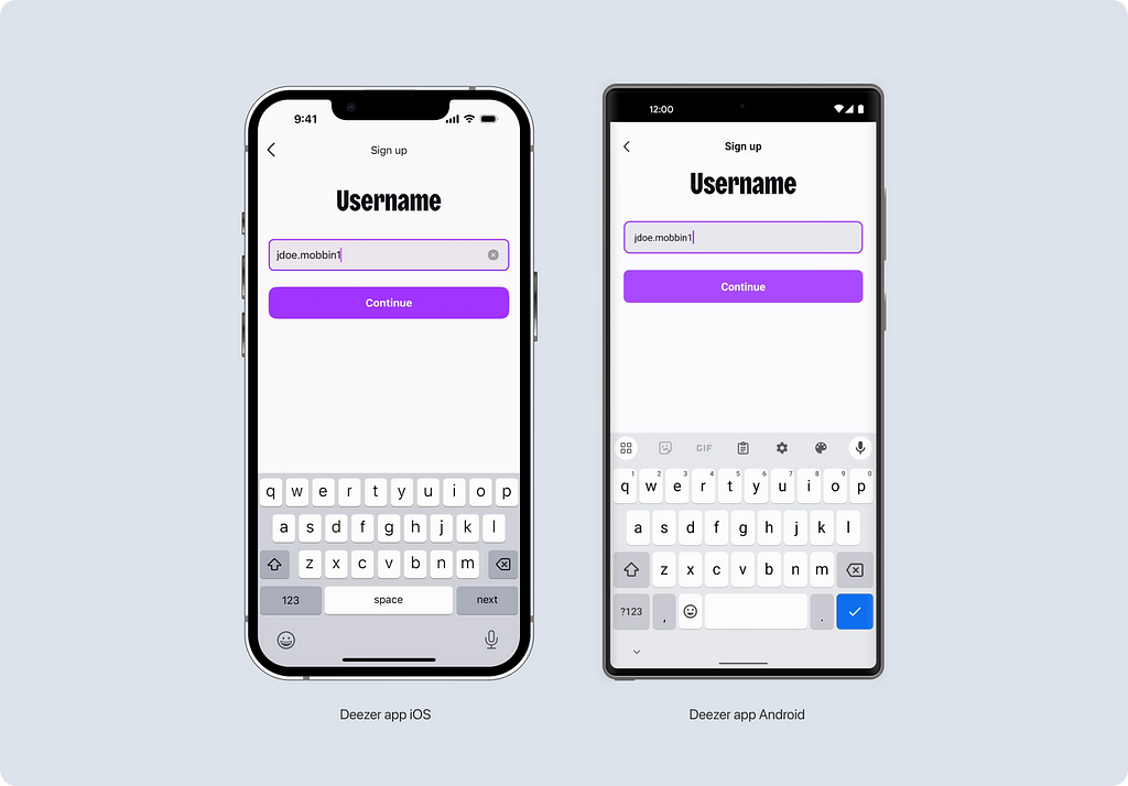
Let’s look at the Deezer app as a sample to see how the standard keyboard looks in the same situation. Pay attention to the action button. The user clicks on it to move to the next step without pressing the purple Continue button. The screen could be slightly improved. If Deezer had chosen the continue button for the keyboard, it would match what’s written on the screen, as the action upon clicking is the same.
Other letter keyboards
In addition to the default keyboard, there are other modifications of the letter keyboard. Their number depends on the platform. Sometimes, there is a unique keyboard in iOS, while the default one is used in the same case on Android. Let’s look at examples.
Email Input
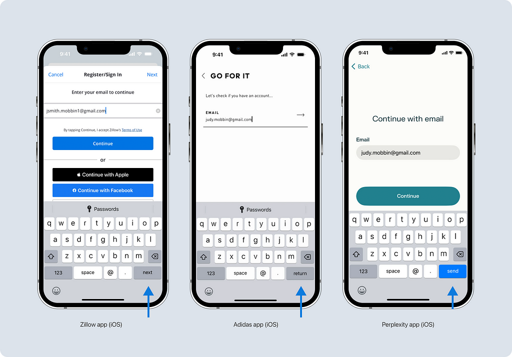
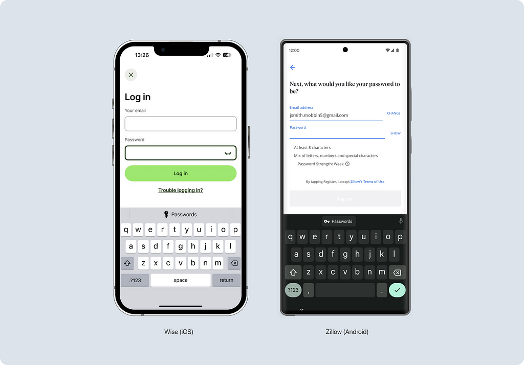
When entering an email address, the user is immediately presented with an additional symbol — “@”. This type of keyboard exists on both platforms. Let’s consider it using the example of the Zillow app.
Sometimes, this keyboard is supplemented with suggestions for saved email addresses. This is quite convenient and considerate as it saves the user time and nerves.
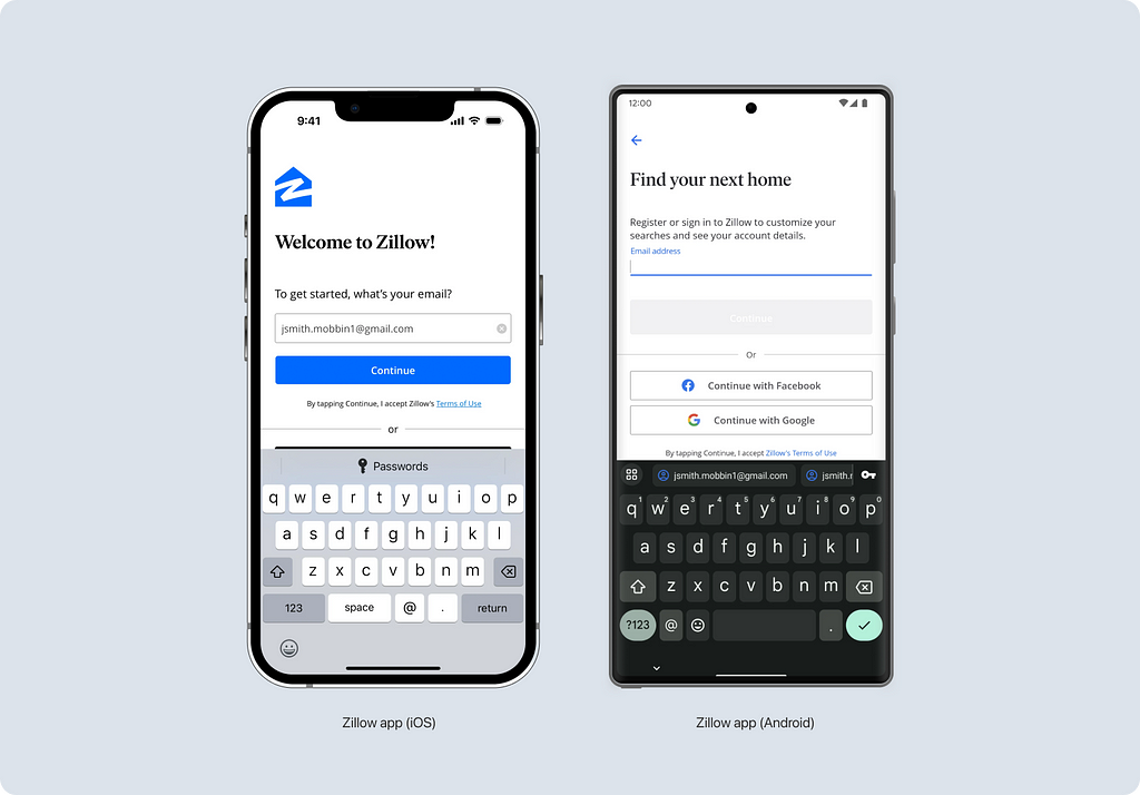
I couldn’t find a standard for which button to use; different applications decide which button to use independently. Despite the different appearances, the action when the button is clicked is the same — moving to the next step.
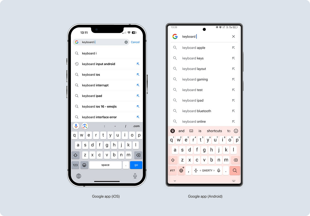
URL input
For entering web addresses, iOS has a separate keyboard, while Android uses the standard keyboard.
Let’s consider this using the example of the Google app. In iOS, the keyboard is supplemented with a period symbol, while in Android, the standard keyboard is used, which already includes this symbol by default. I also want to draw your attention to an attractive solution — a custom toolbar in the iOS app, which makes keyboard usage even more convenient. We’ll discuss toolbars in more detail below.
For Tweets
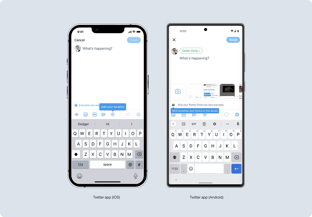
The iOS operating system has a special layout for X (Twitter) for convenient tweet writing. The “#” and “@” symbols are readily accessible, while there’s no action button. There’s no such keyboard on Android, so the standard solution is used.
Apart from the keyboards mentioned above that contain letters, there are also several others available on iOS. While not as widely used, I’ll simply list them here:
- NumbersAndPunctuation keyboard initially presents users with a numerical layout, but they have the option to switch to alphabetical characters when beginning their input.
- PhonePad keyboard has two modes — letters and numbers without additional symbols. It’s convenient for cases where either a name or a phone number must be entered without additional symbols.
- ASCII keyboard. Its main difference from the standard keyboard is the absence of emojis. ASCII (American Standard Code for Information Interchange) is a standard for encoding characters of the Latin alphabet, digits, some special characters, and control sequences, adopted in 1963 by the American Standards Association as the primary method of representing text data in computers.
You can see what these fields look like in this article by Robin Kunde.
While these keyboards are not widespread, they may prove useful in your particular case.
Numeric keyboards
There aren’t many numeric keyboards available, but there are still a few options to choose from. Let’s consider three usage scenarios:
For phone numbers
In addition to numbers, it contains symbols such as + * and #. In iOS, such a keyboard is called PhonePad, while in Android, it’s simply called Phone.
For numbers with decimal separators
This type of keyboard is useful for cases where you need to specify a non-integer numerical value, such as an exact amount with decimals.
A decimal separator is a symbol that separates the integer part from the fractional part of a number written in decimal form (e.g., “.” in 12.45). Different countries officially use different symbols as separators — in Britain, it’s a point, while in France, it’s a comma. You can read more about the list of countries and decimal separators on Wikipedia.
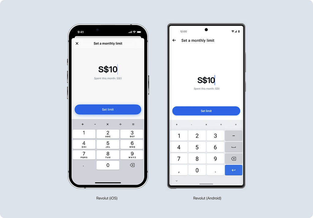
In iOS, this keyboard is called decimalPad. In addition to numbers, the keyboard includes a decimal separator symbol. In iOS, depending on the country, this can be either a period or a comma. In Android, this keyboard is named Decimal. Here, both the period and comma symbols are readily available on the keyboard.
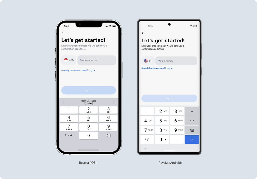
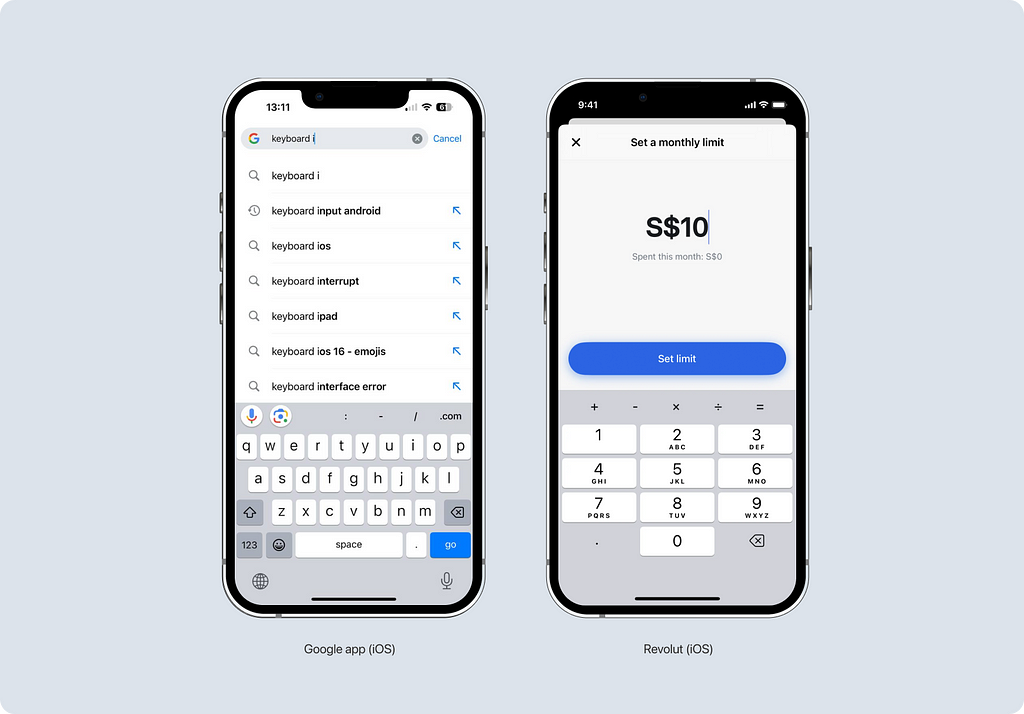
You can find examples of using this keyboard in almost any financial-related application. I chose to demonstrate it using the Revolut app, where you can also notice the custom toolbar. It allows for simple calculations directly while entering the amount.
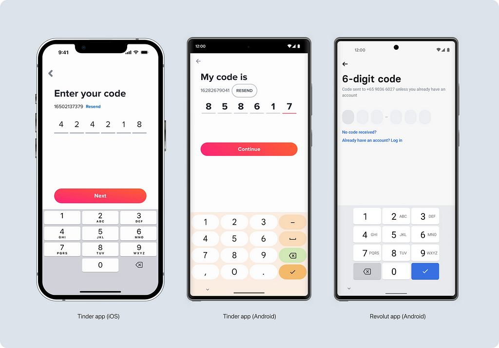
For verification codes
In iOS, a special keyboard called numberPad is used for this purpose, while in Android, it’s the same Decimal keyboard, even though the period and comma symbols cannot be used in this scenario. There are many examples, but I’ll show you how it’s implemented in the Tinder app.
However, I found an interesting solution in Revolut — apparently, they didn’t like the extra symbols and decided to remove them. This seems to be a custom solution.
Keyboard extensions
In mobile applications, you often encounter suggestions and additions to the keyboard. These can be of two types:
- Native
- Custom
You can combine native enhancements with custom ones.
Input suggestions
This native keyboard enhancement is equally common on both iOS and Android. It’s designed to speed up data entry by offering the most likely options. In the Twitter app, in addition to the native suggestions, there’s also a custom toolbar with additional actions.
Autofill from SMS
The input field must be set to a particular content type — OTP to make the magic happen. Then, the system understands that it can insert codes from SMS messages. Since then, my life has become easier.
This toolbar is only available on iOS. On Android, this is implemented differently — through a function called the SMS Retriever API, which is not related to keyboards. It reads SMS messages and inserts numbers into the field.
Autofill saved information
The toolbar also allows you to fill in fields based on previously saved information. For example, in the Bloom and Microsoft Teams apps, you can fill in the name field during registration.
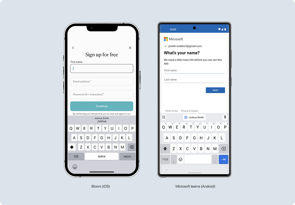
Additionally, the system can store passwords. Clicking on the button allows you to get a list of saved passwords and select the desired one.
Custom Solutions
Sometimes, more than default solutions are needed for applications. In such cases, you can add your custom toolbar. It sits above the keyboard and can complement native enhancements.
Here are some more examples of custom toolbars. In Google and Revolut apps, they blend in with the keyboard using a gray background.
More Examples
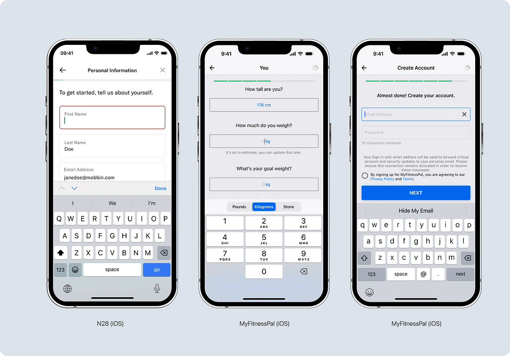
The variety of toolbars deserves a separate article. Here, I’ll show a few more examples. In the N28 app, you can switch between fields using the up and down arrows. In the MyFitnessPal app, you can change units of measurement and hide your real email address.
One interesting (but not for everyone) fact
When I was writing the article, I wondered: why are there letters on the virtual buttons of modern smartphones alongside numbers? To understand this, we need to delve a little into history because letters next to numbers on phones appeared long before cell phones.
When the number of subscribers in the USA increased to the point where seven-digit numbers became common, it was decided to replace some of the digits with letters to make them easier to remember. At first, a prefix consisting of 2–3 letters was placed, followed by the regular number. For example, the famous number Pennsylvania 6–5000 can be deciphered as 736–5000.
Later, this system was abandoned, but the mnemonic rules remained. However, they are only used in some countries. For example, in my country, they are not used.
Conclusion
Keyboards are smart enough and make users’ lives easier even without the involvement of a designer. However, you can only use all the features if you know about them.
Here, I wanted to put a link to Figma. Unfortunately, I couldn’t find a complete and correct library of keyboards in the Figma community. If you want, I will create a complete keyboard library. Leave your opinion in the comments.
I would like to express my deep gratitude to senior developers Denis Kozhukhar (iOS) and Rostom Artyomov (Android) for their help in finding information.
I am wishing everyone a convenient interface!
Are you designing with the right keyboard? was originally published in UX Collective on Medium, where people are continuing the conversation by highlighting and responding to this story.
Leave a Reply