
Creating a new UI component in Figma for yourself, your team, or your Design System is a form of art. It’s not easy, and there’s a lot to consider when building a component.
Luckily, Figma prioritizes features for full-time or ad-hoc Design System designers (I understand the struggle of not having a full-time Design System team). But these features can sometimes look daunting… a weird-looking icon button in the design panel that I have no idea how to use? Yeah, I’m gonna ignore it.
Even if you do use the daunting and weird-looking icon buttons in Figma, it’s just not everyday knowledge on how to make components easier to design, simple to consume, and better performing.
So when it’s been justified that a new component should be built, it needs to be scalable for various use cases that exist now and in the future. But most importantly, it needs to be useable by Design System consumers.
A good indicator of how a component is being used by designers is how often instances are being broken. If a designer does break an instance, it’s more than likely the component wasn’t working for them or their design needs. Maybe they couldn’t prototype a nested element or maybe they needed to alter an auto-layout constraint that was disabled.
Though breaking instances is viewed as a sin to Design System designers, it also sends us a message. Seeing a pattern of broken instances from the same component shows there is a possible area of improvement. These breakages defeat the purpose of a Design System because they are no longer mapped to its master component; meaning it will not include critical properties such as interactive states, as well as not receive component updates.
We want to avoid breakages and prevent sinning while using the Design System, and this can be supported by making your components work harder in Figma by using the following seven techniques:
- Create a ‘Nested Elements’ Figma file
- Expose nested properties in the master component
- Use local variables
- Use text property
- Use instance swap property
- Use boolean property
- Add embedded prototype interactions
1. Create a ‘Nested Elements’ Figma file
Creating a separate Figma file for master UI component’s nested elements, or children components, helps designers understand the build of the component, saves Figma file memory, and enhances organization.
How to steps:
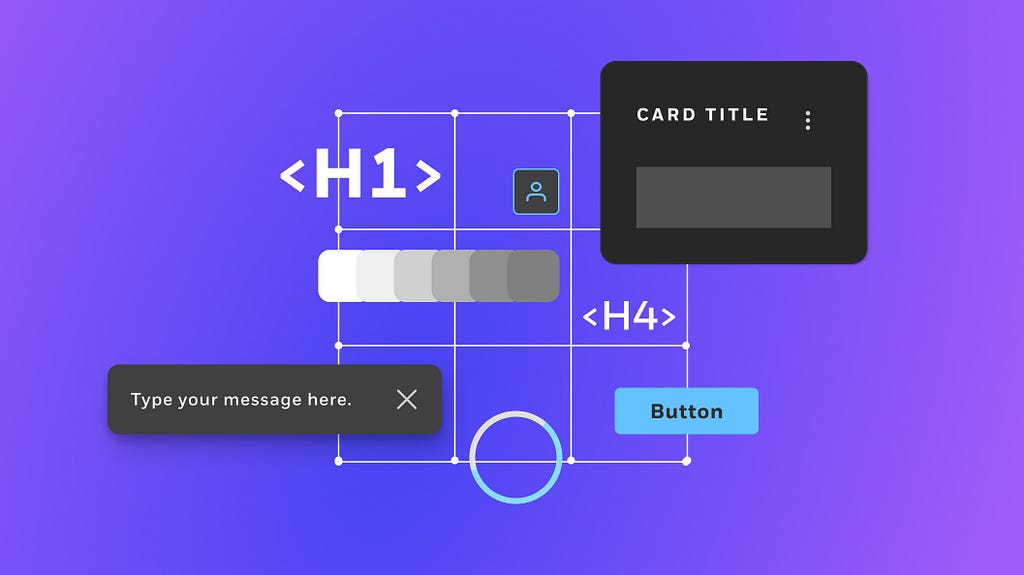
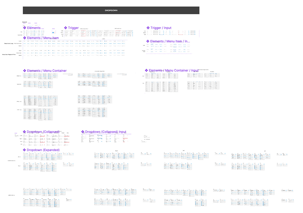
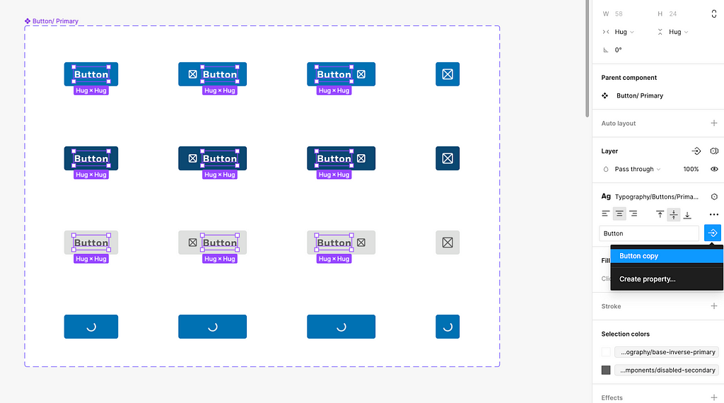
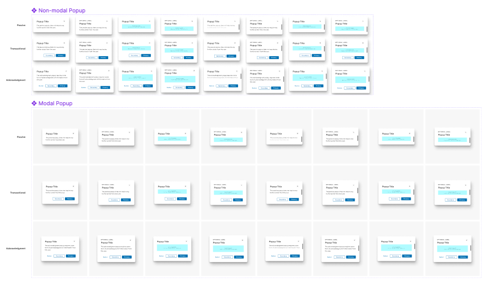
- 1a: Identify components that use nested components. (A good way to tell your component could use a nested element file is if your component build looks a little something like the below image).
- 1b: Create a new Figma file in the same project or work-space as the master component file, and name the new file ‘Nested Elements’.
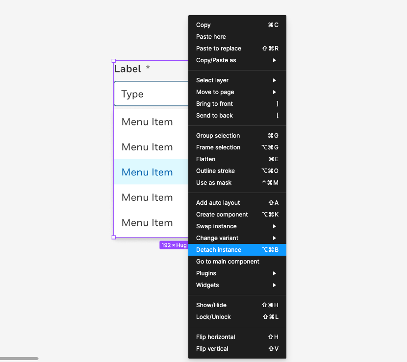
- 1c: Migrate all nested elements to this new file and relink them to their corresponding master component. I prefer this manual process to not risk losing a component, but Figma does have a “Move published components” article in Figma Learn if you don’t want to do this manually.
- 1d: Ensure the master components are properly linked to their nested elements in the new file by right-clicking on the nested component in the master component, and selecting ‘Go to main component’.
- 1e: Publish the nested element file as a library so the master components can receive updates, but make a clear note of the file’s intent that it does not store the final components.
Tip: My Design System organizes the master component library in alphabetical order by component name, and the nested element Figma file is structured the same. If the master component does not have any nested elements, it is omitted from the Nested Elements file.
I previously wrote an article on this Design System file strategy called “Organizing a web design system for scalability in Figma”, which I implemented in my team’s Design System. It has proven effective in allowing our Design System to scale without effecting file memory storage, as well as opened the doors to use other techniques such as using instance swap properties (explained in #5).
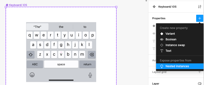
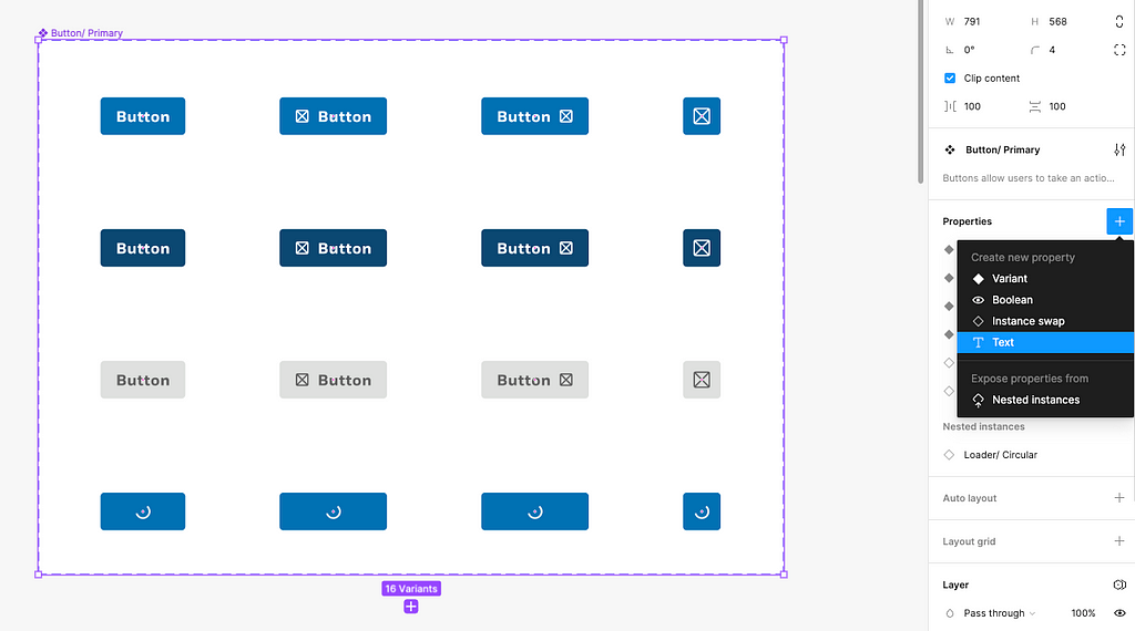
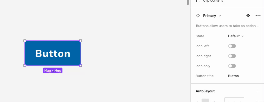
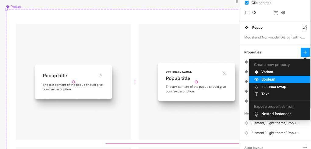
2. Expose nested properties in the master component
Exposing a nested component’s properties in its master component can help consumers modify the nested properties without having to drill into the component. Additionally, it can make components more intuitive to work with in understanding what can be modified and what can’t.
How to steps:
- 2a: Identify a component that has nested or children components included.
- 2b: Select the entire component set, then click the plus (‘+’) icon button next to ‘Properties’ in the design panel.
- 2c: Select ‘Nested instances’ under the subtitle ‘Expose properties from’.
- 2d: In the ‘Expose properties from’ menu that appears, select the nested elements that need to be exposed in the properties panel.
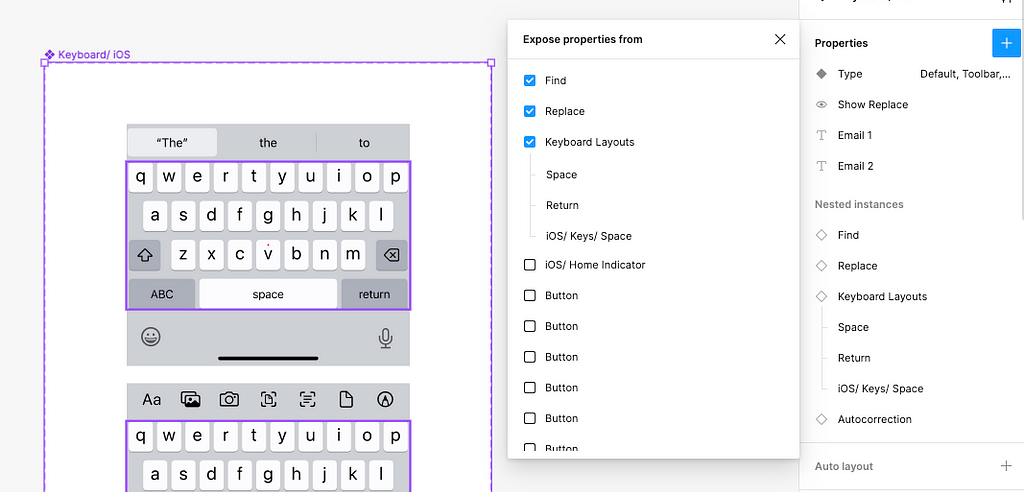
- 2e: Test the component to ensure it’s working properly.
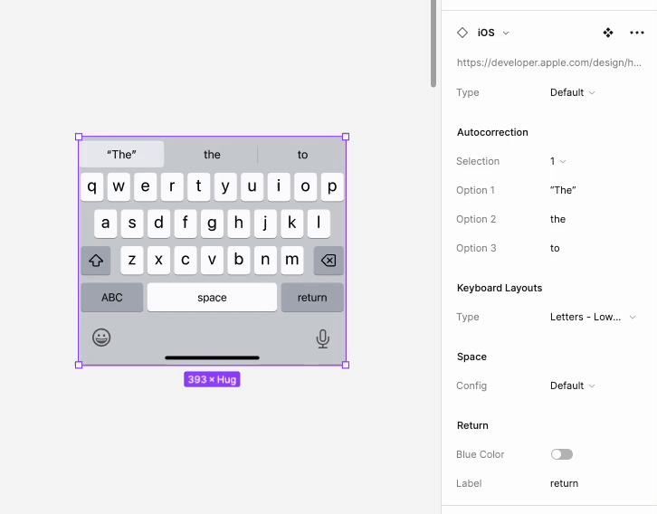
The nested properties that appear in the design panel will depend on which variant is selected, so properties that are not at the top-level of the component will be altered.
3. Use local variables
The release of local variables has been a game-changer for my Design System. Work is more efficient when updating and building new components.
For example, instead of having to create a light and dark theme version of a component, I only have to build one component and assign the correct color variables to easily swap between themes. This has eliminated the need to support two separate Figma files including the light theme and dark theme components.
How to steps:
- 3a: Create local variables to house your Design System’s colors, breakpoints, typography, etc. For more details on this step, view my article “Migrating from color styles to local variables in Figma”.
- 3b: Create modes in the local variables menu to link variables together and place them in-context.
- 3c: Select a component set or similar variants in a component.
- 3d: For colors, next to the style or hex value, select the grid icon on the right to open published libraries.
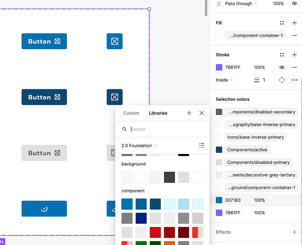
- 3e: Select the appropriate color variables from the library. Note: variables are square-shaped, versus styles are circle-shaped.
- 3f: For numeric variables, select the variables icon on the right of a input field (I.E., auto-layout property) to open local variables.
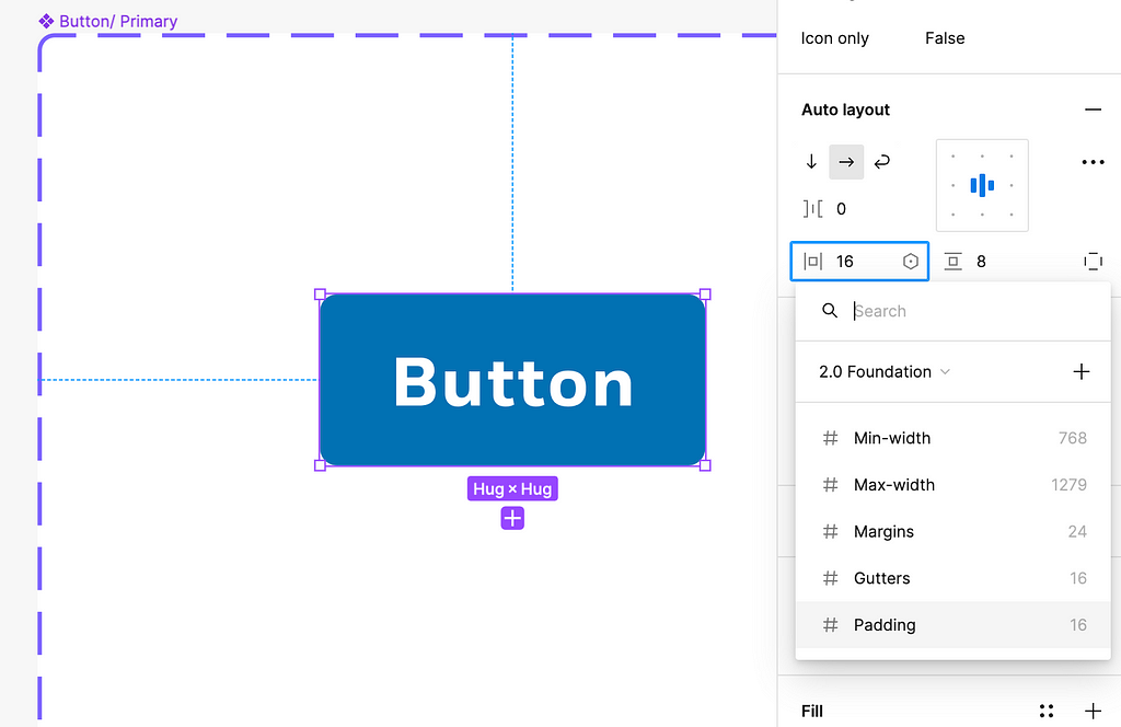
- 3g: Select the appropriate numeric value from the library. The variable will appear in a grey square in the input field.
- 3h: Test that the components swap between their intended modes.
Though this technique is easily understood for colors and swapping between themes, it can also apply to support device responsiveness. Typography and number variables can be used to swap between desktop and mobile frames.
4. Use text property
Ever hear a co-worker clicking an insane amount of times in a row? (Click, click, click x 6)… well, maybe they were just trying to select a nested layer of text to modify it in Figma.
Adding a text property to a component’s copy, such as titles or body text, allows consumers to modify the copy on the design panel without having to drill into the component’s layers.
How to steps:
- 4a: Identify a component that would benefit from a text property.
- 4b: Select the entire component set, then click the plus (‘+’) icon button next to ‘Properties’ in the design panel.
- 4c: Select ‘Text’ from the dropdown menu and name the property accordingly.
- 4d: Select all corresponding text layers, then click the icon button with an arrow in a diamond shape in the ‘Typography’ section of the design panel. This will open a menu with any text properties associated to the component.
- 4e: Edit the value of the text property if needed; this is the default text that will show when consumers insert this component into their file.
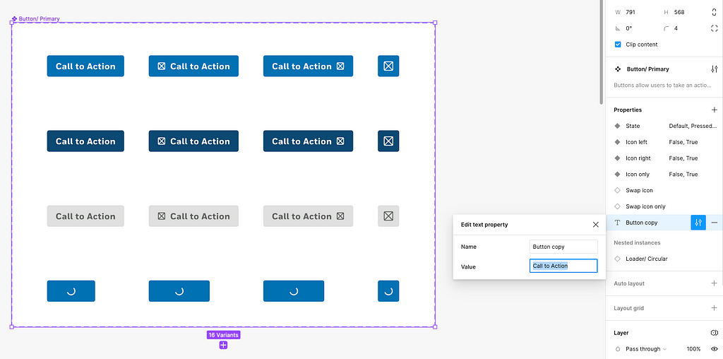
With the text property applied, you only need to click on the first layer of the component to modify text.
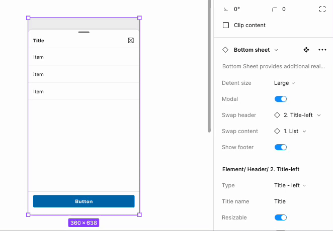
5. Use instance swap property
Similar to text properties, instance swap properties allow consumers to easily switch between design elements in a component. This property supports the scalability of a component as additional use cases arise.
How to steps:
- 5a: Identify a component that includes sections that may need to be changed depending on the use case. (I.E., a bottom sheet that has multiple header types).
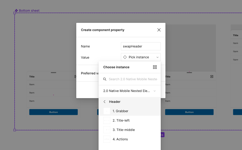
- 5b: In the ‘Nested Elements’ file, create a separate component for each element the master component needs to swap from, and name each appropriately. Note: creating one component with all the different swaps will not work with this property.
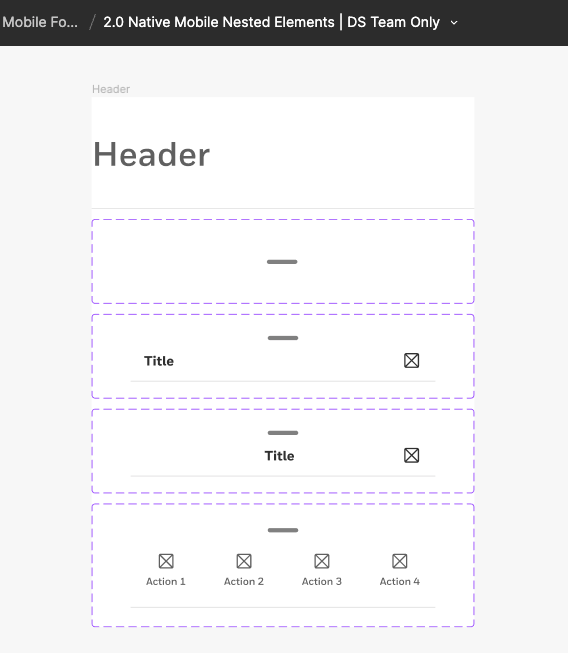
Tip: I name the swap components with forward-slash (‘/’) to group them and number them from #1 to #n. (I.E., ‘Header/ 1. Grabber’). This will support how they appear in the master component.
- 5c: Insert the nested component into the master component.
- 5d: Select the master component set, then click the plus (‘+’) icon button next to ‘Properties’ in the design panel.
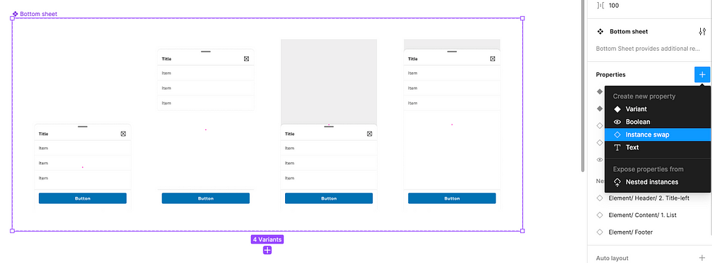
- 5e: Select ‘Instance swap’, name the property, and pick the instance for the value by selecting the correct library and component.
- 5f: Select all corresponding layers, then click the icon button with an arrow in a diamond shape in the ‘Property’ section of the design panel. This will open a menu with any swap properties associated to the component.
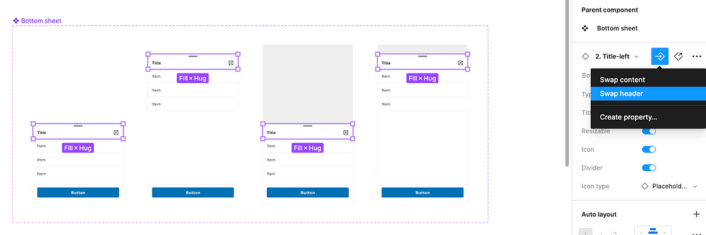
With the instance swap property, consumers can easily switch between nested components without having to drill into the master component. This can be applied to different content in a component, including iconography, buttons, etc.
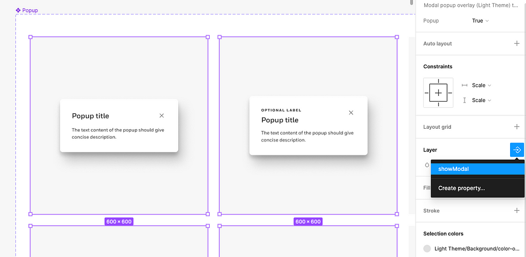
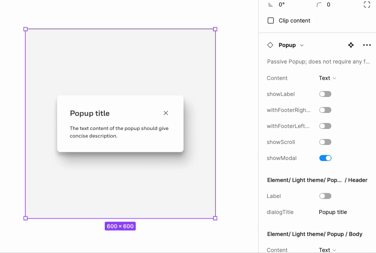
6. Use boolean property
As easy as a light-switch, the boolean property removes the need to create two separate variants in a component set when one variant needs a design element and the other doesn’t.
If I created a popup component that needs to support a modal and non-modal, I would need two separate variants for each popup. One would have the modal background, and the other would not have the background. Instead of having these near duplicate variants, I can add a boolean property and attach it to the modal’s background to turn it on and off.
How to steps:
- 6a: Identify a component that includes variants where a design element is ‘on’ in some variants and ‘off’ in others.
- 6b: Select the entire component set, then click the plus (‘+’) icon button next to ‘Properties’ in the design panel.
- 6c: Select ‘Boolean’ from the menu.
- 6d: In the modal that appears, name the property accordingly and decide if the layer should be ‘True’ or ‘False’.
- 6e: Select all corresponding layers in the component set, then click the icon button with an arrow in a diamond shape in the ‘Layer’ section of the design panel. This will open a menu with any boolean properties associated to the component.
If the component doesn’t need the element turned on by default, the value of the boolean property can be set to ‘False’ so the consumer would have to turn the element on in the design panel.
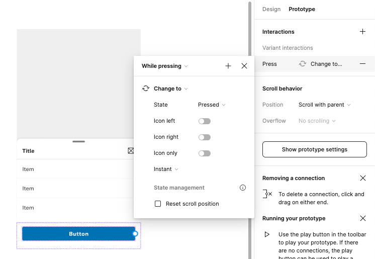
7. Add embedded prototype interactions
This one may seem like a given, but it’s a commonly forgotten attribute to give a Figma component. Trust me, I’ve forgotten to add prototypes between states as a Design System designer. This is especially important for nested components because consumers cannot add a prototype to the individual nested components without breaking the master component.
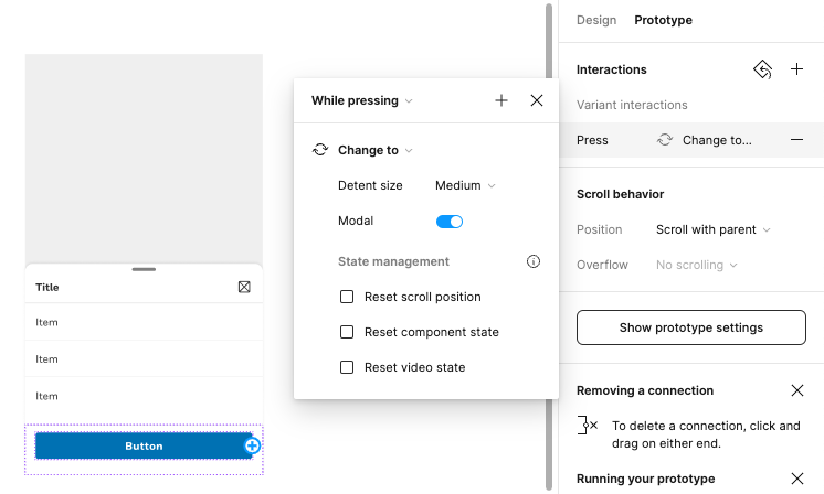
Let’s say I have a button nested in a bottom sheet component, and I want the button to have a pressed state for my prototype. If the button component does not include a ‘Change to’ interaction while it is being pressed, I won’t be able to add this in the bottom sheet. I will only be able to control the variants in the bottom sheet component; not nested components like the button.
How to steps:
- 7a: Identify a component or nested component that needs an embedded prototype.
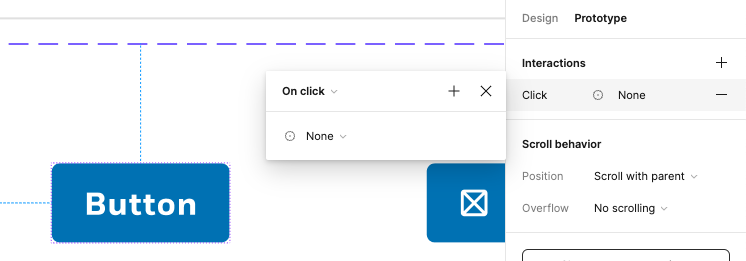
- 7b: Switch from ‘Design’ to ‘Prototype’ in the design panel.
- 7c: Select the starting variant in the component set, and click/ drag the noodle to the ending variant or select the plus icon (‘+’) next to ‘Interactions’ in the panel.
- 7d: Modify the specifications of the interaction (I.E., ‘While pressing’, ‘Change to’, ’State: Pressed’).
- 7e: Publish the changes or relink the nested component to the master component.
- 7f: Test out the prototype.
That’s all for now! Incorporating these techniques into your personal, team, or organization’s Design System will make UI components easier to build, manage, and consume. Most importantly, it will help prevent Design System sinning from consumers breaking component instances.
Figma has awesome features to support creating recyclable components, so let’s make the most of using them.
Make your Figma components work harder was originally published in UX Collective on Medium, where people are continuing the conversation by highlighting and responding to this story.
Leave a Reply