AI is very broad, meaning there’s no singular definition, meaning contradictory claims reasonably coexist
While sparkles have effectively monopolized the identification of AI, concerns about accessibility and intuitive communication have risen. Striking a balance between leveraging established patterns and ensuring a seamless, integrated experience is key.
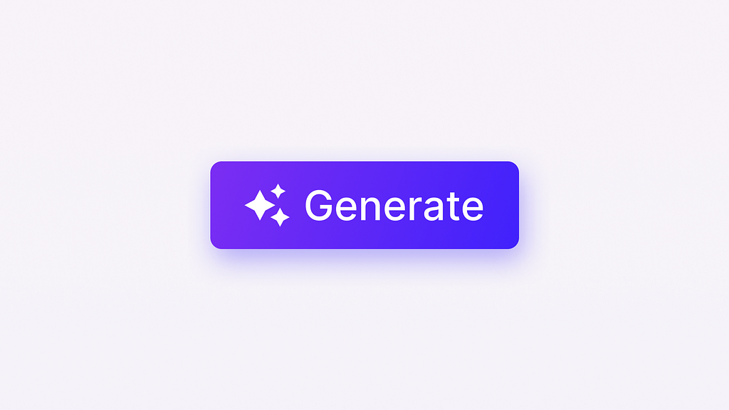
Sparkles have become a common symbol for AI, but this has led to concerns about accessibility and clear communication. The challenge is to strike a balance between recognizable patterns and an accessible, smooth user experience.”
Imagine browsing through your favourite online store to find an ideal product. Suddenly, a personalized recommendation appears, offering you items you may be interested in based on your previous purchases.
AI powers this smooth process and is changing how we interact with products and services (and, consequently, how we design them).
“In the age of AI, the very nature of design is evolving. As we embrace the uncertainty inherent in probabilistic systems, we must reconsider our roles as designers and researchers, and redefine what it means to create meaningful user experiences.” — Jakob Nielsen
Real magic happens when users can effortlessly recognize and interact with these AI-driven features. As a product designer specializing in AI applications, I’ve learned that subtle visual cues can significantly impact the user experience, allowing users to seamlessly adapt to and embrace the product’s AI-powered aspects.
In this article, I’ll share practical tips for incorporating visual clues to gently guide users toward discovering and appreciating the AI-enhanced features that make your product unique.
Real-world applications of AI visual cues
Here are some user scenarios where AI visual cues can be helpful:
- Chatbots and Virtual Assistants: In chat interfaces, AI visual cues can help users identify AI-generated responses and suggestions, helping them differentiate between AI and human interactions.
- Personalized Recommendations: In online stores, streaming services, and social media platforms, AI visual cues can highlight AI-driven recommendations, letting users know that content has been personalized for them.
- AI-Powered Analytics and Insights: In analytics dashboards and reports, AI visual cues can differentiate between AI-generated insights and traditional data analysis, making it easier for users to understand the implications.
- Intelligent Search and Filtering: Visual cues can indicate when AI has refined results when searching or filtering content, helping users find relevant content more efficiently.
While I mentioned a handful of user scenarios, it’s important to note that the application of AI visual cues extends far beyond these examples. You can check more use cases, broken down by industries, in the article by Redress Compliance. As technology evolves and new use cases emerge, the need for clear and user-friendly AI identification will only grow.
Specific patterns to introduce AI-powered features
- ✨ Sparkles: This icon has become synonymous with AI features, likely representing the innovative and transformative power of AI. The widespread adoption has made it a recognized pattern. This serves as an easy way to direct users’ attention to AI features, even if it’s sometimes more about adding sparkle than genuine utility.
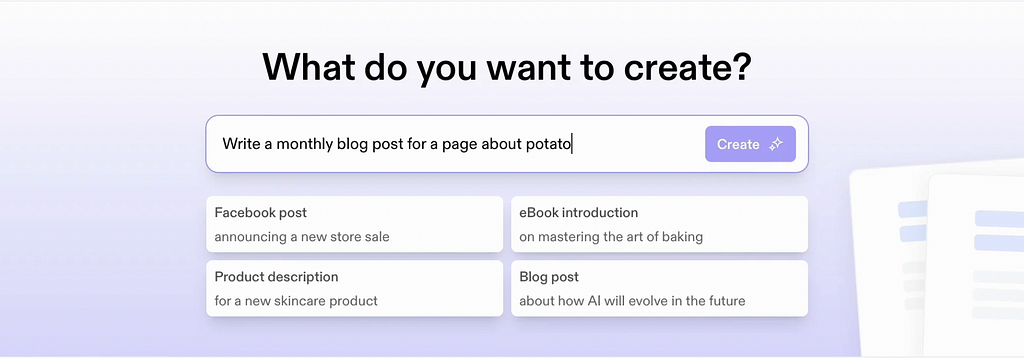
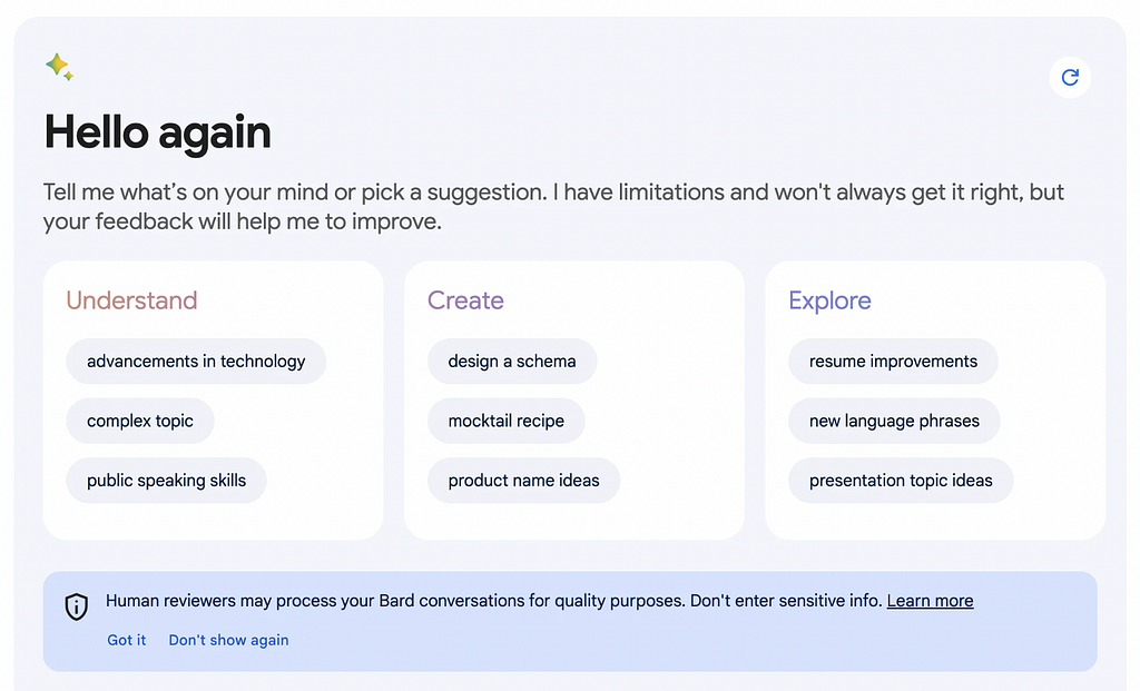

- Badges (with or without icons):
Text badges with short labels also help users identify AI features. They provide context by showing when content is AI-made, or a feature uses AI. They can be used alone or with icons to create a clear, user-friendly experience.

- Colour Palettes
Colour plays a crucial role in helping users identify AI products and features. While there’s no standard palette, purple and green have emerged as popular choices, with purple clearly being the most common choice. Why purple? Emily Campbell from The Shape of AI suggests that this aesthetic style popularized by Linear, which heavily features the colour purple. Or because of its early use in design-centered AI tools like Diagram’s Magician plugin for Figma
Some companies prioritize unique iconography over colour, extending their brand colours to AI applications. Emerging trends for AI-generated content include gradients and alternating pastel hues.


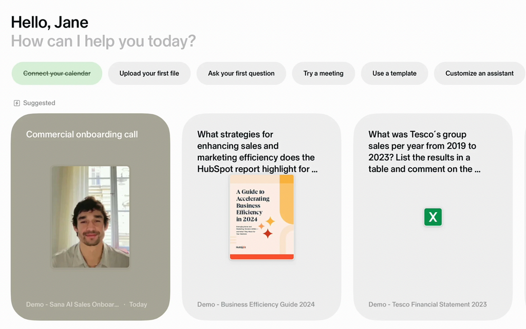
- Naming and Humanizing
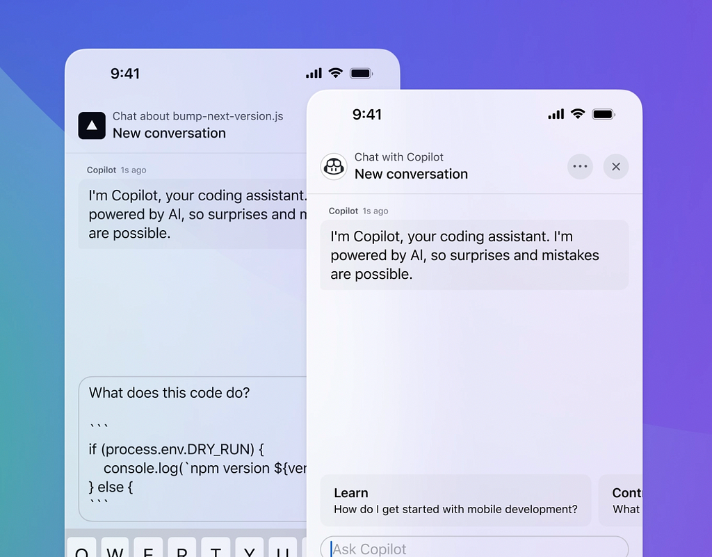
The NN/g research shows that anthropomorphic behaviors have a functional role (users assume the AI will perform better) and a connection role, meant to create a more pleasant experience.
Giving AI features names and personas transforms human-computer interaction by allowing users to engage with technology more naturally and flexibly.
This humanized approach encourages intuitive communication, lets users express their needs and preferences naturally, and fosters trust and emotional connections. As a result, people become more comfortable interacting with AI.
Challenges
While incorporating AI visual cues into product design can improve the user experience, it is essential to consider the potential challenges and limitations that may arise.
One challenge is that visual cues may be perceived differently across cultures. For example, some colours or symbols commonly associated with AI in one culture may not be recognized or understood in another. As stressed by Dan Andrews in his article, the meaning of icons and images is strongly affected by cultural background of our users.
Research and testing across different demographics can help ensure that visual cues are inclusive and accessible to all users.
Additionally, the varying levels of computer literacy among users can pose a significant obstacle in creating a seamless user experience. For individuals who are frequently exposed to AI tools, subtle indicators like a sparkle icon may be sufficient to signal AI functionality. However, for those less familiar with such technology, more explicit cues, such as badges or labels clearly marked with “AI,” might be necessary.
So, I can not agree more with Daley Wilhelm who mentioned in her article Sparkles aren’t good UX, that sparkles are great, but they don’t have a solid meaning in the same way that a clock or calendar icon has. When tapping on a sparkle, users aren’t entirely sure what might happen next.
Final thoughts
Companies are increasingly interested in leveraging AI for their products. However, in the excitement to embrace this technology, there’s a risk of focusing more on the novelty of “doing AI” rather than thoughtfully considering its integration. It’s essential to ask questions like how a feature should function, why it should work that way, and whether it genuinely benefits the user. This approach can help ensure AI features enhance the user experience rather than simply being added for the sake of innovation.
One key aspect of this is rethinking interaction patterns, including those that help users recognize AI-powered features. The goal isn’t just to adapt to AI, but to harness its full potential in creating more engaging, intuitive, and effective experiences.
Some more great resources on this topic:
- “AI for Designers” IxDF course by Ioana Teleanu
https://www.interaction-design.org/courses/ai-for-designers - “Design Patterns for AI UX” IxDF webinar by Vitaly Friedman https://www.interaction-design.org/master-classes/design-patterns-for-ai-ux
- “Accessible and Inclusive Design Patterns” IxDF webinar by Vitaly Friedman https://www.interaction-design.org/master-classes/accessible-and-inclusive-design-patterns
AI visual language: How to help users spot AI-powered features was originally published in UX Collective on Medium, where people are continuing the conversation by highlighting and responding to this story.

Leave a Reply