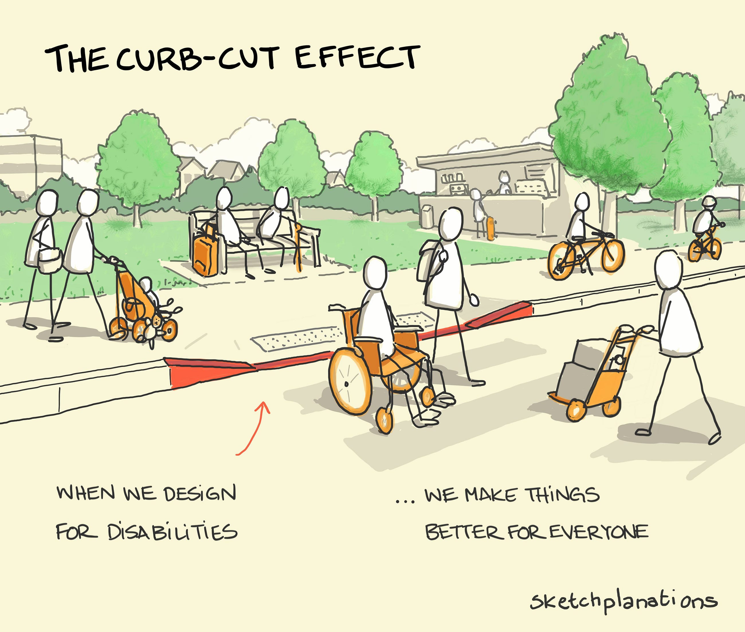
Wheelchair-inspired curb cuts led to universal accessibility. From closed captioning to QR codes, designs meant for one group benefit many.
For the last couple of years, the field of Design has witnessed an invisible decline in impact, trust, and ambition.
Wait what? Please keep reading.
We’ve worked hard to get a seat at the imaginary table and for many, it’s been hard to demonstrate the business impact behind design.
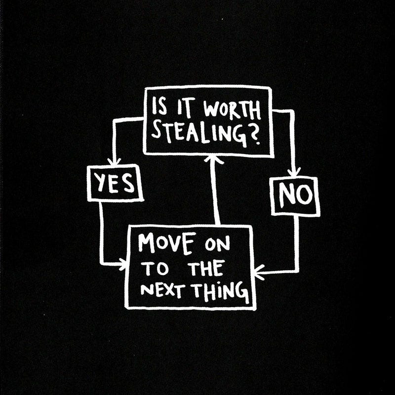
Good artists borrow, great artists steal.” — Pablo Picasso.
We’ve heard it all before and if you’re like me, you’re starting to question if the internet is drowning in a sea of stolen, uninspired design.

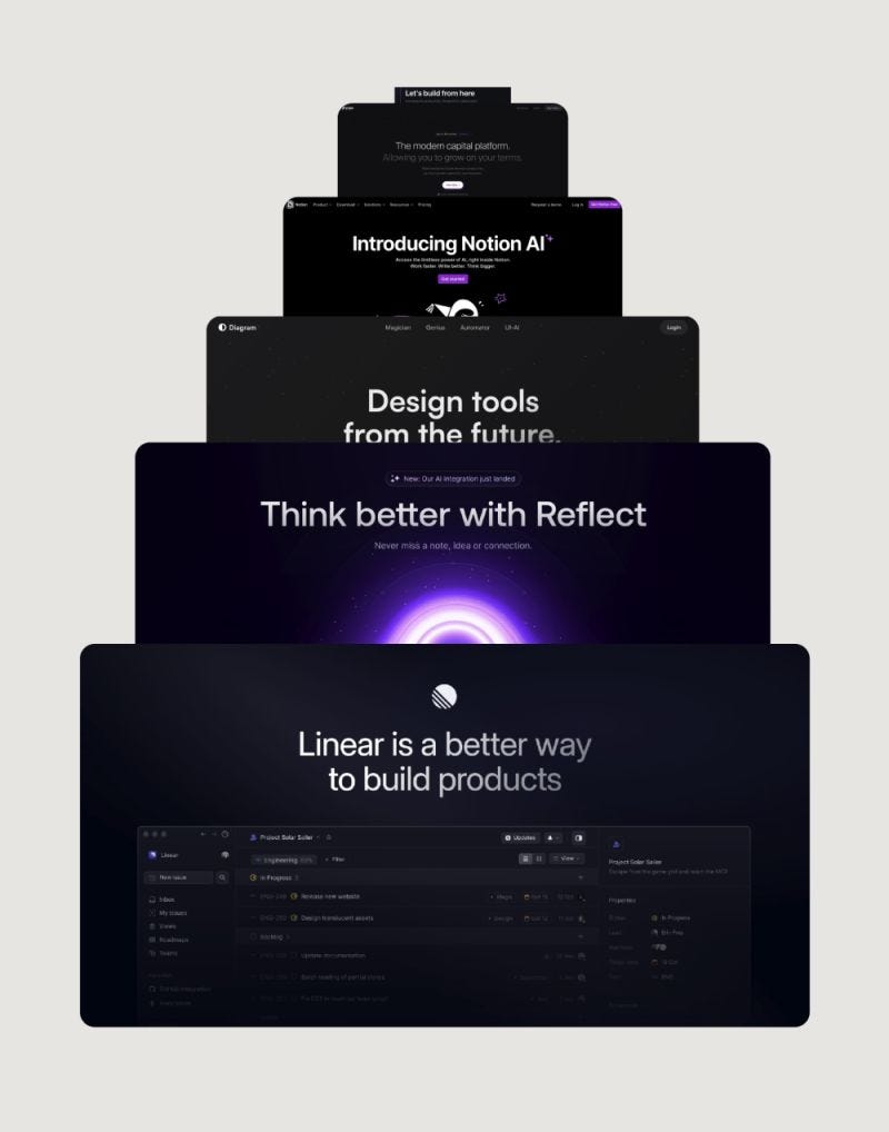
One website gets crazy conversion rates, and all of a sudden, every other website uses the same structure and simply replaces its colors.
Apple introduces bento boxes…
→ the internet goes wild using it everywhere.
Airbnb brings back skeuomorphic design…
→ the following week we see it all over Twitter design.
Your favorite designer on Twitter posts his new website design…
→ everyone replicates it for their own.
As Mat Venn pointed out in his article, we’ve seemed to hit a critical roadblock in product design evolution, characterized by predictability, stagnation, and looming sameness.
Listen, I get it.
We replicate what works.
We learn from observing from others.
The design space, which was once a haven for creative diversity, has evolved… the design landscape is changing.
Technology is changing. The world is changing.
Where did the wild things go?
Don’t get me wrong… I dislike websites, apps, and products that are extremely creative yet, which makes it so hard for me to know what I’m supposed to be doing next.
Did unique and eclectic designs get traded in for dull and homogenized ones?
Have we gotten so good at understanding users?
Has pure creativity been replaced by data?
Has auto layouts killed explorations?
So many questions…
We don’t all have the same end-users and yet, most products look alike.
Let’s step outside our user interface world for a second here and look at it from a different angle.
If we look at shower heads, they may vary primarily in shape and colour, but the fundamental design remains unchanged across brands and models. Arguably, the same things happen with light switches with minimal functionality and appearance variations, making them virtually indistinguishable from one another. This “similarity” reflects a broader trend where innovation or creativity can sometimes take a backseat to familiarity and convention.
The culprit?
Efficiency… maybe? Because it works… maybe?
Perhaps it's just simple human nature or, perhaps it’s our new design obsession with measuring the impact behind every pixel pushing us to prove we belong at that “table”. Or maybe, just maybe, it’s the combination of the internet and the inspiration becoming globalized.
Should we be questioning things?
When every designer uses the same sources for inspiration, we are bound to create the same things over and over again.
It sometimes feels like:
– we are afraid of trying…
– we’re afraid of breaking free…
– we’re afraid of colouring outside the lines.
– we stopped digging deep within ourselves for bold, original ideas.
Is this progress or a creative crisis?
Can we break free?
Is this even a problem?
😵💫🫥🫣😶🌫️🧐🙃😱
The internet needs a shot of uniqueness and a dash of weirdness.

Is this the future of design?
The above thoughts will probably poke the bear, ruffle some feathers and make people feel uncomfortable.
Why?
Because it challenges the current state of design and it challenges our comfort zone.
After 17 years in the design field navigating my way around agencies, agency owner, startups, and enterprise software, I’ve seen design both evolve and stagnate.
Design isn’t weak, it’s misunderstood.
We’ve become overly obsessed with what we call ourselves (UI/UX/content/product designer…) and methodologies (user journeys anyone, stakeholder mapping, design thinking…).
We’ve fallen in love with our tools and processes probably more than we should of…
We’ve drowned in a sea of tools and fallen in love with process over purpose.
We may have created more confusion than clarity in our craft.
We often over-design things to impress our fellow designers and chase likes.
You’ve all seen this. Someone creates a button, animates it and all of a sudden his tweet goes viral and it gets thousands of likes and comments.
Someone sees this… and replicates it. ♻
Don’t get me wrong, I’m all for designing and being creative, but I feel that sometimes we can easily get caught up in the weeds of over-designing things just because.
Does the user really see the difference? Does it really convert more? Should you really have spent one week designing and animating one single button?

Have we lost sight of what matters?
Vitaly Komar and Alexander Melamid ran an interesting experiment on 1,001 US citizens and the results are fascinating.
We’ve learned that:
- Humans want to be comfortable.
- Humans all want the same thing.
- Humans all want to “fit in”.
As Vitaly Komar stated:
“We have been travelling to different countries, engaging in dull negotiations with representatives of polling companies, raising money for further polls, receiving more or less the same results, and painting more or less the same blue landscapes. Looking for freedom, we found slavery.”

There are many different reasons why this might have happened over time, such as:
- Humans seek the safety of the familiar.
- We’ve been obsessing about quantification and optimization.
- We’ve inevitably been influenced by inspiration becoming globalized.
When I started in design, inspiration came from observing the world, nature, art museums, and magazines. Now, we turn to the 1,000s of inspiration sites online… And back then, don’t recall having to measure the impact behind every single pixel this heavily.
Is design weak? Not inherently.
But it’s certainly misunderstood. We’ve become obsessed with processes, jargoning ourselves into oblivion with titles like “content designer of designers” while forgetting the core mission: solving problems.
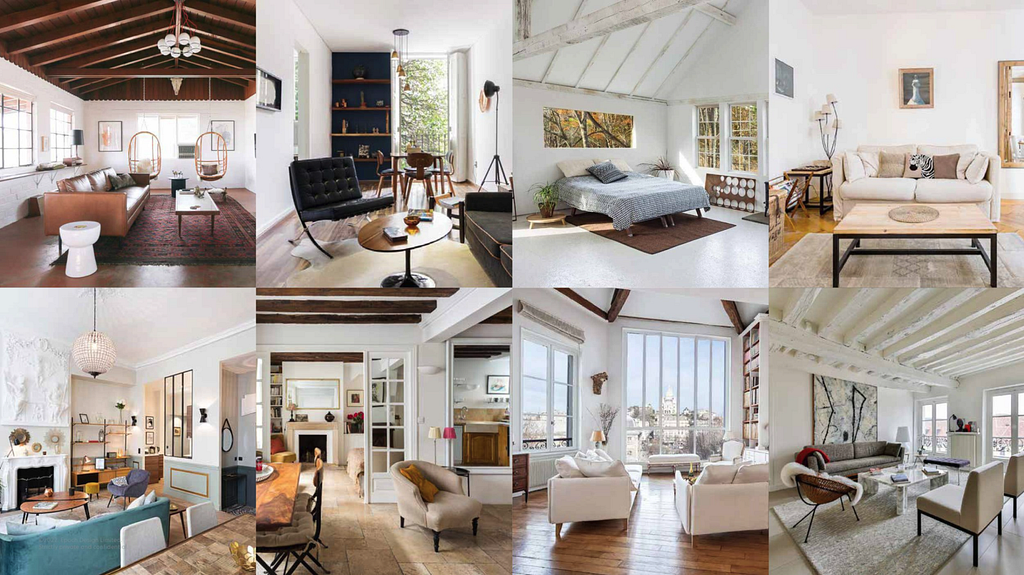
Interiors all look the same

AirBnB’s design aesthetic blends industrial rawness with mid-century simplicity, featuring elements like white walls, raw wood, Eames chairs, bare brick, and open shelving, spreading rapidly across its properties.
Coffee shops all look the same

Architecture all looks the same

In the modern era, developers prioritize function and efficiency amidst new challenges: stringent building codes, soaring land prices driving densification, industry consolidation due to heightened barriers to entry, and a relentless pursuit of cost reduction.

Cars are now designed for the broadest possible audience, across the broadest number of countries, to be manufactured in the most efficient possible way.
Media all look the same

Ever wonder why every poster, trailer, and TV spot feels eerily similar? It’s all about testing. Anything original gets axed for poor scores.
But where does this all leave us?
When people optimize for the same thing (conversion, for example), best practices tend to emerge and get replicated. We streamline the process until it’s nearly perfect.
If you have not yet read The end of design I highly encourage you to read it. It’s thought-provoking for sure, but it’s also eye-opening on so many levels.
Suff Syed & Daiyaan Syed claim in their writings that the C-suite, despite giving Design a seat at the table, has failed to engage the craft to create meaningful outcomes at scale.
It’s hard, I know. It’s a continuous battle to prove our worth and make that impact, get invited to the discussions and drive roadmaps.
Technology moves faster than we humans can adapt and yet, visual environments aren’t moving as fast. Kurt Anderson mentions that these visual changes were much faster in the 20th century than it is in the 21st.
A few thoughts before we all get discouraged:
- With all that being said, there are still a lot of unique sites. They don’t all look like Linear’s or Apple’s website.
- As designers, we must consider the client's perspective: if clients are paying 10k, 30k or 100k for something, we probably won’t try something completely new and risky, we are more than likely going to stick with something nice that a few others also use similarly. Would you, for example, pay 30k for a car not knowing if it works properly? If it is your own money, you’re probably not that brave…
- Also, we as designers live in our web design bubble. We see something and think ‘Already seen!’. However, building a client’s site solely to impress fellow designers on Twitter (a common pitfall) is misguided. The majority of users likely haven’t encountered certain design elements, such as horizontal scrolling or even dark mode on a website.
Sounds like I’m against innovation!?
Heck no.
I’m a fan of out-of-the-box approaches. A huge fan of challenging the status quo and pushing boundaries and I miss the good old design days.
A potential solution: different input and inspiration. Not just Awwwards, Dribbble and Behance… or replicating what your favourite designer is doing on Twitter.
Culture has come to a standstill. The New York Times article even goes to say that we are the least innovative century for arts in the past 500 years.
Could all this “measuring the design impact” also be caused by the Cartesian thinking which states you can isolate things and measure their performance?
The flaw in this concept becomes apparent once you acknowledge the intricate nature of contemporary business challenges.

What is design, exactly?
We live in a KPI-driven world.
Measuring pixels isn’t always easy.
Designers often preach passion and craft, not profit. That’s what we learned in school and we didn’t all get an MBA in business. We started this journey for the love of art, for the love of creating beautiful things and for making products and services people would use and love.
It’s time to bridge that gap.
The answer isn’t abandoning design, it’s embracing innovation. It’s time to explore, speak up, cast aside conformity, and decline the indistinguishable.
It’s time for designers and design leaders to share their knowledge.
Let’s talk about creating and shipping ideas → putting them in the hands of people.
As Thijs Kraan stated: Design is in a weak position and it is up to us, designers and leaders to help executives understand design.
Don’t just create tools or Figma how-to posts. Articulate and evangelize the value of design and its impact on business.
So, is design weak? Nah.
Just under-marketed.
Let’s change that.
References and other articles to explore:
https://www.alexmurrell.co.uk/articles/the-age-of-average?
- Deconstructing Roy Lichtenstein™ © 2000
- Make Product Design Great Again
- YOU SAY YOU WANT A DEVOLUTION? | Vanity Fair
- The End of Design
I’m a Design Principal & Creative Director, a spiritual and a health enthusiast. I write about design, skills, careers, and systems. I’m all ears for your take on anything design or, feel free to connect with him on Linkedin.
Is ⌘ + C the new design process? was originally published in UX Collective on Medium, where people are continuing the conversation by highlighting and responding to this story.


Leave a Reply