A digital endorsement process gone wrong

To run for President of Iceland, you need to be an Icelandic citizen, at least 35 years old, and have 1,500 endorsements.
For the first time in Icelandic history, this endorsement process is digital. Instead of collecting all their signatures on paper the old-fashioned way, candidates can now send people to https://island.is/forsetaframbod to submit their endorsement.
This change has, also for the first time in Icelandic history, given the nation a clear window into who is trying to run — and it’s a remarkably large number. To date, 82 people are collecting endorsements, including a comedian, a model, the world’s first double-arm transplant receiver, and my aunt Helga.
Many of these people are seriously vying for president (yep, my aunt Helga), some of them have undoubtedly signed up as a joke (nope, not the comedian), and at least 11 of them accidentally registered and had no idea that they were collecting endorsements for their candidacy.
“I’m definitely not about to run for president, this was just an accident,” one person told a reporter after having a good laugh about it.
“That’s hilarious!” another person said, thanking the reporter for letting them know that they were in the running.
As a content designer, I was intrigued. How could so many people accidentally start a campaign for President of Iceland?
Content design can have real consequences — for democracy, even
It turns out, the answer largely has to do with content design.
Presidential hopefuls were sending people a link to a page where they could be endorsed, but instead of endorsing the candidate, some people accidentally registered to be a candidate.
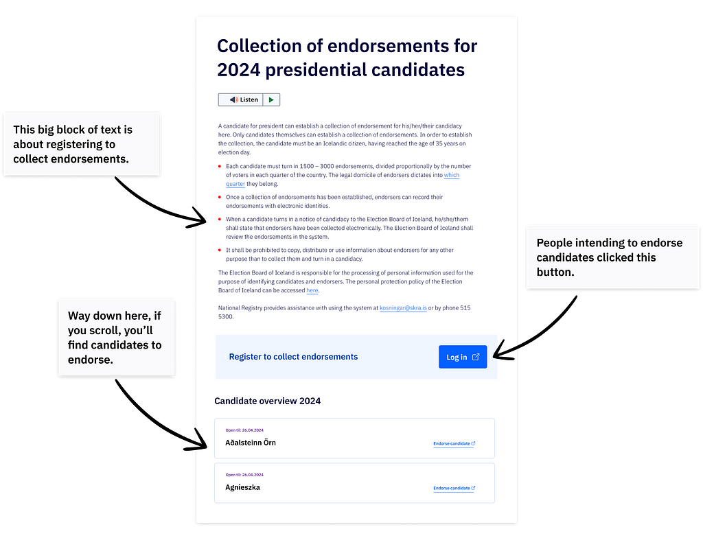
The page was titled “Collection of endorsements for 2024 presidential candidates,” and it served two purposes: It was for candidates to register to collect endorsements, and it was for people to browse candidates and submit their endorsement.
The top part of the page detailed criteria for registering to collect endorsements and prominently featured a “Log in” button. The bottom part of the page, below the fold, featured a list of candidates with links to endorse them.

When people arrived at the page to endorse a candidate, many of them likely skipped past the initial wall of text and some of them clicked the big “Log in” button, filled out a form, and were — unbeknownst to them — added to the list of candidates.
In the comments section of various news articles, people wondered, ‘What’s wrong with these people? Can’t they read? Will they even be able to vote?’
But, if you ask me, it wasn’t their fault. At the root of the problem was a UX issue.
This page serves multiple purposes, but it’s not divided into clear sections with appropriate hierarchy. People did what they tend to do: they scanned the page. The fact that some of them clicked “Log in,” which is by far the loudest CTA, is not strange, especially considering that endorsers need to provide their electronic ID to ensure that their endorsement is real and valid.
People were sent to this page to make an endorsement, they arrived with that mindset, they met a wall of text, and they clicked “Log in,” which was plausibly the first step in the process.
Don’t make people think or read too much — they’ve got things to do
When the list of presidential hopefuls surpassed 40, people grew suspicious. In past elections, only a small fraction of this number has expressed interest in running for president, and there have never been more than 9 candidates on the ballot.
After journalists spoke to some of these people and discovered that they were accidentally campaigning, Digital Iceland quickly redesigned the page and created a separate one for registering to collect endorsements.

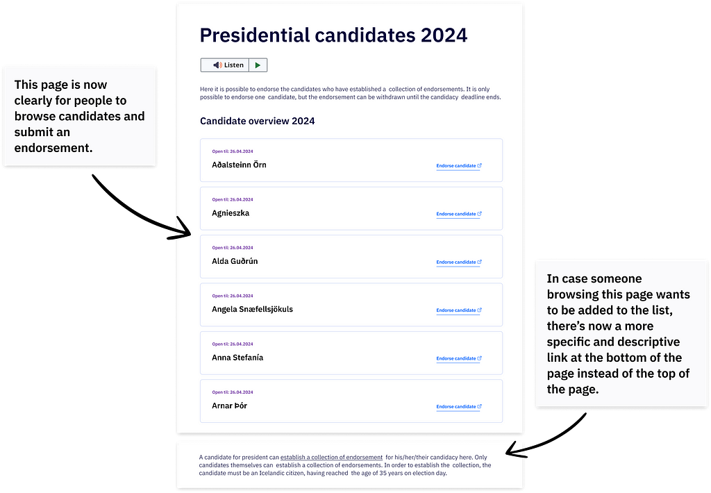
Now, when people arrive at the page to endorse a candidate, they clearly see a list of candidates with links to endorse them, and it’s obvious what to do next.
There’s still a way to register to collect endorsements from this page, but it’s now a link at the very bottom of the page, which makes a lot more sense than having it at the top. There are a large number of people vying for the presidency this year, but the vast majority of people visiting this page are there to endorse a candidate. As such, the page should prioritize this use case.
In addition to revisiting the information architecture and reorganizing the content, Digital Iceland also improved some of the microcopy.
In the original version, the text “Register to collect endorsements” and the “Log in” button were grouped in a box, but still appeared to be separate. It was possible to skip the text and click the somewhat ambiguous “Log in” button with the assumption that you first needed to log in to a system to endorse a candidate. In the redesigned version, the “Log in” button has been replaced by a link that reads, “establish a collection endorsements,” which is much, much clearer.
Since these changes were made, the list of candidates has continued to grow. It’s hard to tell who is serious and how many of them will be able to get the necessary 1,500 endorsements, but at least we can be fairly confident that people are no longer campaigning for president by accident due to a content design issue.
Key Takeaways
- Be wary of generic buttons.
- CTAs should be clear and descriptive.
- Don’t overwhelm people with too much information.
- Use visual hierarchy and clear headings to break up a page into sections so that people can scan — because that’s what people do.
To learn more about usability principles, check out Steve Krug’s Don’t Make Me Think.
How do you accidentally run for President of Iceland? was originally published in UX Collective on Medium, where people are continuing the conversation by highlighting and responding to this story.

Leave a Reply