Content design market is as exclusive and inaccessible as ever. How to survive in the industry as a “non-native”?
How I improved the user experience of an established decision-making tool

Science constantly builds upon itself, always allowing room to grow. As a UX Strategist, my job centers on this type of iteration, on questioning the way things are done. I brought this approach into learning the Cynefin framework, a decision-making tool for leaders. Because, as much as I tried to internalize it, I couldn’t. In the past, I might have seen this as a personal deficit. Informed by my experience transforming systems, I took a different approach. I iterated the framework to better serve its users (including me).
You may keep reading because you love Cynefin and doubt it could get any better (let’s see if I can change your mind). You may keep reading because you’re curious what the heck Cynefin is (and how it might serve you). Or, you may keep reading because, like me, you see the world as an opportunity for improvement (and you want a case study on making it happen).
I needed to learn Cynefin
We constantly adapt to our circumstance. As leaders, we are distinct from who we are as parents, which is distinct from who we are as friends. So, why would we calcify one approach to leadership? That’s why we utilize the Cynefin framework. It helps us adapt our leadership to our circumstance, assessing our situation to make better decisions.
Cynefin isn’t some framework or another gathering dust in a digital closet. My employer truly values it, making it a critical part of how we grow in our career. I think they value Cynefin because, as a self-organizing company, we’re all leaders.
I’m not going to dig further into Cynefin itself (sorry, people who kept reading for that reason), as that resource already exists in UX Collective, Harvard Business Review, and elsewhere online. I’m focused on the challenges I faced while learning Cynefin and, more importantly, how I overcame them.
Cynefin was a struggle for me
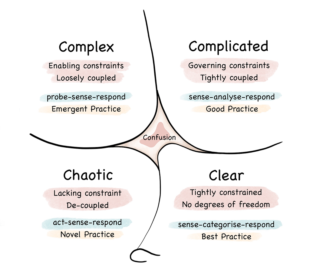
Let’s start with a visual representation of the framework, so we’re all on the same page.

It has some elements that I struggled to learn and use, including:
- A difficult-to-pronounce name. If you’re wondering how to pronounce Cynefin, you’re not alone. There’s a 30-second video entitled “How to Pronounce Cynefin” with over 13,000 views on YouTube. My best answer (after watching the video, of course) is to say “Kevin” with a “Neh” in the middle, so “Ke-neh-vin”. However, every time I use this framework, I have to remind myself how to pronounce it.
- An abstract shape without obvious meaning. There’s meaning involved in the not quite straight lines and the ridge between simple and chaotic. I’ve read articles and watched YouTube videos on this framework, and I still couldn’t explain this to you without referencing them again.
- Guidance that requires further reading. There are three words within each domain that represent actions to take, in order, when in that domain. How can I be sure what domain I’m in? What do those action words mean? The answers aren’t clear to me within the framework itself.
- Distinct domains labeled with colloquial synonyms. This is a real struggle for me, as I cannot reliably differentiate between three words that begin with the same letter and share very similar meanings. For instance, when I asked Google, “What is another word for complicated?” it answered, “Some common synonyms of complicated are complex…”
The visual representation of Cynefin wasn’t going to magically transform itself to serve me. So, I gave up fighting my brain to learn Cynefin, and I asked a different question. How might I make Cynefin easier for me to learn and use?
How I iterated Cynefin to make it easier to learn and use
Drum roll, please. Here’s my version.

My iterative diagram adds:
- Analogies, which offer clear examples of each domain. Examples were the clearest explanations I found in my research. Some circumstances have predictable recipes for success (like baking cookies), while others lack a singular, right answer (like parenting). I expressed them with both words and iconography. And, I chose only analogies starting with the letter C. Was it to be cheeky or consistent with the framework as designed? You decide.
- Colors, which give the domains more distinct labels. There’s some traffic-light meaning built into the colors I selected. And, the colors could offer another label for each domain. “Do you think we’re in orange or yellow territory now?” makes more sense to me than “Is this complex or complicated?” (see “colloquial synonyms” above).
- Expanded text, which provides more complete context. By just viewing the diagram, I can better diagnose my current domain and understand the guidance about what to do. Words that were listed without description are now defined. For instance, “Probe” became “Probe by running safe to fail experiments”.
If my Cynefin diagram resonates with you, use it. You’re also welcome to share it or iterate it into your Goldilocks-perfect fit.
How to be an effective iterator
So, what does this really mean? This section is for the case-study-craving, status-quo-challenging folks.
You don’t need to accept things as they are now, even if they’re established tools that your employer values. Find your place of maximum friction (think about it, what really grinds your gears?) and brainstorm what you might do about it. Keep what works, iterate what doesn’t, and make things better. As a UX Strategist, this is what I do everyday for my clients. It’s empowering to also keep doing this for myself, my team, and my community.
Oh, and if you’re going to sketch a graphic, it’s worth asking a design colleague to make it pretty (thanks for your help, Ashley!)
UX meets Cynefin: Making a sense-making device more sensible was originally published in UX Collective on Medium, where people are continuing the conversation by highlighting and responding to this story.


Leave a Reply