I first discussed this topic in a meetup at dayone together with Sarrah Vesselov. If you want, you can view a recording of the talks. Due…
Improve your design by embracing literal touchpoints

Dear (Future) Designer,
Ever heard of Fitts’s Law? No, it’s not the latest social media trend or a design buzzword — rather, it’s a simple, fundamental principle that packs a punch in the world of design.
Picture this: You’re navigating through a bustling city, aiming to reach a specific destination. Would you opt for a narrow, cluttered alley or a wide, clear path to your spot? It’s a no-brainer, right?
The law predicts that the time required to rapidly move to a target area is a function of the ratio between the distance to the target and the width of the target.
— Wikipedia, Fitts’s Law
Fitts’s Law is that wide, clear path in the digital realm. It’s a straightforward concept stating that the time required to reach a target area is determined by the size of the target and its distance from the starting point. In design, it translates to this: the bigger and closer a clickable area is, the easier and quicker it is for users to interact with it.
Let’s bring this theory into a practical, user interface context. Think of your mobile app’s navigation bar. Larger icons or buttons placed closer to the user’s thumb zone are easier to tap, reducing the effort required for users to select an option.

For instance, think of Spotify. Or any other music player app. In practically all of them, the “Pause” button is generously sized and strategically placed within thumb-reach at the bottom-center of the screen.
It follows Fitts’s Law by providing a larger and more accessible target, leading to quicker and more accurate user interactions. Likewise, Fitts’s Law ensures higher accessibility, especially on touch-oriented devices.

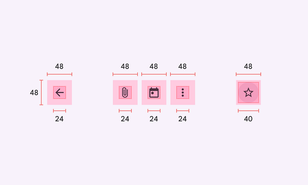
Especially in elements like iconography, having a tappable area that is larger than the icon itself is key to making these components accessible to users. By embracing Fitts’s Law, designers can create interfaces that not only look sleek but also function seamlessly. Remember, it’s not just about aesthetics; it’s about designing for effortless interaction, making the user experience a smooth journey from point A to B.
Understanding and applying Fitts’s Law is a powerful tool in a designer’s arsenal. It’s not about simply making things bigger; it’s about strategically enhancing usability and interaction design. So, future designer, let’s champion user-friendly designs that make every interaction feel like a breeze.
Designingly yours,
Paul
For more selected reading on this topic:
- Fitts’s Law and Its Applications in UX
- Fitts’ Law In The Touch Era
- Fitts’s Law: The Importance of Size and Distance in UI Design
Dear (Future) Designer is a series of things I wish I had known earlier in my career. Things I wish someone had told me, before or shortly after embarking on this journey. To make things just a little bit easier for those of you out there who are trying to carve their own path in the world of design.
Dear (future) designer: understand why touch matters was originally published in UX Collective on Medium, where people are continuing the conversation by highlighting and responding to this story.


Leave a Reply