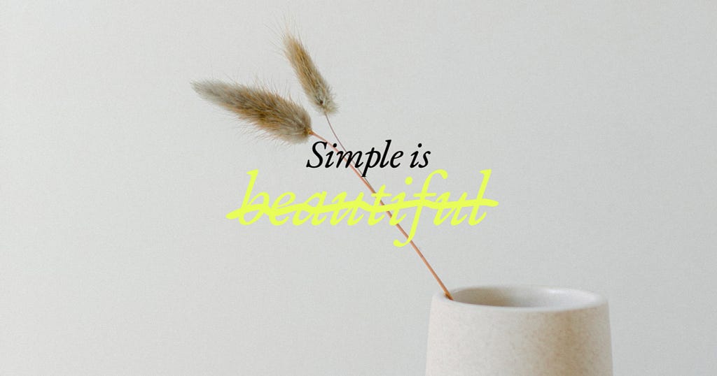
Simplicity strips the world of creativity, hides complex systems just below the surface, and reduces human experiences to stereotypical representations.

Minimalism, whitespace, and simplicity…. These are design principles that are often used to describe what good design is. Less is more — It was my personal design motto from the time I started designing logos, visual identities, and book covers in college. Born and raised in the north of Sweden, I worshiped Scandinavian design principles rooted in simplicity and white space. From the beginning, design was a way for me to simplify the complex. By stripping away extra details and embellishments, we ultimately create the ideal user experience. Simple = beautiful.
That is what I used to think.. But last year, I started to explore a different, less beautiful side of simple. It’s a side that strips the world of creativity, hides complex systems just below the surface, and reduces human experiences to stereotypical representations.
I presented this less beautiful side of simplicity during a talk I gave at Creative Mornings Munich and later during Touch Summit in Tbilisi, and I would love to share some highlights here.
Simplicity strips the world of culture and creativity.
We can’t talk about simplicity in design without talking about Minimalism — a concept that emerged in 1950 — that is often described with words like “truth” and “harmony.” In recent years, we’ve seen the minimalism trend show up in Netflix documentaries, best-selling books like “The Life-Changing Magic of Tidying Up: The Japanese Art of Decluttering and Organizing” by Marie Kondo, and Capsule Wardrobes that tell us that by simplifying our closet, we’ll be happier and more peaceful people. In graphic design where I started my career, we express our love for whitespace, and brands are becoming more simple — and also more alike. And therein lies a problem. Minimalist promotes a world of sameness — making no room for differences. Think about examples we see of Scandinavian interior design. Often, it feels anonymous. Without a trace of any humans living there, and without any hits to the local culture we’re in. You can take an Ikea kitchen and fit it anywhere. And it can be for anyone. Because in the name if Simplicity, we’re all the same.
A few years ago, I read this Vox article talking about the elitist nature of minimalist design. The article explains that by focusing on minimalism, we’re creating a world devoid of diverse ideas, cultures, and expressions. It also explains how through simplicity we promote a world where big and loud things, AND big and loud personalities, are seen as wrong. Minimalism tells you not to stand out. Not to be different.
And even though minimalist design looks clean and spacious, it does not give space to different kinds of people to live and thrive.
Simplicity hides complex systems just below the surface.
I used to believe that design was about simplifying the complex, and in turn, we create frictionless experiences. Good design is frictionless. Right? But when we say frictionless, we must ask ourselves for whom is it frictionless? Ruha Benjamin is one of my favorite authors and thinkers. She is a sociologist and a professor in the Department of African American Studies at Princeton University. Her work focuses on the relationship between innovation and equity, particularly focusing on the intersection of race, justice and technology. And she’s also written about the problems with simplicity. In the forward of the Book “Black Experience in Design: Identity, Expression & Reflection” she highlights how, often the technology solutions that seem simple, actually hide the social structures that they are all dependent on. We can find, order, and enjoy a hot meal without even leaving our couch. And it gets to our house fast and simple. The apps strip away the complexity and the humans, and we’re left with a frictionless experience. But less friction for some humans — us — often means more friction for others. There are gig workers, fruit pickers, and supply chains for PEOPLE making sure we get food and clothes simple, fast, and cheap. When things are so simple, it is easy to ignore the humans working tirelessly behind the scenes to make sure our food gets to us fast.
Because of simplicity, we’re never forced to reflect on the social structures needed for us to take part in a frictionless experience.
Simplicity reduces humans to simple stereotypes.
As designers, we pride ourselves on being human-centered. We listen to and advocate for users. But as we try to meet deadlines, create universal personas or fit people nicely into frameworks, we sometimes lose important layers needed to show someone as a full human. Simplcity and universality can be harmful in the longrun. I wrote about an example of this in “The harm of simple symbolism” and I would like to highlight it again here.
Most of us are familiar with The International Symbol for Access. It was created in the 1960s by a Danish design student. This simple and clean visual is often used to show improved access, such as the removal of steps and the availability of ramps, and many decades after it was created, we still see it in bathrooms, and parking spaces. The symbol was created as a way to raise awareness around accessibility, and help people living with disabilities better navigate their surroundings. However, the simple symbol, while helpful in some ways, also creates problems. Many disability advocates have explained how the symbol gives a narrow view of what living with a disability is actually like, because many disabilities are invisible. For example someone living with chronic pain condition, a bad hip, or any other disability that doesn’t necessarily require use of a chair (and might not be visible to others), but they benefit from accessible features like closer parking spaces. Many people living with an invisible disability often experience hostile behaviors if they use the accessible parking spaces or restroom facilities, because the public’s perception of what it means to be disabled is colored by the visuals they’ve been exposed to. The visual of a person in a wheelchair.
And that is the problem with trying to use a simple symbol or story to communicate.
In her TED Talk, The danger of a single story, the novelist Chimamanda Ngozi Adichie, explains the problem of a single story both for the individual and our society as a whole. “The single story creates stereotypes, and the problem with stereotypes is not that they are untrue, but that they are incomplete. They make one story become the only story.”
From simplicity to expansion
Now that I’ve told you about this ugly side of simplicity, I want to start dreaming of another reality together with you all. What if… Instead of practicing reduction, we practiced expansion — by adding boldness to our work through colors and cultural references? What if we got curious about the complex systems that are powering our seamless user experiences? And what if we created spaces where people can share their full stories?
And what if.. We apply this to the biggest design challenge of them all? Our lives. Life is messy. Because even if we “marie-kondo” our homes, dress according to capsule wardrobes, or embrace the principles of minimalism, that does not protect us from experiencing heartbreak, disappointment, or overwhelming emotions. Feelings that are anything but simple.
Life is not simple. It’s full of contradictions and complexity and only by accepting AND embracing complexity together can we create true harmony in our lives.
This post is a modification of the this talk presented at Creative Mornings Munich
Less is not more: designing for people and for the planet was originally published in UX Collective on Medium, where people are continuing the conversation by highlighting and responding to this story.


Leave a Reply