
Navigation is the heart of any mobile application. The success of an application may depend on how intuitive, efficient, and user-friendly its navigation is. It is crucial for a designer to understand how navigation can function in every application to make the most suitable decisions for their specific situation. This article will explore the most common navigation practices in the market as of the end of 2023.
Hello, everyone! My name is Ksenia Toloknova, and I am currently working on creating patterns for the Alpha Bank business application. While working on the navigation pattern for our design system, our team encountered an interesting fact — there is a lack of materials for designers that help understand how navigation can work. Therefore, I decided to conduct my own research: I talked to developers, analyzed numerous applications, and delved into guidelines.
We will cover:
- The main types of navigation that exist
- How navigation logically operates
- Some features and differences in platform solutions (iOS vs. Android)
I will try not to give my subjective assessment of the solutions provided in this article. You will find facts, observations, and information from authoritative sources below. In this article, I will focus on the fundamental elements of navigation without delving into auxiliary aspects.
Let’s start with the Tab bar (HIG) and Navigation bar (M3)
In modern applications, this type of navigation is quite commonly used, if not always. Currently, this is the primary navigation method in mobile applications. Depending on the guideline, it is called differently — Tab bar in Human Interface guidelines (HIG) and Navigation bar in Material guidelines version 3 (M3).
Here are a few reasons
Easy access: Convenient for finger tapping, providing easy access to the main sections of the application.
Simplicity and clarity: Navigation elements are visible and based on icons. Icons can quickly convey basic information about the content of a section.
Consistency: If navigation remains accessible on all screens of the application (not always, as we will discuss below), it creates a predictable user experience. Users can always return to the main screens of the application.
At the same time, such navigation has its limitations
The recommended number of items for this type of navigation is from 3 to 5 elements. You must organize all your scenarios into these 3–5 conditional “folders”. Moreover, we are heavily restricted in the number of characters and font size. It can be pretty challenging to come up with concise and understandable section names.
Display options
Once you’ve decided that your app needs bottom navigation, you’ll need to decide how this navigation will work. Technically, there are three possible implementation options:
- Navigation is visible only on the main screens. For example, suppose you have 3 sections in the bottom navigation — Home, Catalog, and Profile. When the user goes deeper into the Catalog section, they no longer see the bottom navigation.
- Navigation is visible everywhere. Even if the user goes inside the app to a second or third-level nested page, they can still see the bottom navigation.
- Navigation is visible on the main sections by default and appears on internal pages when scrolling up. This logic is suggested in Material guidelines as one of the possibilities.
Regardless of the platform, you can implement any of these options in both iOS and Android applications using native technologies.
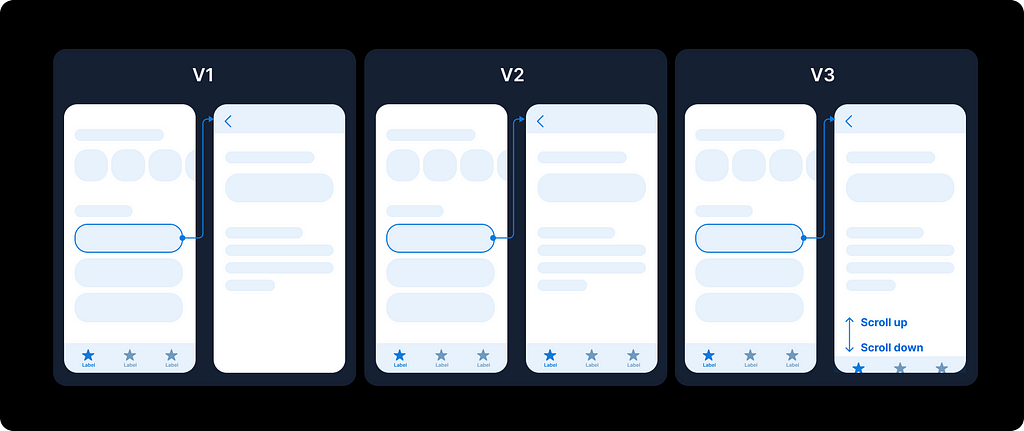
V1. Navigation only on main screens
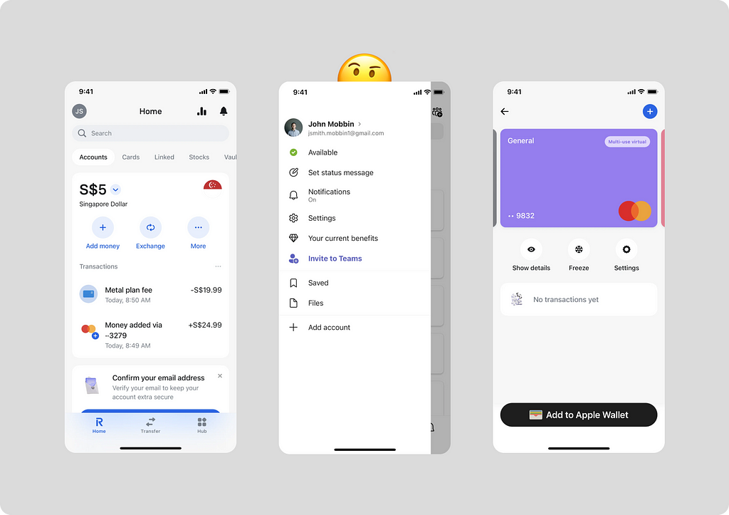
In the Revolut app, they have chosen the first option. Navigation is visible only on the main screens of sections and disappears further. To see the bottom navigation, you must go back to one of the main screens: home, transfer, or hub.
Companies such as YouTube, Booking, Airbnb, and many others have chosen this type of navigation for their apps. Messenger apps also often choose this type because they don’t need to distract the user from the chat if the user is already inside.
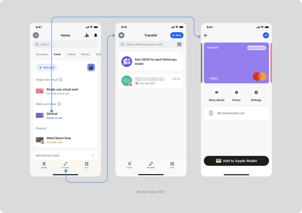
By the way, if we look at the implementation of the Android app, we’ll notice some differences — in the Android version, the bottom navigation doesn’t have such a beautiful blur effect. It is replaced by a simple white background. This is due to the technical difficulties of implementing such an effect on the Android platform (it takes a long time and is expensive), as well as the absence of such an option in the guidelines. So if you want to use such a blur in an iOS app, be prepared to have an alternative version for Android.
Pros and cons of the solution
An obvious advantage of this solution is that navigation does not take up space on internal pages. The user can return by using the “Back” button. One downside is that this approach may make it difficult for the user to return to the main page, especially if they go too deep into the scenario.
V2. Navigation visible everywhere
This type of behavior is chosen less frequently. One example is the Fitness app from Apple.
Below, you will see the user’s path, starting from the main Fitness+ page and going deep into the scenario for viewing meditation content. While in the Fitness+ page, we click on the meditation section and view detailed information. Throughout the entire path, navigation at the bottom of the screen accompanies us.
No matter how deep we go into the scenario, we still see navigation. In this case, the tab where we started to dive deeper and deeper into our scenario always remains active.
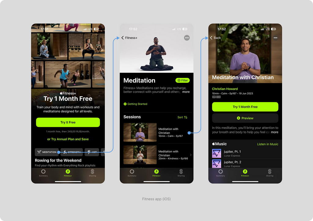
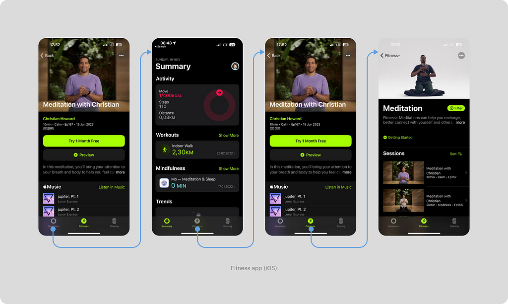
We only don’t see navigation when directly watching workout videos because it is implemented in a full-screen modal window. Full-screen modal windows and drawers always overlay navigation as they open on top of all the content. The keyboard behaves the same way.
Navigation “remembers” our choice. If we go into a workout in the Fitness+ section and then click on the Summary tab, then clicking on the Fitness+ tab again will take us back to the meditation page, not the main Fitness+ screen. To return to the main section screen, you can click on the Fitness+ tab again.
Pros and cons of the solution
Among the pros of such navigation, it’s worth noting that it’s challenging to get lost in it. The user always understands which section they are in and can quickly return to the main sections of the application. The downside is that the bottom navigation sometimes takes up about 7–10 percent of the screen, which is quite a lot considering the sizes of our mobile devices.
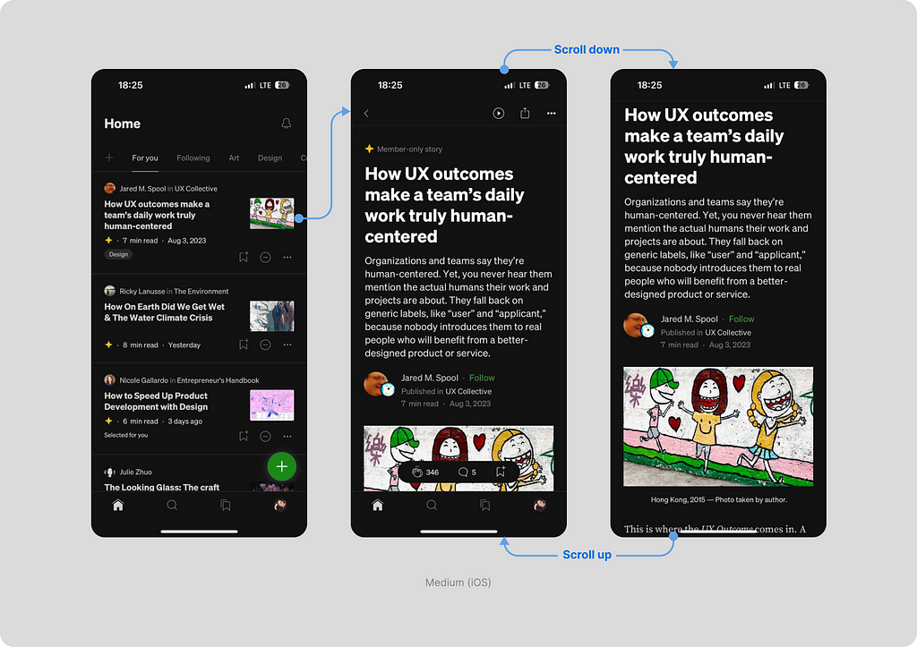
V3. Navigation is visible on main sections and appears on internal pages upon upward scroll
This type of navigation is also actively used. For example, the Medium app employs it. The user sees navigation on the main section screens in the app. If the user moves to an article, they see navigation, but the navigation disappears as soon as they start reading and scrolling down.
Pros and cons of the solution
This type of navigation can be very convenient when we have a feed with content. For instance, in the Medium app, a user can scroll down the page in search of content. They don’t need navigation during surfing. No obvious downsides to this option have been found. However, that doesn’t mean it’s ideal. There is a suitable mechanic for each specific application, and it’s not guaranteed that this will be the most convenient one in your particular case.
Mixed behavior
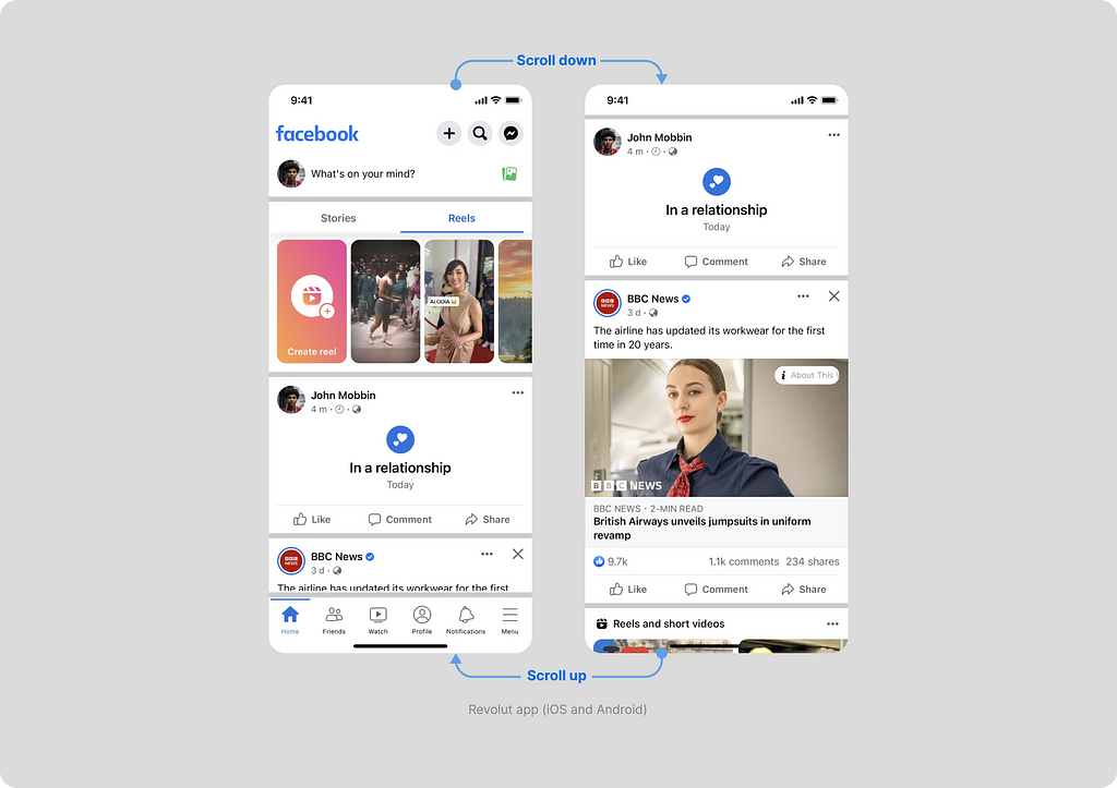
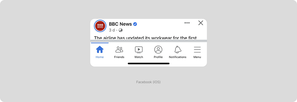
Sometimes, the decision is made to use navigation differently depending on the section we are in. Facebook uses the “visible everywhere” type of navigation, but with one exception — the main Home tab works differently. The navigation disappears when we start scrolling down to avoid interfering with the news feed.
Interesting solutions
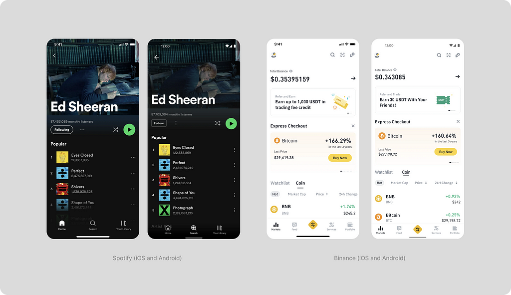
Most often, standard color fill is used under navigation, but Spotify has implemented a transparent gradient. This approach works well if you only have a dark theme in the app. You can implement it by placing a gradient layer under the navigation layer.
Binance highlighted the main action with a special icon in the center. Clicking on the center icon opens a curtain with actions (buy, sell, convert, etc.). This type of behavior is not specified in the guidelines, but implementing it is not difficult, even within the framework of native navigation.
What’s in the HIG?
Tab bars use bar items to navigate between mutually exclusive panes of content in the same view.
- Make sure the tab bar is visible when people navigate to different areas in your app (the exception is a tab bar within a modal view).
- Use the minimum number of tabs required.
- Use a succinct term for each tab title.
Read more details here.
What’s in the M3?
Navigation bars let people switch between UI views on smaller devices
- Top-level destinations that need to be accessible from anywhere in the app
- Three to five destinations
- Navigation bars can be temporarily covered by dialogs, bottom sheets, navigation drawers, the on-screen keyboard, or other elements needed to complete a flow.
- Upon scrolling, the navigation bar can appear or disappear.
Read more details here.
What else is helpful to know about the tab bar
In newer iPhone models, there is a home indicator — an interactive element in the form of a line. The home indicator has its own height but does not have a background. It can share a background with the elements of the bottom navigation. The tab bar height adds up to the height of the home indicator, forming a quite significant bottom margin.
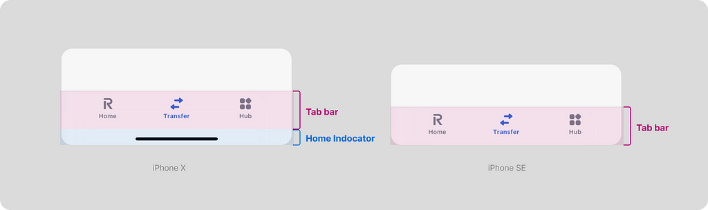
If you want to truly get rid of this large margin, the folks at Facebook have done just that. They created an additional setting to reduce the height of the bottom navigation area.
Despite the attractiveness of this solution, I recommend approaching it with caution. iPhones with a home indicator physically end approximately there. There is no physical button or finger space at the bottom. Moreover, implementing this option will require modifications and additional testing on phones with and without a home indicator.
Sidebars (HIG) and Navigation drawers (M3)
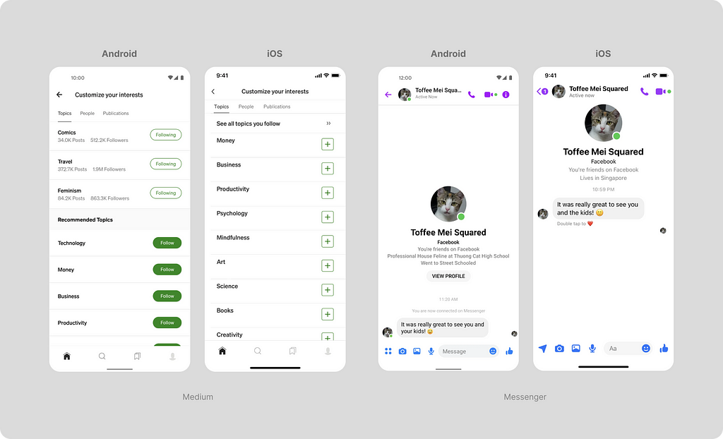
In this type of navigation, it is hidden behind an icon and appears from the side (usually on the left) once the icon is clicked. The naming conventions differ between platforms, called “Sidebars” in Human Interface and “Navigation Drawers” in Material guidelines. The icon often chosen to trigger this type of navigation is commonly referred to as a “burger.”
This type of navigation has many enticing advantages, such as
- There are almost unlimited elements, as this menu can be scrolled down.
- The ability to use a larger and more readable font size.
- Greater flexibility — you can use icons or do without them, visually grouping elements.
Sounds great, but what’s the catch?
According to numerous studies, this type of navigation is less user-friendly. It’s also known as “Hidden Navigation,” and here are some of its drawbacks:
- Hidden navigation is more complicated to discover.
- When navigation is hidden, users are less likely to use it.
- Hidden navigation provides a worse user experience than visible or partially visible navigation, both in mobile phones and desktop user interfaces. This conclusion holds true for various UX metrics, including user-rated task difficulty, time spent on task completion, and task success.
You can read more about it in the NNgroup article.
When is the sidebar used?
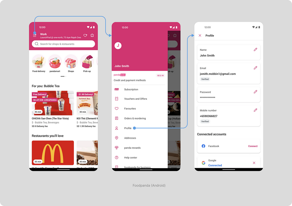
This type of navigation is used in the food ordering app Foodpanda. It’s important to note that you won’t find a list of restaurants and shops in the menu items. Only sections related to the user’s profile are inside the Navigation drawer. They open in full-screen modal windows. The user’s primary navigation within the app occurs through search and the main screen.
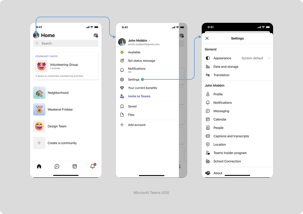
Here’s another interesting example — the Microsoft Teams app for iOS. Here, both the tap bar and the sidebar are used simultaneously (although this is not recommended by guidelines). Similar to Foodpanda, here you may find user profile-related data — notification management, settings, and saved bookmarks. It’s also the entry point for adding another account.
Another interesting example is the Gmail app. Gmail uses two types of navigation. The primary mail navigation is through the burger. The Navigation bar is used to promote another product — Google Meet. This is quite an interesting and probably effective marketing solution that few can afford.
Let’s look at how the sidebar navigation works. Inside the burger, all mail folders, settings and help are located. When transitioning to a folder, for example, Social, the burger is retained, and the user can switch between sections through it. When transitioning to the second level of navigation — an email, instead of the burger, a “back” arrow appears.
However, not all menu items work this way. When going to settings, a drawer opens, and for the help section, there’s a simulated page with a back button, which is really a modal window.
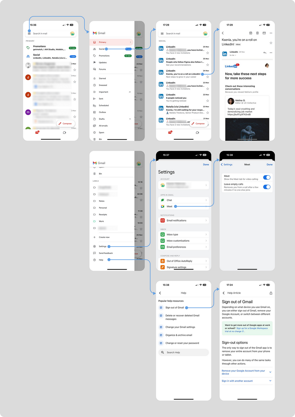
Some of the solutions are likely associated with the fact that a vast number of people are working on the application, and the solutions are not always perfectly coordinated.
What’s in the HIG?
A sidebar can help people navigate your app or game, providing quick access to top-level collections of content.
- In an iOS app, consider using a tab bar instead of a sidebar. A sidebar interface can require a lot of horizontal space, which might make it too crowded on iPhone.
In the guidelines, the use of this type of navigation in phone applications is not recommended. Moreover, out-of-the-box implementation of such a solution is not possible due to limitations imposed on this component. If you need to implement a similar solution in an iOS phone application, it will require custom development.
Read more here.
What’s in the M3?
Navigation drawers let people switch between UI views on larger devices.
- Navigation drawers provide access to destinations and app functionality, such as switching accounts.
- Navigation drawers are recommended for apps with 5 or more top-level destinations, apps with 2 or more levels of navigation hierarchy and quick navigation between unrelated destinations
- Avoid using a navigation drawer with other primary navigation components, such as a navigation bar.
The Material guidelines recommend using such navigation on large devices (tablets and monitors), although it does not prohibit its use on mobile phones.
Read more here
Search-based navigation
In applications with a large information base, search-based navigation is often employed. This type of navigation is seldom the sole method but is frequently a key element.
I won’t delve into the mechanics of search functionality in this article as it is quite extensive. In this piece, I will explore it as an entry point for the user, enabling them to find what they need within the application.
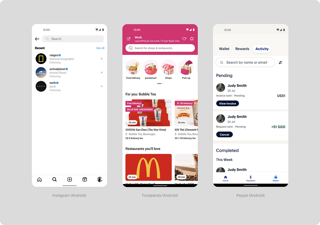
In the Instagram app, search is so crucial that a dedicated section in the navigation is allocated for it. This is a comprehensive search across the entire application. Foodpanda also features a universal search accessible on the main page, distinguished by an accent pink background. This design makes it highly noticeable to users.
PayPal, too, uses search, but it is specific to a particular section. This type of search is convenient when sifting through a vast database. For instance, in payment transactions, it’s important to have the ability to find a specific transaction.
What’s in the HIG?
A search field lets people search a collection of content for specific terms they enter.
- Display placeholder text that describes the type of information people can search for.
- Provide suggestions to improve the search experience.
- Consider providing access to relevant items near a search field so people can select them instead of searching.
- Include a Clear button.
Read more here.
What’s in the M3?
Search lets people enter a keyword or phrase to get relevant information.
- Use search bars and views for navigating a product through search queries.
- Search bars can display suggested keywords or phrases as the user types.
- Always display results in a search view.
- Search bars can include a leading Search icon and an optional trailing icon.
Read more here.
Top bar (HIG) and Top app bar (M3)
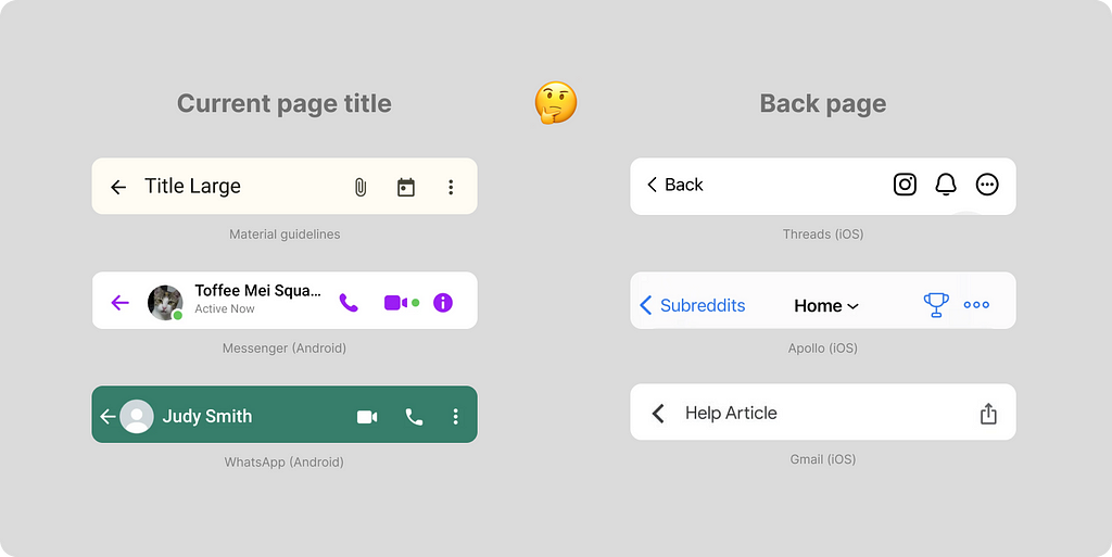
As screens on mobile phones are relatively small, this type of navigation is crucial. The Top bar (Human Interface) or Top app bar (Material) is fixed at the top and is always visible to help users navigate.
In the top navigation, you can find
- A “Back” arrow (sometimes with a label) to navigate back to second-level or higher pages or a burger icon for accessing the side navigation.
- A title, which can be centered (mainly for iOS) or closer to the “Back” icon (mostly for Android).
- A subtitle, which may appear above the title for better context understanding (mostly for iOS).
- Icons for additional actions. Material guidelines recommend placing 1 to 3 icons in priority order.
Regarding titles, there are three options
- Place the title subtly in a single row with the “Back” button. It can either be centered (more common in iOS) or placed next to the back arrow (more common in Android).
- Display the title as a large header below the back arrow. In this case, it won’t be visible when scrolling down.
- Present the title as a large header but move it upwards next to the back arrow when scrolling down. This way, the title is initially large and readable, then becomes smaller but remains visible.
For modal windows (dialogs, sheets, full-screen modal windows), swiping, a close button (cross), or clicking outside the lightbox area is typically used for closure. Sheets and modal windows are not covered in this article, but you can read about them in my article Sheet, dialog, or snackbar — what should a designer go for?. I’d like to mention that newcomers occasionally make the mistake of using the back arrow instead of a close button. This icon is not correct (unless you have a complete scenario within the sheet).
What’s in the HIG?
A navigation bar appears at the top of a window or screen, helping people navigate through a hierarchy of content.
- Use the title area to describe the current window if it provides useful context. However, if titling a navigation bar seems redundant, you can leave the title area empty.
- Consider temporarily hiding the navigation bar to provide a distraction-free experience.
- Use the standard back button.
Read more here.
What’s in the M3?
Top app bars display navigation, actions, and text at the top of a screen.
- Use a top app bar to provide content and actions related to a current screen, such as navigation, screen headlines, and actions.
- There are four types of top app bars: Center-aligned, S, M или L.
- Top app bars contain an optional leading navigation icon (a menu icon or a back arrow)
- Up to three interactive icons can be placed after the headline, at the trailing end of the container. Place the most-used actions closest to the leading edge and progress towards the end.
Read more here.
Some discrepancies in top navigation between platforms
I find it important to note the discrepancies in the placement of the title concerning the back arrow between platforms.
In Material guidelines, the title is placed very close to the back arrow. This creates a visual connection between them, and for some users who switch from iPhone to Android, it might seem like the title of the previous page.
In the Human Interface, next to the arrow, they often write the name of the section to which clicking the arrow will return us or a text prompt like “Back.”
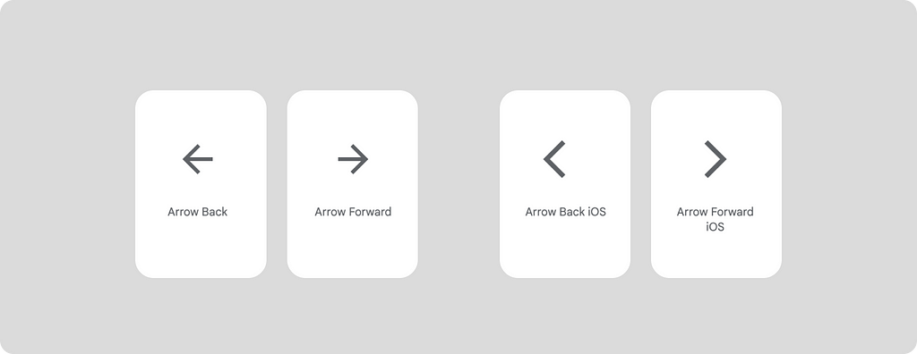
It’s also worth noting that in iOS and Android applications, different icons are usually used for going back. In the Material icon library, there are even separate icons for back and forward for iOS.
With this, I would like to conclude this article, even though there is still much to say about navigation. Many thanks to everyone for the support, kind advice, and recommendations. Special thanks to Artemov Rost, Denis Kozhukhar, and Alexey Telyshev for consultations, and to Igor Dolgov for feedback.
Wrapping up
Navigation is a crucial component in any application. Choosing the right mechanics significantly impacts the user experience. Select navigation based on your goals and needs, taking into account platform specifics.
You can use the following questions as a guideline:
- What should be at the top of the screen, and is it necessary to provide the ability to go back through top navigation?
- What should be at the bottom of the screen?
- Is in-app search beneficial for the user in my product scenario?
These questions will help you remember the key navigation elements within your application.
Navigation patterns in mobile applications. How to make the right choice? was originally published in UX Collective on Medium, where people are continuing the conversation by highlighting and responding to this story.
Leave a Reply