Designers might be at a crossroads with flat design and more detailed and three-dimensional design elements. Here are some recent examples of it to give you a heads-up of what to expect in user interfaces soon.

Design trends come and go, but one general trend that has been around for a while now is flat design — you’ve seen it everywhere; buttons on UIs, logos, graphics, etc. We might be at a time where we’re going through a shift in this approach, and here are some recent examples I came across that might make this case true.
For this article, I’m mainly focusing on digital interfaces and how design has changed over time in this area.
A quick overview of how flat design became a trend
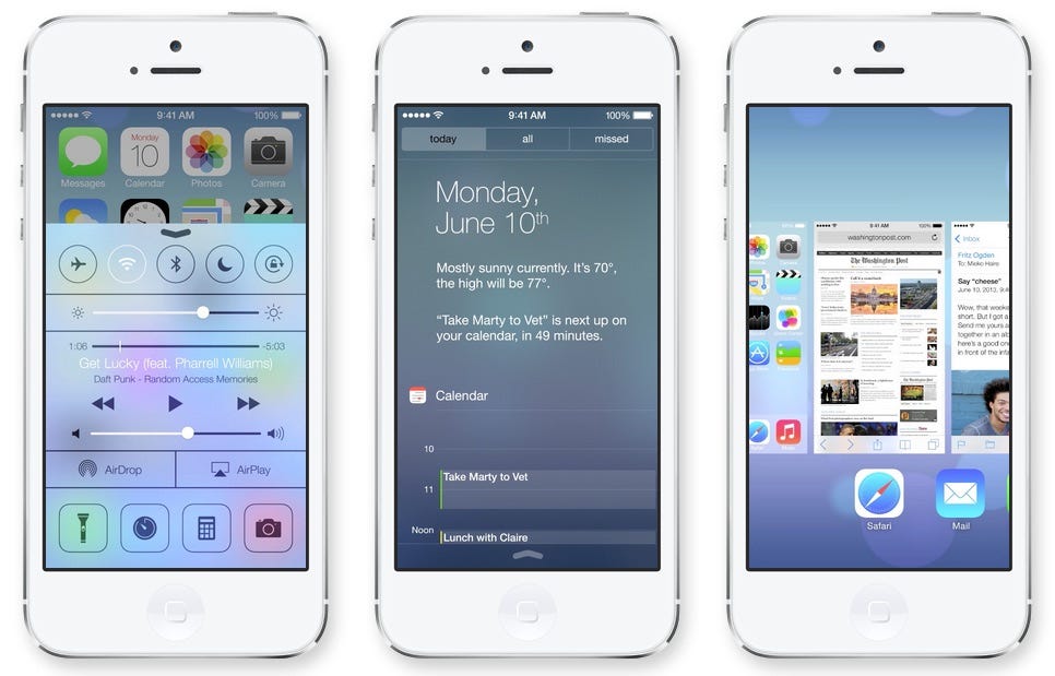
Flat design became a thing and we saw an overnight shift in design approach for interfaces when Apple introduced iOS 7 in 2013. They certainly took elements that other manufacturers were already implementing but the impact Apple has on the rest of the industry (as a trend-setter) cannot be matched.
iOS 7 saw a massive jump in design language for iOS. Apple introduced a much simpler and flatter design compared to its predecessor's more complex and skeuomorphic design. Tim Cook called it “the biggest change to iOS since iPhone.”
“The biggest change to iOS since iPhone.” — Tim Cook
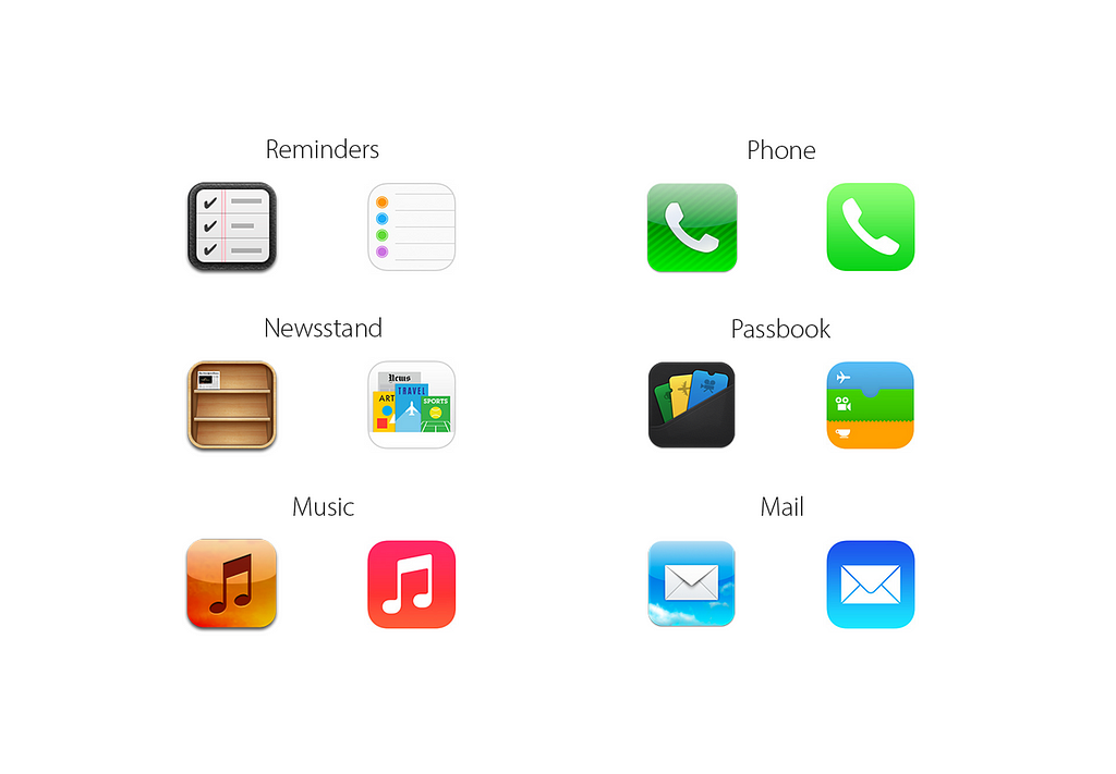
As you can see above (iOS 6 left and iOS 7 right), most of the 3D aspects of elements were removed for a more flatter design for iOS 7. There were good reasons for making this change. The world needed to move on from the skeuomorphic designs that were intended to familiarise users with a new generation of interfaces.
Fast forward 10 years and most modern interfaces still use this design language on their products. But some aspects of it are starting to change as designs are starting to get a little more complex and 3D (again!). Let’s take a few recent examples.
Reddit brand redesign

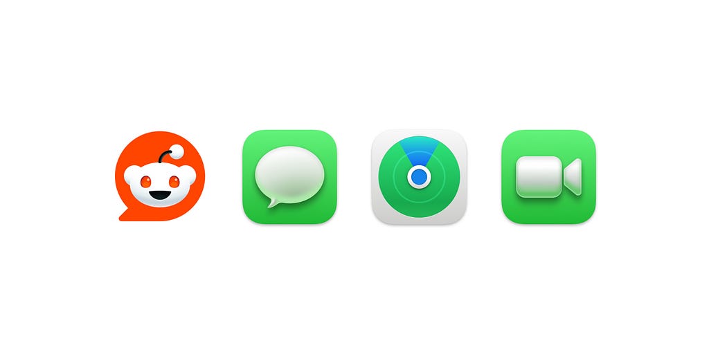
Let’s start with the most recent one. Reddit recently redesigned its logo with a new symbol and wordmark. As you can see the symbol representing Snoo (Reddit’s mascot) now has some 3D aspects to it compared to the older logo. We rarely see logos that are not flat, and given that Pentagram, the company that also works with many major global brands, is taking this direction means it's going to be something we will see a lot more of.
Modern logos are usually flat due to their readability and scalability. It will be interesting to see how other companies approach their brands in the near future.
MacOS Big Sur icons
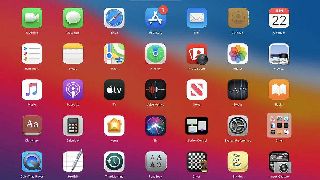
Let’s go back a few years to 2020. In November of that year, Apple released MacOS Big Sur with an updated set of icons. I personally like to think this is where the new trend for detailed designs with more 3D effects started since that’s where I saw most discussions regarding this started popping up.
With Big Sur, Apple started to add more detail to their native app icons to make them look less flat. As you can see above, the icons now have more profound shadows and gradients. This helps add depth and make the icons look more detailed.
Many other 3rd party app developers also followed and updated their app icons to look more 3D than before.
As usual, Apple’s influence on interface design can be seen in how many more companies and individuals followed the new trend.
New Airbnb designs

Airbnb with their summer and winter design updates to their app has implemented a range of designs that are more complex and 3D. Take a look at their new “guest passport” feature. The guest passport icon resembles a real “book” with its design and when interacting with it, it has an animation that mimics a real-life book opening.
The inside view of the guest passport also has shadows added to the top section to add depth which look less flat.
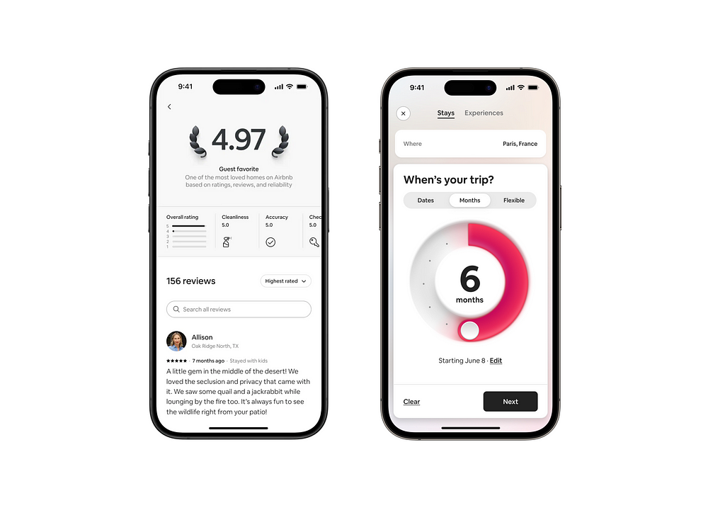
Another example from Airbnb can be seen in their “guest favorite” and newly revamped “month selector” designs. As seen above the new “guest favorite” section adds a nice 3D effect to the rating. The new month selector (right) also has a more realistic dial design.
Finally, the new illustrations that came with their winter release also add a more isometric touch to it as you can see below.
https://medium.com/media/40c5f815903dd4b2213f41f935d6d3c1/href
Shopify’s updated design system
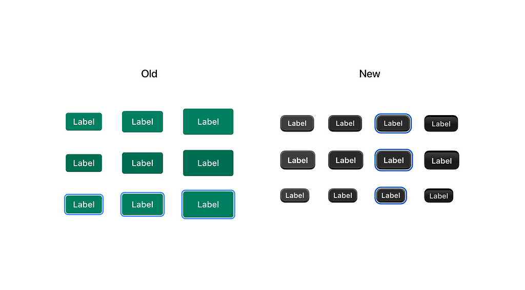
Shopify updated its highly popular and acclaimed design system, Polaris, with a new design language. The older flatter buttons are now smaller and more tactile.
The redesign had meaning to it. According to the team, the initial flatter designs fostered cleaner interfaces, made things easier to understand, and made experiences feel more efficient. But as time went on, merchants started classifying the Admin experience as “dull”, “depressing” and “bland”
The main goal was to uplift the design system to make the Admin feel more like a “pro tool”.
You can read a more detailed case study about this project here.

Conclusion
So what does this all mean? For me, I think we’re moving on from fully flat designs. There are benefits to flat design but I think modern designs are evolving in a way to add more details. Designers and developers should be ready to add these changes to their systems as they become common among bigger brands and products.
Further reads:
Skeuomorphism isn’t back… yet
Uplifting Shopify Polaris
Flat Design. History, Benefits and Practice.
If you liked this article, follow me to see the new ones first. You can also find me on Twitter and LinkedIn where I post work in progress and other updates.
Is the flat design trend finally over? was originally published in UX Collective on Medium, where people are continuing the conversation by highlighting and responding to this story.
Leave a Reply