Creative connection: A formula for creating designs that connect
Let’s not get lost in a sea of sameness as we systematise design and utilise generative AI tools. A drumming gorilla holds the key to creating exceptional designs that connect with people on an emotional level.

I first discovered the potential of creative connection when working in advertising and seeing the Cadbury Drumming Gorilla ad. It’s one of the world’s best ads, it’s simple, and it connects with you on an emotional level. It’s something advertisers have been doing for decades, and it showcases principles that designers can leverage to create experiences that resonate with people. I want to share these principles to inspire you to not get lost in a sea of sameness. Instead, leverage the efficiencies to differentiate and design more creative experiences that connect.
Increased efficiency (should) = increased creativity
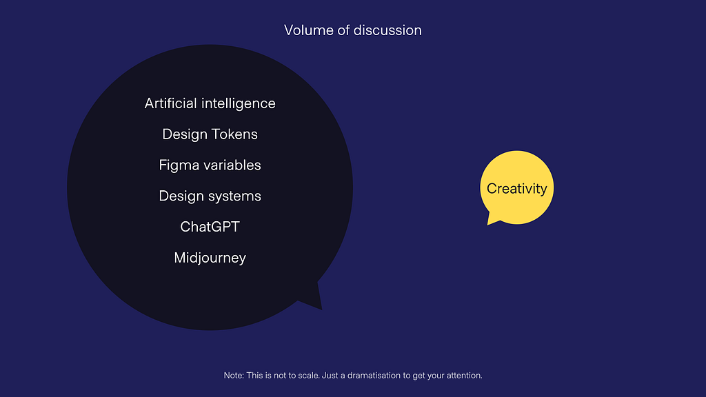
Think about what dominates our feeds these days. It’s often about emerging technologies like generative AI, design tokens, design systems, and more. While these are essential topics, it’s equally crucial to focus on creativity and ideas. Creative connection helps us ensure that we don’t lose sight of the emotional aspect in the rush for efficiency.
A formula to connect on an emotional level
Creative connection is when a design or a piece of creative connects with you on an emotional level.
It goes beyond logical thinking and stirs feelings within you. Dialling down the head and dialling up the mind. It can be achieved through various design elements such as copy, animation, interaction design, sound design, photography, or visual design. Often, it’s a combination of these elements.
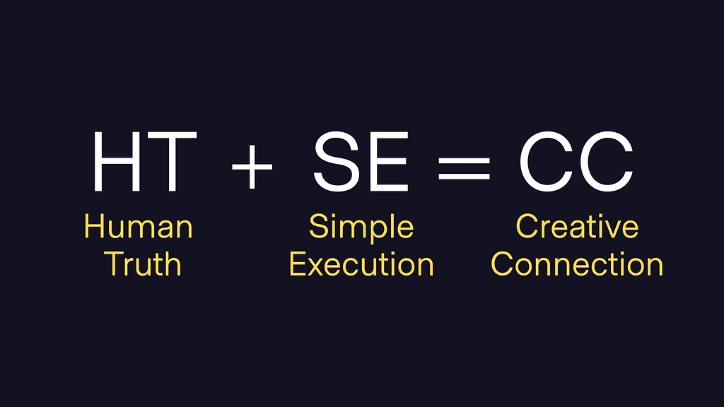
The formula that leads to Creative Connection is HT + SE = CC. Or Human Truth + Simple Execution = Creative Connection. I’ll unpack each of these elements, so you know what I’m going on about, but just know that to achieve this requires persistence.
To create work that goes beyond the expected, requires persistence, difficult conversations, and a relentless desire to do something that’s different.
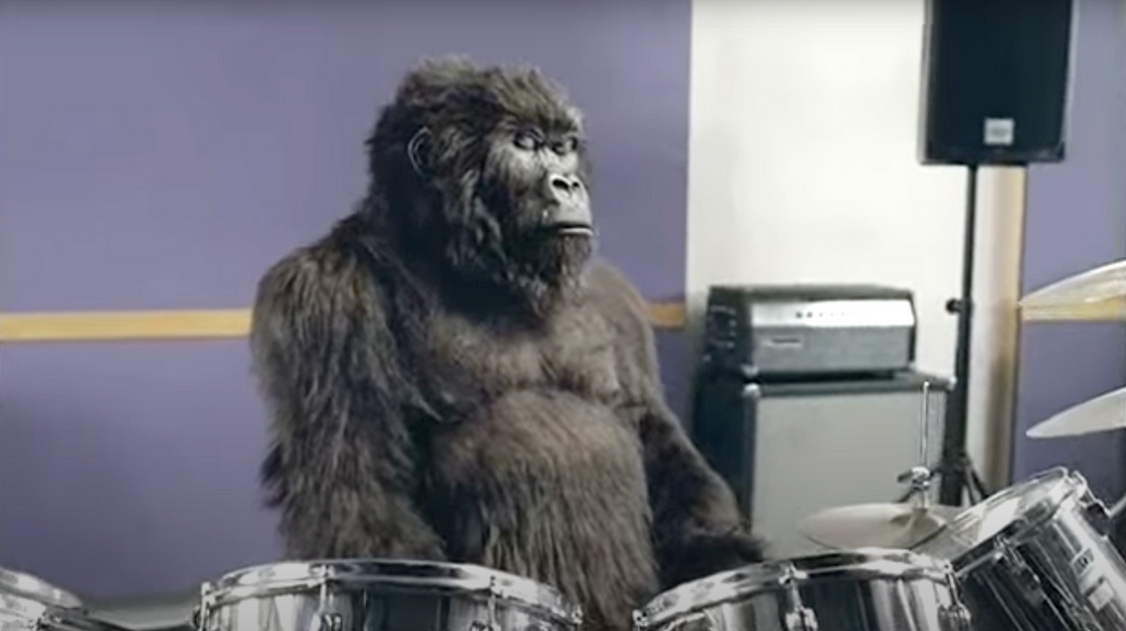
Cadbury’s drumming Gorilla is an ad that clearly showcases creative connection. For those that haven’t seen it, check it out.
Human truth: You feel joy, you don’t think it.
Simple execution: Gorilla + Drums + Phil Collins
Creative connection resulted in a 10% increase in sales, over 6 million YouTube views within 3 months, and appearing in the best ads ever lists continually.
Human Truth:
A human truth is a fundamental insight that is undeniably true. It captures a feeling or experience that we all share but might not have been able to express.
It’s that “a-ha” moment when you recognise a truth you didn’t even know you knew.
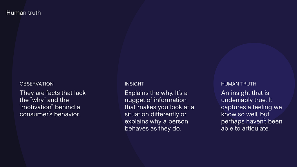
Finding human truths involves observing people, gaining insights, and crafting a clear statement that emotionally connects. Human truths provide a launchpad for creativity. They set the direction for design by focusing on what truly matters to people.
An example of a human truth in product design comes from Uno Home Loans, a challenger online mortgage broker in Australia. They conducted user research with the following outcomes:
Observation: Most people want to know if their home loan is competitive, but it’s overwhelming.
Insight: Home loans are complex and people value brands that are transparent and can simplify the process.
Human truth: We want to be experts but don’t have the time to time to become one.

This human truth is core to the eventual feature they released called the LoanScore. That allowed people to answer a few questions and get a sense of how their current loan compared to others in the market. It resulted in a 16% increase in sales conversions and a 21% increase in customer retention.
To uncover human truths, start with observations and insights. Reduce the insights into a concise statement that emotionally connects, and expands possibilities for ideation and ways to deliver new value to your customers. And don’t forget, it takes creativity, persistence, and deep thinking to craft.
Simple Execution:
In design, simple execution is the process of reduction to the point where a design has just enough information for the viewer to understand your message.
It’s like telling a good joke — it should contain just enough information to convey the message without overwhelming the audience. A cluttered design can be confusing, while an overly minimalistic one might leave people puzzled.
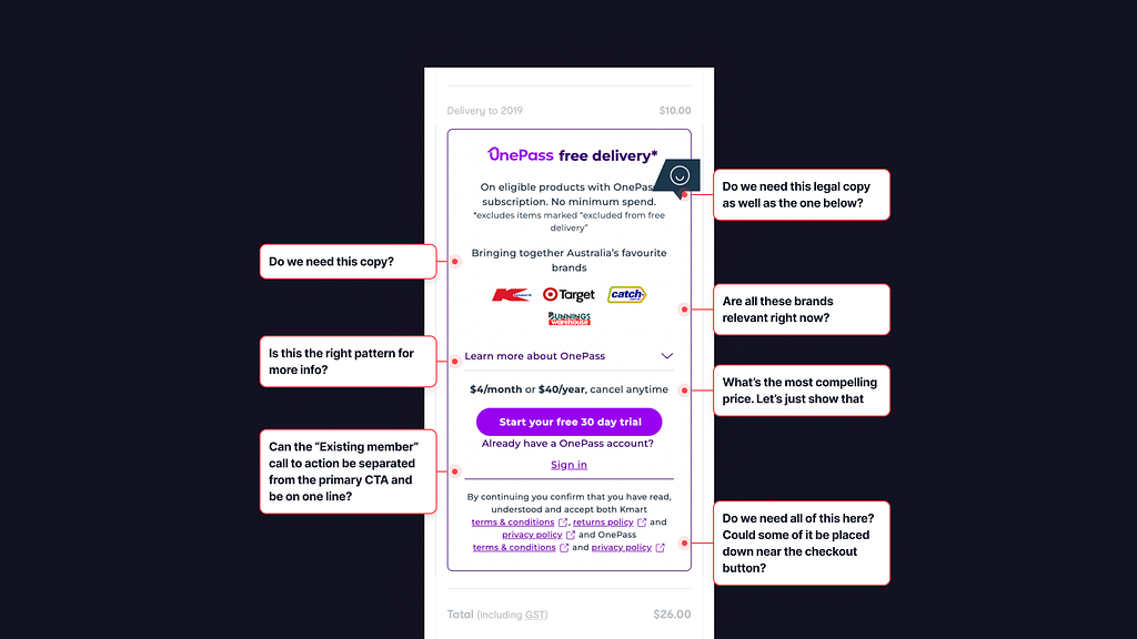
Too often as designers, we’re provided with requirements, competing priorities, and constraints that lead to complex and ineffective solutions.
It’s our responsibility to challenge and question things in the pursuit of simplicity.
Trying to find the right balance of just enough information to entice. In advertising, we were encouraged to continually remove elements from the design until it didn’t make sense and then take it one step back to find the sweet spot.
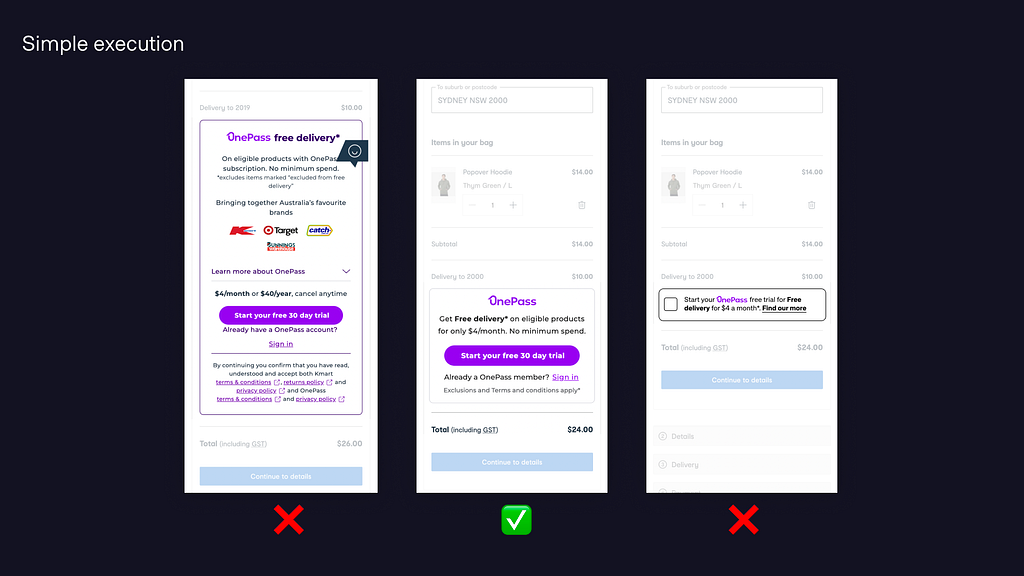
As product designers, it’s worthwhile to try the same practice of reduction. It can feel uncomfortable to show people a design that might not make sense, just like sharing a joke that doesn’t quite land. But the more we put ourselves out there, test, and iterate, the more likely we are to achieve simple execution.
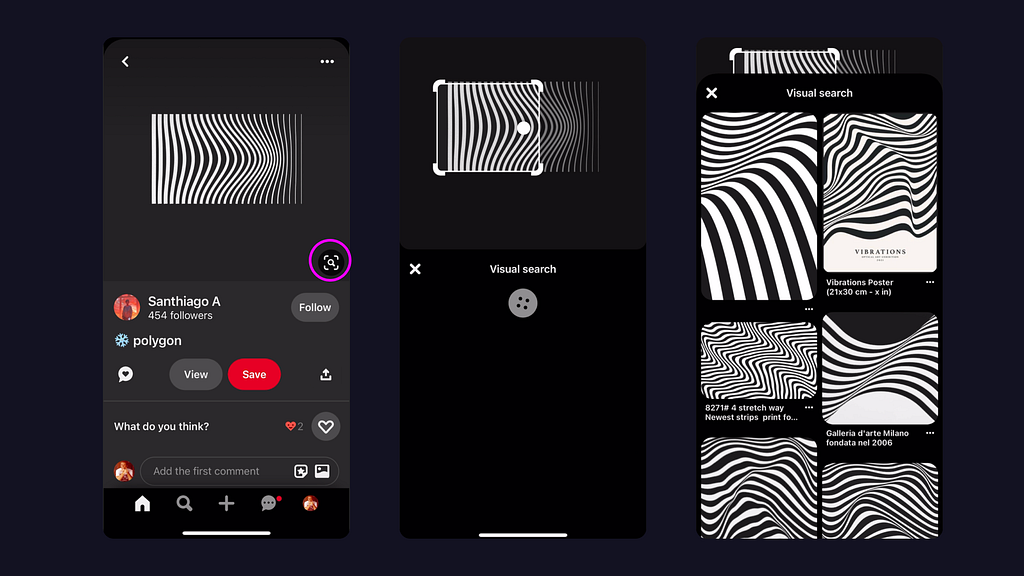
A brilliant example of simple execution is from Pinterest. The “Visual Search” function is simple and intuitive. People can tap the icon, and adjust the bounding boxes to focus on the area of interest, all while getting updated results below to inform their actions. It leverages image recognition, known UI patterns, and impressive engineering to deliver a delightful experience which I assume leads to increased engagement and user success.
To achieve a simple execution, it’s essential to set expectations early, leverage interaction design, and iteratively test your designs. The goal is to provide just the right amount of information in a clear and concise manner.
Creative connection out in the wild
So what does it look like when human truths and simple executions collide in product design?
I have 3 examples that demonstrate this, and guess what!? They include a bit of generative AI and Machine Learning, just to prove I dig our eventual robotic overlords.
Letgo — Post in a Snap
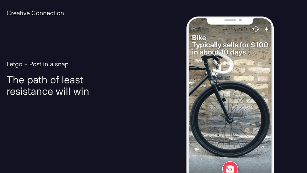
Letgo was a Marketplace in the US that launched a feature a while back that allowed people to list the item they wanted to sell with just a photo. They simply executed this by using image recognition to identify the attributes of the item, the title, and the recommended price. The human truth — people will opt for the path of least resistance.
Spotify — Unwrapped
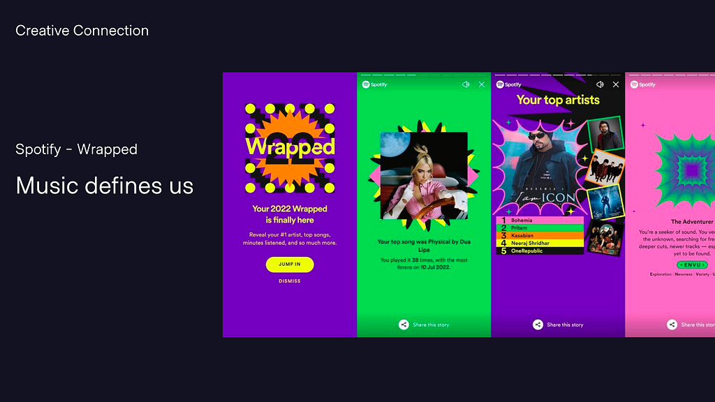
Who had a moment of joy sharing their top 5 songs played on Spotify? Or now dread, as it’s flooded with Frozen and Moana songs thanks to your 6-year-old daughter!? The human truth here is that music defines us, and the simple execution is a beautiful data story that’s simply executed through dynamic and vibrant visuals.
Looking to the future — Siri
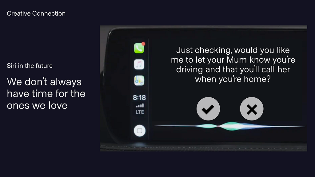
What if we could leverage technology and creative connection to increase the emotional intelligence of other products we use, like Siri in CarPlay? Imagine driving and getting a text message from your mum. Currently, when asked whether we want to reply, we’re presented with yes/no options. What if we could leverage the human insight, that “we don’t always have time for the ones we love” as well as contextual smarts to instead ask: “Just checking, would you like me to let her know you’re driving and that you’ll call her when you’re home?” This kind of moment is the type of experience I’d like us all to be striving for.
Creative connection is a powerful approach to design. It ensures that our creations touch people on an emotional level, making them more memorable and effective. Understanding human truths and achieving a simple execution are key components of creative connection.
As designers and creators, we have a responsibility to challenge the status quo, question assumptions, and strive for designs that delight and connect with our audience. By focusing on creative connection, we can create experiences that resonate and leave a lasting impact. So, the next time you’re starting a design project, remember the formula: Human Truth + Simple Execution = Creative Connection.
References and further reading:
Hungry for more about the Cadbury Drumming Gorilla? Here are some articles on the story of the ad’s creation:
- 'I was basically told: you are never showing this' – how we made Cadbury's Gorilla ad
- Why Cadbury's 'Gorilla' ad nearly didn't get made
Interesting articles on insights:
This ad is a brilliant example of Simple Execution:
The ad that changed advertising.
More on the research that went into Uno Home Loans:
Uno: Home Loans Made Simple | Proto
Creative Connection: What a drumming gorilla can teach designers was originally published in UX Collective on Medium, where people are continuing the conversation by highlighting and responding to this story.


Leave a Reply