

Myths and considerations for the future of VR design through the eyes of an enthusiast user.
The dilemma of perfection.
As UX designers, we navigate a delicate balance between aspiration and reality, driven by an insatiable urge to refine our creations. But in this pursuit of perfection, lies a dilemma. How can we resist the allure of redesigning everything in sight, and where do we draw the line between striving for flawlessness and embracing the constraints that bind us?
Have you ever found yourself lost in the dance between shifting pixels left and right, consumed by the desire to perfect every element of a design? As UX designers, we are always looking for ways to make our products and services better, more user-friendly, and more delightful. If you’re a designer, you know how to spot good and bad design, good and bad experiences. You’ve developed your skills to see how every element of a designed system affects the whole. You’re meticulous about every detail, from the pixel alignment on Figma to the optical balance of your layouts. You expect the same level of quality from the products you use in real life. As Jared Spool once said, ‘Good design, when done well, should be invisible’, but you can’t help noticing the design choices of the products you interact with, some of them great, some not so much.
The Allure of Perfectionism
I don’t know about you, but whenever I use a product — old or new, I try to be mindful of the interactions, the visual design, the typography, the spacing, and even the little round corners of the fancy shapes. I especially keep track of how interacting with the product makes me feel. This is sometimes referred to as the Designer’s Eye or as Shristi calls it, the ‘Designer’s Gaze’ — where designers are in creation mode by default and are always looking at the world with an intention to find and solve problems rather than to understand it. This can be a gift — or a curse.
Recently, Amazon offered a 4-month free subscription on Amazon Music Premium plan for new users in Australia. I signed up because — well because it’s free! But also, because I’ve always been a Spotify user — and I wanted to see what the grass on the other side looked like (I will try Apple Music when I’ve saved up enough). I am an admirer of Spotify’s design team and Spotify as a product, and I love how Spotify makes an effort to keep improving its’ users' experiences with music. I still remember their process behind the Spotify Blend, and I reckon you read it if you haven’t.
So, when I tried Amazon Music, I was baffled — by how horribly hard it was to figure out and build the same music experience I was used to with Spotify. While Amazon Music’s interface and interactions are partly to blame, there’s also a whole music discovery and listening experience part to it. The only thing good I found about Amazon Music was the sound quality with its Ultra HD offerings for listeners. While I loved the higher sound quality, the rest of the Amazon Music experience was not desirable enough for me to make a complete switch.
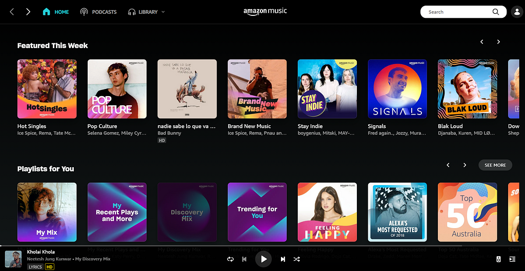
Even after a week of listening and creating playlists, my Amazon Music’s home page was filled with recommendations of music that I was not at all interested in listening to. For me to continue listening on Amazon Music, I found myself searching for songs and playing them manually.
I am also used to listening to Spotify on one device while I use another device to control the music. In the process of doing that, I was greeted by this screen on the iPad version of the Amazon Music. Needless to say, Amazon has some catching up to do in cross-device performance.

With a little makeover in design and certain Amazon Music could actually be a really good product. I kept a list of everything wrong with Amazon Music — with an intent to redesign it and add it to my portfolio. But it got me thinking, how many bad designs have I come across every day that I said I would redesign? Probably too many to count by now. Every time come across an annoyance; I try to be my own savior — I will redesign this to make it better.
And that’s the allure of UX perfection — the need for every product experience to be better — if not perfect. But is it ever achievable?
The Reality of Constraints
I ask you this — how many problems could you solve with design before you’re repeating yourself, before you become a mad UX Scientist. How many hours would you spend on a problem that’s already got thousands of hours put into it from its conception to your hands.
Think about the sheer volume of apps and products you encounter with daily. That makes it impossible to redesign and fix every instance of UX flaw we encounter. This is in addition to our already busy lives with constraints on time, budget and technical limitations. In between work and university, I have barely any time left for myself. I choose to spend this time unwind from the stress of everyday life, not to worry about a distorted Ed Sheeran cover. I choose to spend it with my friends, shouting over Discord as we lose yet another game of Dota 2. I choose to take a walk in the park and step away from the screen and fix my own life.
A Better Route
I do acknowledge that as a UX designer, it can be hard to turn off that side of us that wants to fix things. In the end, we all want for our experiences to be better, for anyone who uses it — and we have the power to do that as UX Designers. The joy it brings when we see a user have a delightful experience is why we’re in this career. Though we can’t fix everything, we can however take better approaches.
Prioritizing Impactful Designs
One way we could go about this is by prioritizing the impact of the redesign that we’re doing. This happens all the times in the industry — we fix what is critical and gives us the most value. This gives us the most value for our effort. You can also try a little exercise we call feature prioritization.
If I were to fix Amazon Music app, I would probably not be fixing their distorted Ed Sheeran cover — this has been covered way too many times and should be a given by now that images should be responsive no matter what device we’re using it on. This is for the design and dev team at Amazon Music to figure out how to include a single line of code in their app. I would prioritize the discovery of Music and how it matches according to the user’s preferences — that is where the highest impact is. That was what pushed me away from Amazon Music, not the wide-eyed version of Ed Sheeran.
Reach Out to the Design Team
Some products actually have a team that listens to user feedback. I would suggest it’s a better idea to just email or tweet (sorry old habits, I mean Xeet) at them with the issue. Chances are these issues probably got through when they were shipping the product and they never really found out. This helps the team flag and solve the issue for all their users not just you. By helping them, you’re now helping thousands of users across the world. It’s better than a post on Instagram or Dribbble that gets you views but without any impact.
Sid Dani on Twitter: "I can't help but feel pity for @amazonmusic when I get their emails. It's not about the cost; people just don't like the product. Amazon seriously needs to rethink its design language. The gap between their current state and their potential is staggering, especially for such a… pic.twitter.com/O9Q7yw3H0O / Twitter"
I can't help but feel pity for @amazonmusic when I get their emails. It's not about the cost; people just don't like the product. Amazon seriously needs to rethink its design language. The gap between their current state and their potential is staggering, especially for such a… pic.twitter.com/O9Q7yw3H0O
Mentorship and Guidance
Use your examples to share with other designers who are starting out. You don’t have to have the entire Figma design completed to do so. State a problem, and then navigate the issue — offering your mentee to pitch in and develop their problem-solving skills. This way you’re using your experiences to guide and create better designers for the future. A sustainable solution? Maybe.
Mindfulness and Acceptance
It’s important both as a UX practitioner and a human being that we practice mindfulness to acknowledge and accept that you cannot redesign everything. It is important to cultivate a sense of satisfaction in knowing that you’re making a difference where you can, even if it’s not everywhere.
Occasionally, even I will give in to the temptation, if only to satisfy myself with the redesign. It’s actually healthy to do it once in a while, it keeps you motivated, sparks your creative and problem-solving juices as a UX designer. But remember that managing the urge to redesign everything involves finding a right balance between your passion for design and practical realities of time, resources, and impact. Choose the approach that resonates with you most and aligns with your long-term goals in the UX Design space.
References and Related Links
- DOC • The designer’s gaze
- Behind The Designer`s Eye | LinkedIn
- How to Harness the “Designer’s Curse” for Your Next Design Review | by Blink UX | Medium
- How to Redesign an App: When to Do It and What to Start With — UX Magazine
- How to prioritize like a designer in 4 steps | by Stephanie Irwin | Medium
Navigating the urge to redesign everything you see was originally published in UX Collective on Medium, where people are continuing the conversation by highlighting and responding to this story.
Leave a Reply