
A cost-saving, accessible, and adaptable color palette system that maintains the light and dark themes created by using HSB color space for convenient and consistent DesignOps.
Simplicity is the ultimate sophistication
Color palettes are the core elements of design systems, and there are many different approaches to creating them. For example, according to Google Material Design 3 Guideline, a design system must have primary, secondary, tertiary, and surface color palettes that compel you to have more than forty colors. That number would cause confusion and interruption in delivery processes; most wouldn’t even be used.
Design Systems are companies' core products, and its users are design, development, and creative teams. Therefore, design systems must be understandable for all, usable for teams, mistake-proof for maintenance, and profitable for companies. I had been striving to achieve these goals and consequently enhanced a color palette system that provides these.
This color system:
- Provides fewer and limited -total nineteen- color options and reduces the decision-making process for design teams.
- Provides minimization of the storybooks to develop products conveniently and consistently for developer teams.
- Simplify DesignOps management and reduce communication costs organization-wide.
- Shorten the delivery process, reducing bug fixes and budgetary costs.
- Colorizes the interface entirely with the brand color monochromatically.
- Covers light and dark modes at once and prevents having additional dark theme palettes and variables.
- Easy to modify and adapt to new projects by changing HSB values.
Creating a color palette that provides these features requires expertise in colors and Figma implementation. Therefore, a few subjects must be comprehended. Let’s take a look at this.
1. What is HSB color space?
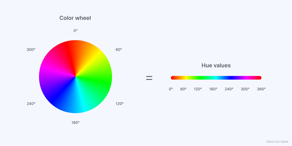
Fundamentally, there are 16,777,216 colors in RGB color space, each with unique HEX codes we designers cannot easily understand. The most understandable and editable representation of RGB color space is HSB color space to generate a single color palette without using a color palette generator; it depends on the color wheel, which has 360°:
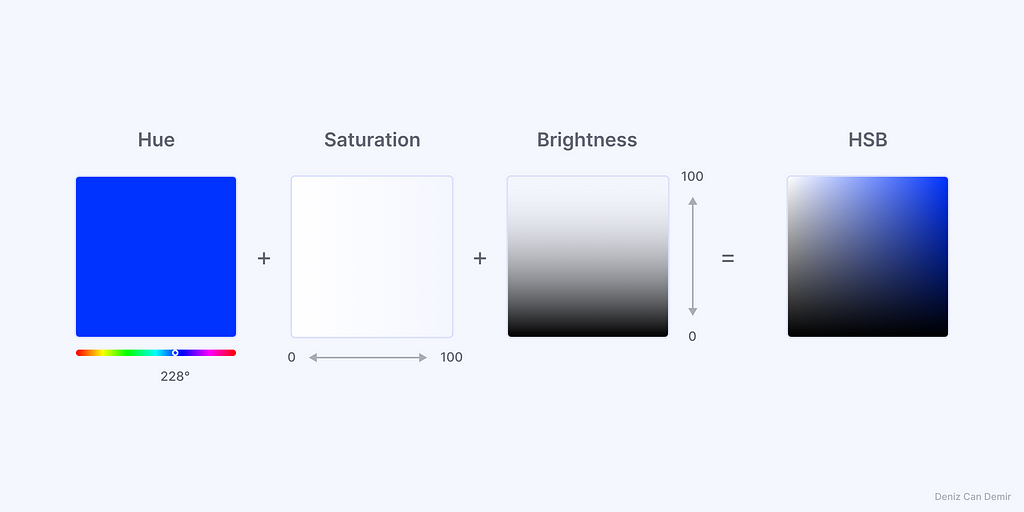
1.1. Hue + Saturation + Brightness = HSB
HSB color space has three values affecting the HEX code: Hue, Saturation, and Brightness:
- Hue: The value that identifies a color; it has 0°-360° values. Each 60° is a main color. H:0/360 is red, H:60 is yellow, H:120 is green, H:180 is cyan, H:240 is blue, and H:300 is magenta.
- Saturation: White-based affection for Hue; it has 0-100 values. S:0–33 are faded, S:33–66 are pale, and S:66–100 are saturated tones.
- Brightness: Black-based affection for Hue; it has 0-100 values. B:0–33 are dark, B:33–66 are mid, and B:66–100 are high tones.
Each of the three inputs must be valued with a number to have a HEX code. For example, as long as the H:228 remains the same, S and B values only change values of H:228, which means it gives only the tones of the same blue.
To switch the HSB color space in Figma, open the color picker, click the dropdown, and select HSB.
2. Create the color palette with HSB
The color palette created with this method will be fully accessible in light and dark mode. To have it, the primary color must be accessible, and the required number of colors must be defined beforehand.
2.1. Define an accessible primary color
The primary color must have a 4.5:1 contrast ratio for an accessible color palette. But first, we need to know what an accessible color means to define one:
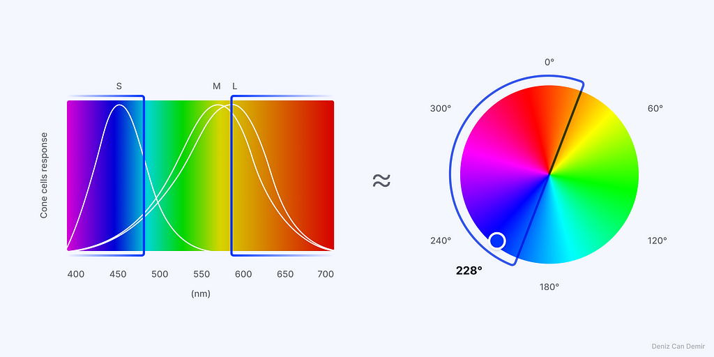
The human eye has three types of cone cells, S-M-L, that perceive different wavelengths. M and L cones respond to the same wavelengths of green and yellow simultaneously and cause the human eye to perceive the hue values between -approximately- 20°-200° brighter, and this gap has low contrast with bright colors.
Given such information, the color palette could have maximum possibility of being accessible for light mode as long as it has these HSB values:
- Hue values between 200°–20° (not 20°-200°)
- Saturation values between 50–100
- Brightness values between 50–100
The opposite values could be used for dark mode-only color palettes. H value is the base parameter of the color that affects the accessibility. Saturation and brightness have inverse proportions; high brightness increases while low saturation reduces the contrast ratio. A preset accessible color could be used.
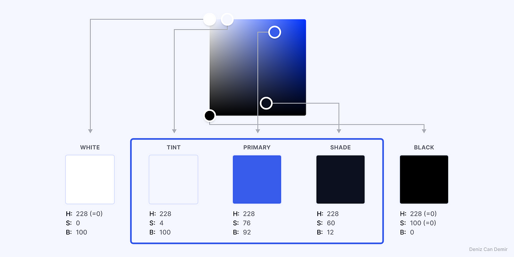
The primary color was defined as H:228 for the best practice.
2.2. Define the anchors
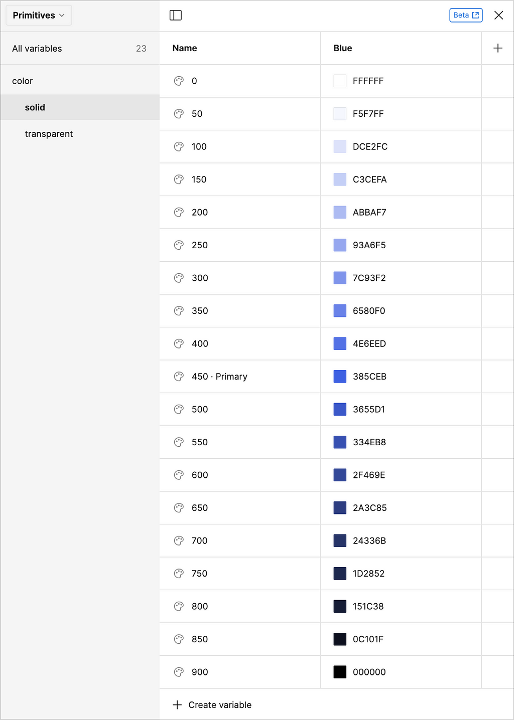
Regarding personal inquiries, the required and optimal number of colors for a color palette is nineteen (one primary, eight tints, and eight shades). The gaps could be apportioned into the steps if the anchor colors are known.
A design system’s fundamental colors, white [#FFFFF] and black [#000000], are at the first and nineteenth rows. They are the uncustomizable anchors of the palette and cannot be counted during stepping.
The customizable anchors are the palette's second, ninth (primary), and eighteenth steps. Start with the primary color and set values as H:228, S:76, and B:92 to provide accessibility. To have enough value gap between primary color to tints and solid black and white, it’s better to set tint values closer to solid white and shade values closer to solid black.
The S and B values of tint, shade, and step number nineteen could be customized according to the requirements.
2.3. Interpolation
Interpolation is a phase in which steps S and B values are calculated between outer tint to primary color and primary to outer shade color.
The S and B values of steps that start from the primary color must be increased or decreased according to the values of outer colors. The difference of S and B values between tint, primary, and shade colors is divided into the number of steps and apportioned to them.
This formula must be used for interpolation:
([Greater number]-[Smaller number])/[Step number]=[Number for each step]
2.3.1. Interpolate saturation
76 is the S value of primary color, 4 is the S value of tint color, 60 is the S value of shade color, and 8 is the number of each step from primary color to tint and shade colors:
- (76–4)/8=9 is the value that needs to be subtracted from each step to the tint color.
- (86–60)/8=2 is the value that needs to be subtracted from each step to the shade color.
2.3.2. Interpolate brightness
100 is the B value of tint color, 92 is the B value of primary color, 12 is the B value of shade color, and 8 is the step number from primary to tint and shade colors.
- (100–92)/8=1 is the value that needs to be added to each step to the tint color.
- (92–12)/8=10 is the value that needs to be subtracted from each step to the shade color.
Apportion of primer decimal numbers doesn’t have to be equal in each step; you can adequately apportion the number until you find the extreme numbers or add anchor points between steps.

2.4. Vary transparent
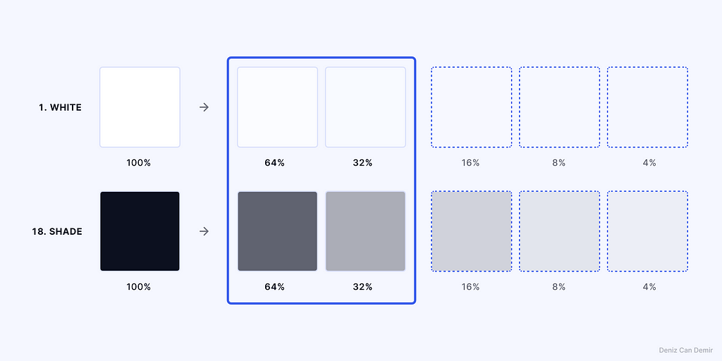
Transparent colors are necessary elements of design systems to provide a hierarchy for texts and component states.
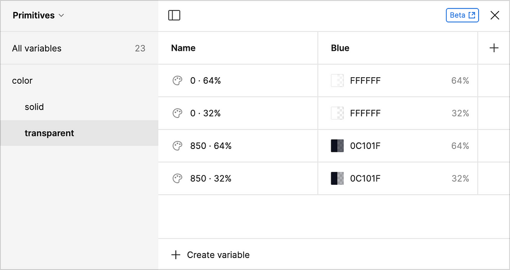
To have transparent colors, duplicate the first and nineteenth steps (I preferred the eighteen step -shade- to have a harmonic appearance) and reduce the opacity values to 64% and 32%.
Additional transparent versions with 16%, 8%, and 4% opacity could be added, and values could be customized according to the requirements.
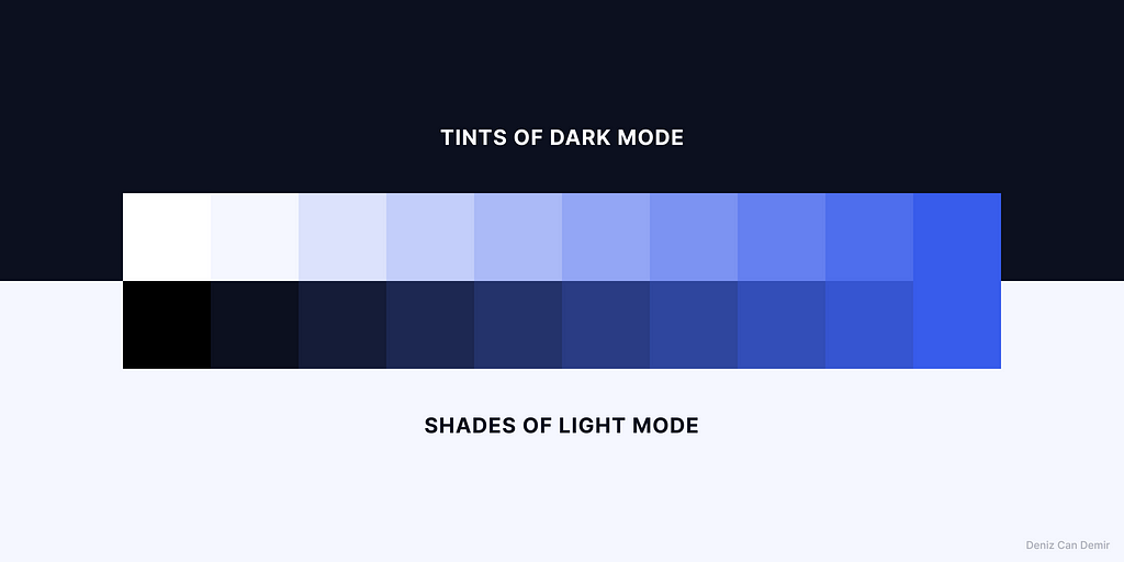
2.5. Pair the tints and shades for the themes
Pairing colors will be helpful while assigning the colors to the Figma variables for themes and component states. This is why this color palette system has an odd number of colors, and each side has its own pair to provide and maintain light and dark modes. It gives the shade colors for the light theme and the tint color for the dark theme at once.
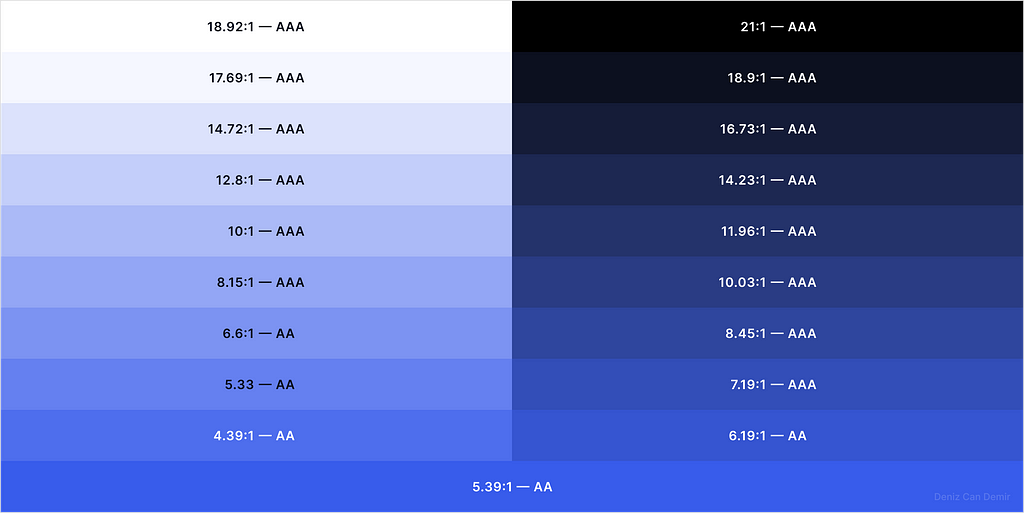
2.6. Crosscheck the accessibility
Defining the proper opposite color matching to provide accessibility will be helpful while assigning colors to the Figma variables and themes.
Due to the primary color contrast ratio being 5.39:1, the whole palette is consequently accessible. To have the highest contrast ratio, choose proper text colors. It provides an AA/AAA level accessible color palette that covers dark and light modes. This scale offers convenience while establishing dark theme components.
Crosscheck all the combinations, define if there are any inaccessible matches, and try to adjust anchors and S and B values of extreme steps.
3. Assign the color palette to Figma Variables
The color palette was generated correctly and ready to be assigned to Figma variables. Follow the steps below to do so:
3.1. Primitives: Solid
Create a collection, name it “Primitives”, click “create variable > color” and name “color/solid/0”, and add all the colors in the palette in the same way by naming them a multiplication of 50.
All the namings are optional and depend on the requirements.
3.2. Primitives: Transparent
Click “create variable > color” again, name “color/transparent/0 · 64%”, and add other colors in the same way.
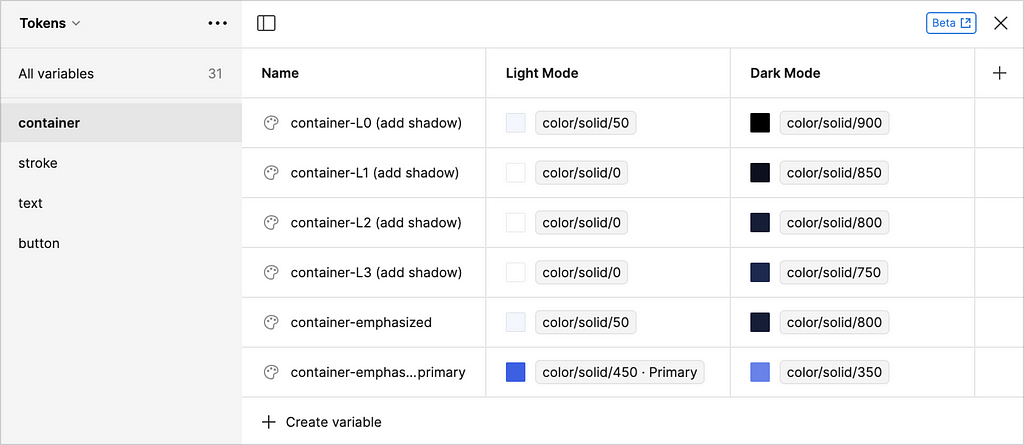
3.3. Tokens: Container
The primitive colors must be assigned to the Tokens to use them as limited variables.
Follow the same way of creating a color variable: click the “color picker > libraries” and select the required variable in the list.
Click the “+” button on the right, add a new mode, and name them “Light Mode” and “Dark Mode”.
Due to no “shadow variable” in Figma, I added (add shadow) information for container names for the light theme.
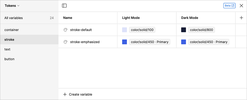
3.4. Tokens: Stroke
Assign the variables in the same way.
The stroke variables can be increased according to the requirement.
3.5. Tokens: Text
The transparent colors are used in text tokens to create a hierarchy in typography.
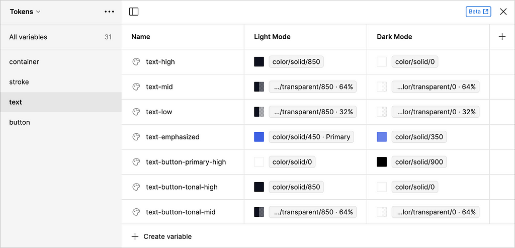
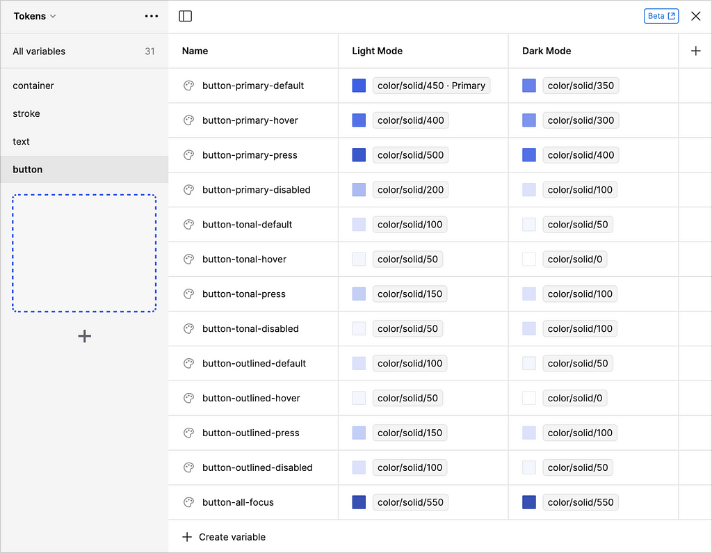
3.6. Tokens: Button
A design system generally has three versions of a button: primary, tonal -secondary- and outlined -tertiary-. The color pairing and contrast ratio schemes are utilized while adapting dark mode to the vital components such as buttons.
Component-specific token collections could be enhanced according to project requirements.
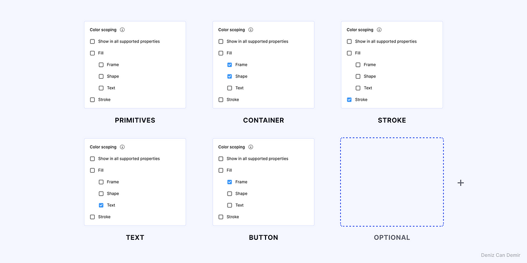
3.7. Color scoping
Figma recently released Color scoping, a feature that lets you prevent seeing all variables according to the properties that are not selected.
The variable system we established utterly depends on this structure: containers, texts, and strokes. If these settings are applied as below, a minimal amount of variables in the library panel will be displayed, and it prevents conflicts in the design process.
These settings could be adjusted according to your project’s requirements. For instance, I had to select “stroke” instead of “frame” for the -outlined- button in button tokens.
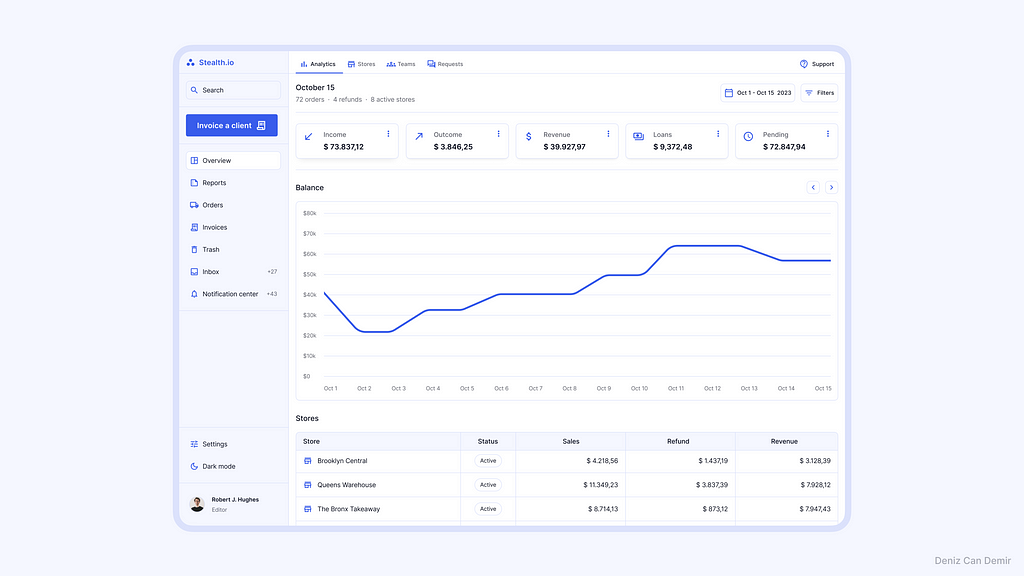
4. Implementation and outputs
Coming up next is using these variables in a design. The implementation and outputs of the color palette that were generated have been presented in the draft design to represent the usage:
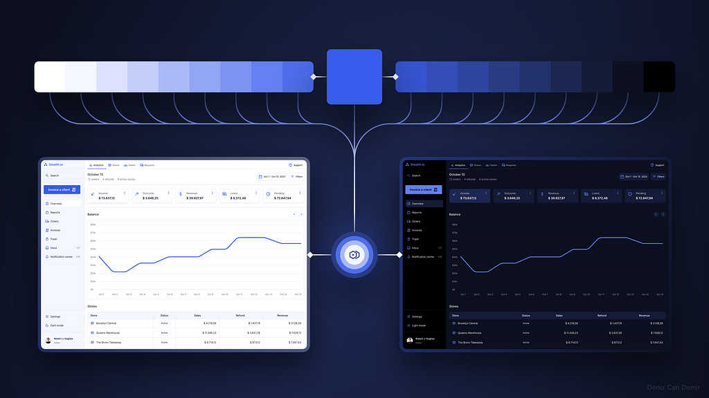
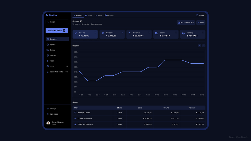
4.1. Light mode
The tints of the color palette were defined to the variables properly and gave the result as expected:
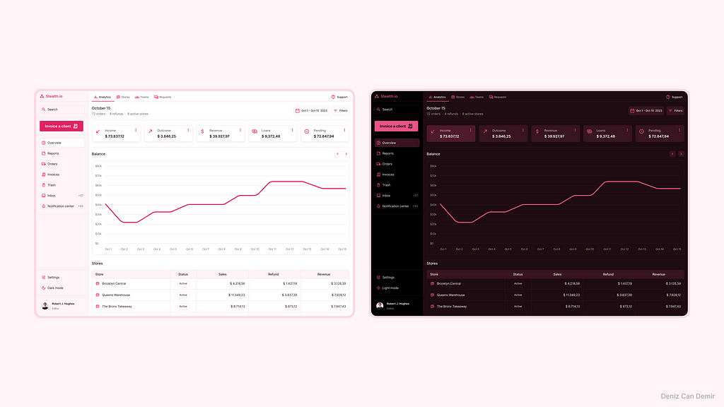
4.2. Dark mode
Similar to the tints, the shades of the color palette were defined to variables properly and gave the result as expected:
4.3. Adoption and thematizing
This color system could easily be modified and adapted to any other project. The only thing that needs to be done is to define an accessible primary color, interpolate it, and change the primitive values.
Let’s see the results for different adoption cases:
Iteration is never-ending
Finally, it’s done! We have a well-orchestrated, wholly accessible, branded color palette that covers the entire design system with light and dark modes.
Depending upon the structures of design systems, inconsistencies may be detected during implementation; you must modify and adapt the color values, variables, and color scope settings according to the requirements.
Epilogue
This methodology will provide you with an understanding of color interpolation, HSB color space, accessibility, and Figma variables during the implementation.
The probable requirements of your design system would impel you to inquire into another subject in these fields that make you competent.
One of the things that makes the designers genuine is the competence we got during the inquiry processes.
Keep inquiring.
Simplified Figma color variables based on HSB interpolation was originally published in UX Collective on Medium, where people are continuing the conversation by highlighting and responding to this story.
Leave a Reply