Hi there! 👋🏻 We are Raquel Piqueras and Christina Yang, we work together at Microsoft where we design a set of internal and external…
Why your brand colors aren’t working in digital spaces.
As a brand designer, have you ever handed off your brand guidelines with beautiful colors only to hear from the product team that adjustments need to be made? Sometimes, you might be unaware of the changes until after launch! Let’s break down why this is happening.
The problem: accessibility and scale are not considered
When a product team receives brand guidelines, it typically only includes a set of primary and secondary colors of varying hues. These colors are used throughout all areas of a company’s brand—so scale and variety within these hues are extremely important for a successful execution.
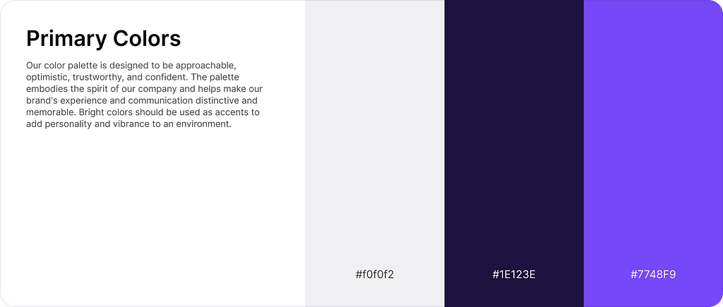
Trying to create a product or website from these colors alone is difficult. It’s easy to overlook just how many colors are used within digital mediums when you’re only looking through the lens of branding and marketing. This may work well for social media assets, but when we dig a little deeper, we will uncover the issues.
Considerations for designing for digital mediums:
Accessibility
This is the number one reason for color adjustments. According to the World Health Organization, there are 2.2 billion people globally with vision impairment. There are a variety of vision disorders that impact how people perceive color. You’d be surprised how many people you know have color blindness or difficulty seeing low-contrast color combinations.
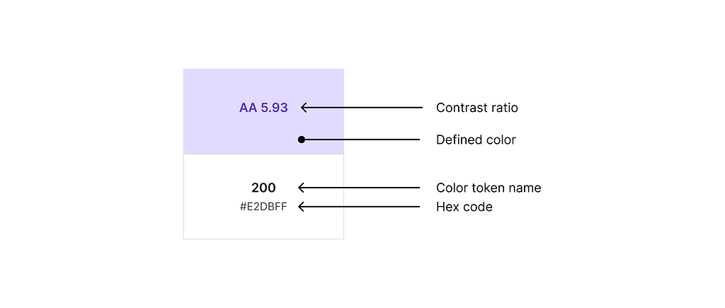
The minimum contrast ratio requirements:
Normal text: AA 4.5
Large text: AA 3.1 (~18px, bold and up)
You can’t “eye-ball” color contrast you have to use a checker. My favorite contrast checker is a Figma plug-in called Stark—they have a wide range of great accessibility tools.
I often hear brand designers say that designing for accessibility holds them back creatively. This usually signals to me that a designer is operating at a junior level and doesn’t yet understand the business impact of their design decisions. Just look at this website full of beautiful color combinations.
States
The World Wide Web is full of interactive elements. A single interactive element, such as a button, needs at least 5 different states to communicate interactive feedback to the user: default, hover, focus, press, and disabled. The most common way to differentiate each of these states is through color. In our brand guide example, we don’t even have 5 colors available, let alone be used together to create a smooth transition from one state to the next.
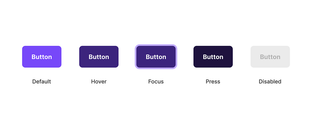
You can see from the example above that we are using eight colors to create a single button—technically seven with disabled using black opacities—showing us that the brand guide is incomplete.
As a design systems designer, I don’t necessarily need a brand designer to create entire color ramps—although I do think it shows good craftsmanship and attention to detail. So what’s the problem? It’s good to know that this is how color is used so that you avoid selecting brand colors that have inconsistent hues from one another. e.g., Two purples with different undertones.
Consistent hues for like colors
A common mistake I see in a brand guide is inconsistent hues for like colors. As a brand designer, you’re likely considering needing different shades for one color for assets like illustrations or marketing materials, so you create a lighter or darker version of a particular color. Beware! This is acceptable; just make sure you adjust the color’s lightness, not its hue.
The colors below both look purple and like they could live together, but their hues differ. This will cause problems when trying to create color ramps that are used for defining all the various states.

Our goal for each color hue within a brand guide is to create a color ramp that we use like a catalog. Product designers often add colors not included in the brand guide to build ramps for success, warning, and destructive states. e.g., green, yellow or orange, and red
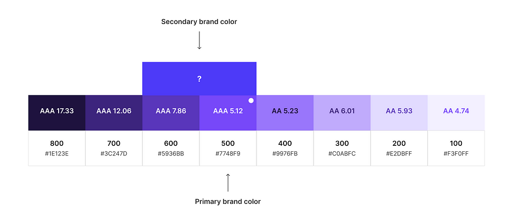
In the color ramp above, the secondary brand color does not naturally fit within the primary brand color ramp. It’s leaning too heavily into a blue hue.
Here are a few options to move forward:
- Replace the secondary brand color with the new 600 value.
- If there is enough contrast between the two hues, a second blue color ramp could be created. If not, I will adjust the hue to create more contrast.
- If my back is against the wall, I’ll attempt to ramp the saturation and hue values to squeeze it into the same ramp as naturally as possible.
None of these options are ideal. They all require a value adjustment to be made that impacts multiple teams as well as takes additional time to solve. Keep an eye on your hues as you build your color palettes.
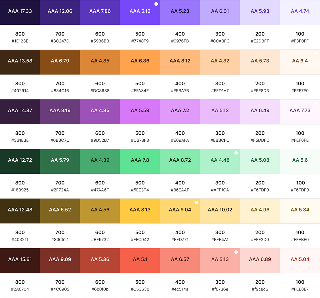
This is what a final color catalog will look like—which is what we call color primitives.
In conclusion,
- Check your color contrast ratios.
- Consider how interactive states are defined.
- Use consistent hues for like colors and enough contrast for different colors.
My next article will walk you through how I create these color ramps, so stay tuned!
Taking on new work:
By day, I am a Sr. Product Designer at Forge Studio. We are currently taking on new design systems and branding projects. I would love to sweat all the nerdy details of building a design system for your team so you can operate more efficiently and scale quickly. Learn more about our process on our website!
Where to find me:
Twitter, LinkedIn, Posts, Instagram, Website
Color for brand designers working with product teams was originally published in UX Collective on Medium, where people are continuing the conversation by highlighting and responding to this story.


Leave a Reply