And why I believe we are on the way toward a completely tokenized design future!
Tokens are all the rage in the design world in the last few years, and it’s especially true after Figma announced their new ‘variables’ capability at Config. Now, before this new announcement — none of the big tools natively supported design tokens functionality, so people had to hack it with plugins, verbal agreements with the dev teams (which are difficult), spreadsheets and other dark magic, so it’s mainly the big companies that actually made tokens part of their design systems (and even then — mostly colors, typography and rarely — dimension tokens like size, space and corner radius.)
For many of the rest of the designers — it all feels overwhelmingly complicated, and above all — unclear what the actual value is in going all-in on tokens, instead of doing what they already did, which is to use hard-coded values for some things, and styles for others.
In this guide, I’ll answer two main questions: why tokens, and why now? Then I’ll dive more practically into the recipe for creating a token system that works.
But first — quick intro to set the stage for my perspective:
I’ve been climbing the ropes of web and product design specifically, and graphic design more broadly, for the last 13 years. I come at this with some scar tissue, as every year I have this moment when I look at how I worked on previous projects and want to facepalm myself in disbelief: “How primitive and needlessly laborious my process was!” And this holy ceremony repeats itself every year. Knowing my design tools inside out became a passion of mine and very quickly I started teaching design tools to other designers, students and professionals who needed an extra edge. Nowadays, I mainly do workshops for product design teams teaching them how to get the best out of Figma with their processes and design system. I’m a total design systems and Figma geek, so you and I probably have much in common.
So, why tokens?
To answer this question thoroughly, we first need to talk about why the move towards greater abstraction took place in both programming languages and user interface design tools.
Abstraction in programming languages
In short — increase in abstraction was a natural evolution. It allowed for greater speed and efficiency of expressing developers’ intent.
In more detail — computer languages follow an evolution tendency for the last ~70 years, starting from machine language (zeros and ones) to Assembly, to languages like C and C++ to higher languages like Javascript, Ruby and Python. You can think of all the languages as steps in a tower, where machine language is the bottom, and languages like Javascript and Ruby are closer to the top. Usually, the higher up the abstraction you go — the more expressive, effective and reusable the language is.
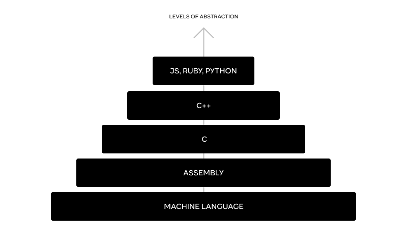
Programming tower of abstraction
The evolution of that tower was for the most part from the bottom up, and for a good reason — it takes a lot of knowledge to write with machine language and Assembly, so the less time developers spent tinkering with specific micro orders for the computer to do and figuring out memory allocation — the more time they had to declare in human-readable language what they wanted to achieve. The more abstract you go — the more the code will be easier to understand, and the more effort you can spend thinking about ‘what do I want to happen’ and less about ‘how would the machine do it’.
It’s worth noting that there is a price developers pay for more convenient high-level languages — a reduced ability to make sure performance is optimized, since in high-level languages, you’re not going deep enough to control the actual orders to the machine itself, and what you can’t control, you can’t optimize. This is one of the reasons why in industries where every drop of efficiency is paramount — you’ll see devs use more low-level languages.
Abstractions in user interface tools.
In the design tools space abstraction took a slightly more straightforward approach, mainly — grouping hard-coded design choices as a ‘sort of variables’, where you can define something once and then reuse it in many places, with the ability to change the definition in one place and see the ramifications play out all across the designs. These are your typical paragraph and character styles (still love you, InDesign), global colors swatches (Illustrator), symbols (Flash and Sketch) components, grid styles, page layouts, margins and smart objects (remember Photoshop?).

Design tools tower of abstraction
The abstraction in most of these cases was very simple: the lower part of the abstraction tower is the hard-coded value (could be HEX color, a font family, a stroke style etc) and the higher levels of the tower would be styles that point to those specific values. In more advanced and technical tools like InDesign you could point paragraph styles to other paragraph styles (using the ‘based on’ feature) and include distinct character styles and color swatches in it, but it’s an exception to the more general rule of a rather simple 1:1 ratio.
It really helped because instead of memorizing the HEX values of your ten brand color shades — you’d just need to find your way through much more human-friendly names like ‘primary-5’, ‘heading-1’ etc.
Unlike in the code tower — the only ‘tax’ for using the more abstracted styles was the time it took to create and manage them. But the cons pale in comparison to the pros, since making sweeping changes across many screens / pages becomes a huge pain if all the values are manual and it’s very easy to lose track of how many distinct shades of gray or sizes of text you’ve used that way. The same goes for the benefit of using components.
Ok, so all of these are variations of ‘styles’, with one level of abstraction, a hard-coded value is named and saved somewhere once and can be used over and over. So, what do we need tokens for?
We need them for two main reasons:
Reason # 1
Styles are idiosyncratic to the design tool at use. By which I mean that they are particular to that tool, and don’t correlate to either other design tools, nor to coding languages, especially for different platforms (vanilla web, React, Android and iOS for example). It’s true both in terms of the way they are written and ordered in folders and what each style represents.
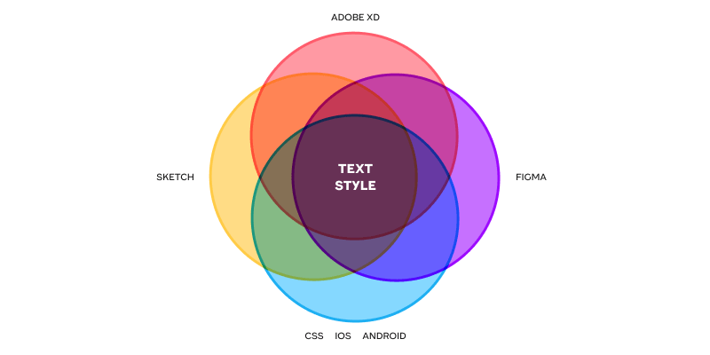
Non-overlapping style meanings
For example — in Sketch — typography styles include properties like text color and alignment while in Figma they don’t. Both of them understand some level of foldering, both represent font family, font weight, font size, line-height and letter spacing. So there’s some overlap, but not perfect overlap. In coding languages there’s not even a unified idea of a bundle such as a ‘typography style’ and each language will need to unbundle this into the specifics of font family, font-weight etc.. This is a recipe for misunderstanding when thinking about where changes reside, huge time sinks when going from one tool to another and when trying to find common language for communication of the designs to the developers.
Design tokens alleviate the vast majority of that problem. This is due to the fact that they are platform agnostic, usually written and saved as a JSON file (a semi-structured text file) so can be both used by a design tool and read by developers who only need to specify the mapping between the token and the actual css/scss/React/Java/Swift visual properties once, and then just use the tokens as a shorthand to tell components how to look.
So basically tokens provide a unified, generic language, with strictly defined properties, to communicate design decisions.
In the high-paced, multi-faceted digital jungle we live in — it’s no small gift indeed.
Reason #2
Modes (light/dark, loose/dense etc). Themes (brand A and brand B for white label or multi-sub-brand products). Generally — any global style setting that an app can have (and that happens more and more in the last couple of years) necessitates some kind of mechanics that is better than just manually adjusting every design decision for every mode, because it’s both hugely time-consuming and very hard to maintain and develop.
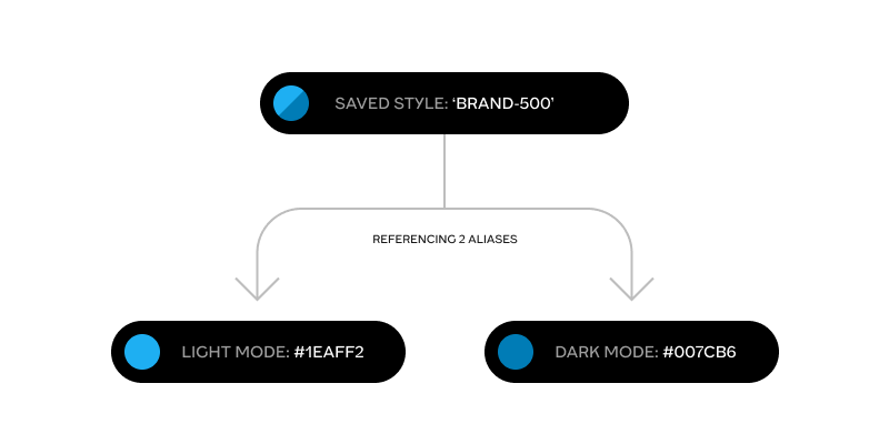
Style referencing 2 aliases
So we need some form of two-layered architecture of ‘styles’. One layer in that architecture to make the local design decisions saved and defined to recall later (as styles already do) and another layer — and here’s the most important part — to be persistent for multi-mode environments, and point to the relevant 1st level style for each of the modes. This is achieved thanks to a referencing mechanic named ‘aliasing’. And tokens, unlike regular ‘styles’, allow for that aliasing mechanic as an integral part of the way they are built. Here’s a quick example of how aliasing works with tokens:
Let’s say we want to allow for light and dark modes of our UI. That would mean that we need a set of core color styles (tokens), say gray-100 (#F5F5F5) to gray-900 (#141414) in increments of 100:

And a set of 2nd level alias tokens, which have semantic meanings like ‘primary_text’ or ‘secondary_text’:

These semantic tokens don’t point straight to specific HEX values, but rather they point to 2 different core color tokens, depending on the mode. For light mode ‘primary_text’ can point to gray-900 and for dark mode it can point to gray_100. So you assign a semantic token to some piece of text and it’ll work perfectly for each of the modes.
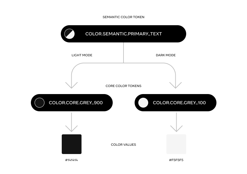
Semantic token points to two distinct core tokens depending on whether the mode is dark or light
This is going up the tower of abstraction we mentioned before, because with time you don’t even bother looking where the semantic tokens point (the actual hex values, and even the names of the core color tokens), you ask yourself: ‘is this a text object that needs to have higher prominence over other pieces of text in this part of the screen? Great, let’s assign it a ‘primary_text’ token — and be sure that it’ll work perfectly for both light and dark modes.
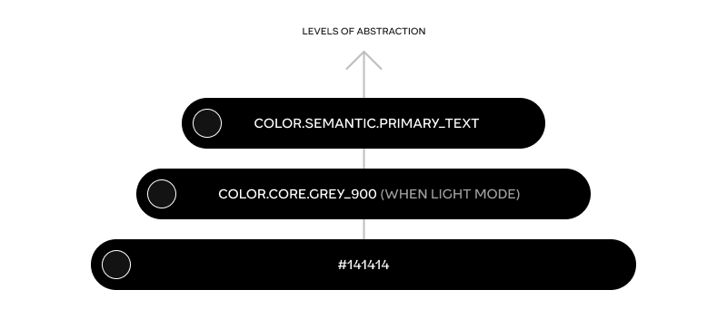
Design tokens are the first time in a lot of years that designers get to step up in the abstraction tower, and think in terms of meaning and purpose rather than concrete hard-coded values. This is a big cultural shift — but an inevitable one.
Since modes (like light and dark) are relatively recent as a common property of modern applications — there wasn’t a big pressure to push the design tools to embrace tokens. When there’s no modes in your app, there’s less of a need for second layer referencing, no need for styles to point to other styles, and the first reason alone was not enough to make it worth it for most tools to embrace tokens as a tool/idea. Now that modes are all around us, the pressure is way up to have tokens.
Which raises the question…
Why now?
As mentioned before — multi-mode ability became a commodity in applications. Pressure built on, people started implementing tokens even without the support of the popular design tools using plugins (like the awesome Token Studio plugin for Figma), 3rd party tools on the web and even spreadsheets with mappings of styles to tokens. That was generally a very uncomfortable solution because the act of playing around with styling and saving and naming and mapping them should be one unified cohesive experience, and the only place that can allow for that are the product design tools themselves.
Which brings me to the latest Config, and Figma’s release of ‘Variables’. Now we finally have the ability to start thinking about design decisions as tokens, with aliasing ability and modes that affect components that use tokens within them.
Now, the spec of what variables gives is far from being complete, as basically there are only 2 types of tokens available — color and dimension (Figma called it number which is needlessly confusing, as ‘number’ is a different thing than ‘dimension’ in the W3C community draft and in Figma it’s sometimes used as actual number (in prototypes) and sometimes used as dimensions for height, width, corner radii etc..) and there are no composite tokens like typography, shadow, border, gradient etc [yet, they’ll probably arrive sometime this year I hope] — which are badly needed. But — it’s the right direction for advancing, so kudos to Figma for being the first big design tool to implement it.
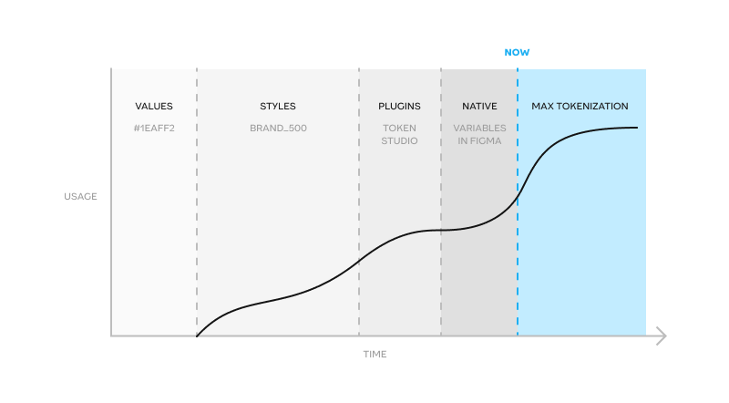
Timeline for tokenization
As we’ve seen with plenty other features in the past — this is going to be copied quickly and become a standard. After that — tools are going to be in a race to complete the full set of all the token types that the W3C community group will agree upon, and probably even expand upon it in some ways. We are accelerating towards max tokenization, which will plateau when all the leading tools get there. Yes, I believe — token systems, instead of the classic ‘styles’, are going to be ubiquitous in all the design tools that want to stay relevant in the future, and it’s either Figma or some other tool that is going to lead the way into a complete support of all the stylistic decisions that can be defined as a token. It is definitely the future of how we make, communicate and document design decisions.
So if you didn’t already — both of the reasons I provided above should convince you that the right time to switch to tokens is now. If you don’t — the other designers will, and you’ll be at a competitive disadvantage for product design jobs pretty soon.
How to think about and structure tokens usefully?
There are many articles that showcase slightly different takes on how tokens could be organized to be effective, but some common practices quickly start to emerge. This is my take after comparing and contrasting the different taxonomies people propose. To make it as clear and easy to understand as possible, we need to make sure 3 properties of tokens are taken into account:
1st property — alias vs core tokens
2nd property — simple vs composite tokens
3rd property — nested grouping of tokens
Alias vs core tokens
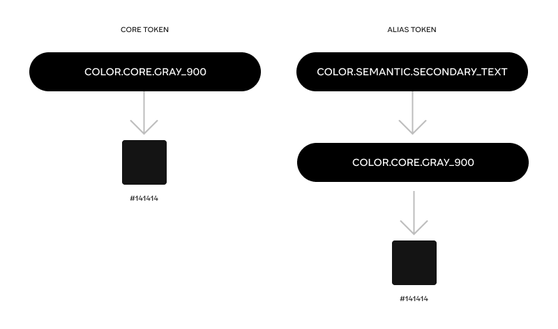
There’s a very important axis to distinguish between tokens: ‘what they are pointing to’. If they point to a concrete value (HEX color, 48px, Font family etc) they are ‘core’ tokens (sometimes called global, general, primitive). These tokens are basically like a palette of all the possible permutations of color, dimension, font family, shadow, border etc.. that our product can use, whether in one mode or another.
Core tokens are usually not directly connected to any specific mode. They are the base upon which the token tower builds.
Alias tokens can be of 2 kinds, ‘semantic’ or ‘specific’ (sometimes called component tokens, or scoped tokens), but in either case they always point to some other token, usually ‘core’, sometimes other semantic tokens, never to a concrete value. More on the difference between semantic and specific tokens later >>
Simple vs composite tokens
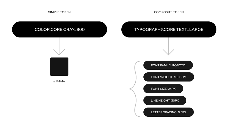
Another axis by which tokens can be divided is whether they are simple or composite. Simple tokens are of a type that can be expressed as one singular value, like: color, font family, font weight, dimension (whichever unit of measure), duration of an animation and an animation curve (cubic Bezier for example). There are probably more to come later on, but these are the ones so far.
Composite tokens are of a type that have to be represented as a set of values, with a rigid formation. For example shadow has to have both a color value, an x, y, spread and blur values. Border, typography, transition and gradient are all composite tokens as well.
Nested grouping of tokens
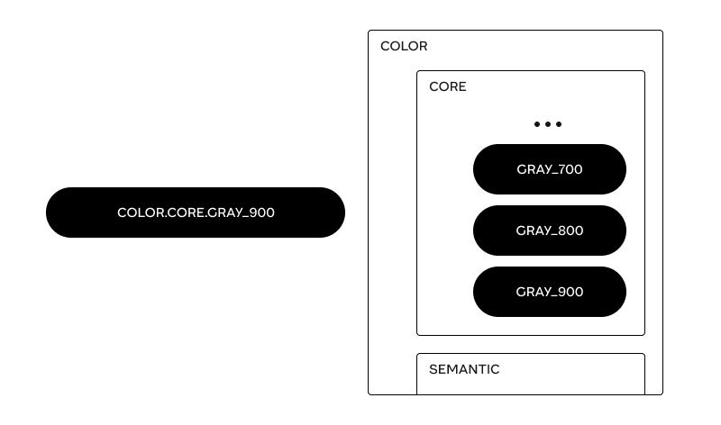
One ability that the token, formatted as JSON allows for — is grouping. This is important because grouping, and specifically nested grouping, is crucial to make a coherent and clear system to search, read and understand the meaning of tokens. Grouping is also the reason why tokens are written with dots separating words. A token’s name is basically its ‘address’ in the foldering tree.
So ‘color.core.background.primary’ is basically the same as saying there’s a token named ‘primary’, and it resides inside ‘background’ which resides inside ‘core’ and the type of that token is color.
One important thing to remember is that composite tokens are not groups! Typography token type includes font family, font weight, size, line height and letter spacing, but it’s not that you can group these attributes together under a typography group. A valid group would be something like ‘headings’ and this group will include all the relevant composite typography tokens, each of which has their 5 values.
The recipe
Baring the three properties of tokens in mind — here’s the recipe, with ordered steps, I think makes the most sense:
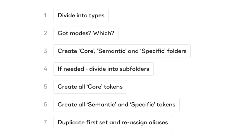
Summary of 7 steps to build up tokens
Let’s go over those one by one, with detail:
First — Divide your tokens into their types. A full list of supported types can be found in the W3C community draft , as stated above some types will be simple, some composite.
Second — decide which modes or sets you are going to have. If it’s only a color theme like dark and light or maybe a density option, increased or reduced motion, color blindness mode, high contrast mode etc..
Third — start with one mode (for example light mode). In each of the token types create three prime folders, these folders are the only ones that are going to be persistent throughout all of the types. The prime folders are: ‘Core’, ‘Semantic’ and ‘Specific’. This is the place to establish the difference between the last two.
‘Semantic’ tokens are broad in terms of their reach but particular in terms of the meaning for the user. A great example is the semantic meaning of ‘success’ color (usually pointing to some core token like ‘green_500’ that points to a green-ish HEX value). Lots of things can be usefully tied to success — a border color, a text color, an icon color, a background of a chip or toast component. It has semantic weight for the user, she sees this color and can easily decipher its meaning in the UI. It very much might be that in dark mode the ‘success’ color token points to a different core token, perhaps ‘green_300’ but thanks to the aliasing all the borders, texts, icons and backgrounds that were tied to it — will change their rendition accordingly.
‘Specific’ tokens on the other hand have a very narrow reach, they are somewhere between ‘single-component-related’ to a ‘set-of-components-related’ that all share some common property to be targeted. For example — ‘modal_padding_horizontal’ is a specific token made to target all the different permutations of modal components (there could be many) and make sure they all share the same horizontal padding. It’s great for consistency, it’s great for particularity since we might not want to make our tooltips, toasts and popovers share the same padding values (so the specificity helps) but also it has no semantic meaning for the user, only for the designers, so it fits the ‘Specific’ folder well.
Fourth — keep ordering your tokens into subfolders inside the three prime folders until there’s nothing more to subdivide.
Fifth — create all the core tokens first by pointing them to values (color, dimension etc..)
Sixth — create all the semantic and specific tokens by pointing to the relevant core tokens in that one mode (light).
Seventh — duplicate the token set, rename it to the other mode (dark in our case) and change all the semantic and specific tokens so that they point to the correct core tokens for that mode.
Bonus — go ask your boss for a raise because you are doing dark magic and should be celebrated for that!
A few quirks of irregularity, because… life is chaotic
It’s easy to assume that all the token types are going to have relatively straight-forward t-shirt scales of core tokens — whether it’s a color palette of brand colors, neutral colors and viz colors, a palette of sizes, of spaces, of corner radii, of border width and style, of shadows (elevation) font families (hopefully not to many) and weights, but when it comes to semantic and specific — different types might look very different in terms of the usage of both of these.
For example it’s easy to come up with very meaningful semantic colors, because it’s well established that colors convey meaning in UI, but it’s a bit harder to come up with meaningful semantic tokens for dimensions because humans don’t ascribe much meaning to the sizes of paddings and widths of cards, tables and modals (it could be something like ‘selected’ semantic token for dimensions if the way a certain ui works is by making the selected object larger for example). On the other hand there’s going to be a swarm of specific dimension tokens as every component set would want to solidify its choices. In this case there would be a big number of specific tokens, a small number of semantic tokens (if any) all of which point to the palette of core tokens.
Borders might be the complete reversal of dimension with only semantic tokens and no specific ones (because borders are usually highly regular across the design system).
So don’t expect a very homogenous distribution of the three prime folders in each of the token types. Still — the mere existence of this ‘three-prime-folders-system’ helps make the whole token system be as regular, consistent and as readable as it can be.
Some design teams go into much detail about the rest of the subfolders with things like ‘attribute’ ‘purpose’ ‘prominence’ ‘state’ and ‘index’. But these are so irregularly dependent on each token type that I feel it’s best to leave it to the particularity of each specific design system, and their product’s unique quirks, but just to give a taste:
Attribute subfolder may divide into something like free / premium for, say, badges, cards buttons etc.
Purpose subfolder may divide into container / wrapper / surface / background etc.
Prominence subfolder may divide into primary / secondary / on_primary etc.
State subfolder may divide into on_hover / on_click / disabled / selected / error / success etc.
Index subfolder is usually added when there’s no more meaningful way to differentiate tokens and all you can do is to attribute t-shirt-like numbers to it, like animation.1 / animation.2 / animation.3 etc.
I hope this deep dive was helpful in illuminating the darker corners of design tokens, maybe even demystify them a little (I predict in a few years time it’s going to be as trivial as using styles in design tools is today). I hope that by now it’s clearer how we got here, why using tokens has merits, what’s special about now and how to actually go about creating a token system that works.
If you found this article interesting and helpful — I would see it as a token of appreciation (I couldn’t help it. Sorry. It’s stronger than me) if you share it with your colleagues!
Happy token building!
As always, we are standing on the sholders of other people, some of whom are definitely giants. Tokens and design system management as a whole is a huge topic, so for further reading please take time to read through these as well:
- https://www.w3.org/community/design-tokens/
- https://medium.com/eightshapes-llc/reimagining-a-token-taxonomy-462d35b2b033
- https://medium.com/@nitishkmrk/design-tokens-beginners-guide-4424944bf5f9
- https://medium.com/@NateBaldwin/component-level-design-tokens-are-they-worth-it-d1ae4c6b19d4
- https://medium.com/@amster/wtf-are-design-tokens-9706d5c99379
- https://bootcamp.uxdesign.cc/design-tokens-2-0-the-ultimate-guide-32b4a047503
- https://uxdesign.cc/naming-design-tokens-9454818ed7cb
The real value of tokens was originally published in UX Collective on Medium, where people are continuing the conversation by highlighting and responding to this story.

Leave a Reply