Minimalism sometimes gets a bad rap. There have been trends over the past decade or so to make branding and websites flat, which helps streamline things to their raw components. This can help with branding and recognition, but it may make usability suffer if it’s not done correctly. Some may prefer the “charm” of older designs, or don’t want the design to become to gentrified along with all the other minimalist design changes over the years. It even seems that some forms of minimalist graphic design art have garnered some mistrust from users.
It’s probably a mix of these things that make minimalist designs controversial. But real minimalism can actually address these issues. The Nielsen Norman Group wrote a list of characteristics of minimalist interfaces, though not all of these may actually contribute to the usability of a design. While not all of their points directly relate to board games, here are a few that might:
- Flat, non-skeuomorphic attributes. Skeuomorphism is fairly common in board games, as theming a game can expose the intent behind the design. In Incan Gold and Diamant, when you get loot, you put it into a tent-like structure to hide it from the other players. While this could have simply been a cup or the components could have been tallied on paper, stashing them away in a tent adds to the theme of exploration.
- Limited color palette. Thematic games tend to have a broad color palette, but some minimalist design — such as checkers, backgammon, and even a deck of playing cards — will have just a few colors.
- Limited graphic elements. To be truly minimalist, the game would probably not have much in the way of graphics. Board games demand some graphic elements — whether actual pictures or physical components — but it’s a question of how many unique elements they have and how many elements are needed. A minimalist example of this would be Othello or Reversi: While you could take pieces off the board and replace them with one of your own color, flipping them instead saves on components and alludes to the gimmick of the game.
With these three considerations in mind, I would like to look at a few minimalist designs in the board game sphere and see how they relate to web design. To do this, let’s look at abstract games, thematic games, and how complex game designs approach minimalism.
Abstract Games
Abstract games are games that have little or no theme. A game like checkers or Othello would be considered an abstract game. Even though they may have some vague theme (e.g., war), it’s usually something the player projects onto the game instead of what the game is trying to project onto the player. A game may have a light theme and still be considered abstract, though, as the mechanics don’t really have much to do with the theme. You could think of it like painting checkers pieces with the faces of angry soldiers or kings. It’s still checkers, and it only vaguely resembles a war. Putting a coat of paint on a game doesn’t always make the game’s mechanics less abstract.
Two fairly popular, new abstract games are Shōbu and Boop. The latter has more of a theme than the former, but let’s look at both of them.

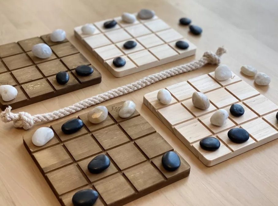
In Shōbu, players have four boards and can only move their color of pieces. After moving one of the pieces on your side of the rope, you move one of your pieces in the same direction on the other side of the rope. This game has no theme, really: you’re moving stones and trying to push your opponent’s stones off a board. (That being said, I like to think of the game as “checkers across the multiverse,” but that’s me projecting a theme onto it for the sake of explaining it to new players.)
The game is very abstract and very minimalist. The different color of the boards plays a role in the rules, the rope helps divide the board into spaces that designate control in an area, and even the pieces are literal rocks. The rules are pretty straightforward (the last paragraph I wrote covers about 80% of them). Strategy is robust, and the game is replayable.
But the lack of a theme may make this game a little too difficult for people getting into the hobby to approach, or it may only appeal to a niche demographic of players that is looking for chess- or checkers-like games, and it would need to compete with the other games in that genre.

Including a theme in an abstract game, like Boop does to good effect, may counter these issues to some extent. In the game, players control cats that are “booping” each other to push them into other squares, off a quilt, or to combine the smaller cats into a big cat. After three large cats are put in a row, that player wins.
The game still checks all the boxes for an abstract game, and it still fits the definitions for a minimalist design. It has very few skeuomorphic attributes, it has a limited color palette, and it has very few graphical components. The theme may make the game more appealing to players while it doesn’t bog down the game with too many rules or fiddly parts.
How does this apply to web design? Designs can work even when they are not colorful, frilly, or extremely thematic. Consider why paper prototyping and wireframing are effective ways of validating designs. You don’t necessarily need colorful graphics of people or places (though those may help in the long run) to have something usable and high-quality. But it may help with marketing to be more thematic or prettier.
Thematic Games
Some games benefit from being explicitly thematic. Games can use their theme to explain and reinforce certain behaviors. Some games, such as Risk, are sometimes referred to as “dudes on a map” games. It may look like that when you step back from the game a bit, but when you play the game, you may feel like a general or commander of these armies. Your armies are meant to defend and conquer. The theme helps teach the mechanics of how you should operate. It’s important for the game.
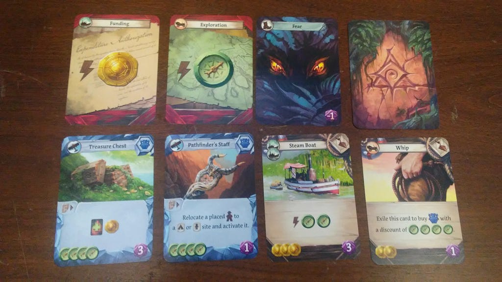
When I think of thematic games, one of the first that comes to mind is Lost Ruins of Arnak. In the game, players go around some South-American-inspired ruins to find artifacts, log their findings in journals, solicit funding, discover new sites, and more. All of these things sound like quite a bit, so let’s look at just a few of the actions and how they’re done.

In the image above, we have a few cards that a player can get. I’d like to focus on the two in the top left for now, though. The funding card will give the player one coin — one of the currencies of the game — that they can then use to purchase cards like the steam boat or whip (among other things). The exploration card will give the player a compass, which can be used to explore new areas or discover an artifact, such as the treasure chest or pathfinder’s staff. Both of these rewards for playing the cards are immediate, but there are details in the background of each of these cards that suggest what the player is doing. They are either writing a letter to solicit extra funds from expedition sponsors (as the letter says “Expedition Authorization”) or drawing up a map to make the place more navigable with a compass.
A generic background likely wouldn’t hurt too much here, and it’s doubtful that every player noticed the background art. The theme is minimized while still allowing the game to be thematic. A maximized version of these may involve filling in squares on a map to show what you’ve discovered and therefore where you can travel, or writing up a research grant proposal that you need to send to the board for review before it goes to the government, and you get half the funds you asked for a year later. These unused options may be more immersive, but they probably aren’t fun, and they distract from the player’s main purpose: living in the fantasy that they are exploring ancient ruins.
Other aspects of the theme are abstracted as well, such as discovering a new site amounting to spending compasses, travel being represented on cards that may not have anything to do with the travel option (e.g., a brush can be used to travel in a car), and sending an archaeologist to bribe a giant monkey with some money. But all of these abstractions make the game more streamlined in the interactions a player can have with the game. And the game still reeks of theme.
How does this apply to web design? Minimalist doesn’t mean boring or flat. It means simplified enough to allow the user to focus on their goals. You can add theme, flair, or soul to your website or app as long as it’s not a distraction and it doesn’t radically change how the user is meant to interact with the site. And the theme can even be framework for how the user can best interact with the site.
Complex Games as Minimalist Games
If every game were streamlined to the point of the minimalism examples I’ve provided thus far, there wouldn’t be a need to talk about minimalism in board games. Complex things are hard to not make complicated, and some games are examples of that. Keeping games minimalist can help reduce the confusion with using the game’s system, however, and it that should be promoted.
In case you couldn’t tell from this and my previous writing, I’m a bit of a board and card game enthusiast myself. But I started off by playing video games. One genre of games that I played frequently was fighting games — Street Fighter II, a little Mortal Kombat, and the controversial “fighting game” of Super Smash Bros. In order to play a cut above the rest, I learned a lot of in-depth mechanics about how the games work. Attack buffers, active frames, ways to mitigate end-lag, and so on were all made part of my vocabulary, and throwing these terms around may make new players feel like the task to “get good” is insurmountable or that the games are too complicated to learn. One of my favorite quotes about reducing complexity comes from Sam Harris:
“Imagine where astronomy would be if everyone had to build his own telescope before he could even begin to see if astronomy was a legitimate enterprise. It wouldn’t make the sky any less worthy of investigation, but it would make it immensely more difficult for us to establish astronomy as a science.”
In other words, if we want something to be less complex, one of the ways to do that is to remove a barrier to entry, whether physical, cognitive, or financial. In the realm of fighting games, one of these barriers is understanding how to move the character and how to react responsively. Controls are pretty complicated in most fighting games, after all.
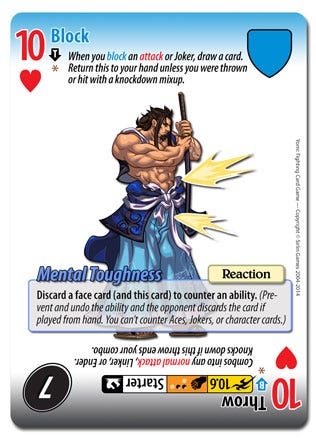
Enter Yomi, a card game based on Fantasy Strike. Yomi aims to simulate a fighting game where each player can choose an action to do at the same time, and actions have priorities based on their type and speed, where (usually) faster attacks don’t deal as much damage as slow attacks. There are different fighters, and, among other fighter-specific qualities, each fighter also has three cards in their deck that have a special ability tied to them. And, perhaps most uniquely, each card is double-sided to allow for two different types of actions. Here is an example of a card from one of the fighters:

Most of the iconography and other factors are best displayed on the bottom of the card. I’ll count each instance of iconography or a mechanic taught in the card numerically here. The bottom action on this card has (1) a number from a poker deck, (2) a suit from a poker deck, (3) an arrow to indicate what’s on the other side of the card, (4) an asterisk to indicate that this card has an ability, (5) an attack type title, (6) attack speed in the yellow box, with lower numbers being faster, (7) how many combo points this attack uses and the character’s limit of combo points in the orange box, (8) where this action can be used in a combo, e.g. “Starter,” (9) iconography to show if this action knocks the opponent down, (10) the action’s damage output, (11) additional clarifications about how combos work with this specific action, and (12) any special ability on the card. Keep in mind, though, that this half of the card represents a fairly standard action in the game, and there are typically two of these per cards, doubling all of these things other than the special ability. And more advanced actions may even have more labels.
If you skimmed over that last paragraph since it’s just so much stuff or if you’re confused about all of it, imagine how it feels to learn, teach, or play the game. I haven’t touched much on the rules here other than explaining a bit of the iconography, but I was able to essentially teach how to play Shōbu in just a few sentences. This task feels just as insurmountable as it would to play an actual fighting video game. But don’t despair! There’s also a Yomi video game you can play instead if you’d rather where they handle a lot of the backend work instead of you, but you still have all this iconography to get through, too.
The game is complex because the game genre it is trying to simulate is complex. But the game is complicated in addition to that. The game’s designer even thinks the rules are a bit fiddly. Most of the 12+ factors I listed earlier are part of fighting video games that are important to know. But instead of abstracting the ideas into different mechanics or combining them into new stats, the game instead gives players everything all at once and asks them to make sense of it. If you’re part of the target audience that wants to play fighting video games but you can’t get the controls down, this will simulate it. But it’s also putting burden on the user to essentially become the processor, handling all the decisions of the game.
How does this relate to web design? Complex things don’t need to be complicated. Consider a wizard for selling insurance. Do you need to verbally tell the user about the state-required minimums? Should you make sliders to say how much coverage they want with ranges of all real numbers? Do you need to give them the terms of the contract in the wizard? There are things you can abstract, simplify, or limit to let the user not become overwhelmed by just how much there is to insurance and feel like you’re helping them. It’s not dumbing it down. It’s helping the user stay focused on the task at hand.
Conclusion
Minimalism is sometimes fought against because minimalist graphic design can look flat or too similar to other designs, but minimalist interfaces help guide the user and not feel overwhelmed by distractions, decorations, or irrelevant information. Allowing our users to be focused on their goals by getting rid of distractions can help in both board game design and web design.
Additional Resources
If you’re interested in the topics presented here, I would recommend the following.
- The Nielsen Norman Group typically publishes articles about best practices for UX. This selection of articles focuses on minimalism and some of the best practices associated with it. Keep in mind that even designs that follow best practices should be tested with users to confirm user needs are being met.
- This article by a fellow Medium writer discusses a good deal about UI tips to focus on minimalism. These suggestions can also transfer to the UI of board games relatively easy if you’re looking for something more focused on game design.
- University of Texas Health isn’t the first place I’d consider for UX practices, but they’ve compiled a pretty good list of minimalist design suggestions.
Board game UX: minimalist design was originally published in UX Collective on Medium, where people are continuing the conversation by highlighting and responding to this story.

Leave a Reply