Data is a product, not a commodity. It is used by people, not computers. And it should be designed, not built. Use these heuristics to be human-centred with backend products.

Not data, ‘data products’
Data products are the glue that holds everything together. How does your phone get traffic updates? How does your doctor send a referral?
But plenty of us spend more time designing the thin veneer of interface that covers these APIs and services. As if buttons and inputs are the product and data is just a commodity. Why?
What we’re doing wrong
Data is the new oil
Like fossil fuels, the data industry is unsustainable. It has evolved slower than the world’s needs. And as digital engineering becomes more sophisticated, we are grappling with the cost of change.
Legacy debt: users, standards and use cases have changed multiple times as the digital economy has matured. But data products haven’t caught up.
Scale debt: tech teams often grapple with deliverables against the clock, so are forced to build unloved MVPs that don’t scale well.
The product behind the data is a black box
Adequate user insight is lacking for many data products. As legacy and scale debt puts more strain on teams, user research is deemed low priority and skipped.
Jared Spool on Twitter: "In product and service design, the absence of user research has a technical name:Guessing. / Twitter"
In product and service design, the absence of user research has a technical name:Guessing.
Skipping research only compounds the problem and breeds more legacy and scale debt. And the cycle continues:
- Data products are built by developers, for developers, in a vacuum.
- Data products simply aren’t seen as human-facing, so lack discovery.
- Designers avoid leaving their comfort zone, so don’t challenge this problem.
True value in data is missed
Imagine what today’s technology could do. There are two versions of this:
- what is technically possible
- what is currently feasible
Because of legacy and scale debt, we tend to miss opportunities by choosing what is currently feasible.
A common way to prioritise features is to compare the effort vs impact of making stuff. If effort outweighs impact, most teams don’t build the thing.

But ‘impact of building’ something backend is being decided by teams without user insights. So impact is most likely deemed lower than it truly is.
Bring Design into Data
There is an approach that can be adopted by engineers and product managers. It will add value and reduce risk for building data products:
- find journeys for your data output
- find users for your journeys
- critique each user’s experience of each journey
The above can be used as extensively as you like. It can be as simple as a team workshop for an hour or two every three months.
1. Finding your data’s journeys
If you know what is happening with the data you process and export, you can start to add value and turn it into a product. Ask the developers in the next team. Ask your designers. Ask stakeholders. Ask anyone.
This is an exercise in systems thinking. There’s loads of material out there to learn more about this. Personally I love Houda Boulahbel teaching system thinking to her five-year-old.
When we intervene to change a system, we need to observe the consequences of that change on the system, and probably need to tweak again and again to produce the result that we want.
Time for a made up example
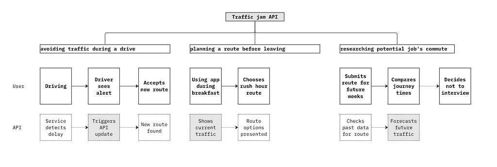
Let’s consider a hypothetical API that tracks traffic jams. It updates drivers on sudden delays during a journey. But this API will have other use cases (journeys) to consider, such as forecasting future traffic.

Once you clarify use cases, you can flesh out users for each one. So perhaps a plumbing agency requires a high request volume when calculating traffic forecasts in bulk on a weekly basis for appointments.
You might not have time to invest in a lot of research into exploring your journeys. But chances are, stakeholders and colleagues have some prior discovery to share with you. A simple exercise like a Jobs to be Done interview is also a great way to unearth and document easy insights.
2. Finding your user and end users
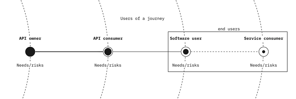
An end user is just a user who participates downstream in a journey your data product enables. Your data product impacts them.

For example, an API to process crypto transactions online isn’t just a payments API, it’s an API to allow a particular set of users to buy specific goods/services under specific conditions downstream.
Simulate crypto user research — supafast!
Let’s explore the crypto example, time to conduct some questionable research on Bard. Bard tells me the most popular brand bought online with crypto is Tesla. Apparently by middle aged, college educated tech. professionals in urban areas.
Bard says you can’t set up recurring payments using crypto. But we know that in the UK, some electric car owners use their vehicle to store electricity when it is cheaper and sell it back to the grid for a profit.
If they hypothetically can’t use their preferred currency (crypto) to manage a direct debit from selling electricity to the grid, this might cause a downtick in early adoption of vehicle-to-grid. Not good. Let’s plot this in a simple journey map that represents the experience of a new Tesla user.

We have flagged selling energy to the grid for the first time as not available for a direct user of Tesla and crypto. Being available is one of the five principles in the Data Delivery Checklist.
Where does an end-user fit into this?
For the issue Bard has given us, let’s imagine a new smart platform emerges to manage vehicle-to-grid transactions each day. Using AI, it brokers sales on the owner’s behalf, then charges them in crypto each quarter.
This transactional platform might solve a problem for the direct Tesla/crypto user. But let’s suppose a third-party industry analyst who manages community energy settlement now has a hurdle to getting real-time insights, due to this settlement delay.
Because data fed by the transactional platform is not released in real-time due to a crypto regulatory validation that takes place (remember I’m making this up!). This might affect how intuitive settlement analysis is.
From the crypto transaction to the transactional platform to the settlement analysis… each stage adds value to the last, but each is dependant on what comes before. As described in this Reflectoring article.
Dependency Rule: each item depends on all the items upstream from its viewpoint
Value Rule: moving downstream, each step adds more value to the product
In the end, it always affects the consumer
This lag in reporting could hamper the ability to fairly estimate electricity costs for entire areas. This might restrict energy access for the most vulnerable in society, downstream end users who struggle to afford bills on pre-payment tariffs.
Design data products, don’t build them
The various actors in this energy-to-grid pipeline of value are able to account for these risks in their designs. But only if they incorporate proper design principles into how they approach their data products. They can’t see them as simple gateways between developers. The have to consider the wider journey. Let’s look at critiquing how you enable a journey.
3. Critiquing each user’s experience
User experience analysis can seem qualitative and messy. Checking if something does or doesn’t break is simpler. When you’re already building technical systems with less-than-ideal time and resources, you need to claw back simplicity where you can. So this kind of critique isn’t attractive.
But this practice isn’t a luxury. Assessing how well you support a user’s experience is ultimately assessing whether your product does or doesn’t break. Just because you don’t return error codes, doesn’t mean it works.
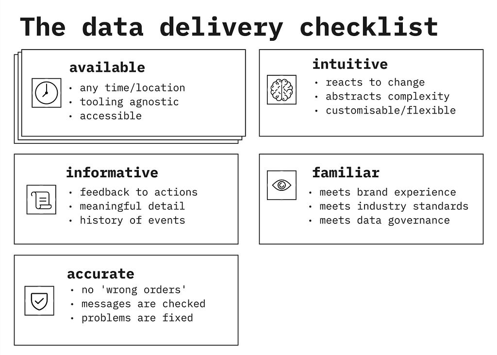
The Data Delivery Checklist 🚚
Data products are really delivery services. They take information and place it somewhere else. Just like a delivery service might process or package its cargo, data products can do things with the data while it is in their care.
The journey supported by your data delivery service needs to fulfil its obligation to the users. And you need to ensure your data product is not the weak link in the larger chain of value.
The Data Delivery Checklist can help, by enabling you to:
- critique existing journeys that feature your data product
- sense check ideas for a new or enhanced feature
- revisit data product heuristics to stay aligned on quality
- simplify data product language for stakeholders and colleagues
Here are the five heuristics that make up the checklist. For any data product, you need to ask the question…
Does this data delivery service enable journeys to be..
- available? (e.g. regardless of time, platform, expertise or location…)
- intuitive? (e.g. reacting to change, abstracting complexity, customisable…)
- informative? (e.g. offering feedback to actions, useful detail and event history…)
- familiar? (e.g. consistent with convention, governance and brand experience…)
- accurate? (e.g. no ‘wrong orders’, everything is checked, fix problems, trustworthy…)
Inspired by data and design excellence
These principles are inspired by industry leaders like Stripe and Plaid. I compared their value propositions against the UX Honeycomb and the 15 Principles of Good Service Design.
Then I utilised the principles on multiple projects at Kaluza. I also scoured problem statements of dozens of other projects, annotating them with the checklist.

Design can be done by everyone, not just designers
If a product team applies this together, they will unlock value in the following ways:
- Engineers will understand how their product impacts users with every micro-decision they make.
- Product managers will feel more connected to users when they prioritise scope.
- Designers will be more effective on deep dives, because low-level user research will have already been done by incumbent teams.
I have used the checklist to to organise product feedback and co-design output, prompt interview questions, coach teams and much more.
Some product teams simply won’t have time to conduct user research. But the occasional get-together to discuss users and journeys will be a great start. (The best way to incorporate design-thinking is to make it as convenient as possible.)
Thanks for reading!
I will write more on how to apply these principles, this article is an introduction to the checklist. And this article is in fact another way for me to source feedback, so comments are welcome.
The data delivery checklist: principles to design data products was originally published in UX Collective on Medium, where people are continuing the conversation by highlighting and responding to this story.

Leave a Reply