Designing for engaging, delightful experiences in the age of AI

There’s a lot of talk right now about the death of UX, the end of design as a discipline, and how the machines will replace us all.
Counterarguments include the current limitations of AI and the unique contributions designers bring to the table, such as: creativity, critical thinking, and empathy.
“I’ve said it before, but I’ll say it again…
Designers won’t be replaced by AI.
They’ll be replaced by designers using AI.
This is true with every technological shift.”
I’ll provide some practical examples of how I’ve used psycho-sociological theory to design human-centered experiences and how that which makes us human will mean even more in the age of AI.
Designing for delight
Early in my career as a product designer, I was working on an app for patients undergoing chemotherapy when the client asked “How can we make this experience delightful?”
Once I got over my initial shock from the contradictions inherent to that question, I dug a little deeper.
What is delight? And how can we design experiences that are highly engaging, even when those experiences are difficult and challenging?
I dug into Behavior Change Theory, oncology research, nursing guides and habit formation UX studies. (My 20-year-old self, who studied critical theory, psychology, and sociology, felt finally vindicated for my otherwise undervalued degrees.)
From my research, I developed a formula:
Engagement = users’ intrinsic motivations + delight
Delight = gamification, right?
When we think of delight, we’re often thinking of surface delight:
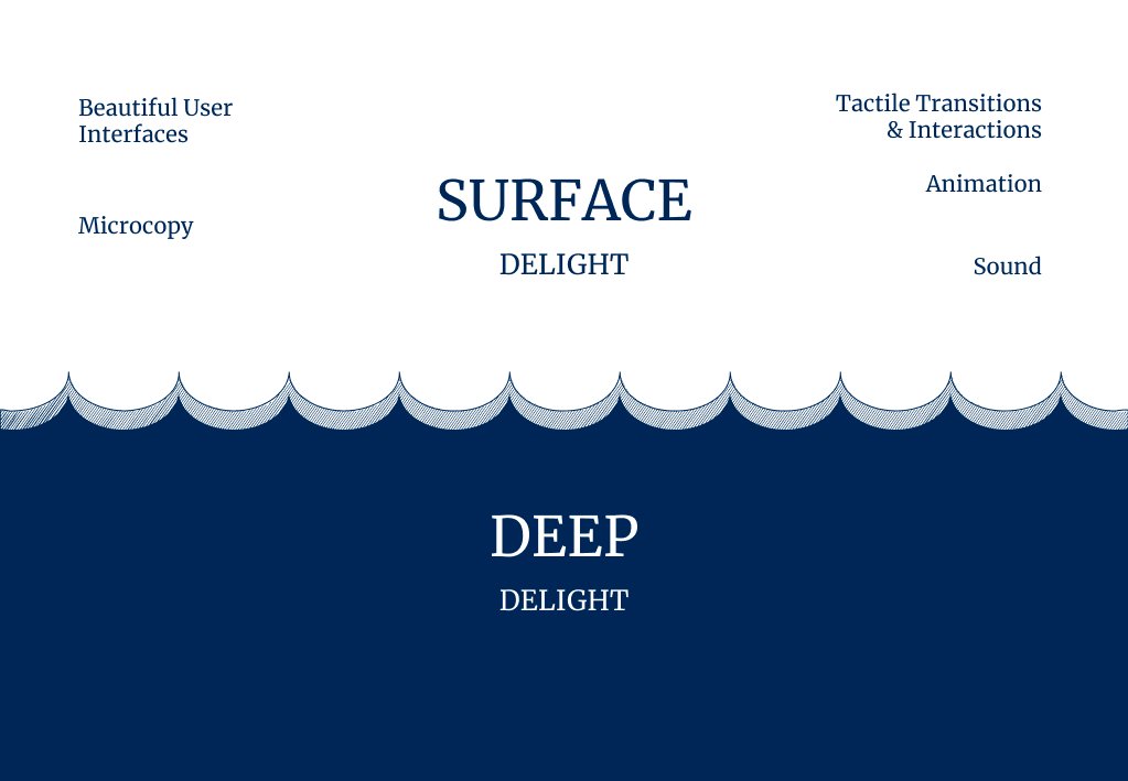
But this is just one area of opportunity as designers.
“Surface delight can be very effective, but the problem is that the novelty factor of surface delight fades over time. What was new and exciting yesterday easily becomes commonplace today…
A delightful user experience is often about invisibility. Getting out of the user’s way. We all know that something that “just works” can be extremely delightful…
From a UX standpoint, if we create products that are completely frictionless, and encourage users to get into that flow state, we’re creating happy, productive users and a deeper level of delight.” — Ben Rowe
Deep, invisible delight is much more meaningful and tied to human’s needs and motivations. It can often come from anticipating users’ needs, before they even have them:

In ideations on delight, I ask my teams “What are some experiences, apps that bring you deep delight?”
Answers included:
Perfectly worn-in boots:

Perfectly organizing your pantry with items from the container store:

The feeling of financial pleasure when you hear the Venmo “cha-ching” (note the sound itself is surface delight, the economic implications is deep delight).
https://medium.com/media/495d30a1deadf0d09f61ebeb813d1034/href
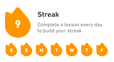
The sense of accomplishment when you‘ve completed a Duolingo streak:
In Invisible Details of Interaction Design, Rauno Freiberg writes:
“There’s a unique human component to interaction design. Why? Because ultimately people are trying to get stuff done using a product. Beauty in form and composition is not enough. There’s an inherent satisfaction apparent in striking a holistic balance between form and function. Great interaction design rewards learning by reusing metaphors…Great interactions are modeled after properties from the real world, like interruptability.”
Take, for instance, swiping horizontally to navigate between pages:
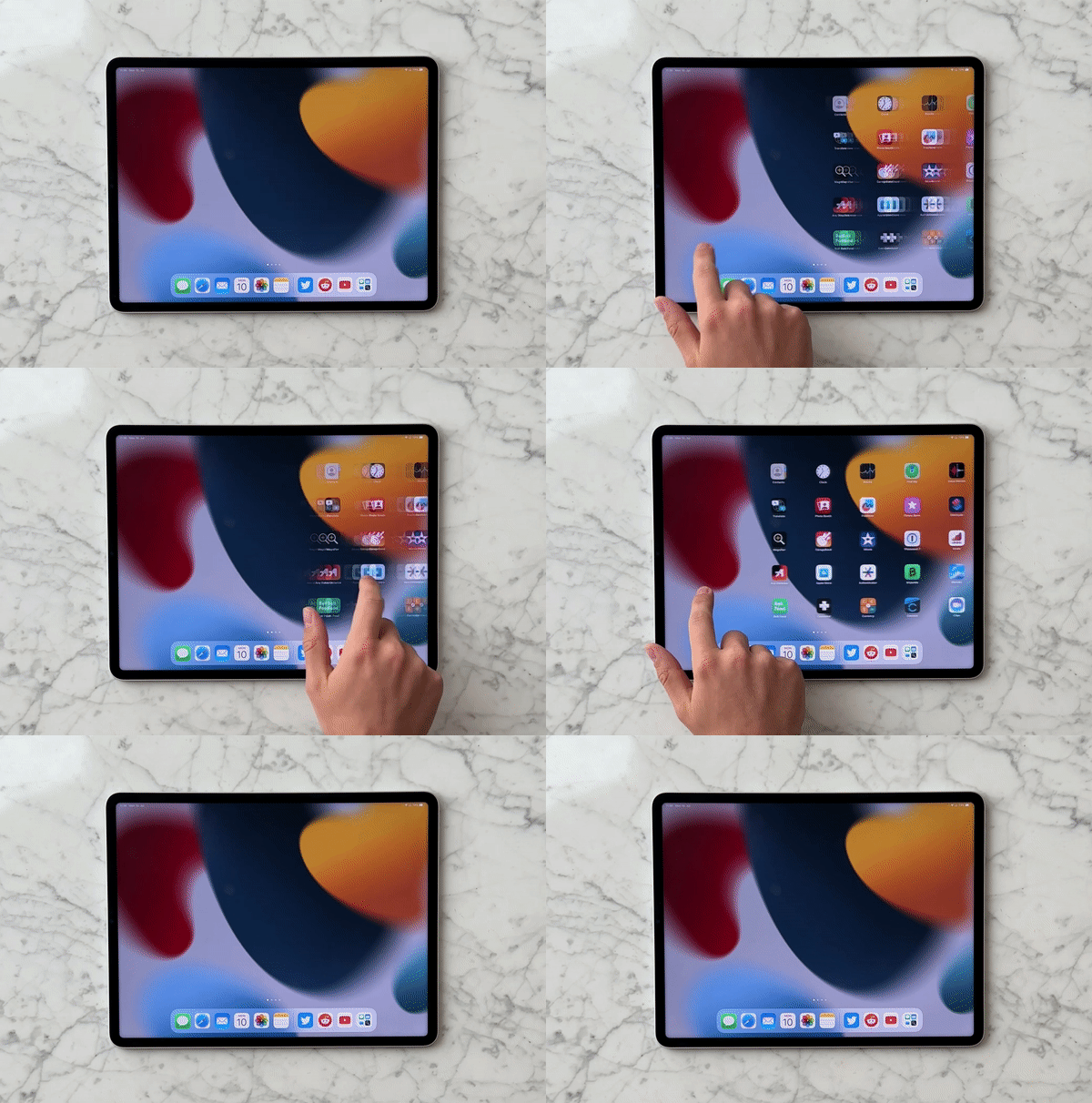
and the learned behavior of flipping through pages in a book:

Or pinching along an anchor point:
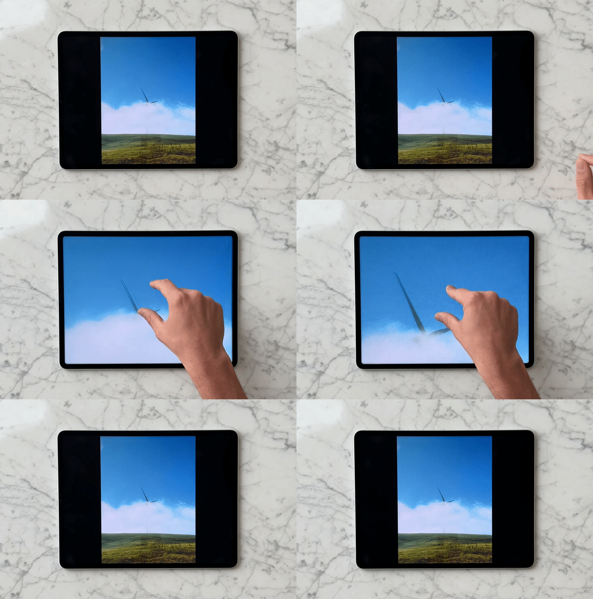
And the precision required in pinching spices:
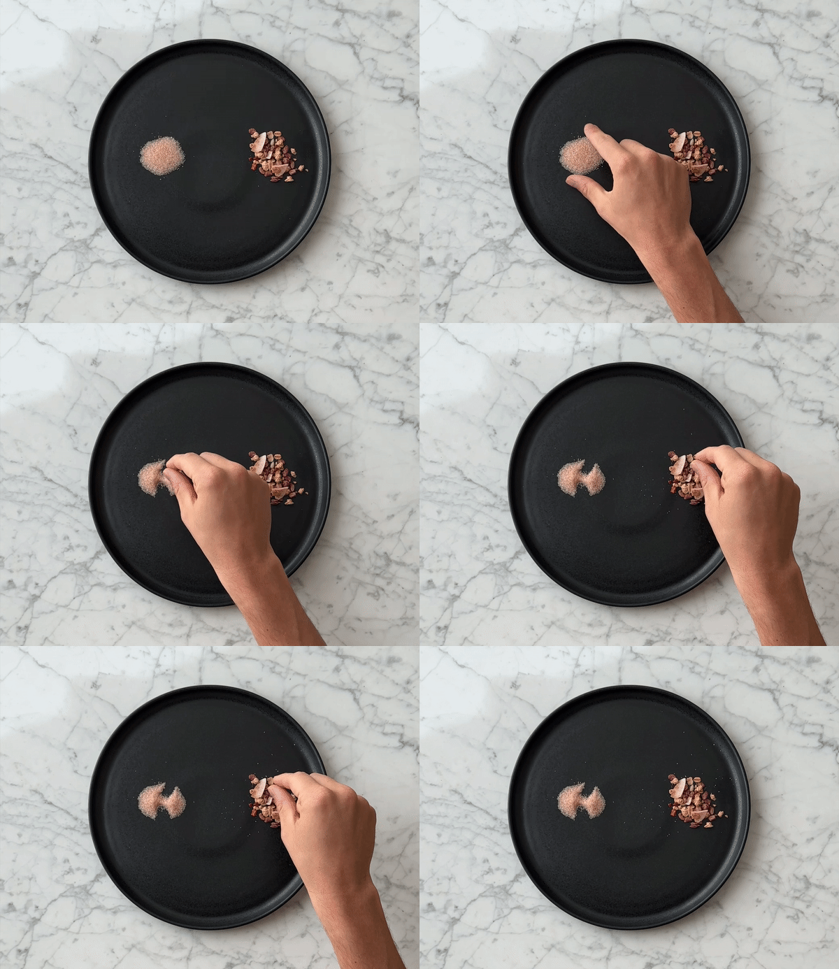
These interactions are inherently delightful because they are deeply human.
Asana is known for the surface delight of its celebration creatures:
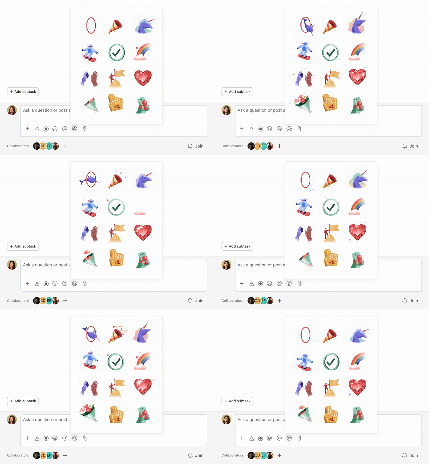
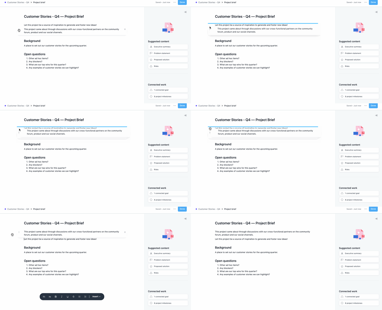
But Asana’s users also experience deep delight when they achieve flow state in a focused text editor:
Their pain is also reduced with automatic goal progress roll-ups. They no longer have to rely on arduous, manual reporting on business-critical goals and objectives:
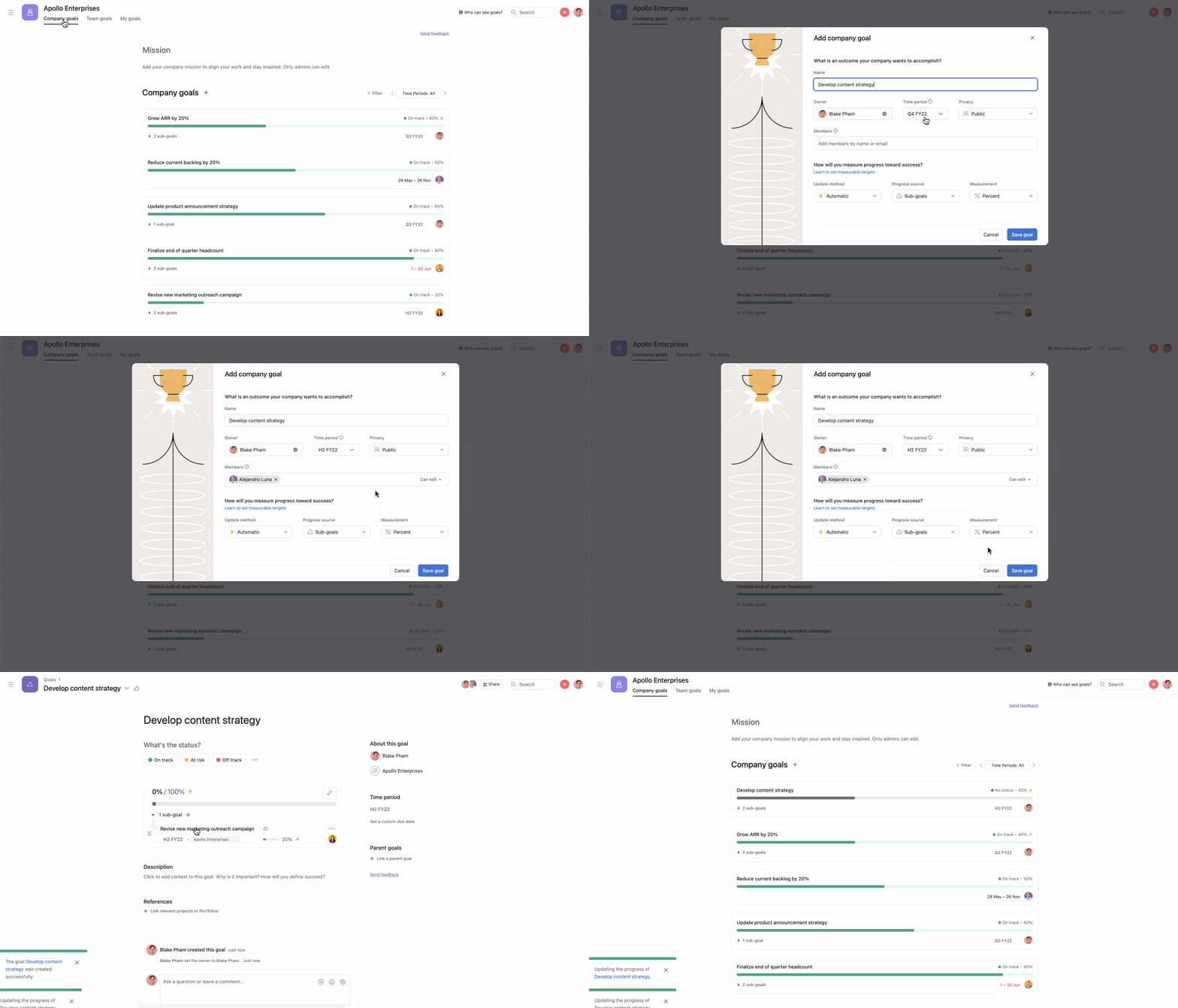
And they are further able to kick ass by quickly reporting on goals using generated status updates:

For these and other smart suggestions to work, users have to trust the brand and its algorithm.
When testing such features at Asana, we learned that the usability and reliability of simple, basic experiences factor heavily into whether users trust the product’s insights and recommendations.
Samuel Hulick of UserOnboard is often quoted as saying that:
“People don’t buy products; they buy better versions of themselves.”
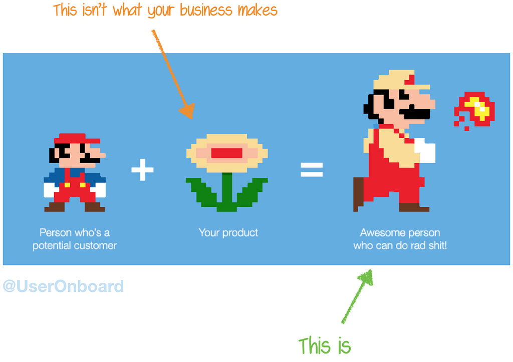
Artificial intelligence is the latest fireball-gifting flower for users and designers:
“A great example of flow at play in a digital product is iA Writer, a simple writing app, without any of the bloat or the complexity that tools like Microsoft Word have. Instead of getting caught up in using the software, you get lost in your own writing instead. You forget that you’re even using an application, and you move into a state of flow.” — Ben Rowe
The essential role of a product designer is understanding Mario — what are his motivations, pains and needs? How do we build his trust so that he feels confident enough to eat a burning flower? What rad shit can he do once he uses our product?
“Assisted intelligence improves what people and organizations are already doing, augmented intelligence enables organizations and people to do things they couldn’t otherwise do, and autonomous intelligence systems act on their own.” —Kathleen Walch
When humans are interfacing with assisted, augmented or autonomous intelligence, other humans will always be needed to understand and craft those experiences.
If what brings us deep delight is inherently human, what can we learn from human psychology to further design engaging experiences?
Let’s return to the original equation:
Engagement = users’ intrinsic motivations + delight
What the heck are intrinsic motivations?
In Eysenbach’s “The Law of Attrition users show up motivated, but leave feeling demotivated.
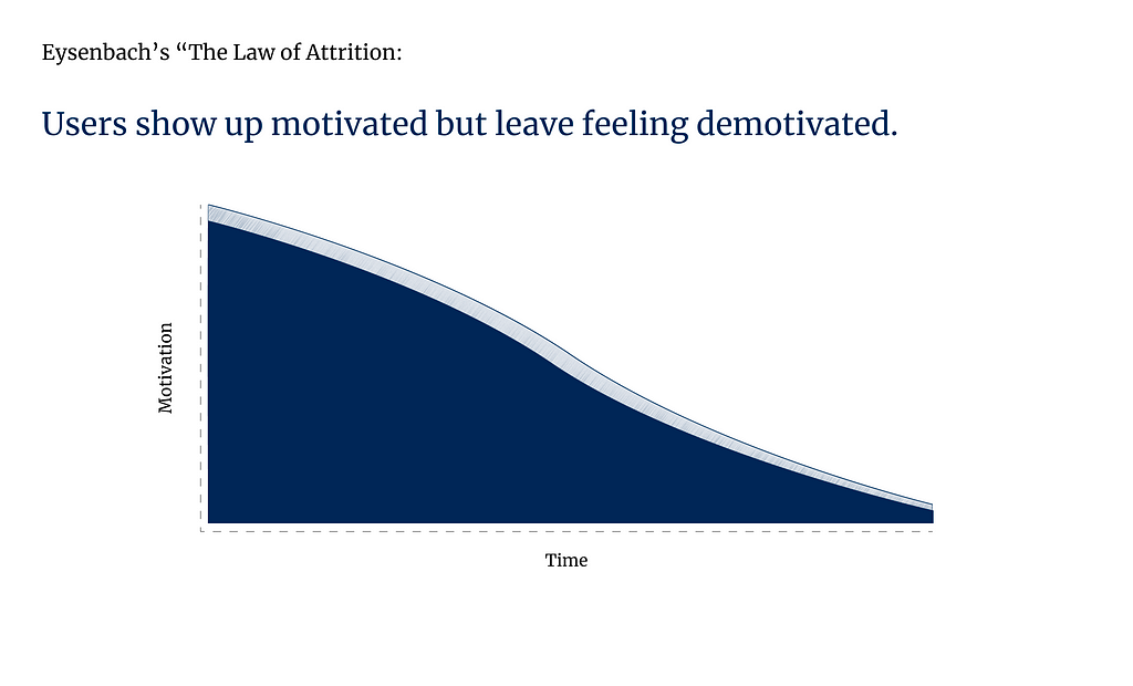
When starting a new habit or trying out a new product, users arrive excited and motivated to give it a try. However, with time this motivation declines as users are tangoing with feelings of autonomy and coercion. If users feel guilt or shame around failing to build the habit or master the new product, they’ll often quit to get back their intrinsic power.
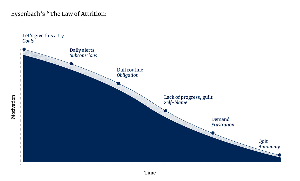
Take, for instance, the app to support patients undergoing chemotherapy. We needed to design alerts to remind users to take oral oncolytics and log their symptoms.
Adherence is especially important with these treatment programs, but like any new habit (especially one that’s unpleasant), daily alerts are the critical inflection point on the attrition curve.
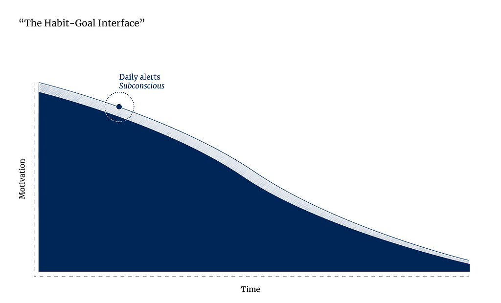
When receiving an alert, for one brief moment, users ask themselves:
Was it worth the interruption?
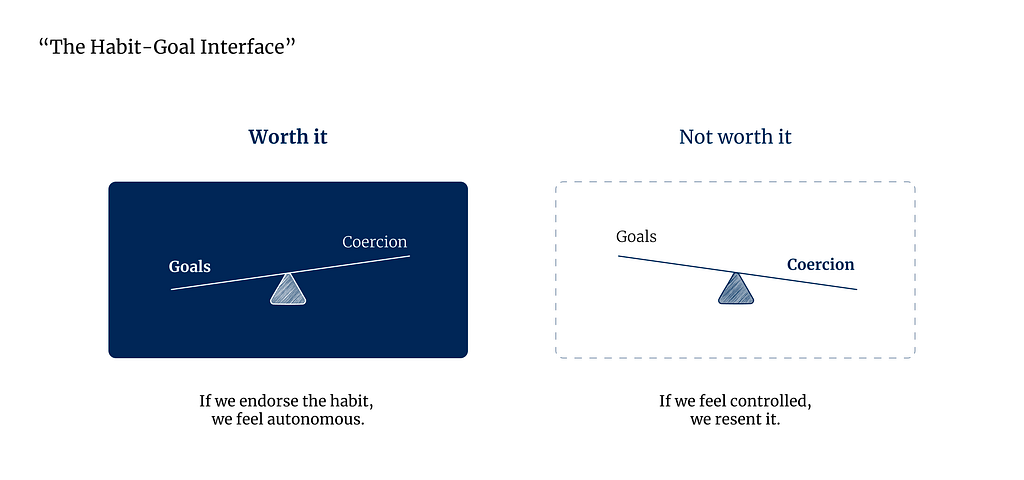
The more the experience aligns with our intrinsic motivations, our sense of self, the more likely we are to form the habit.
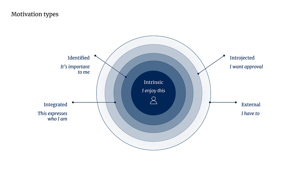
The less autonomy you have, the lower your motivation:
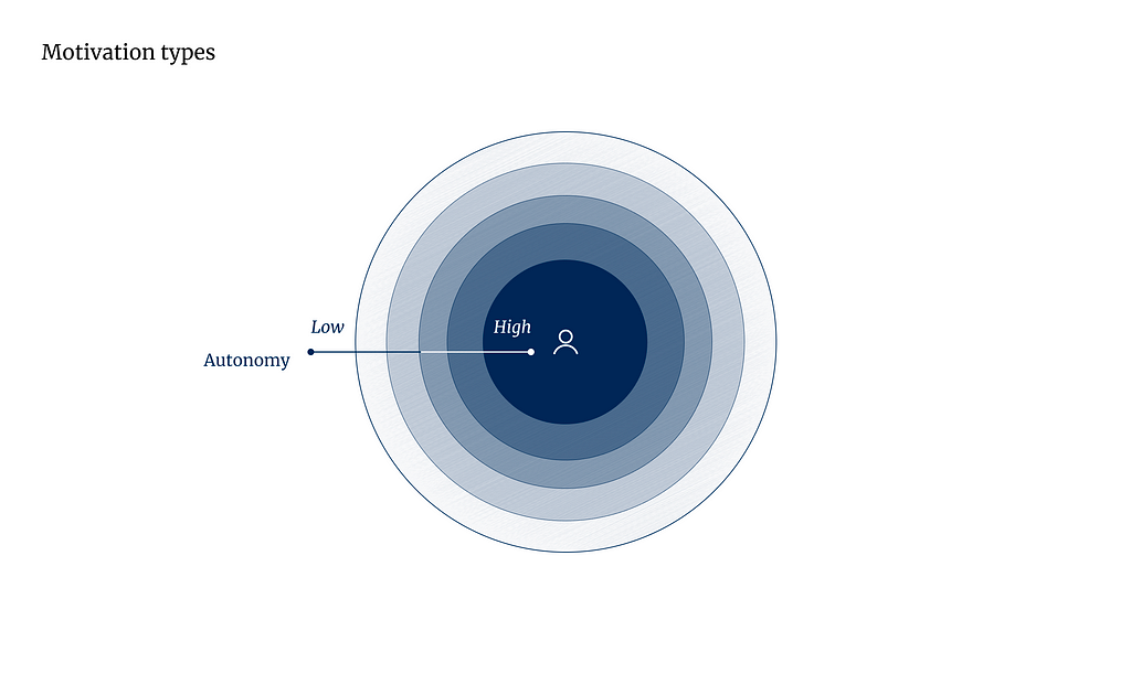
“Autonomy is the feeling you get when you act with a sense of choice, initiative, volition and meaning.” — Habitry
Autonomy is so important, it’s one of our basic psychological needs:
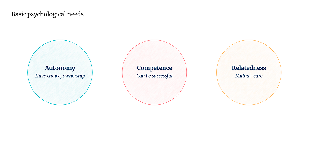
When these basic psychological needs are met and intrinsic motivations are unlocked, the slope flips and forms the Automaticity Plateau, the “Asymptote of a curve representing the relationship between repetition and habit strength”:
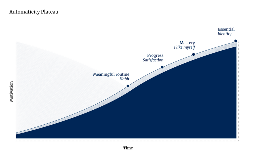
But what to do when the user is powerless, and the experience feels beyond their sense of autonomy and control?
What can designers learn from behavior change theory?
When designing our oncology support app, we heavily referenced best practices from nurses who had developed powerful methods for supporting patients through an uncertain and powerless journey.
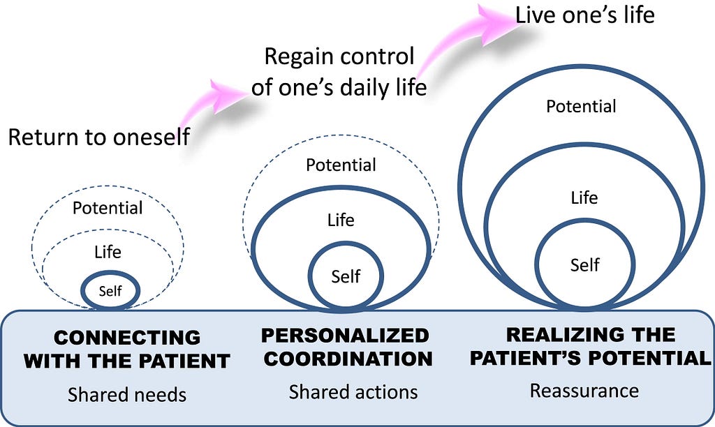
“Even when external barriers, such as access to medication, have been handled, patients may still face internal barriers such as lack of belief in the treatment or low motivation to stay on course through protracted or complicated medication regimens.” — Patient adherence to oral cancer therapies: A nursing resource guide
Nurses employed motivational interviewing techniques to bring back the patient’s sense of self and potential.
“Motivational interviewing respects patient self-determination, acknowledges autonomy, and recognizes that it is the patient who decides whether or not to change behaviors.” — Patient adherence to oral cancer therapies: A nursing resource guide
They developed an innovative service design model using technological and human interventions:

Self determination theory asks us: how can I create the conditions that afford this person the opportunities to learn how to motivate themselves?
Motivational interviewing techniques include:
- Reflective listening
- Open ended questions
- Individual decision making
- Empowerment
- Choice
- Set personal goals
We determined that human intelligence, like the methods used by nurses and social workers above, was key to building an engaging experience for patients along this journey. We unpacked engagement to be more than just delight, and ideated on a variety of types of engagement:
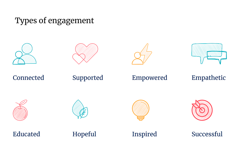
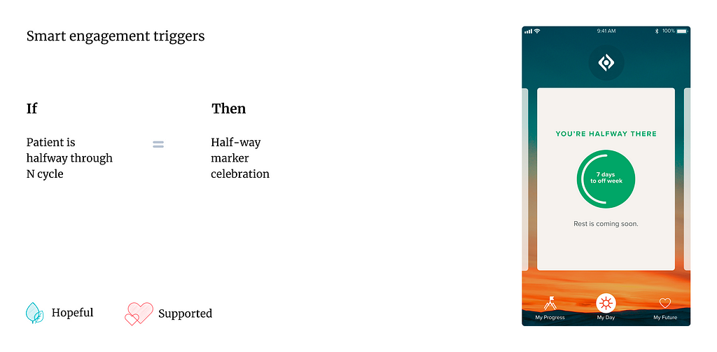
By pairing human intelligence with machine learning, we could trigger if/then moments in the user journey to provide an engaging experience that also drove better health outcomes for patients:
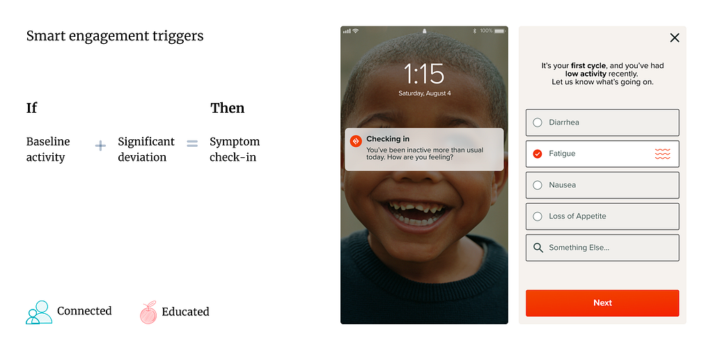
And we could provide smart insights to Oncologists, analyzing trends in patient symptom and adherence data:
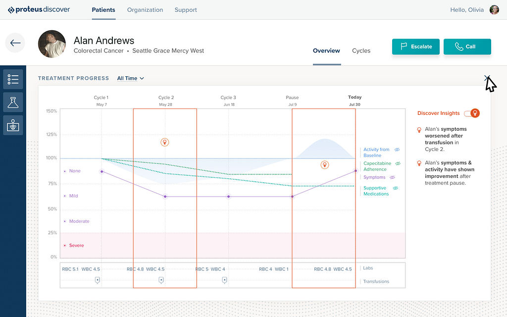
Additionally, there was massive potential in sharing these insights with the oncological community — building machine learning models for precision medicine.
I’ve used this framework to help designers design for intrinsic motivations throughout my career:
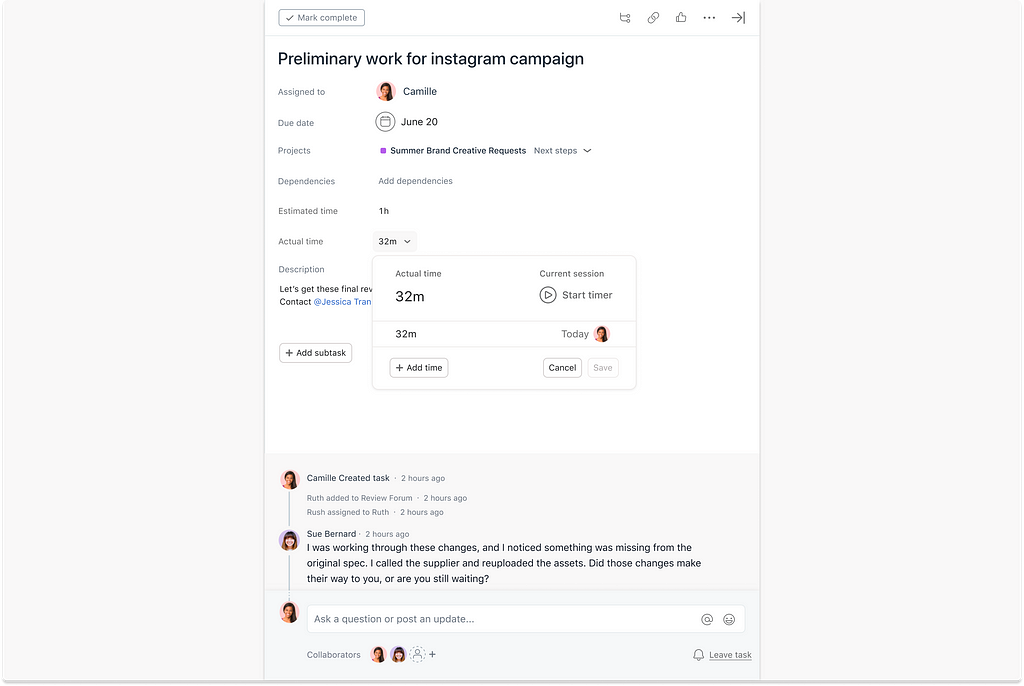
- How might a time tracking feature provide a sense of accomplishment, rather than feelings of big brother workplace reporting?
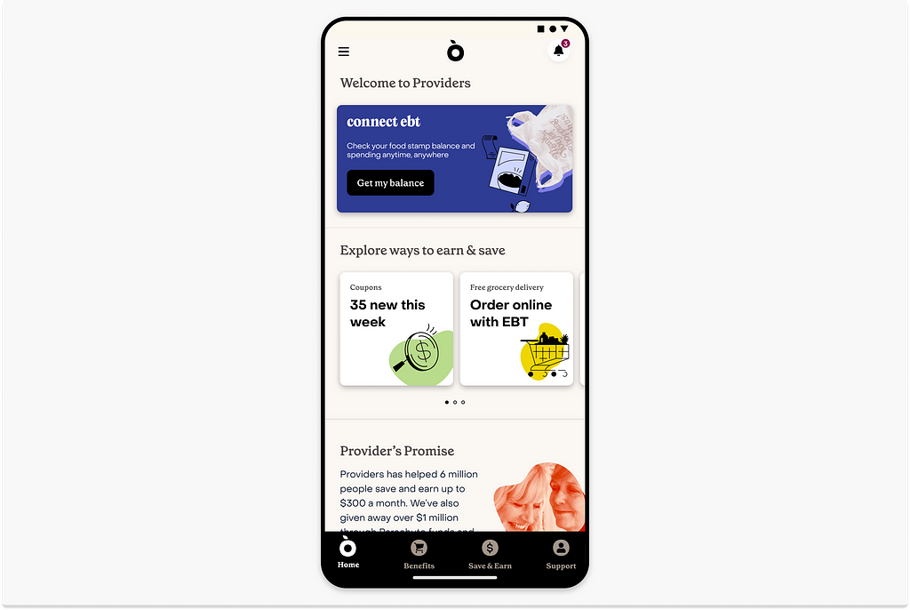
- How do we better engage, build trust and usage with users who associate an app with the pains of social services?
Critical thinking is as much a part of our craft as pixels are.
The uncanny valley & design’s future
Like with many new things that scare us, it’s best to dive in and demystify our fears by learning. I recently took Design Department’s Designing with AI: Prompting course and played around with Midjourney.
Using a prompt: “photography, designer overwhelmed by new technology,” I got a whole lot of this:
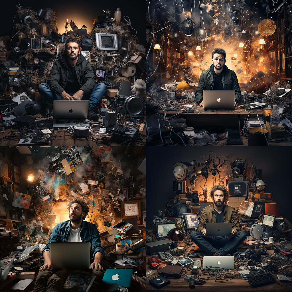
I had to specify race and gender to generate more diverse outputs:

This is much like how Emoji skin tones were built, where the baseline is always yellow with additive properties.
Tools are biased based on what they’re trained on. In example, because Midjourney was developed primarily from illustrations, if you type in “cats”, you’re most likely going to get an illustration of a cat.
There was also a feeling of dystopian futures in many of my results:

Even when prompting “soothing ocean view”:

The uncanny valley “suggests that humanoid objects that imperfectly resemble actual human beings provoke uncanny or strangely familiar feelings of uneasiness and revulsion in observers. ‘Valley’ denotes a dip in the human observer’s affinity for the replica — a relation that otherwise increases with the replica’s human likeness.”
What’s strange is I often feel this effect not just when viewing AI generated images of humans, but also of spaces, places and things. I feel it when I read a movie review that was clearly written by a bot. There’s an uneasy quality to these new creations — they are, but are also are not quite, real.
Darren Yeo provides an exceptional analysis of these and other psychological aftereffects of AI in:
Developing UX/AI thinking for a new design world
Designers can now generate more outputs than ever, but human craft remains essential to making those outputs engaging; to discern a level of taste so that we the outputs align with our brand, and avoid immersing our users in the uncanny valley.
“Taste is the ability to identify quality. To understand quality we need to look critically at: materials that are fit for purpose, ergonomy that considers audience needs, effective use of affordances, usability, accessibility, harmonic color choices, aesthetic choices that elicit emotion, intentional visual hierarchy — amongst others. Taste is in the observer, quality is in the object. The concept of taste becomes more productive when framed objectively around quality, and in ways that are measurable or at least comparable.” — Caio Braga and Fabricio Teixeira, Taste
Mia Blume sees AI prompting as an extension of creative direction, wherein we’ll need to get more specific in our language and knowledge around style, setting, mediums and parameters. But we have to learn to think like the model, until the model thinks more like us:
“It’s like cooking — if don’t know what the spice tastes like, you won’t know what the final product will taste like.” — Mia Blume
As designers, we’ll need to further refine and develop our palettes for taste and craft, for understanding users’ intrinsic motivations, workflows and that which delights and repulses us.
As a career changer, I had to learn many new tools that at first were overwhelming, which I later mastered, only to have them be replaced by something more usable and more efficient that I then had to learn again. (Justinmind < Sketch & Invision < Figma). Few AI tools currently have usable, well crafted interfaces. It’s going to be our job to design them — using our unique sense of taste, critical consciousness and human empathy.
References:
Design & AI
- AI Agents: a designer’s guide to the next big thing
- Cliffnotes: Designing Agentive Technology
- 3 Human Super Talents AI Will Not Replace
- Why generative AI needs a creative human touch | MIT Sloan
- The End of Design
- Developing UX/AI thinking for a new design world
- What are the skills designers need to stay relevant in the next decade?
- Designing for AI: beyond the chatbot
- The many deaths of UX design
CX , content strategy & AI:
Research & AI:
- Terri Lovins on LinkedIn: Insta-Personas & Synthetic Users
- What’s with UX Research layoffs?
- What’s UX research got to do with AI?
Ethics & AI:
These Women Tried to Warn Us About AI
AI Foundations:
- Dr. Milan Milanović on LinkedIn: #technology #softwareengineering #chatgpt #techworldwithmilan… | 70 comments
- The Uncanny Valley: Why Realistic Robots Are Creepy
- Ralph Aboujaoude Diaz on LinkedIn: #technology #ai #artificialintelligence #data #value #outcome | 36 comments
Motivational theory, user trust:
- How Artificial Intelligence Will Scale Health Coaching
- How to Design Motivating Push Notifications
- Motivating Humans
- The Twitter X dilemma: Trust as a finite resource in UX
That which makes us human was originally published in UX Collective on Medium, where people are continuing the conversation by highlighting and responding to this story.

Leave a Reply