Airbnb’s recent move to change the conventional PM function has sparked conversations in the tech world. Coupled with recent layoffs, the…
We design a stressed and frustrated society. With huge effects on people’s minds, accessibility and the light weight of our digital products. Damn, we can do better!

Let’s talk about how we stress our lovely users, how to create calm design and how relaxed design can benefit mental health, accessibility and our nature. Yeah, that’s right. It will also be about how we can reduce our digital footprint with stress-free digital products. It’s a win win win for everyone. So, let’s get into it.
Wait, what?
You open a website, and upfront you get a cookie banner to accept or decline your cookies. Frustrating, but we are already somehow used to it. Click. Next up, you see a full-screen newsletter teaser. You haven’t even been on the website yet, so why would you subscribe to their newsletter? Close. Another banner pops up. Do you want push notifications? Heck no! Block notifications. And if you thought, that’s it? Nope. Some websites then want to know your location. Content is sliding in from all sides. Animations are jumping around. Promo news are running through the viewport like a ticker. Plus, you might be on a booking website that tells you that only two rooms are left and they sell out in minutes.
Aaaaah! Your brain is buzzing and you haven’t even read the first paragraph of this website.
Are we for real? That’s what we design?
Overstimulation by design
We’re often so heavily stimulated that we can’t focus during the day and we can’t sleep at night.
Bethany Sonefeld said in her Config talk that “technology controls our time, emotions and attention. Additionally it changes us psychologically and socially.”
And you know what? We designers are part of that problem!
We often talk about how stressed our society is. But do we really look at how we are contributing to that?
We have to stop stressing our users for our own sake.
I know, when we are sitting in our offices and talking to our business, design and marketing colleagues, it all sounds awesome. Sure, we want to increase sales. Of course, we want to have more newsletter subscribers.
But if we really ask ourselves on a personal side, we probably wouldn’t implement all of those things. Because we hate them as a user ourselves.
Marketing techniques we should ditch
There’s a huge list of stressful marketing techniques. Let’s have a look at some of the most common ones: Cookie banners, push notification pop-ups, massive animations, newsletter banners, location requests, marketing bling bling, making it harder to book something for marketing reasons, unclear call to actions violating user expectations, email inputs without email autocomplete, fake scarcity, processes being super complicated, confirm and cancellation shaming such as “No, thanks, I don’t want to get healthy”, “No, thanks, I don’t want to have this super amazing offer” or audio and video auto-play. I mean, for real? Audio auto-play? Who thought that’s a good idea?
It’s small and big friction everywhere.
All of that leads to super long loading times, inaccessible websites, addictive usage, over-consumption and a nervous system on fire.
Why do we do that? It’s nuts.
Just recently I’ve been on a furniture website with constant “only two days left of this promo”. One week later there was exactly the same promotion.
Duh!
Having a stressful day, an emergency task or a disability
Imagine you had a hard day. You’re stressed from our current world crises. You have a newborn baby that is crying and you haven’t slept in days. You are sick, your eyes are swollen, your nose is running and you need medication.
Maybe you had a car crash and need a tow truck. Maybe you quickly need a doctor’s phone number but the page just won’t load. Maybe you are neurodiverse and have anything related to ADHD, to dyslexia, to Tourette, to autism, etc. Maybe you’re in a burnout or depression and everything is triggering you.
Your users might be in exactly those states.
I don’t say that all of the listed marketing techniques are wrong (but a lot of them are). With some of them it’s about timing. It’s about the amount of information.
How to create calm and stress-free websites, apps and digital products
A calm design doesn’t mean to create boring and dull websites, apps or software.
Stress-free design can be more enhancing, loving, beautiful and aesthetically pleasing because it reduces the stress of it all.
Let’s get into four categories that you can de-stress your design with:
- Enabling healthy usage
- Ensuring a calming environment
- Communicating in a healthy way
- Promoting well-being
Enable healthy usage
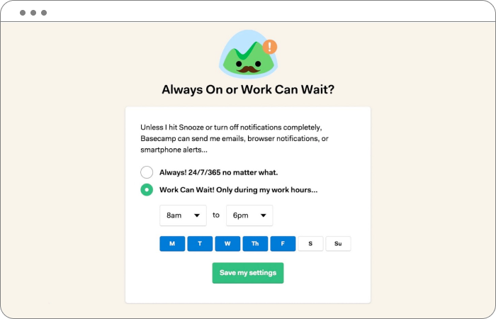
Build in preference settings
Offer users to set their preferred settings and promote those settings in the onboarding phase. Never trick users into settings that are stressful or frustrating for them. Settings can range from video auto-play, to notifications, to data privacy.
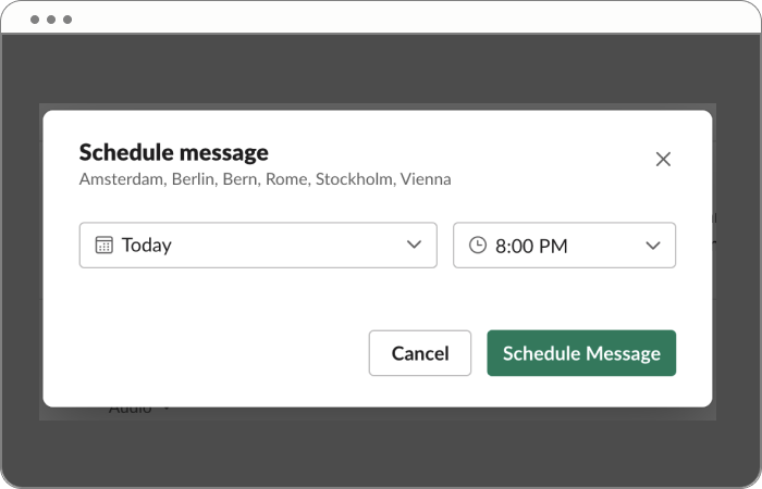
Implement a “Send later” feature
Reduce stress and weirdly saved pre-written messages by integrating a feature to schedule messages. It ensures to not pressure others to answer late at night or during holidays.
Integrate exit points, push notification stops, de-cluttering helpers and pause features
How awesome is it to get stopped scrolling with “You’re all caught up”, to get a sense of completion after having done all language learning modules of the day or to pause tasks in an app. Slack even suggests to leave channels the user rarely participates in. What a great help!
Ensure a calming environment
Use animations carefully
Fast paced and splashing animations can trigger everyone, but especially people with impairments and cognitive challenges (people on the autism spectrum, with Tourette, ADHD, etc.). Better use micro-animations, e.g. for celebrations, on buttons, opening overlays, explanatory illustrations.
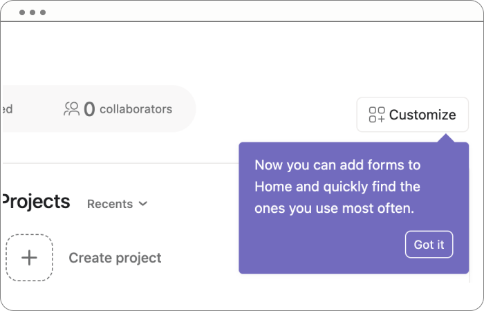
Use banners on the periphery
Newsletter promos, location requests, freebies and more banners pop up on every website and are mostly judged by users as extremely frustrating. Show banners only after the user spent some time on the website. Don’t interfere too much with your users view. It can trigger everyone, but especially people with impairments and cognitive challenges.
Step away from video (and audio) auto-play, implement focus modes and allow space in your designs
Dig deeper into finding a truly calming digital environment for your users. Ensure that your users have room to breathe, short onboardings, easy click paths as well as a clear focus while using the product.
Communicate in a healthy way
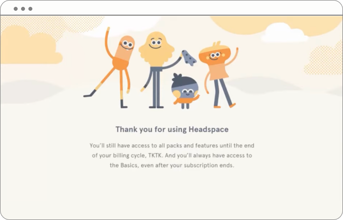
Show love in your confirm and cancellation process
Stop shaming users for unsubscribing from newsletters or cancelling a service. It’s the users choice and nobody should ever be shamed for that.
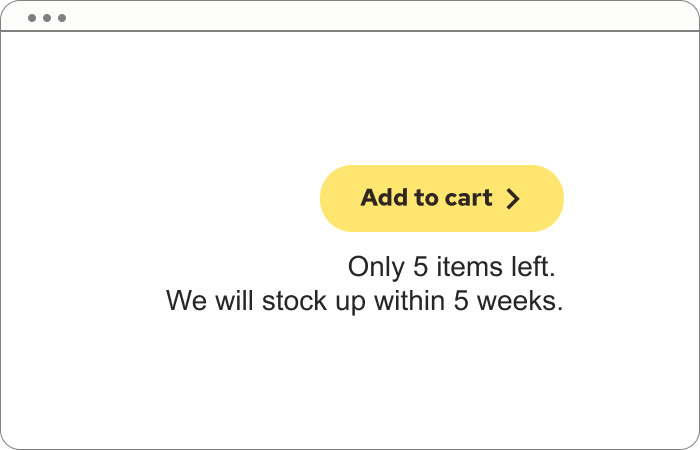
Integrate only helpful and true scarcity
When there truly is a limited amount of products available, communicate it and add information about upcoming restocks, next opening dates, etc. It could be tickets, art prints, meetup seats.
Communicate with care and get rid of manipulative patterns
Never use deceptive and manipulative patterns. Stop claiming services and products to be a “Once in a lifetime opportunity”, as “Buy now or never” or “The best offer you will ever get”.
Promote well-being
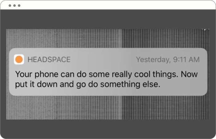
Remind users to get off the device
Support users to get off their devices after scrolling for long or working the whole day.
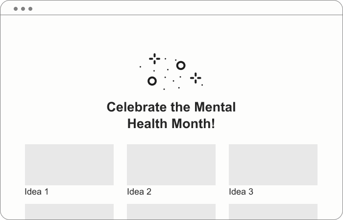
Raise awareness for well-being days
Promote the International Day of Unplugging, Labor Day, Mind Body Wellness Day, Mental Health Month, Stress Awareness Month, and many more. Advocate for the Earth Overshoot Day and taking time off digital devices.
The benefits for mental health, accessibility, mother nature, and business
I bet you already guessed a lot of the benefits that come with calm design.
The benefits for our mental health is a calming, soothing experience that doesn’t trigger episodes, overwhelm, frustration, stress, shame, anxiety or a distrustful society. We don’t want that. I don’t want that, especially in a world where mental health is the number one for sick leave and occupational disability in many countries. Your design is one way of caring for a healthy society.
The gains for accessibility lye especially in an (oh surprise) accessible website with clear processes, easy click paths and nothing that disturbs or even blocks the website navigation (which happens very often, by the way). Really care for permanent disabilities (as in having just one arm), temporary disabilities (as in having a broken arm) and situational disabilities (as in having a baby in one arm). Think about accessibility in a holistic way and make it easy to use your product or service.
The payoff for nature is, for sure, a lightweight digital product with a smaller digital footprint. The product uses a minimum of data and even sends people outside into nature. Fewer push notifications, less buzz, less push and pull from one server to another, less server space, less energy used, less carbon, more biodiversity, more life, more nature.
And last but not least: business. A smooth, accessible, efficient, fast-loading, joyful digital product drives sales. More people can access the product; the usability is way more enjoyable, and users love to come back for more and recommend it to all their friends and family. As I said in the beginning, it’s a win-win-win situation.
Get aware of stressful user journeys
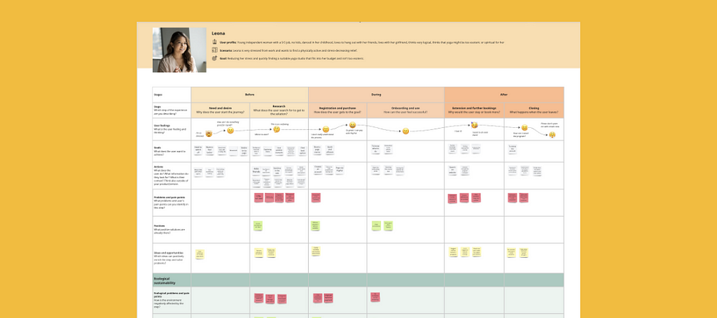
You got it, right? There are a lot of stressful user journeys. And you know that you can do something against it. If you wonder how, you can check out my User Journey Map template. There is a template for Figma and one for Miro. It’s free. You can just give it a go and adjust it to your needs. The template even has additional lanes for ecological and social sustainability in it.
Respect people’s time and mental health. Respect our nature and the resources we have.
More from Sandy Dähnert
You want to learn more about ecological and social UX/UI design? Head over to Instagram, the Green the Web podcast or the Green UX/UI Design course (where calm design is one part of the curriculum).
Plus, I’m keen to know what your additional thoughts are about Calm Design. I’m always happy to get into discussions. Let’s grow together.
More resources about Calm Design
- Create with a conscience: Healthier tech for a distracted world, by Bethany Sonefeld at Config
- Designing for stress, by Katie Swindler
- Delightful UX: How To Design for Joy [with Headspace]
- We need more calm design, by Canvs Editorial
- Is Your Product Designed to Be Calm?, by Amber Case
De-stress your UX: for mental health, accessibility, and mother nature was originally published in UX Collective on Medium, where people are continuing the conversation by highlighting and responding to this story.

Leave a Reply