We’re in an age where artificial intelligence is rapidly evolving and more powerful and accessible than ever. This shift is reshaping how…
Apple’s Vision Pro has ushered in a new age for designers, and it’s exciting. New set of principles to learn for colours, typography, sizes, accessibility, and so on. Let’s check out some of those guiding principles.
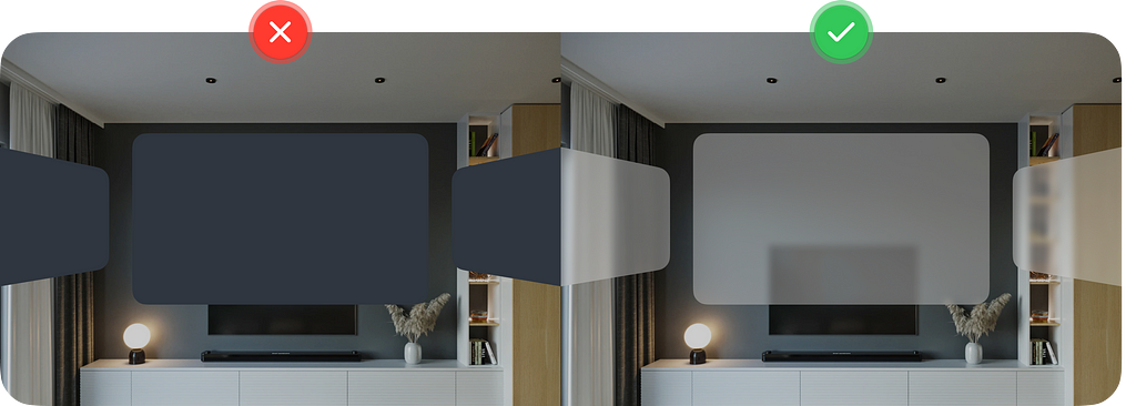
1. Avoid using solid colours or opaque windows
Solid colours tend to cut away users from what is happening in the background. With glass material users can still be aware of what is happening in their surroundings.
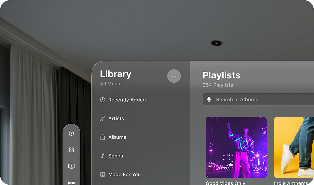
2. Text colour always defaults to white
Colours other than white don’t go well on glass material. You risk it blending with colours of objects in the environment surrounding the user.
3. If you need to use colour use it in the background layer
Glass material can have different colours based on what is behind it. Colourful elements on top of glass material may be difficult to see if colour of the glass is similar. Stick to white text or symbols most of the times.

4. Don’t stack light material on top of another light material
Vision pro primarily uses two types of glass material. A light one and a dark one. Light on light just makes everything lighter and hard to see due to the poor contrast.

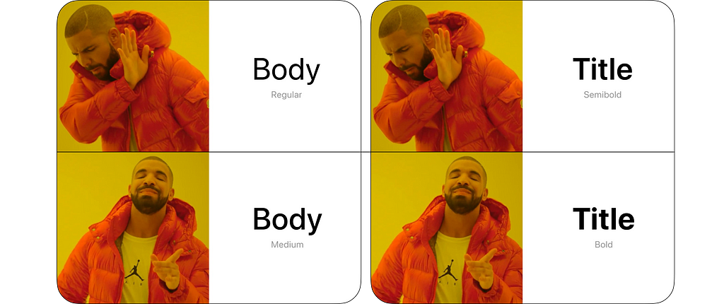
5. Use bolder font weight for better visibility and legibility
For the Vision Pro Apple has increased their body font from regular to medium and Title from semibold to bold. You can do the same if you are experimenting with other fonts.
6. Avoid placing anything too high up or too far down
It is easier for the neck to move left and right rather than up and down.
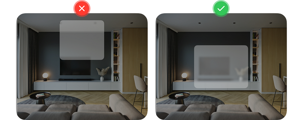
If you need a larger canvas, go wider instead of taller.

7. Place most important info at the centre of users field of view
It makes it easier for the users to see and interact with the content without moving their head too much. It also helps reduce distraction and help bring focus to what matters.

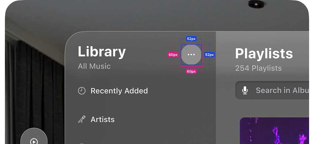
8. Interactive elements must have a target area of at least 60pts
The elements itself can be smaller than 60pts but add in extra padding of at least 60pts.
9. Clearly indicate state of elements to a user
States can be interactive, inactive or selected. To Indicate interactive elements accompany them with an hover effect when people focus on it.

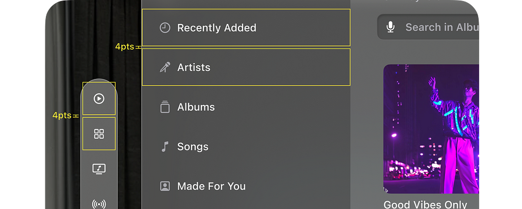
10. Give 4pts of spacing between interactive elements
This is done so that the hover effect doesn’t overlap when the user glances at it.
11. Nested elements should have relative corner radius and padding
It keeps them concentric with each other and it helps feel like they belong together. Use the formula below to calculate the corner radiuses.

12. Avoid having more than six items on the tab bar
Purpose of the tab bar is same as the purpose of the tab bar or bottom navigation on a mobile device ie: to give users quick access to the top level section of your app with a single tap. The tab bar on the Vision Pro is vertical and does the same. It is meant to be light and out of the way.

13. Place ornaments so that they overlap the bottom edge by 20pts
It feels more integrated with the window without blocking too much content. And they look nice 🙂

14. Menu and pop overs to be centred to the icon
This ensures that content always appears where the user is looking.
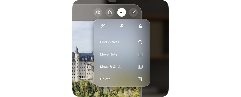
15. Avoid using button with white background unless they are selected
This is how Apple has defined it. Your app can be different but ensure selected state and other staters have a very clear visual difference.

16. Close and back button to always be on top left corner
This sticks to the general interaction pattern on all Apple devices. Close and back is always on the top left corner.

17. Use dimming to help focus on the content
The environment around the user can be unpredictable. You can use dimming to your advantage to bring more focus to the content being displayed to the user.

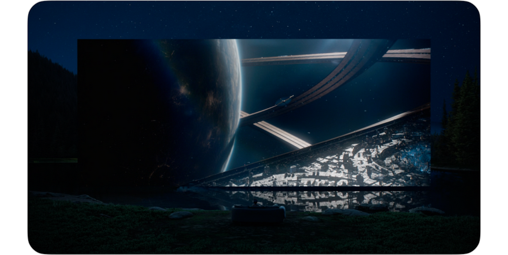
18. Switch from AR to VR using Environments
Environments are when the surrounding space is replaced by a virtual space. This can be used to give your users a more immersive experience.
To learn more check out the official resources by apple:
🔗 Design for spatial user interfaces
🔗 Design for spatial input
🔗 Design considerations for vision and motion
🔥 Also check out the Vision Pro UI Kit (unofficial) created on Figma, using all of the above principles.
🙋🏽♂️ Let’s be friends! Connect with me on Twitter and LinkedIn. Also check out my free resources on Figma.
18 design principles to keep in mind when designing for Apple’s Vision Pro was originally published in UX Collective on Medium, where people are continuing the conversation by highlighting and responding to this story.


Leave a Reply