

Who still remembers NFTs, Google Glass and ChatGPT 3 years later?
Ultimate guide to baseline alignment using Figma’s auto layout
An in-depth analysis of implementing the overlooked baseline grids in Figma
It’s been a few years since Figma introduced its first version of the auto layout feature. I wanted to write about my experience with it since then, so I started a draft, but it’s taken me some time to get back to it.
Now, that Figma recently implemented vertical trim, I came to the realization that if I don’t write this now, someone will eventually come up with a better solution. Or Figma might actually implement something even better than vertical trim, so my method will be rendered useless 😅.
The goal of the article is to showcase and propose a quick solution for using and documenting baseline grids in design systems.
Since this is my first article, I’m looking forward to feedback on the writing and the method presented here, so don’t hesitate to leave your comments.
How it started
Before I jump into baseline grids, here are a few words on how exactly I stumbled on this issue.
Prior to my transition to UX design, I worked as a brand designer. I always believed that I could have created more valuable work if I hadn’t been so preoccupied with geometry and grids in my designs 🤓.
My interest in geometry, and particularly in grids, was further fueled after reading “Grid Systems In Graphic Design”. The book not only helped me deepen my understanding of leveraging grids, but also inspired me to make the jump from brand to product design.
As the book puts it:
By arranging the surface and spaces in the form of a grid the designer if favorably placed to dispose his text, photographs and diagrams in conformity with objective and functional criteria. The pictorial elements are reduced to a few formats of the same size.
I was then convinced that working on products would allow me to focus more on geometry and grids in design. At the time, I was also drawn to some well-documented design systems, such as Material 2, which offered clear guidelines for creating consistent layouts.
Still, something needed to be added to these guidelines. Responsive 12-column grids were, and still are, extensively used for the web. Baseline grids, on the other hand, are sometimes mentioned and documented, but rarely implemented or used when designing digital products.
This topic haunted me and presented an unhealthy interest for me for a long time. I kept tweaking the method presented here over time, and now with Figma’s vertical trim and auto layout, I had a method and process that presumed easy implementation, had no manual shifting of text elements, and was easy to be documented and included in design systems.
What are baseline grids again?
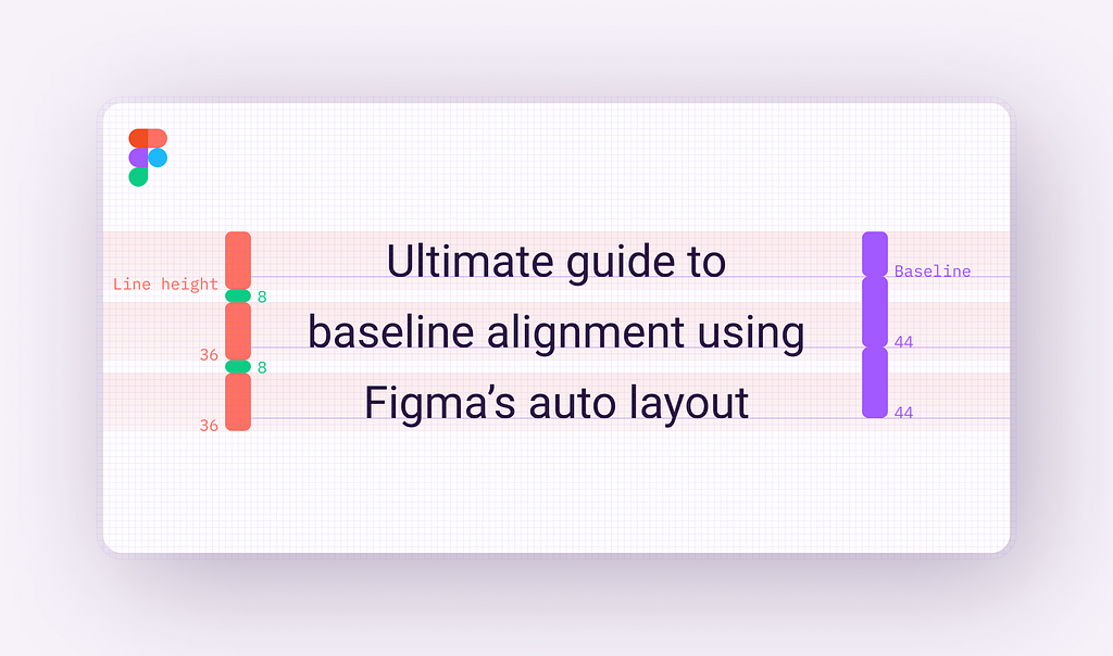
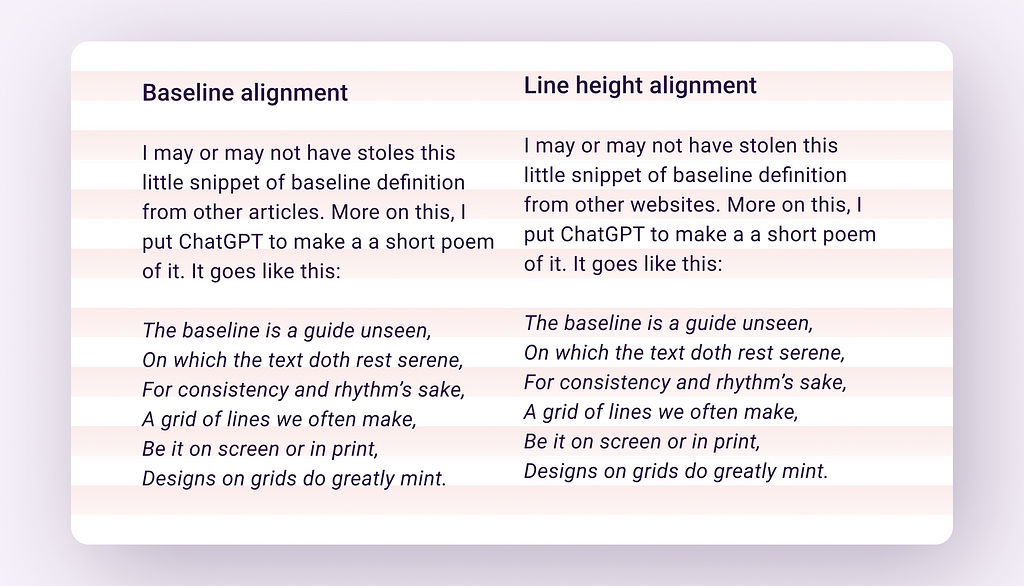
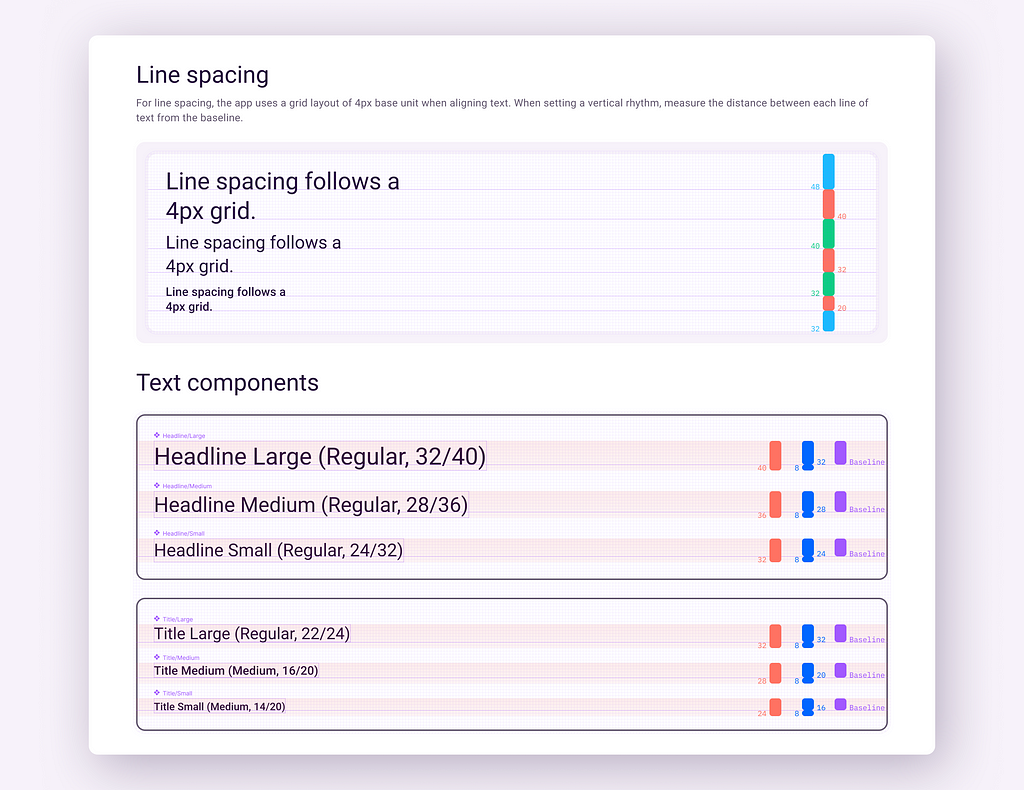
By definition, the baseline can be considered the invisible line upon which a line of text is seated. It plays an essential role in determining the vertical distance between text and other elements in the design.
Baseline grids are also a popular technique for maintaining consistency in layout and establishing vertical rhythm in design. Oversimplified, baseline grids are used to set the distance (leading) between text lines. On the web (and mostly all UI design tools), this distance is calculated using line heights instead of baselines.
There is no correlation between a typeface's baseline and the line height.
The problem
Baseline grids are often specified in design system libraries and kits to ensure that text and other elements align consistently and accurately between them. Two popular design system libraries, Material Design (version 3) and Fluent UI, provide clear and well-documented guidelines for baseline alignment.
However, despite this guidance, baseline alignment is more than often ignored in public UI kits and libraries.
Why are baseline grids challenging to set up?
Files are big and designs are complex. This can be especially difficult when checking thousands of lines of text manually. It’s a tedious job to make sure that the baseline of each text element falls on the grid.
The process is difficult to set up and most of the time not important enough for the purpose of a UI kit or design system library. We download UI kits, play with them, and probably detach the components… in the end, nothing relates to anything no more… you know how this usually goes.
The baseline of a typeface is also specific to the typeface itself, making it challenging and time-consuming to align text elements across multiple typefaces. It needs to be done for each of them.
The solution
Wrap text elements in components with auto layout. Use vertical trim to cut the vertical space that’s above and below the text. Add some vertical padding, and that’s it.
The resulting components will then be included in the design system library. The use of these components will be documented, similar to other major components in the design system.
So, without any further ado, let’s jump straight into it.
Getting started
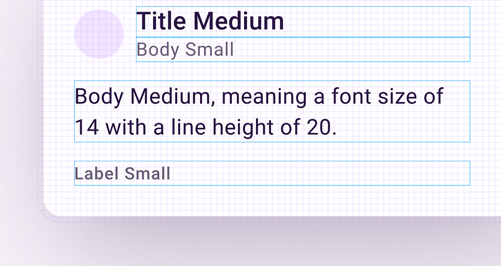
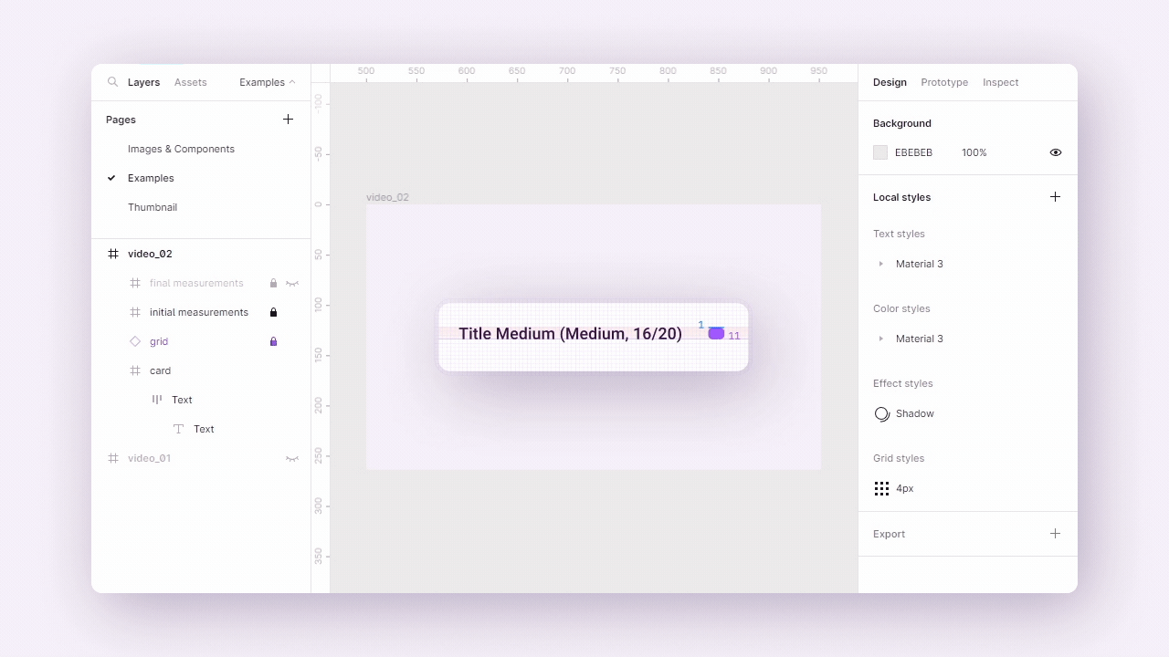
Since I mentioned Material 3 earlier, let’s continue with some text styles from the kit. This will help us have a better understanding of how everything works (while also having the examples supported in Material).
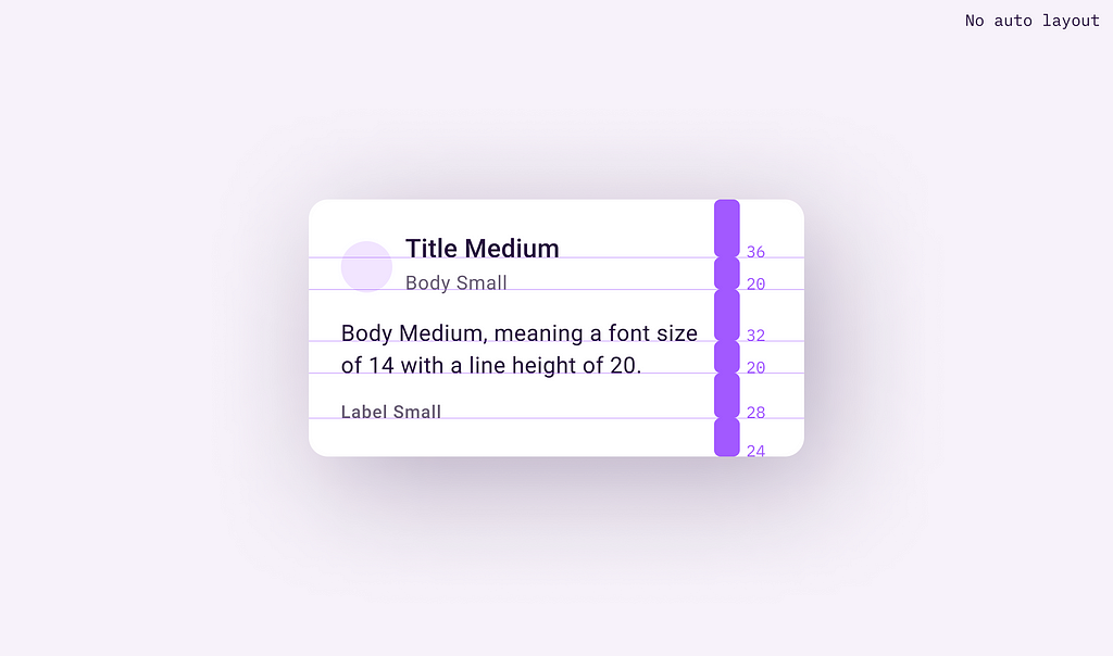
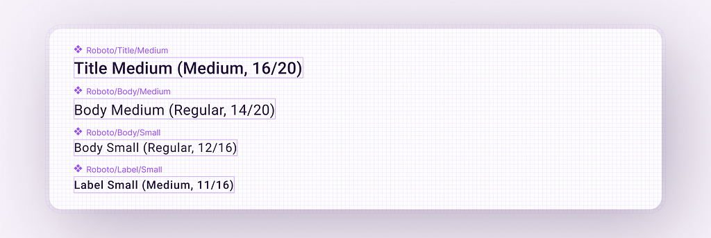
We’ll start with four basic styles from the Material 3 kit: Title Medium, Body Medium, Body Small, and Label Small.
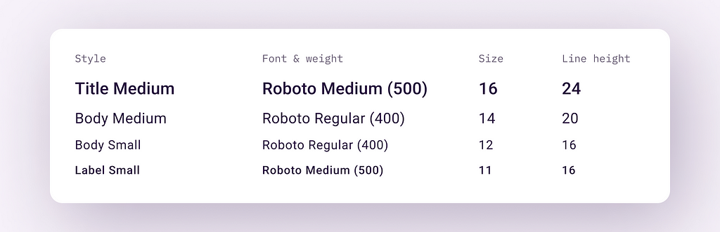
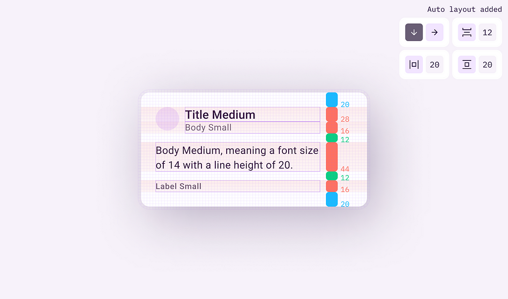
Leveraging auto layout, we’ll create a simple card using these styles. We’ll use a similar layout to the one used in the Material 3 typography guidelines. We’ll align everything to a 4px grid. Each value for padding, the distance between elements, and line height will be multiples of 4px.
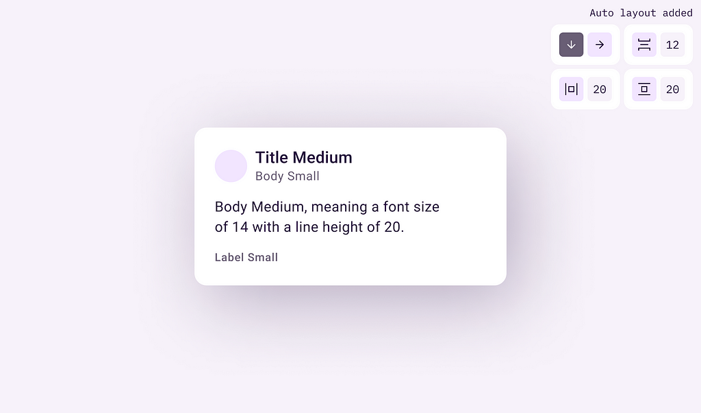
Putting this under the 4px grid, we can see that every element perfectly aligns with it.
Now, we will map every padding value, line height, and spacing between elements to understand and visually see how much height each represents.
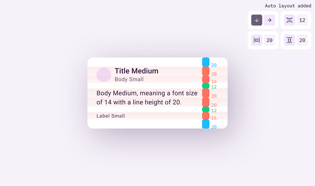
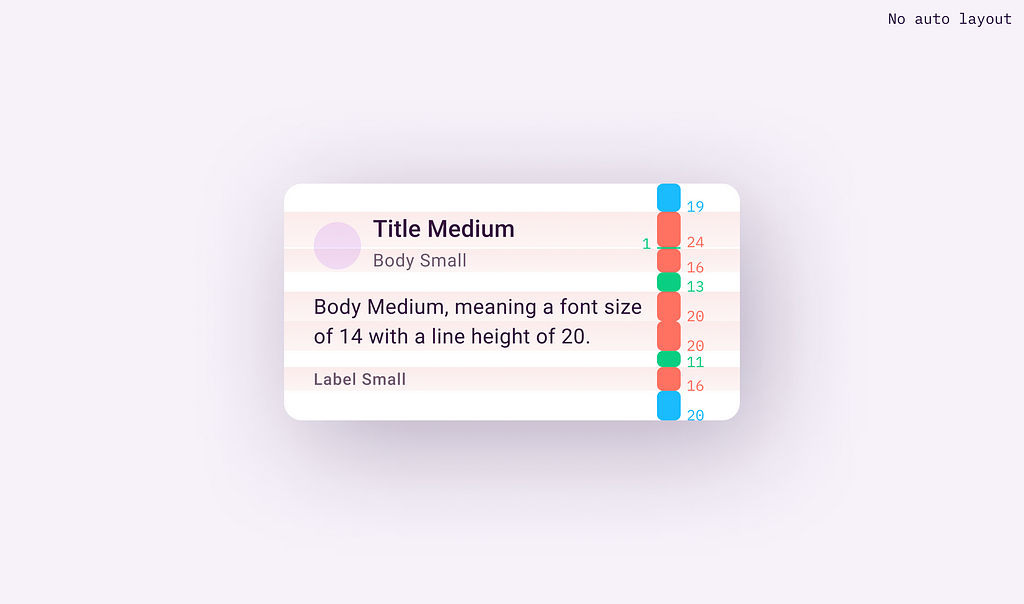
Shifting our focus away from the distance between elements and spacing, we’ll move on to the distance between baselines. This will allow us to understand and see how baselines are distributed between the elements and their alignment on the grid.
Putting this under the grid, we can see that, while everything is indeed aligned on the 4px grid, the distance between the baselines is pretty random.
That happens because, even if the font size and line height are multiples of 4px and so they fall on the grid, it’s not guaranteed the baseline will also fall on it. In most cases it doesn’t, and when it does it’s simply coincidental.
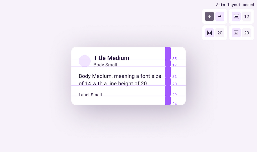
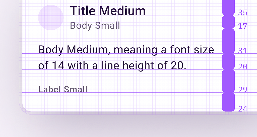
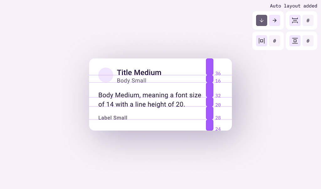
Continuing with the same Material 3 example, we see that the suggested distances between baselines are multiples of 4px (32px, 20px, and 24px). We’ll try to place the text elements in a similar manner.
Now the baselines are on the grid, but we had to manually shift the text elements for them to be like that.
This generates two important problems: we lose the auto layout feature, and it takes a ton of time to do this for each text element.
With baselines manually aligned on the grid, the other measurements will then be affected.
Adding additional top and bottom paddings as a solution
Now that we have a pretty good idea of what the issue is, let’s jump into solving it.
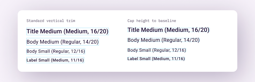
The first step is to set the vertical trim of each text element to cap height to baseline. This will completely trim the vertical space around the element, leaving only the text (glyph).
Next, we’re going to wrap each of these elements in components with auto layout.
By adding auto layout, we have the necessary control over the top and bottom paddings of the newly-created text components. Padding will be used to shift the text element inside the component and force its baseline to fall on the grid.
We’ll start with the Title Medium text style from this list. The baseline distance is calculated from the top and bottom of the total glyph height, which measures 11px. Putting this element under the 4px grid, we can see that the closest grid line is located 1px after the font’s baseline.
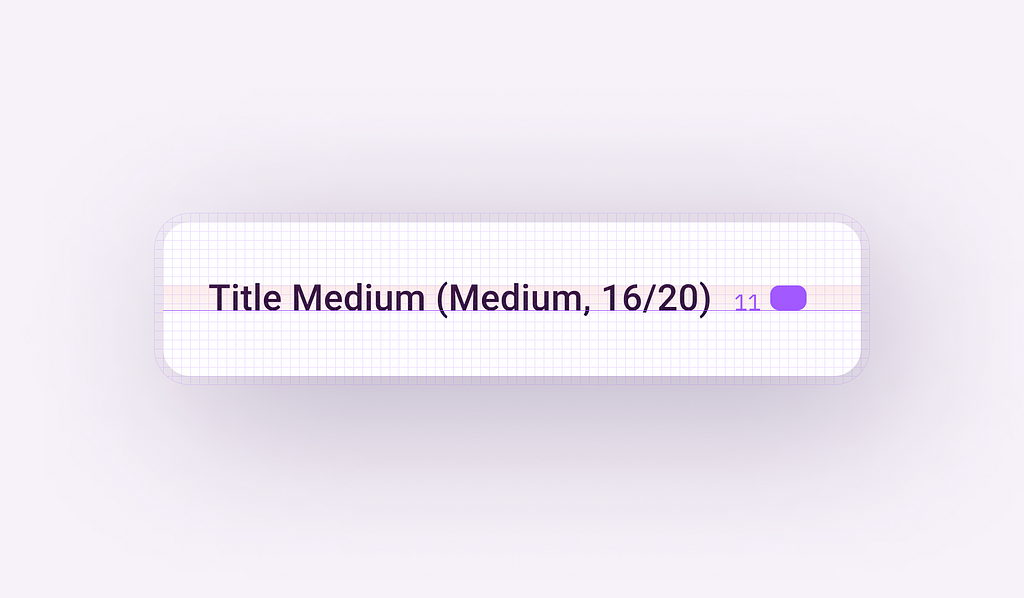
Therefore, using the top padding in the auto layout feature, we will add 1px on top to shift the baseline on the grid.
Why? Adding 1px on top will bring the whole text down, so in the end we’ll have a total line height of 12px.
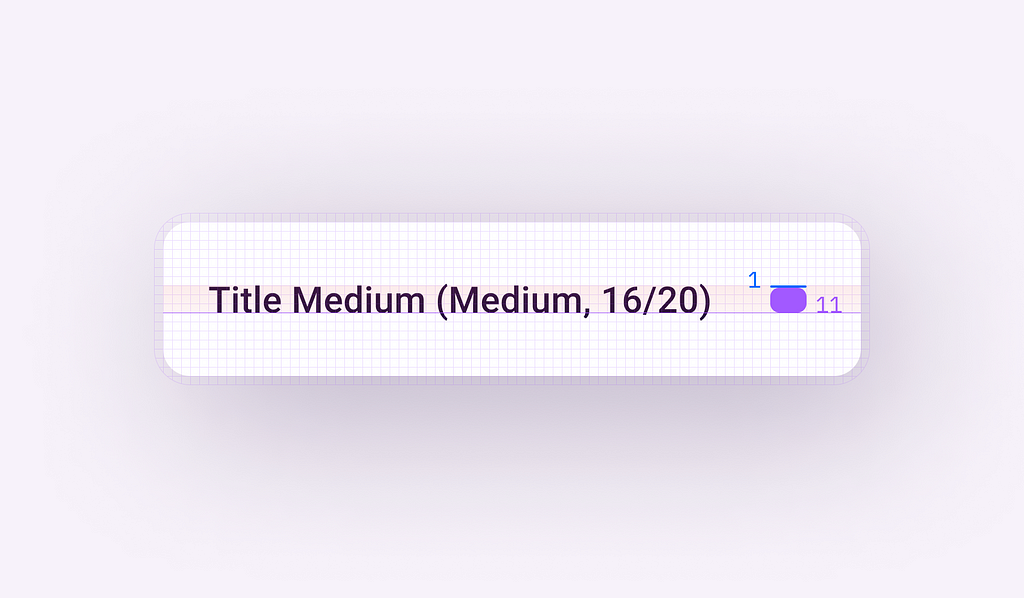
Now, both the line height and the baseline align perfectly with the grid.
Here’s a recap of the complete process:
The next step is optional. We can leave our newly created text component to have a total height of 12px, or we can tweak it further in order to match the actual line height of the text style (20px in our example).
To do this, we simply need to add 4px more on each side of the text component (because, you guessed it, 12px + 4px + 4px = 20px).
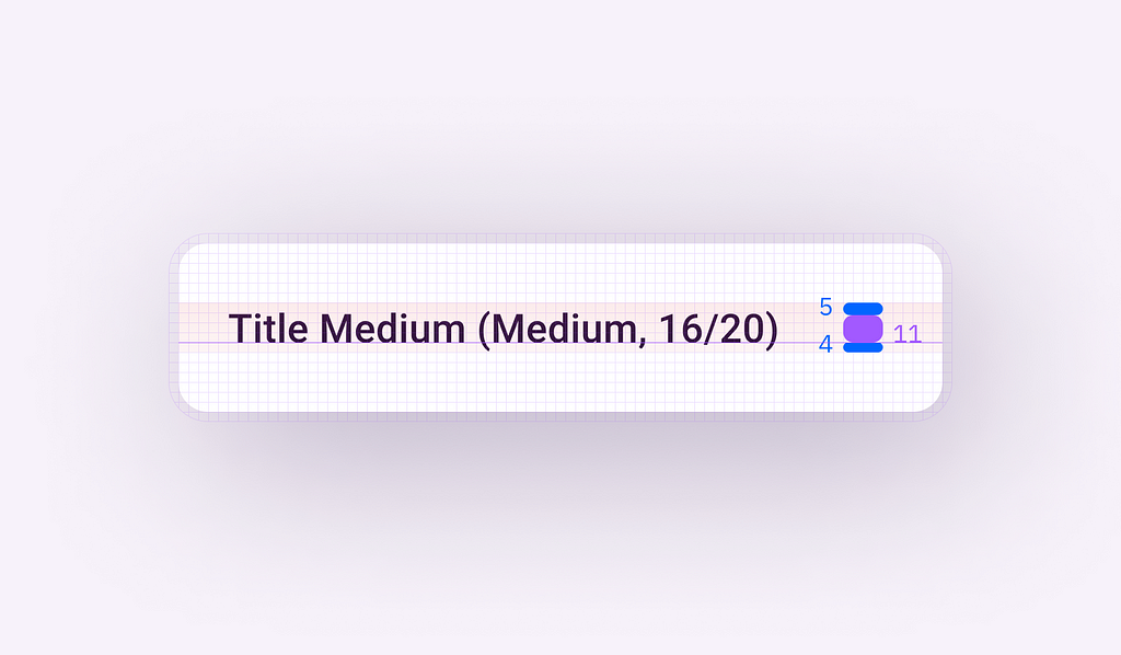
Like this:
Confusing? Not really. Weird? A little… not your typical flow for working with type, right?
We can continue doing this for the rest of the remaining text components: Body Medium, Body Small, and Label Small.
Now we should have a set of text components with auto layout, and top and bottom paddings adjusted. Time to put these to use!
Using the components
Using these components instead of simple text styles, we will recreate the same layout from before, allowing us to see the benefits of this method.

As you can see, now everything automagically falls on the grid. The distance between fonts, paddings, and line height are all aligned to the defined 4px grid, while still preserving the functionality of auto layout.
Using the same text components, we can create more complex layouts and alignments. Everything flows perfectly into a harmony of obsessive-compulsive multiples of 4px.
Keeping it organized and ready for future updates
Usually, when I work with a file like this, I simply design a new frame, where I explain how the method works and I provide guides for the alignment.
This is usually divided into two parts. The first part explains the vertical rhythm, how it works, and some examples.
The second one includes the actual text components with the paddings added. We keep the master components like this, so in case a font gets an update and its original baseline gets modified, we can come here and quickly correct it. Numerous text lines that before required manual adjustment, are now all managed from these master components.
Here’s the file with everything presented in this article, including the examples, library, and guidelines. You can just duplicate and save yourself a copy to play with.
On implementation and future of the approach
There could be multiple options to implement this. Some options can either be similar to the approach here, maybe tweaking the React library of text styles to react (pun intended) the same as the method showcased here.
For web, a great way to do this is to use Capsize, it trims the space above capital letters and below the baseline.
There’s a suggested new CSS property called (for now) text-box-trim that allows you to trim the leading off a text box without cutting off the text. It’s similar to Figma’s implementation of vertical trim.
The downside of the approach
- One of the drawbacks of this method is that you can no longer use simple text layers. Instead, you have to get used to picking your font container from the list of components.
- The method is typeface-specific, so you need to manually adjust the baselines for different typefaces. If you decide to change the font, you will have to revisit the offsets. Luckily, it will be easy to perform with a design system where ideally there is a single main typeface.
- The rendering of typefaces can vary between design and implementation. Implementing this method will depend on each team’s preferences and the existing implementation of design systems.
Acknowledgments
While doing my research for this article, I discovered more or less similar approaches and workarounds for managing baselines in UI design.
In no particular order, here are some other great articles and resources that tackle the same subjects:
- Baseline grids & design systems, written by Dmitrijs Ginkuls
- The padded grid, written by Francois Denavaut
- The 4px baseline grid, written by Ethan Wang
- Leading-trim: The Future of Digital Typesetting, written by Ethan Wang
- Baseline Grids with Auto Layout, session by Figma
Ultimate guide to baseline aligment using Figma’s auto layout was originally published in UX Collective on Medium, where people are continuing the conversation by highlighting and responding to this story.
Leave a Reply