Understanding levels of linguistic change can help designers in an era of uncertainty

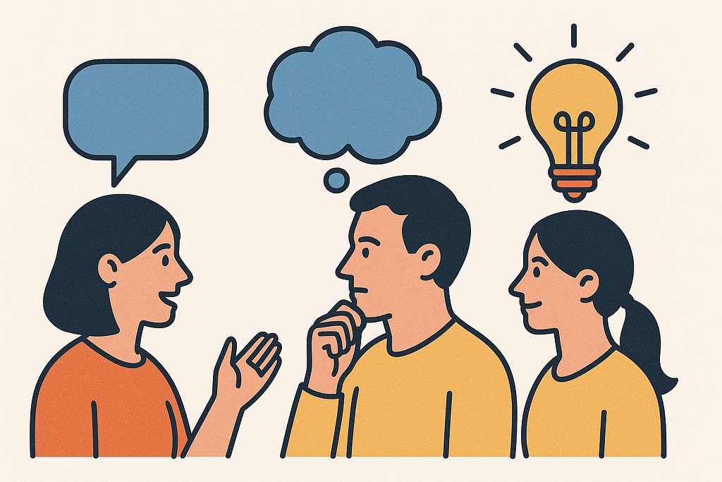
Design is rapidly changing. From the ubiquity of AI (and the era of AI hardware) to the shift in modality (Apple prioritising design elements from visionOS), there is a lot of uncertainty.
It’s important to remember that design is a language to navigate it.
This is, perhaps, rather obvious: the primary function of human language is communication, and that is precisely what we use design for — to communicate information to the user.
But that’s not all there is. Natural language is not just a communication tool, it’s also a cognitive tool which we use to structure our thoughts, create nuanced concepts, and augment our imagination and creativity.
Just as design is not simply a tool for creating nice-looking buttons — it informs our relationship with technology and, by extension, the world. Understanding the relationship between the properties of language and their design counterparts is not trivial, it is essential for bringing about more thoughtful changes in our relationship with technology.
All human languages consist of several building blocks that have their design counterparts.
1. Semantics
Semantics is what we usually think about when we think about language — it’s the relationship between symbols (i.e. words, particles, suffixes) and the meaning we associate with them. It’s how we all agree that “dog” refers to furry creatures that woof and like belly rubs.
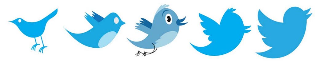
Design, of course, has its own complex system of symbols (shapes, colours, typography, etc.) that make up meaning. Perhaps the most obvious analogy would be icons: we don’t need to think twice to know that an icon with a paper plane means “send message”. And while some icons actually visually depict the action (or a metaphor for that action) they represent, it is not always the case. There is nothing inherent about three horizontal lines that would indicate “expanding menu”, yet this is exactly the meaning we came to associate with it. How do these latter meanings come to be? Is there something innately intuitive about the icon we use for a hamburger menu or is that simply a convention?
And anyway, why is this important?
Both language and design change all the time (case in point — Liquid Glass), and the most immediately observable change tends to happen at the semantic level — through the introduction of new meanings or alterations to existing ones. Sometimes it’s really subtle: app icon updates are sometimes barely noticeable in the moment, but we still update the mental link between the brand and its visual representation. Other changes (like the iOS7 flatification) feel more significant.
We adapt to semantic changes extremely well. We might grumble about words being used “incorrectly” or about the layout of our favourite app not making sense, but we adapt to the new patterns before we realise it.
Why? Semantic change does not require a lot of cognitive load. We map new meanings onto existing structures — whether the Control Center menu uses background blur or Liquid Glass, it is the same familiar element of the interface.
In other words, when we adapt to semantic change, we don’t have to rethink the structure we’re used to — and in language, as well as in design, structure provides the very architecture that allows for meaning to emerge. Which brings me to —
2. Syntax
While meaning is something we typically associate with words, they need to be put together in a specific way to make sense. Language needs structure — or syntax.
Syntax is precisely what makes the sentence “Mary saw John and Bill” different from “John saw Bill and Mary” — they have all the same words, but the structure is different.
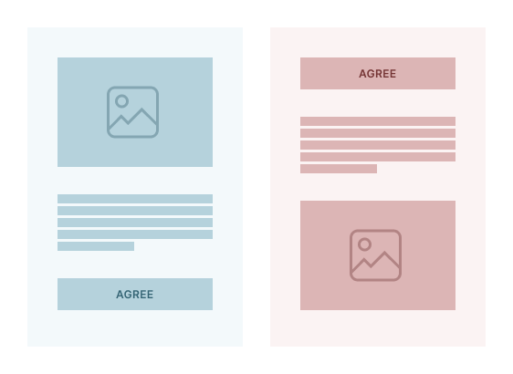
Similarly, design elements have structure: for example, in a typical card design, the call-to-action button is usually located at the bottom, as the context for that button needs to come first. Placing a button that says “Agree” at the top would be nonsensical since the user doesn’t even know what they are agreeing to.
Sounds reasonable, so… why is this important?
With language, structure is what helps us learn meanings of new words. If we were taking a walk and I suddenly said something like “Oh no! I think I left my ronkle at home!”, you probably wouldn’t know exactly what a ronkle is (since I made it up), but you would be able to infer that it’s some kind of portable object—because of how I used this word in the context of a sentence.
Structure also helps us process semantic design changes. You can sort of see it with Apple’s iOS 26 and the introduction of Liquid Glass — the controls look very different from how they used, but you can’t make a mistake about what they are because structurally, they remain unchanged.
In fact, syntactic changes are much slower than semantic ones. Think about the evolution of English, that used to have a robust case system — but not much has changed with how we use English grammar over the past 100 years. Similarly, the syntactic evolution of modern interfaces—the structures we use to moderate our relationship with technology—is slow. The “desktop” metaphor has been in use since the introduction of modern GUIs.
Substantial change at the syntactic level tends to happen out of necessity — like the introduction of multi-touch technology. These devices required a new language for interacting with them — and so we created a grammar of gestural interactions like swiping, pinching — all associated with an expected outcome.
But syntactic change doesn’t need to only happen when it has to. With language, we learn the grammar rules in school, but then bend and twist them all the time to be more fun and expressive. What are the fun ways we can bend the syntactic rules of design to be more creative?
3. Communication and pragmatics
I said in the beginning that one of the essential functions of language (and design) is communication — and that is not possible without actively thinking about the interlocutor, our shared context, and any potential misunderstandings. Pragmatics is what makes it possible to use word play and humour, be sarcastic: we say things that are literally false all the time (“I’m so full I won’t be able to eat for a week!”) and yet we’re perfectly able to understand each other.
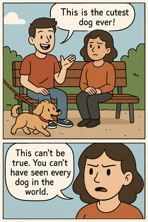
Suppose I told you about the lecture I was excited to attend, so the next time we saw each other, you asked, “How was the lecture?” and I said “Well… The free food was great.”
Why am I talking about the free food when you asked me about the lecture? This should not make any sense. But of course, when we communicate, we assume that our interlocutor is contributing somewhat meaningfully to the discussion, so that statement about food must be somehow relevant. And following that logic, you can conclude that since the best thing they thought to mention about the lecture was the free food, the lecture itself was probably not so great.
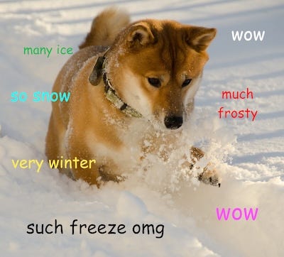
Pragmatics makes language fun because we don’t walk around only using it super literally or correcting someone every time someone says they saw the cutest dog ever.
Why is this important?
Pragmatics is everywhere in design. We use a different colour for the primary action button to guide users’ attention, change the shape of the cursor to indicate what action can be performed, add handlebars to UI elements to indicate you can pull them… The list goes on and on.
Pragmatics is also what makes design innovation possible — why we can show the user how something works without explicitly instructing them.
One of my favourite examples of this is the cursor reveal interaction—where a website appears completely blank at first, but elements start to appear as the user moves their cursor around.
This works because we assume that a website probably contains something other than a blank page, we assume the interaction has already started, so we make our move — by dragging the mouse.
Ok, so design is kind of a language… so what?
I started by saying that language is a cognitive tool: it has the capacity to shape broader cognition through providing a hierarchical structure that underlies a lot of human cognitive abilities—from enhancing our ability to navigate our surroundings to reasoning about complex abstract properties.
Design has that capacity too — to make something possible, we need to design it first. We couldn’t make applications we use today before designing the tools to build them — couldn’t even interact with technology in the way we do every day without inventing GUIs.
But unlike language, we purposefully invented the design systems we use—and while tools can help expand what’s possible, they can be constraining, too. For every tool we use, there is something we are not using. By sticking to the design structures we use, are we constraining the way we can interact with technology—and what it can do for us?
And if that’s true… how do we look for new patterns?
There isn’t one single answer to that question, but I think there is a possible direction: big impactful change needs to happen at the syntactic level. While semantic changes (new icons, visual styles) help us evolve our aesthetic sense, and use of pragmatics helps add delight to common interactions (like cursor reveals), it’s the syntactic shifts that fundamentally alter what we can conceive of doing with technology.
Just like having the capacity to learn language gave us access to the syntactic architecture that expanded our cognitive abilities, design syntax gives us the structure that organises our own thinking about what’s possible. The desktop metaphor taught us to think about data in terms of files and folders, touch interfaces shifted our perception of what kinds of interactions were possible by introducing gestures as a new syntactic element.
What else could a design language teach us to do?
Design is a language was originally published in UX Collective on Medium, where people are continuing the conversation by highlighting and responding to this story.
Leave a Reply