Memory, more than just memorizing

This series explores how cognitive ergonomics — a field that blends psychology and science — helps us understand how people take in, process, and respond to information.
Today’s topic is memory — a concept that’s crucial to understanding how we interact with the world around us — from remembering names to finding our way home. In the world of UX design, memory plays a pivotal role in helping people navigate and enjoy digital spaces. It is closely related to another concept, attention.
In this article, I hope to:
- Define the different types of memory,
- Dive deeper into how memory relates to common UX concepts, and
- Applications of these UX concepts in design
What are the different types of memory?
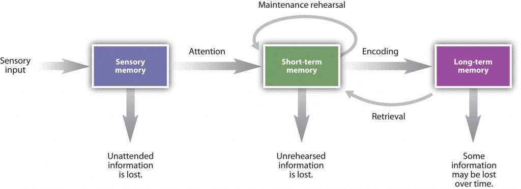
According to the “multi-store model,” there are three types of human memory:
- Sensory memory
- Short-term (or working memory), and
- Long-term memory

Sensory Memory
Sensory memory holds brief impressions of everything we see, hear, and feel, but only for a moment. We tend to ignore or forget most of this information. If something catches our attention, it gets passed on to short-term memory for further processing.
In UX design, sensory memory is why quick, intuitive visuals (like icons or colors) are so effective. For example, a red error message immediately catches our attention before it is consciously processed by other types of memory.

Short-Term Memory
Short-term memory holds limited information, usually for about 20–30 seconds, before it fades away or transfers into long-term memory.
In UX, this means that if we expect users to remember too much information, they’re likely to forget things or become frustrated. Keeping things simple and easy to remember is key.
A key concept related to short-term memory is chunking.
Chunking
Chunking refers to breaking down complex information into manageable “chunks”. This can be applied to specific UI elements, or to the overall flow.
At a UI-level, example of chunking can use Miller’s Law, which states that average person can only keep 7 +- 2 items in their working memory.
For example, two-factor authentication would be a lot more frustrating if it asked for a 12-digit code with no space instead of 6-digits broken down into 3-digit chunks.


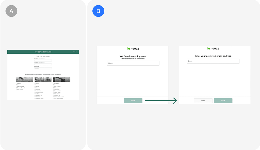
At a flow-level, chunking can be used to break down complex tasks into smaller steps. In the case of Houzz.com, they saw an 15% increase in conversion rate when chunking contact information (name, email, phone number) into three separate screens than on one page.

This shows how something as simple as breaking down complex information can lead to real-life results.
Long-Term Memory
Unlike short-term memory, long-term memory stores information for a long time. It builds through repetition and familiar patterns.
UX designers can use long-term memory by creating consistent layouts or icons, so users learn to recognize them over time. This way, users won’t have to “relearn” how to use your design every time they visit.
Key UX metrics related to long-term memory are learnability and efficiency. How fast can users use the system the first time and how fast can they get better at using it?
Jakob's law can help with improving learnability and efficiency.
Jakob’s Law
Users spend most of their time on other websites, so they expect your site to work like all the other sites they already know.”
This one is closely related to learnability. Common design patterns and by extension, design systems, help users use new systems (apps, websites, etc.) quickly. This is because they already have an existing mental model as to how something should look and function within their long-term memory, and they’re able to pull this information quicker.
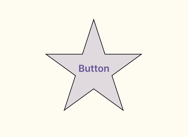
A simple example is a button. A primary button is usually rectangular and has high emphasis, like colour fill and shadow. A star-shaped, dull-coloured button may not be perceived as a button for users. It may take some time for them to figure out that that “thing” is a button and is interactive.


Finishing notes
You may have noticed by now, but these concepts don’t exist in a vacuum, and must be thought in a systemic way to improve user experience.
Let’s use an example of booking a stay on Expedia.com
Sensory memory — user may see the Expedia logo, helping them recognize they’re on Expedia.com. They may also see fields like “Where to”, “Dates”, and “Traveler”, which triggers their short term memory.

Short term memory — once user clicks on “Where to?”, the form suggests a list of popular destinations. If their destination is included in this list, this saves them the effort of remembering where they wanted to go.

Long term memory — if they have booked stays before, they may already come to this site with pre-conceived notion of what’s expected (where, how long, how many people). They may be able to go through this flow more efficiently by remembering what to input before even coming on to this website.
I hope you enjoyed the read! If you want to learn more about memory, check out these resources:
- https://www.nngroup.com/topic/memory/
- https://en.wikipedia.org/wiki/Atkinson%E2%80%93Shiffrin_memory_model
- https://www.interaction-design.org/literature/topics/cognitive-load
5-minute cognitive ergonomics: memory was originally published in UX Collective on Medium, where people are continuing the conversation by highlighting and responding to this story.

Leave a Reply