No doubt, prioritizing mobile-first is essential, but it’s not a one-size-fits-all solution and can, in some cases, even hurt the desktop experience. Without careful adaptation, the mobile design mobile can frustrate desktop users and impact overall engagement. Learn how to balance a seamless experience across all devices for maximum impact.

The mobile-first approach prioritizes designing websites with mobile users in mind before scaling up for larger screens like desktops and tablets.
This methodology has grown in popularity due to the explosion of mobile device usage worldwide. However, while it’s critical to cater to mobile users, this approach may inadvertently hurt your desktop user experience if not handled thoughtfully.
With more than 7.26 billion mobile users, it makes sense why websites are leaning more toward a mobile-first approach in designing and optimizing websites.
As per the NN/G study, the data showed that 63% of users use navigation on mobile, with the main takeaway being that desktop platforms had even lower navigation activity. The increased navigation usage on mobile compared to desktop is not because mobile sites had exceptional navigation designs but because desktop interfaces were poorly optimized. These desktop designs suffered because they were adapted from mobile-first designs, prioritizing mobile usability at the expense of the desktop experience.
But what if mobile-first design, which seems to be the ultimate solution to the current web development, is silently killing the desktop user experience? What if it’s dragging the website’s performance and not letting it achieve the growth it is supposed to have?
To answer and have a clear understanding of this, here is everything you should know.
Why the always mobile-first trend needs a rethink
When it comes to web development, choosing between mobile-first and desktop-first is a debatable option. However, we have always been told that mobile-first is the best approach.
After all, it makes sense. According to a report, 92.3% of users usually go online by accessing their mobile devices. Since this massive audience segment is mobile-based, it’s right to think that the website should be designed to generate more traffic by prioritizing the mobile UX first.
As with everything, there is no such thing as a guaranteed solution for all problems.
And blindly following the trend comes with setbacks such as:
Content dispersion
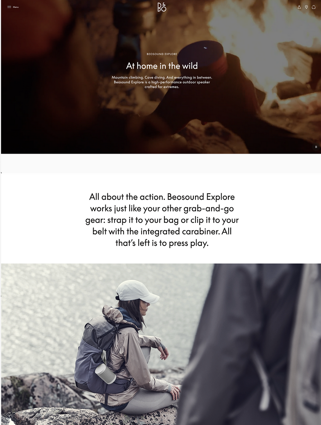
A common issue with mobile-first design is content dispersion. This is where content feels too stretched out on larger screens. Usually, this makes users scroll more, eventually creating a disjointed and frustrating experience.
Such websites are primarily designed for mobile users, so when the user accesses the website from their larger screen, whether it’s a desktop or tablet, the content appears stretched and out of the fragments. Due to this, the users have to scroll more, and finding content gets much more hectic. And this is definitely noticeable for the users, and the overall experience might look sketchy.
Oversimplification of the features
Another drawback to consider is the simplification of the features that are used to maximize space and create a cleaner design on mobile screens. However, for larger screens, this strips away key features for desktop users, making it challenging to find the features and leading to less engagement.
Here’s an example:
Current (desktop): A hidden hamburger menu forces users to search for navigation options, resulting in frustration.

Suggestion: (desktop): A visible horizontal menu gives immediate access to important categories, reducing friction.

Increase in cognitive load
The mobile-first approach certainly simplifies the UX for smaller screens, but it can actually increase the cognitive load when scaled to larger devices like desktops.
Cognitive load refers to the mental effort required to find and process a piece of information. When designs are optimized solely for mobile, desktop users may have to scroll excessively or deal with fragmented content. This lack of optimization makes it harder to navigate, ultimately frustrating the user. Eventually, this leads to longer pages in height.
This is quite the opposite of the user-friendly design. Therefore, it’s clear that mobile-first isn’t the perfect solution. While it’s excellent for mobile users, it can spoil the overall UX without well-thought-out adjustments for the desktop.
Reducing the overall functionality
According to a Google study, a site that loads slowly has a higher bounce rate, which can cause the user to switch to a different website or abandon it.
Starting with a mobile-first design is often preferred to optimize site speed. One effective way to achieve faster loading times is by stripping away non-essential features. For instance, on Airbnb’s desktop version, there are multiple filter fields for location, dates, and number of guests, while on mobile, these are combined into a single field that opens a pop-up when clicked.
However, problems emerge when mobile designs are identically transferred to desktop without adapting the designs. While simplifying features for mobile works well to improve speed, directly reusing those designs on desktop can lead to poor user experience.
In Airbnb’s case, the mobile version combines the filters into one field, which works well on small screens. But if the same design were used on desktop, it would frustrate users who expect more immediate access to information on a larger screen. Airbnb avoids this by tailoring its desktop and mobile designs differently, which is the right approach.
Unfortunately, many designers fail to make this distinction and mechanically transfer mobile layouts to desktop, causing friction in the user experience.
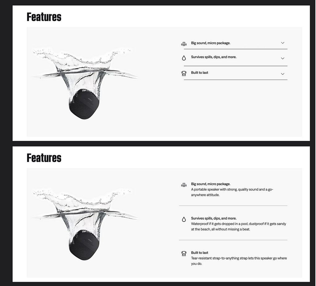
Another aspect of this problem is using only mobile-friendly components. For example, the accordion component is perfect for mobile versions. It helps us to hide more than half the information and lets the user decide which information to display. However, using an accordion to display features on the desktop will make the user click unnecessarily.
Example:
Lack of space for information
The minimalistic approach suits the mobile design to make the website look more cohesive. However, this leads to adjustments according to the space available on the screen. The lack of space in mobile might require trimming content to preserve the space.
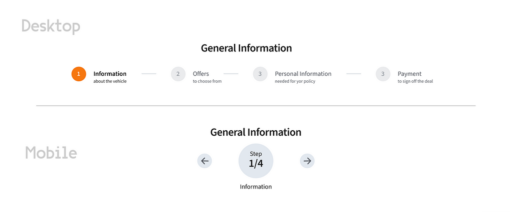
For example, if there are step numbers, this has to be in a shortened format to fit the mobile screen and the available space.
However, when on a larger screen, like a desktop, it allows more space for these steps to be explained in much more detail. Imagine the name of the step and the actions that the user needs to perform.
So the bottom line is that If you start with the mobile-first approach and don’t adapt it to the specific desktop needs, this will cause a missed opportunity to add more information that could benefit users.
Desktop vs Mobile Navigation
When does a desktop-first approach make sense?
Since always blindly following the mobile-first approach is not the solution, it brings us to the next question: Which is for whom?
Suppose you prioritize a Desktop first design. It is for you if you have:
- Complex, Data-Heavy Websites — Sites like enterprise applications or CRM systems benefit from the additional screen space that allows for detailed data display and advanced features.
- Visual/Content Heavy Websites — Sites such as Behance or portfolio platforms that showcase rich imagery and design should be designed for desktops’ first experience to ensure image quality isn’t compromised.
- Desktop-Centric Users — If your primary audience consists of professionals, such as office workers or designers, they are more likely to use desktops. Examples include Jira, Confluence, and business management tools.
- When User Base Are Diverse — For example, if the website is eCommerce, it will require more balance as different users might access the site via various devices. This means the design should be suitable for both mobile and desktop while leveraging the device’s strengths.
- When Website Requires Quick Access — This refers to websites that often require quick access, regardless of which devices are used. For example, if your site is for educational purposes, it might require more information more efficiently, providing interactive features for your users.
Tips on making sure desktop experience isn’t compromised in mobile design
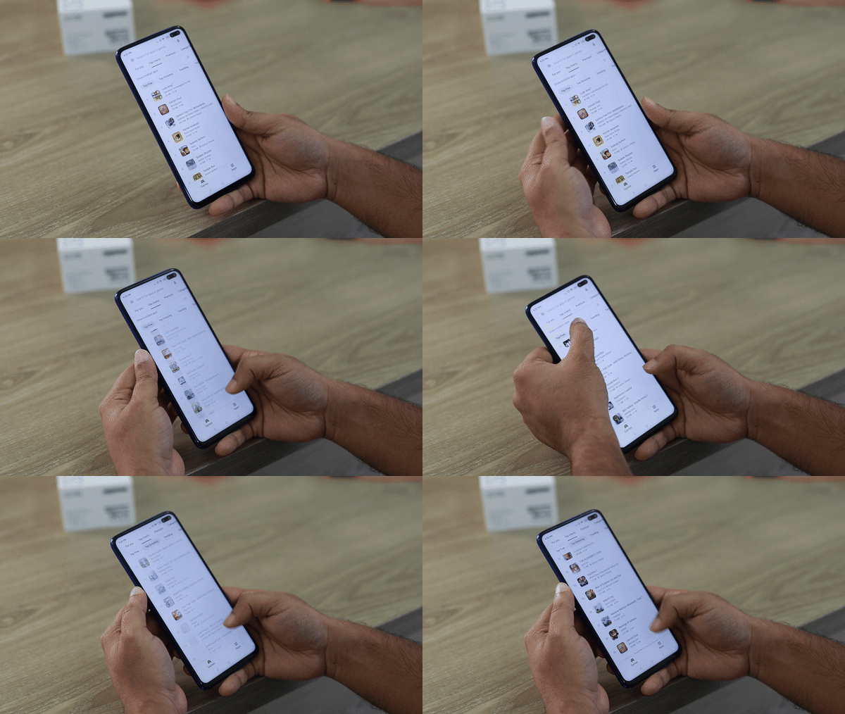
While making sure the desktop experience isn’t compromised even if the design is prioritizing mobile design, here are a few tips to help you out:
1. Responsive/fluid design is your friend
The responsive and fluid design ensures that the website updates as per the devices. With a flexible grid and more fluidity in layouts, the site can maintain its integrity on large and small screens.
Here, the focus should be on determining which elements are important for both devices to be easily accessible.
Consider the elements of HI (Hierarchical interface), which can also be strategically placed to enhance the user experience.
The visual hierarchy, including headings, subheadings, appropriate spacing, and more, creates a clear cohesiveness, helping to organize the important information and reduce the scrolling exhaustion.
Prioritizing the high traffic or frequently used function is for a more accessible location or to the top, like the top of the sidebar or in primary menus. Besides this, similar qualities or content can be grouped together to make navigation easy through categories. — The Gestalt Principles
For example, the CTAs button should be placed next to the relevant information to provide better user engagement. Here, the Z patterns and F pattern layout can be used to align with natural reading, especially Western reading habits.
2. Simplify but keep the depth in navigation
Mobile navigation is often overly simplified to optimize the space, but it should not be a shallow navigation structure in case of using it via desktops, laptops, or larger screens.
Having expandable menus or mega menus balances both.
A simple yet deeper navigation allows desktop users to explore easily without being overwhelming for mobile users.
Adding features like breadcrumbs or a secondary navigation bar helps enhance larger screens while being clean and straightforward for mobile design.
3. Never skip on doing more user research
Ok, this isn’t something new to you, but it’s really important. The more research you do, the more you will understand your users and their habits, and by doing so, you will:
- Start designing with their preferences in mind.
- Find the potential risks and issues that can lead to your site failing to work on its potential.
- Make sure your website looks, works, and feels the same regardless of the screen size, offering flexibility and ease to multiple device users.
So don’t skip it!
A case to learn from — Adobe Flash

Adobe Flash was one of the names dominating the technology industry due to its rich web applications, which are centric to desktop users.
However, as mobile devices started to gain popularity, the company switched its website to mobile users without altering designs. This caused a poor experience and performance on both platforms. While it does have a robust desktop experience, the mobile devices lacked the support.
The failure of Flash on small screens impacted the users, where HTML5 emerged as a better option, which led Adobe to discontinue its support for Flash.
While the company had the best in their respective industry, a lack of attention to their user experience led to the downfall and unsatisfied customers.
The important point to remember is that both mobile- and desktop-centric approaches are indeed not a complete solution. It depends on factors that have been explained previously.
Conclusion
In today’s multi-device world, adopting a “one-size-fits-all” design approach is no longer sufficient. Instead, focus on a responsive, user-centered design strategy that optimizes the experience for both mobile and desktop users.
Conduct thorough research to determine which will be most used, implement adaptive breakpoints, and continuously test your site on all devices to ensure a seamless experience.
Remember, the goal is not to prioritize one platform over the other but to create a harmonious experience for all users, no matter how they access your site.
Have you experienced similar challenges with mobile-first design? Do you think balancing mobile and desktop experiences is key, or is one platform more important for your users? I’d love to hear your thoughts on how you’ve approached this in your own projects.
💻 Visit my site or leave a comment here and let me know!
Reference Links :
- https://www.softermii.com/blog/web-development-mobile-first-or-desktop-first
- https://www.nngroup.com/articles/mobile-first-not-mobile-only/
- https://www.uxpin.com/studio/blog/a-hands-on-guide-to-mobile-first-design/
- https://www.cnet.com/culture/adobe-abandons-flash-plug-in-for-mobile-devices-report/
- https://raw.studio/blog/navigating-the-pitfalls-of-mobile-first-web-design-a-call-for-balance/
- https://www.uxpin.com/studio/blog/a-hands-on-guide-to-mobile-first-design/
Is mobile-first approach killing your website’s potential? was originally published in UX Collective on Medium, where people are continuing the conversation by highlighting and responding to this story.

Leave a Reply