

Is the owl really as evil as they say?
Over half of Duolingo’s active users have a streak of 7 days or more.
But not me.
I’m one of the users who gets bombarded by reactivation emails and push notifications asking me to come back into the app.
The messages I get are chaotic.
One moment Duolingo acts like clingy partner, the next like a food safety officer.
I knew Duo was erratic, but I didn’t quite realise how much so…
Business Insider recently named Duolingo as the ‘meanest app in the app store’, with others describing it “as ‘psychotic,’ ‘unhinged,’ and ‘abusive’.”
A spokesperson from Duolingo even went as far as to say, “Duo the Owl isn’t above posting a thirst trap if that’s what it takes to get you to do your lessons” when talking about their latest underwear range.
If that isn’t chaotic, tell me what is.
It’s certainly polarising too.
Some people love the backchat. Last year FastCompany wrote about how GenZ is obsessed with the Owl.
What’s clear is that it works for growth.
Duolingo have grown organically since their outset, with 80% of users acquired in 2023 from organic channels. Katherine Chan, Duolingo’s marketing director said last year that:
“A significant amount of our user growth comes from people seeing us on TikTok.”
Which is largely driven by sassy owl content going viral 🦉🦉🦉
In August this year too, their Q2 results showed 59% Daily Active User growth and 41% revenue growth. An unhinged owl works well for them it seems.
What I’m interested in is the impact of this scattershot owl on the user experience. What triggers, language and imagery are used in emails to persuade people back into the app?
We’ll look at the full welcome email sequence from Duo, and answer:
- What’s the cadence of emails? Does this change over time?
- How their ‘this isn’t working’ emails work (or don’t)
- The messaging used to motivate me back into the app, and how this changes (more like descends) throughout the 20 days
- The template they repurpose to generate 100s of email variants
First, where it all started.
From emotional blackmail to mouldy messaging
One of my favourite Medium pieces of all time — and one that inspired me to start writing — is on Duolingo’s early email experience.
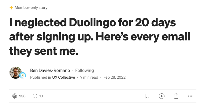
In 2022, my friend Ben Davies-Romano, now Head of UX and Content Design at Klarna, analysed every single email from Duolingo in their 20 days since sign-up.
Ben noticed how ‘keep the owl happy’ language was used throughout the early email flows, and said:
It began to feel like some sort of paternalistic blackmail designed to break my motivation, the green owl equivalent of saying “I’m disappointed in you for not learning like you said you would.” Overly dramatic? Absolutely.
What’s interesting is I think they’ve toned it down (at least in the emails).
I see no copy that asks to keep Duo Happy anymore.
Instead, the themes I see are (in order of appearance):
- A push towards streaks: 3 of 4 of the first emails mention streaks in the top of the fold of the emails — aiming to to reduce time to value and get people into the high-retention features 🧠 plays into Loss Aversion of not wanting to lose a streak
- After streaks, Duo pushes ‘quick’, ‘short’, ‘3-min’ lessons: following an activation moment, they hone in on the friction of ‘I don’t have time’ by highlighting how easy lessons are.
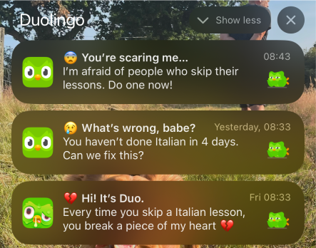
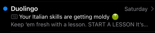
- Lastly, the low-balls: the direct question ‘are you over learning?’ as well as ‘your skills are getting mouldy’ really hits where it hurts. These aim to invoke an emotional response to get you out of your rut
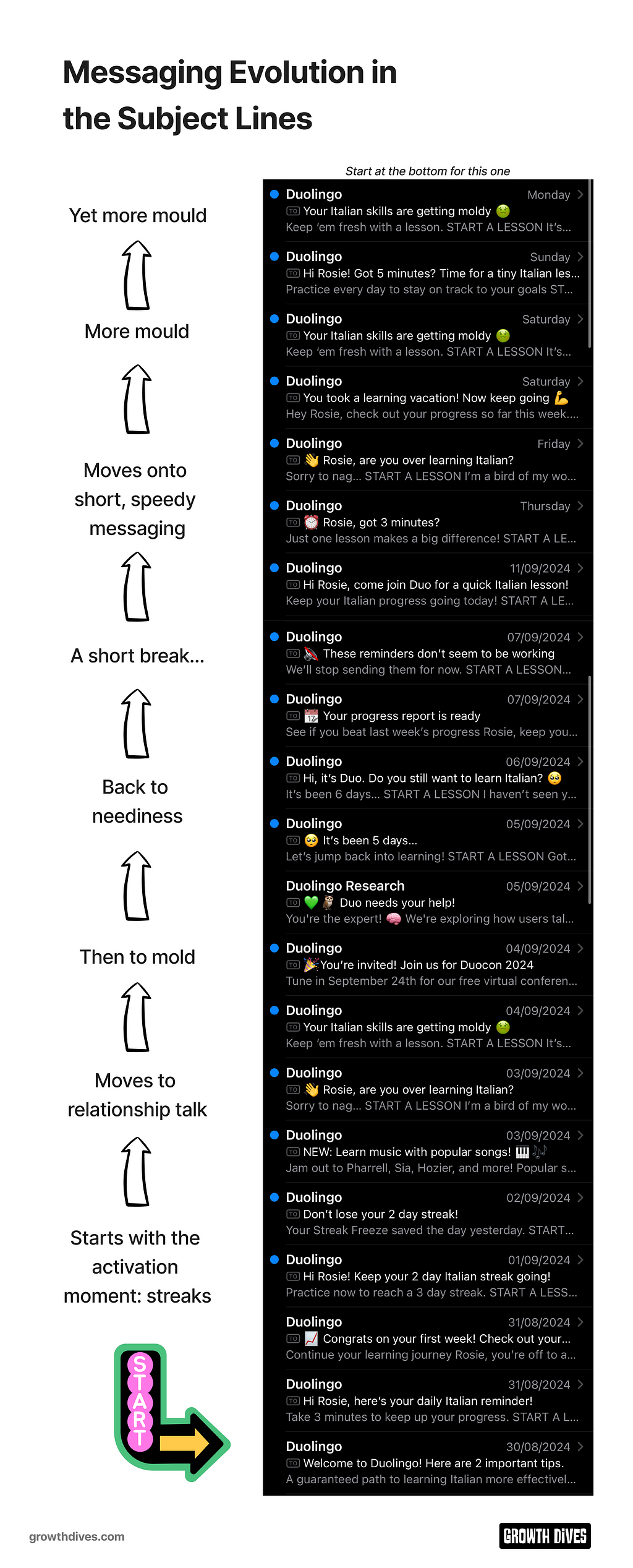
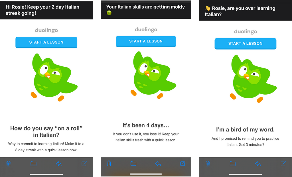
In the last two years, it seems they’ve ditched disappointed Duo and moved towards a Duo that leans on discourse around:
- Relationship make-or-break: ‘Are you over this?’ / ‘Did Duo come on too strong’? / ‘Are we done here’ / ‘Do you still want to learn?’
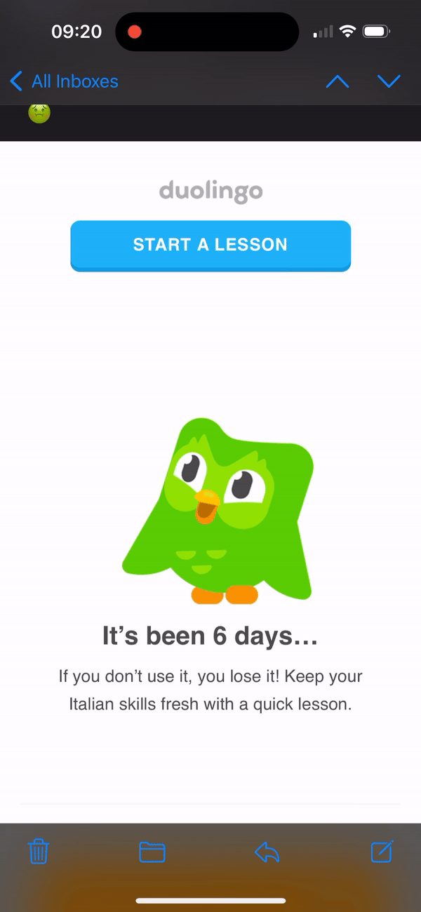
- Stagnating skills: ‘Your skills are getting mouldy’ / ‘Keep ’em fresh’
- Speed & time: ‘Got 3 mins?’ / ‘Join for a quick lesson’ / ‘Time for a tiny lesson’
It’s varied. That’s for sure. One moment I’m being asked if we’re ‘serious. The next it’s like when you have a hyper younger cousin asking to play.
The only thing that is consistent is that these emails evoke an emotional response.
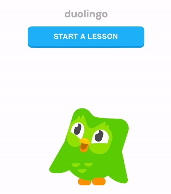
What’s clever, is that the CTA stays the same throughout. The blue ‘learn a lesson’ drops you into the next lesson on home.
These emails are designed for maximum emotional response 😭 minimum Cognitive Load 🧠
After digging into subject line messaging, next stop: triggers and cadence.
Email cadence: Max 2 per day
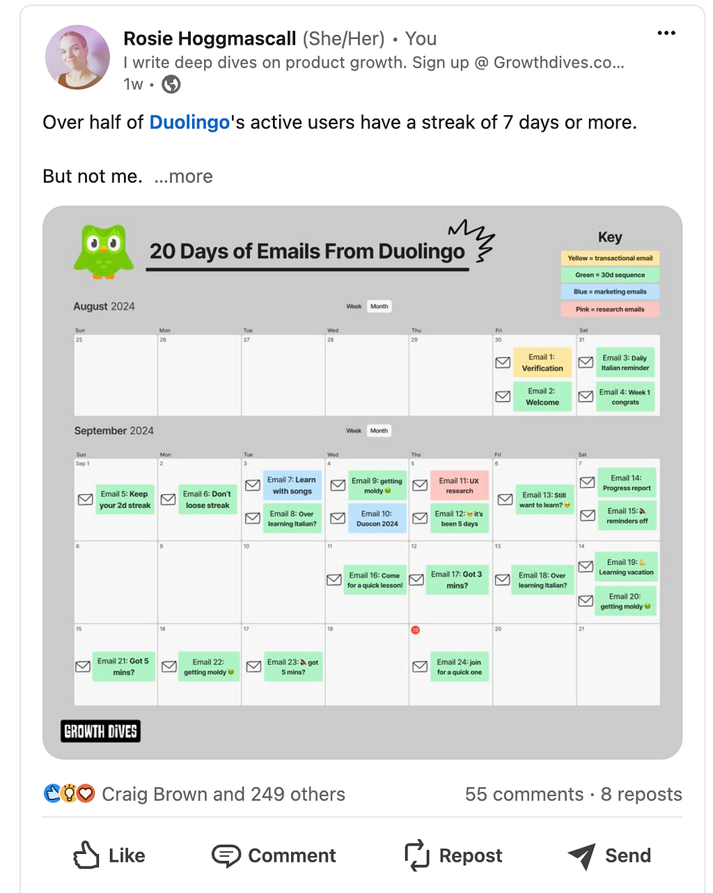
In the course of my 20 days, I received a total of 24 emails, including:
- 3 mouldy emails
- 2 ‘this isn’t working’ emails
- 2 marketing emails (Duocon & music launch)
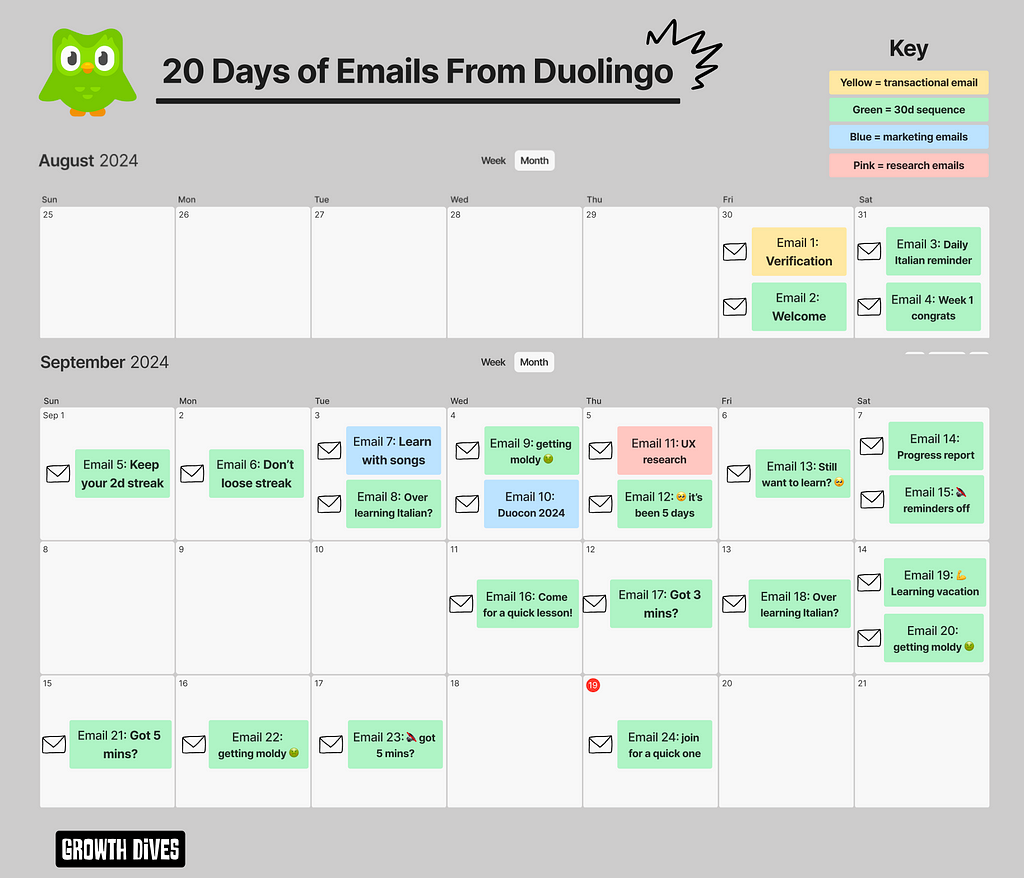
What’s interesting is that I received no more than 2 emails per day. And thank god.
Given the emails are so intense, more than two per day would likely have led to an unsubscribe.
With CRM strategy, typically 1 email per day is seen as the max.
It’s also recommended to send more emails in the early days and then ease off later. Why? Well, you want to capitalise on the early momentum and motivation from users. Push them through.
You want to ensure there are enough touch points in the first 0–7 days for the user to remember you’re there, build trust and push to the activation moment.
This roughly means 1 per day for 3–4 days, then one every second day for a week.
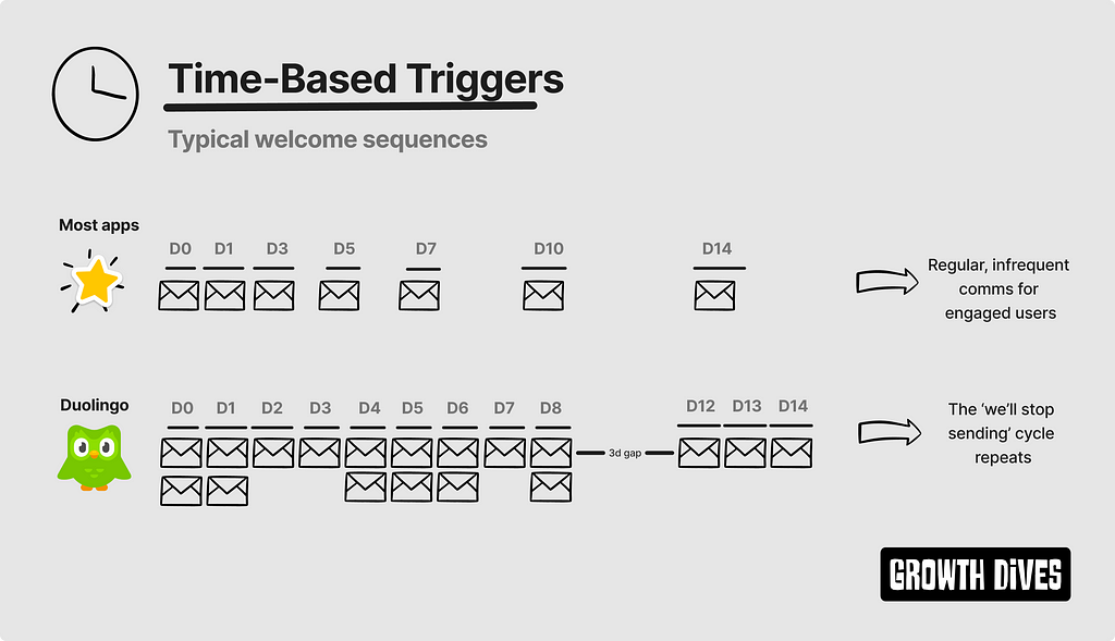
Duo takes this one step further by sending 12 emails in the first 6 days.
We get a breather after their famous email:
🔇 These reminders don’t seem to be working
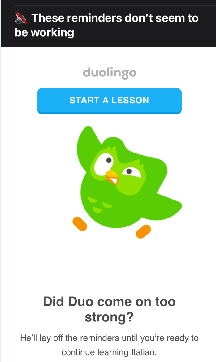
However, this only lasts 3 days before the reminders start again.
Turns out Duo decides when I’m ready to start learning Italian again.
Curiously, after the 1st 🔇 email on day 8, I get a second ‘reminders off’ email on day 18. But different. The reminders stopped for 3 days in the first case, and only 1 day in the second case.
Seems like someone is getting impatient.
What’s clever here is how the template is re-used over and over. And over. And over.
So, onto design.
An incredibly simple email template
The template is smart. Very smart.
First up the CTA is the first thing under the logo.
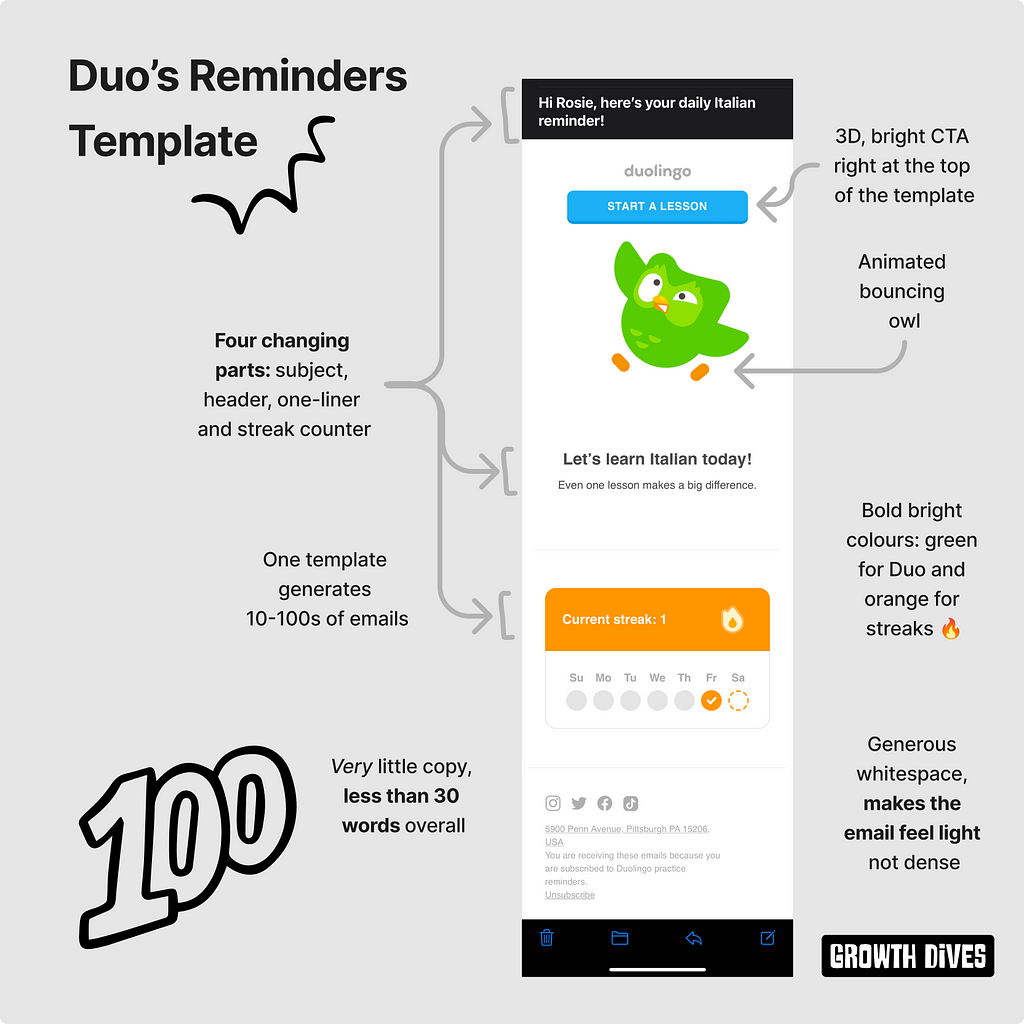
Meaning that it’s always easy to jump back in.
Secondly, the animation of Duo is so entertaining.
Such a bouncy guy.
When you look at the welcome emails side-by-side, it’s clear that four parts of the email change:
- The subject
- The header
- The 1–2 liner under the header
- The streak counter
This means the team can produce these emails at scale, testing the parts that drive better open or click-through rates.
When you look at all the emails together (scrunch your eyes here), what do you see?
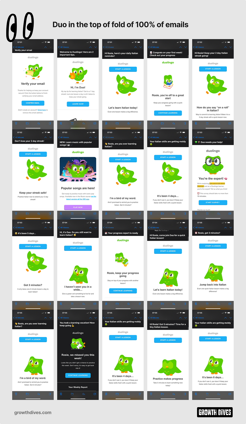
What I see is a lot of owl.
So. Much. Owl.
Duo is in 100% of the emails. Not just that, but in the top of fold.
It’s key for the brand to have the character front-and-centre in all emails. For me, the email top of fold such a valuable piece of real estate.
The thing that stands out most is how simple the email is. No fuss, same GIF. Every time.
It’s harder to strip things out than put them in. And it’s clear here the team have spent time creating emails that pack a punch visually and through language (in good and bad ways).
So, what’s the verdict — Emotionally damaged or just amused?
For me, amused.
I don’t feel too damaged after this email flow.
I like that the messaging has toned down from the ‘keep the owl happy’ threat-like language to the more entertaining relationship play and mouldy food. Which is gross, but fun.
All in all, there’s some learnings we can take away here. Duo did well:
- Starting with the magic moment of streaks, to try and reduce time to value and get people hooked
- Using emotion to break through with entertaining subject lines that weren’t afraid to go off-piste and take up different personas throughout the same flow
- Using a template that’s fast to iterate with subject lines, headers and text that can swapped out
- Simplicity of the CTA, to reduce the cognitive load for the user of what action to take next. Just ‘take lesson’
- Easing up sometimes by pausing the comms (even if only for 1–3 days). Which means that the next email that comes through hits harder
What emails are in your inbox from Duo?
Hi, I’m Rosie 👋 I write weekly deep dives on product, growth and UX. Sign up to growthdives.com for more🕺 Enjoy!
Join the conversation on LinkedIn here.
20 days of emotional blackmail from Duolingo was originally published in UX Collective on Medium, where people are continuing the conversation by highlighting and responding to this story.
Leave a Reply