Applying the Pareto principle to feature availability in UX design
We lost movie stores for streaming, and in the process, lost the useful simplicities of being a movie patron.
There was a time when we didn’t have Netflix, Hulu, Amazon Prime, Peacock, Paramount Plus, Pluto TV, Max…
There are so many more, but I don’t want to look them up.
There was a time when we had to leave the house in our lounge clothes and go to the local video store and wander the aisles, reading the back of movie boxes or scurrying to the New Releases for a movie that we waited almost a year to finally see because we missed it in theaters.
A lot of us who recall that era refer to this as the “good old days.”
Hi, I’m one of those people.
And we aren’t alone. A 2020 documentary The Last Blockbuster covers the nostalgia of our video store days with a visit to the final Blockbuster in existence, tucked away in Bend, Oregon.
But it’s not just the adventure of going out, of choosing a movie and hoping for the best (or, in some cases, sitting through it because you paid for it), but it was the experience.
Writer Collin Souter recalls the closing of Family Videos in 2021, and their “going out of business” sales of merchandise, which people were flocking to buy.
Why are we buying this stuff? What possible purpose could it serve? For me, it’s part of the journey of a film lover and film collector.
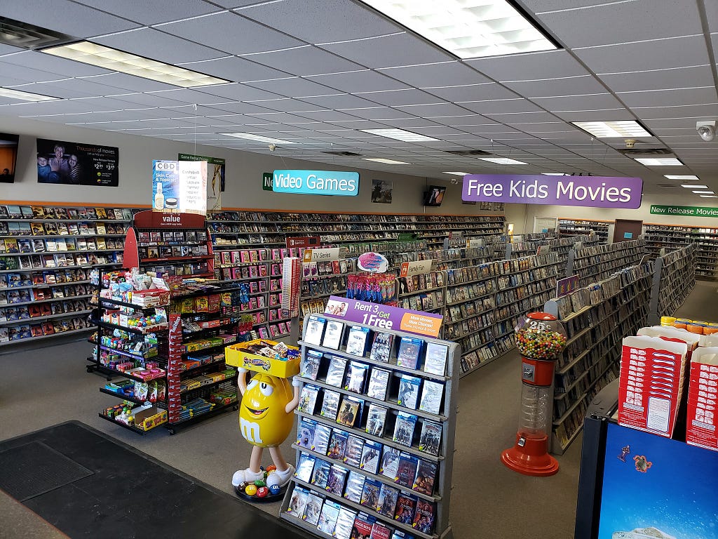
New Releases. Kids. Horror. Comedy. Romance. Action. Thriller.
They were common placards on the wall of our video stores, letting us navigate our way to the genre calling to us that Friday night. What would go good with our Jiffy Pop and slushies?
In the era of streaming, there’s so much content, it makes sense some of these would be broken into subgenres… maybe?
Netflix doesn’t know how to be a movie store
And I hate it.
In preparation for Halloween, my husband and I always start on the Movie section and try to find horror. And since we mostly watch comedy, documentaries, and horror, I’d think the algorithm would improve over time.
But it doesn’t.
Here’s my recent visit to my Movies tab on Netflix.
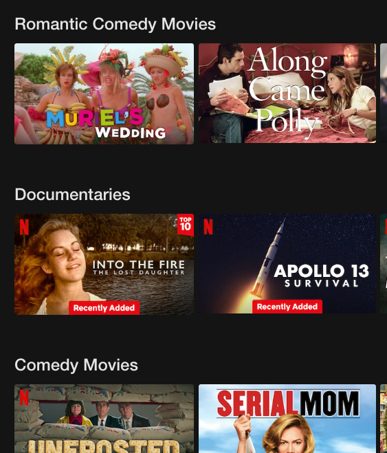
Below the auto-play banner for a new release are these three categories:
- Romantic Comedy Movies
- Documentaries
- Comedy Movies
My brain immediately wondered:
- Why is romantic comedy and comedy split up?
- What the hell is documentaries doing shoved in there?
- Is there a method to the order of these rows?
I kept scrolling to find out.
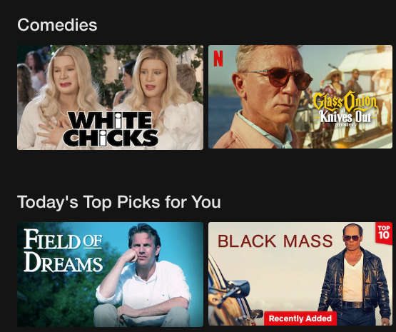
No, it didn’t get better. But I did get a third comedy category, for just: Comedies.
Just a reminder, in five categories I’ve seen on my screen, three are comedies: Romantic Comedies, Comedy Movies, and Comedies.
And in an attempt at personalization, I have Today’s Top Picks for You. But where do these come from? How are these chosen? The screen lacks any information about how they recommend these. And on a cursory Google search for this algorithm, I retrieved no answer.
I live in Iowa. Is that why I get Kevin Costner looking wistfully in this thumbnail for Field of Dreams? Maybe. But Black Mass, Midnight Run, or Edge of Tomorrow? I seldom watch action movies, so why are these in my for-you tab?
It remaines a mystery.
Hick’s Law and the too-many-choices phenomenon
Designers have said that Netflix employs Hick’s Law of user experience, which focuses on choice overload paralyzing the user into making no decisions at all.
Hick’s law stats that the more options available to a person, the longer it will take for that person to decide what option is best. In that logic, Hick’s Law aims to remove barriers to decision making.
Is Netflix really using Hick’s Law, then?
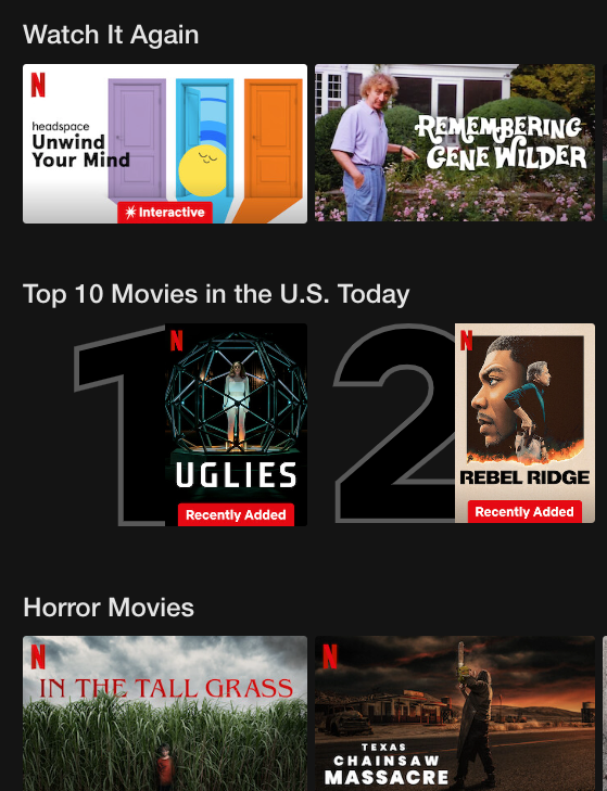
Now that might be why we get the Top 10 Movies. Love this! I’ve used this in the past. If it’s popular, I want to know what the hype’s all about. And ten is a nice round number, too. We love things than come in tens.
But after rows of random genres, the Top 10 feels buried, even though it’s given a better design treatment.
Personalization doesn’t always work
One article writes that Netflix does personalization well, stating that “even the thumbnail images on Netflix are customized to match exactly what each user would prefer to see.”
Really? No source for this claim, sadly, but I don’t see how that plays into personalization.
The same article claims that the Continue Watching, New Releases, Trending Now and Because You Watched are three levels of personalization. Well, two of those are, the others are more what we’d expect from someone offering us movies.
But also, how efficient: Netflix keeps its algorithm fairly cloaked from any of us to understand. Which might be why I don’t understand much of my own algorithm at all.
Sometimes I appreciate personalization, but these days I think we lean too hard into it.
In 1998, user experience research powerhouse Nielsen Norman Group said personalization is over-rated. Times have surely changed since then, right?
Well, maybe not.
Jakob Nielsen writes:
The real way to get individualized interaction between a user and a website is to present the user with a variety of options and let the user choose what is of interest to that individual at that specific time. If the information space is designed well, then this choice is easy, and the user achieves optimal information through the use of natural intelligence rather than artificial intelligence. In other words, I am the one entity on the world to know exactly what I need right now. Thus, I can tailor the information I see and the information I skip so that it suits my needs perfectly.
Nested within these rows of genres I’m given Watch It Again, which is personalized to my profile of recent views. Sure, that’s nice. A good reminder of what I’ve seen, but why am I being served this at random? And isn’t the point that I watch things I haven’t seen?
And hooray, I finally get Horror.
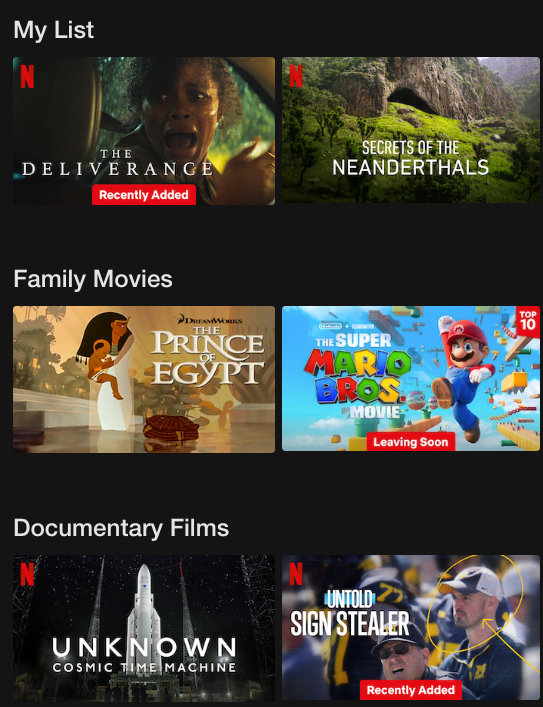
But the personalization doesn’t stop there.
Lower down, I find — well, well, well! My List! My list of movies I’ve been saving and bookmarking to see eventually.
The downside? This row is buried eight categories down — three categories which are different variations of comedy.
If personalization is what Netflix and its kindred apps are lauded for, why wouldn’t My List be at the top?
Because that, my friends, isn’t personalization, it’s customization.
Per Nielsen Norman Group, customization is all about giving people control of the site. Preferences, filters, sorting — all of that matters to how we each individually like to find information or engage with it.
Back to your regularly scheduled wild taxonomy
Keep scrolling, and welcome to another episode of Documentaries. Remember them? Documentaries as at the top of my screen, but here we have Documentary Films. Are these higher quality, high brow documentaries? What makes these films compared to the others?
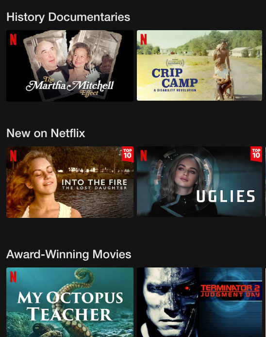
But wait, there’s more! Entering the ring is Historic Documentaries, New on Netflix, and Award-winning Movies of various genres.
(Side note: Terminator 2 won awards?)
If you aren’t going to let users sort, sort it for them
Now I’m nearing the bottom of the page, and what’s tripping me up is the lack of ability to sort.
Thanks, Netflix, for showing me things I’ve watched and making (random) recommendations for other things. But you’ve divvied up countless genres into random sub-genres with no description or emphasis about what makes them different.
And as a user, I’m looking at an unalphabetized list of genres by row, as well as unalphabetized movies in each.
We lost the simplicity of the movie store. That’s the missing fragment.
What happened to simplicity?
I read an amazing article the other day called Simplicity: On removing complexity to add meaning.
And it highlighted — accurately — that simplicity is harder than complexity. Even if we as user experience professionals go into a project with our eye on simplicity, between stakeholder feedback, user research, and priorities, those simple ideas can get messy fast.
But where Netflix has the resource to do this better, they simply want to be everything to everyone. And that doesn’t work.
The article emphasizes, too, that simplicity is not minimalism. Feature-rich products aren’t meant to be minimalist, but the way we present them can be useful.
Likewise, employing common human elements of how we like to organize things is essential.
Information architect Jorge Arango recently wrote about this in his Information Architecture First Principles, which goes like this:
- People only understand things relative to things they already understand
- People only understand things in context
- People rely on patterns and consistency
- People seek to minimize cognitive load
- People have varying levels of expertise and familiarity
- People often don’t know what they’re looking for
- Information is more useful when it’s actionable
I highly recommend reading Jorge’s whole article, but as I think about the Netflix experience, much of this list applies.
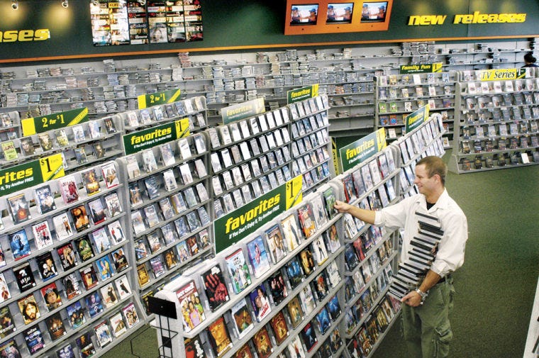
We lost the simplicity of the experience.
As a former movie renter, I expect to look at genres of movies quickly and easily, and in some kind of ordered form. What made movie stores work was the simplicity of the design. You had two options for browsing movies at the movie store:
- Genre, to browse movie by movie and see what catches your attention
- Alphabetical, in case you knew what you were looking for
I expect to see short descriptions of the movie, like I’d turn a movie box over in my hands to read and discern my interest.
I expect to be able to sort my Movie tab by genres I want to see, or even by sub-genres, as if I’m shopping online for a sweater.
But instead, Netflix focuses on a mismash of attempted personalization, and disordered feed of sub-genres with no organization.
And what a disappointing a frustrating journey for someone who just wants to watch a movie on a Friday night.
Where Netflix stands above
Netflix does a lot right. Streaming in general does a lot right.
I can watch Netflix on any device I have, whether I’m at home or traveling. And it’ll pick up right where I left off!
Those of you who remember rewinding cassette tapes — none of that here. It’s much easier to fast forward or rewind on streaming than it ever was with VHS tapes.
I also get the opportunity to bookmark and save things I want to check out later, so I don’t have to make a decision right now to watch something. I wish my movie stores had “Erin’s selections” just for me.
It lets me set up profiles for members of my family, so we can keep our algorithms separate. I can even download movies to my devices so I can watch them if I don’t have access to Wi-Fi, like on an airplane.
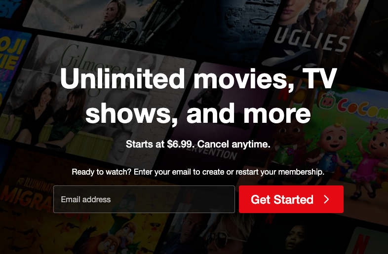
And as someone who signed up many moons ago, Netflix’s onboarding is streamlined and efficient, with plain language and little noise to disrupt the flow of steps.
And yet after all that complaining, I did find a genre selector on Netflix (desktop) at the very top of the page. Eureka!
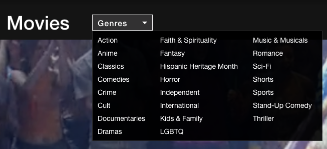
And even on a 32-inch monitor it’s a little small. But it’s there! It’s there. So let’s see Comedy. Maybe now I can get to my sub-genres a little…
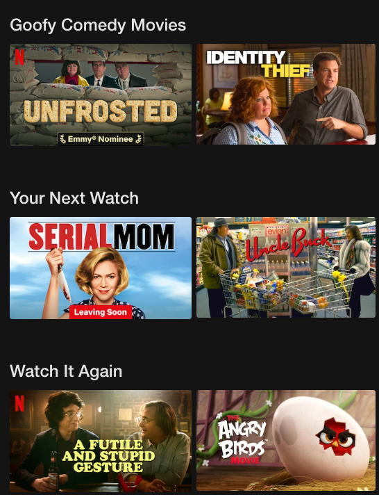
No such luck.
Comedies give me yet another comedy sub-genre of Goofy Comedies, which feels redundant.
It has some recommendations for Your Next Watch, but it’s letting “your” do a lot of heavy lifting. It’s not quite personalization because I have no idea why these are the recommendations.
And here we have Watch It Again…again. I watched these months and months ago. I thought Netflix wanted me to see new stuff?
So, a try and a fail for genre selection. From my review, I can’t accessibly find sub-genres like Romantic Comedies, Goofy Comedies, Family Comedies, etc.
Another opportunity lost to connect with the movie patron.
How it could be better
…and like the movie rental experience once again
I won’t wax poetic too long on what I wish Netflix and streaming services did for their app experiences. I’m sure there are plenty of designers who can express it better visually than I can through writing.
But I wish for a few simple things:
- Streamline it. A single New Releases place to view movies that are new to the platform, of any genre
- Sorting options. Quick access to sorting options, such as sort by A-Z or Z-A; or sort by length (wouldn’t that be nice?!)
- Easy filtering. An accessible way to get to genres, with optional subgenres expanded if I want to get more specific
- Customized content in reach. Quicker access to My List/My Stuff/Saved or otherwise bookmarked shows, movies, etc. from anywhere on any section of the screen
- More text! Less big, bold movie covers and more space with descriptions of the film, or even ratings from Rotten Tomatoes, so I have an idea of quality. Read what Jonathan Colman has to say about text in apps (and hint: there’s no need to be afraid of text). In that same breath, add microcontent to explain some of the personalized options and where they come from; or even the sub-genres you’re feeding me
- Personalize smarter. If you’re going to personalize, just have “Because you watched…” based on the last thing I watched, and have it change when I watch something new
I’m holding out hope for a new tomorrow
In the era of card-based design (thanks, mobile-first experiences), we’ve lost the words that pull us in. I get frustrated when I pick up a book at a bookstore, and turn it over and only see one- and two-sentence reviews and no description of the story.
And at the movie store, we didn’t even want to throw down a couple of bucks unless we felt good about that thick, plastic cassette or flimsy DVD case in our hand.
As the choices get greater and the content continues competing with each other across a multitude of platforms, our attention span is sure to flex.
But what if it didn’t have to?
What if we could have the elements of choice and convenience of streaming with the hook and allure of the movie stores?
What if we could get as excited to choose a streaming movie as we did picking up those plastic boxes from way back when?
If you build it, they will come.
Did we lose movie rentals for THIS? was originally published in UX Collective on Medium, where people are continuing the conversation by highlighting and responding to this story.


Leave a Reply