Disrupting the status quo in design.

Polished interfaces and seamless experiences dominate the design landscape. UX design has, in many ways, become too safe. We prize consistency, accessibility, and user-friendliness — values that are crucial to creating good products. But is “good” enough? Have we, in the quest for perfection, lost the soul of UX? Don’t we need more punk? This is the playlist for your next design project.
The problem with over-polished UX
Mainstream UX is about minimizing friction, reducing cognitive load, and making things easier for users. But by smoothing out every edge, have we lost what makes experiences truly resonate? We’re caught in a loop where everything looks the same, users are wandering aimlessly through a sanitized world and what we do is secret 🎵. In trying so hard to streamline design, we’ve traded the rawness and chaos for predictability — for something pretty vacant 🎵.
Flat design, minimalist aesthetics, and predictable flows might be efficient, but they are killed by death 🎵in their own conformity. We’re so focused on reducing friction that we’ve forgotten what it means to make users feel something — a connection, excitement, or even discomfort. But maybe that’s what’s needed. Perhaps a designer now and then has to have the guts to say “I don’t care about you” 🎵, just to wake people up.
What can punk bring to UX?
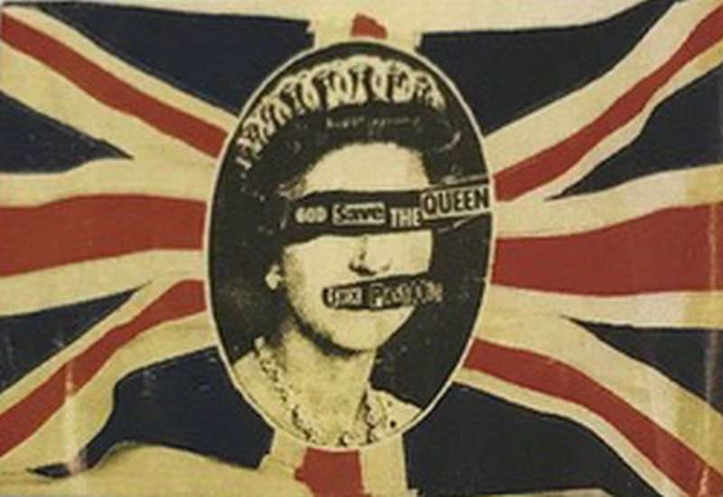
Punk was never about playing it safe. It was about rebellion, breaking the rules, and refusing to conform. Emerging in the mid-1970s, punk was a reaction to the bloated, overproduced rock music of the time. Bands like the Ramones, Sex Pistols, and The Clash stripped down the sound to its raw essentials — fast, loud, and simple — and paired it with lyrics that critiqued society, politics, and authority.
Punk wasn’t just a musical movement; it was an ethos that embraced DIY culture, anti-establishment attitudes 🎵, and a fierce desire for personal and creative freedom. The movement spread quickly across the UK and the US, influencing not just music, but fashion, art, and the way people saw the world.
In UX, we’ve followed the same patterns for too long. What if we tore those patterns apart and embraced the chaos? What if we challenged users and made them think, instead of spoon-feeding them everything?
Disrupting the standard
Punk was about smashing conventions. In UX, this means we don’t have to make everything easy all the time. Users don’t always want to be led through an experience like it’s perfectly planned. Sometimes, they want to figure things out, to be surprised, or even to be challenged. Why should every button be perfectly placed? Let’s take more risks in our designs and let users play their own game, imagine a UI that’s like “don’t talk to me” 🎵.
Embracing imperfection
Punk was raw and messy. It didn’t care about being perfect — too much perfection is a mistake. In UX, we could embrace that spirit. Instead of obsessing over seamless, polished interfaces, why not allow for a little chaos? Maybe a glitch, a clashing color scheme, or an unexpected interaction could make the experience more authentic. The over-polished has no feelings, there needs to be something real, something that connects.
Radical user empowerment
Punk was about giving power to the people, letting them break free from control. UX should take a page from this playbook. Instead of locking users into a narrow set of choices, give them the tools to shape their own experience. Let them break things, hack them, and put them back together. As a user, I wanna be me 🎵. Why force users to follow the same paths when they can create their own?
Punk in action: creative dissonance in UX
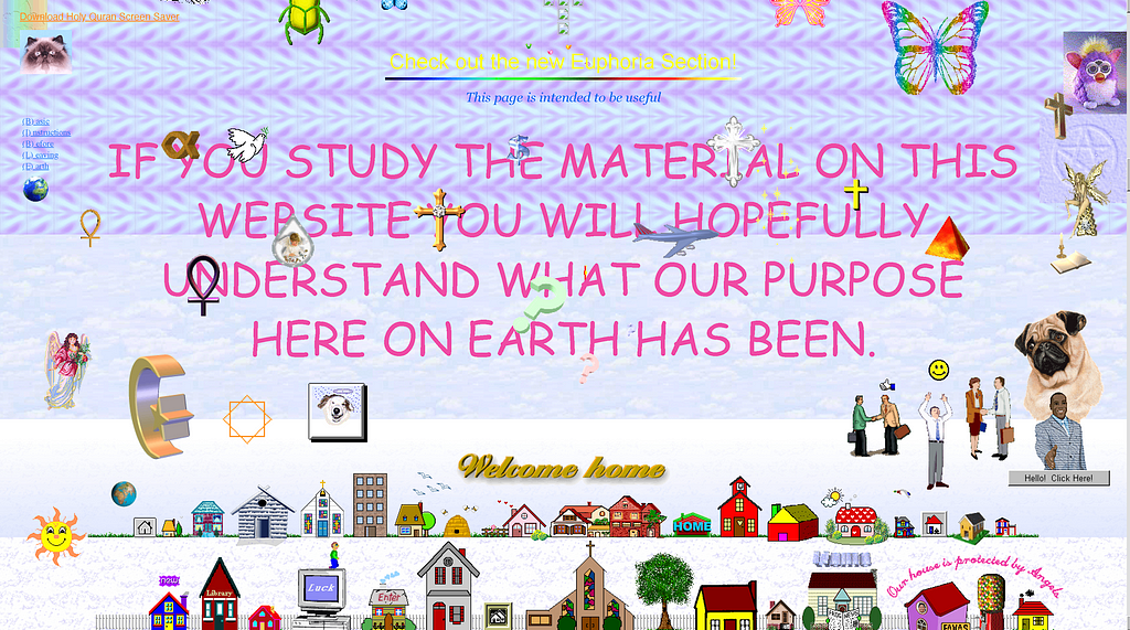
There was a time when digital spaces felt raw, chaotic, and alive — before everything became perfectly curated. Platforms like Myspace and Geocities let users create their own messy corners of the internet. They weren’t designed with sleek perfection in mind, but they were authentic, unfiltered, and full of personality — smash it up 🎵, and rebuild it in your own image. This chaotic freedom was an expression of true individuality, not bound by templates or strict guidelines.
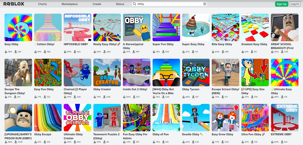
Gaming like Roblox and Minecraft, for example, captures some of this DIY punk ethos. Their interfaces isn’t overly clean or curated, and it feels like a place where users can build their own community spaces — shaping the platform to their needs rather than following someone else’s rigid design rules. It’s a little rough around the edges, but that’s what makes it special. An interface can be space where users can carve out their own identity and go where eagles dare 🎵.
And then there’s anti-design, where designers purposefully break the rules of conventional aesthetics. Unbalanced layouts, jarring transitions, and bold, unrefined visuals challenge the notion that design needs to be perfect to be effective. In this world, imperfections aren’t failures — they’re features too tough to die 🎵.
The ethical punk: disruptive, but with purpose

Punk wasn’t just about chaos — it was about using that chaos to confront societal norms and corruption. In UX, we should take a similar approach. Disruption needs purpose. It’s not about breaking things for the sake of it — it’s about creating designs that challenge manipulation and exploitation in the digital world. UX should fight against the dark patterns and tricks that mislead users, just like punk fought against societal control. It should be a rallying cry against that california-über-alles 🎵 complacency and blind acceptance.
When we break the rules, we should be empowering users, giving them the tools to navigate systems on their own terms. It’s about questioning, pushing back, and resisting the urge to design merely for profit. Let’s not fall into the trap of designing for control. All users don’t want to be told what they want, or what they need 🎵.
Time to break the rules
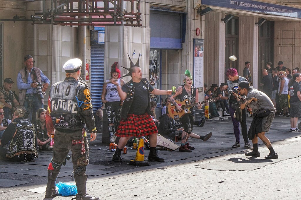
UX needs more punk — more rebellion, more risk, more rawness. It’s time for designers to step outside the polished boxes and create something that resonates on a deeper, human level. Punk teaches us that breaking the rules isn’t just necessary — it’s vital for making real connections. It’s time to raise above 🎵 and reject the rules that holds us back, even if it means tearing down the system.
Search and destroy! 🎵 It’s time to rethink UX — not just as a machine for creating smooth, frictionless experiences, but also as a platform for experimentation, rebellion, and real user empowerment.
This is the playlist for your next design project
🎵 What we do is secret — by The Germs.
🎵 Pretty vacant — by The Sex Pistols.
🎵 Killed by death — by Motörhead.
🎵 I don’t care about you — by Fear.
🎵 Anti-Manifesto — by Propaghandi.
🎵 Don’t talk to me— by GG Allin & The Jabbers.
🎵 No feelings — by The Sex Pistols.
🎵 I wanna be me — by The Sex Pistols.
🎵 Smash it up — by The Damned.
🎵 Where eagles dare — by The Misfits.
🎵 Too tough to die — by The Ramones.
🎵 California über alles — by Dead Kennedys.
🎵 Anarchy in the U.K. — by The Sex Pistols.
🎵 Raise above — by Black flag.
🎵 Search and destroy! — by The Stooges.
I am one of three company mothers of One Day Interact. As a digital design agency, we seek to contribute to a positive development in a larger sense — for the individual, for humanity, the environment and the planet.
UX needs more punk was originally published in UX Collective on Medium, where people are continuing the conversation by highlighting and responding to this story.

Leave a Reply