Accessibility insights and atomic design patterns.
Did you know that 44% of Australian adults have basic skills in literacy, and it is thought that as many as 1 in 5 people have dyslexia. This is why the readability of your website UI is super important.
(Source: Australian Bureau of Statistics, Adult Learning Australia, Australian Dyslexia Association)
Recently, I explored the intricacies of accessibility and readability for a foundational design pattern — navigational components. This journey uncovered that the standard link design negatively affects the readability of text, particularly for people with dyslexia. 📚
Designing navigational components that are both readable and accessible can be challenging. People with different levels of reading skills and abilities may struggle to read and comprehend underlined link text, and those with visual or motor impairments may encounter difficulties interacting with links. As a designer, it’s crucial to ensure that links are designed with readability and accessibility in mind.
In this article, I’ve explained how the current design is problematic and have created versatile and reusable patterns that can be applied across all navigational components to ensure optimal accessibility and consistency across components and pseudo-states.
The question that started it all
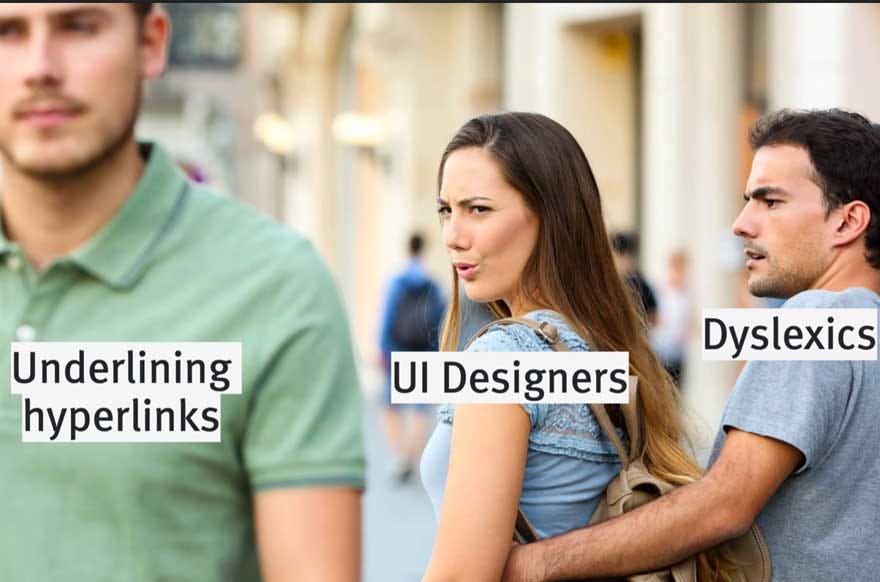
This exploration and research started after a single inquisitive observation: if underlining text is generally discouraged due to its negative impact on readability, then why are links typically underlined? This question led me to delve deeper into the nuances of how reading ability affects user experience.
For more on why underlining is discouraged in design, you can refer to resources such as the GOV.UK accessibility blog, W3C guidelines, and the University of Hamburg’s research on UX ideas.
Why are they underlined in the first place?
Let’s start with a history lesson; the reason for underlining links dates to the early days of the internet; at this time, browsers had limited options so the simplest way to show that a link was different from plain text was to just underline it. Fast forward 30 odd years, and now placing an underline under a link text is a familiar and globally recognisable UI pattern.
Underlining links is a preferred accessibility option for individuals who are colour-blind, visually impaired, or viewing the content in direct sunlight. This practice aligns with WCAG (Web Content Accessibility Guidelines) standard 1.4.1 (Level A), which emphasises that colour alone should not be used as the sole visual means of conveying information, indicating an action, prompting a response, or distinguishing a visual element. By underlining links, designers ensure that crucial information and interactive elements remain discernible and accessible to all users, regardless of their visual capabilities or environmental conditions.
After making this observation I realised that we had a predicament. On one hand, underlining hyperlinks is recommended as it is a familiar UI pattern that meets accessibility requirements for people who are colour-blind or are visually impaired. But on the other hand, underlines cause problems in reading.

How underlining text affects readability
I delved deeper into the issue to understand why underlined text can be problematic for readability. Here are some key reasons:
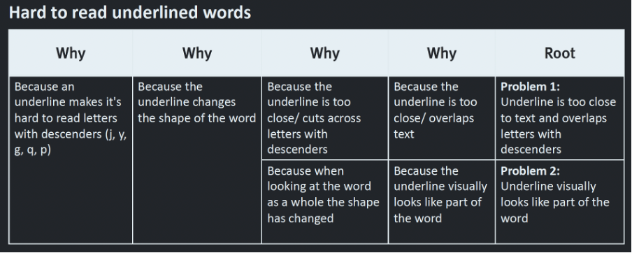
- Overlap with descenders: Default HTML underlines often overlap with letters that have descenders, such as j, p, g, q, and y. This overlap can make it challenging for some readers to distinguish these letters and correctly interpret the word.
- Shape recognition: Many readers recognise words by their overall shape. Adding an underline to words with descenders alters their shape, potentially affecting word recognition and readability.

- Distraction from content: Overuse of in-text links, especially within paragraphs of content, can become distracting. Excessive underlining can disrupt the flow of reading and draw attention away from the main content.
To further understand how the factors mentioned above can hinder reading, it’s essential to consider the science of reading and how individuals with varying levels of literacy approach reading tasks.
Skilled readers have developed efficient reading strategies that involve selectively skimming and scanning content to identify and extract crucial points quickly. They can recognise words and phrases rapidly, relying on contextual clues and their extensive vocabulary.
In contrast, less skilled readers may need to decipher words letter by letter, which can slow down the reading process and increase the likelihood of misrecognizing words. This difficulty in word recognition can lead to a disjointed understanding of sentences, as they struggle to make sense of individual words that do not fit together logically. As a result, confusion rather than comprehension may arise when less skilled readers encounter text with complex formatting, such as underlined words or excessive use of in-text links.
Understanding these differences in reading processes underscores the importance of designing content with clear typography and formatting that supports readability for users across various literacy levels and reading abilities.
Is this problem worth addressing?
To address readability concerns, I initially questioned whether the issue would affect a substantial audience enough to justify design changes. To gain a clearer understanding, I embarked on research to explore the various factors impacting individuals’ reading abilities and the associated statistics.
Factors influencing reading ability encompass both cognitive and physical barriers. Cognitive challenges may arise from conditions like dyslexia or dyscalculia, as well as encountering technical or overly complex content, unfamiliar languages, or difficult typography. Additionally, cognitive barriers can result from limited literacy due to educational gaps, strokes, or dementia. Physical barriers include viewing content on low-contrast screens, in direct sunlight, motor control limitations, vision impairments, and tunnel vision.
Research into affected populations revealed significant statistics concerning low literacy levels and dyslexia:
- Data from the 2011–2012 Programme for the International Assessment of Adult Competencies (PIAAC) grouped Australian literacy proficiency into five skill levels with Level 1 being the lowest. Approximately 7.3 million (44%) Australians aged 15 to 74 years had literacy skills at Levels 1 or 2, with a further 6.4 million (39%) at Level 3 (source: Australian Bureau of Statistics, Adult Learning Australia).
- The Australian Dyslexia Association estimates that dyslexia affects some 10% of the Australian population, and it may be safe to say that dyslexia affects one in five individuals when including the continuum of mild to severe dyslexia (source: Australian Dyslexia Association).
Given this data, it’s clear that designing for reading accessibility should become the standard rather than an exception. Understanding these challenges underscores the importance of creating inclusive and accessible design solutions that cater to diverse user needs and ensure equal access to information for all.
Designing for reading accessibility should become the standard rather than an exception.
Why is there a problem if WCAG standards are met?
This question highlights a common misconception about accessibility standards. While the WCAG (Web Content Accessibility Guidelines) provides a robust framework for digital accessibility, meeting these standards does not guarantee a solution to all accessibility challenges.
The issue arises because, despite the WCAG’s comprehensiveness and ongoing evolution, it remains a living document that continues to adapt to emerging accessibility needs. Unfortunately, not all accessibility requirements, especially those related to cognitive accessibility, are fully addressed in the existing standards.
Specifically, there is limited guidance within the WCAG on how to effectively support individuals with dyslexia and lower levels of literacy. This gap underscores the complexity of accessibility needs and the ongoing efforts required to ensure that digital experiences are truly inclusive and accessible to all users.
Therefore, while meeting WCAG standards is a crucial step towards accessibility, it is essential to go beyond these guidelines by considering diverse user needs and implementing best practices that specifically address cognitive accessibility challenges, such as those faced by individuals with dyslexia and lower literacy levels.
Developing guidelines for improved link accessibility
Now knowing that there are challenges with link accessibility and recognising the limited guidance from WCAG in addressing reading-related accessibility, I took the initiative to develop guidelines that complement existing WCAG accessibility standards, specifically targeting the readability of underlined link text.
To achieve this, I conducted a thorough analysis of the various issues caused by underlined text for individuals with accessibility needs. Employing the “5 whys strategy,” I delved deep into the root causes behind each problem, aiming to understand the underlying issues comprehensively. Subsequently, I prioritised these root causes based on their significance and explored effective strategies to mitigate them.
More information on the 5 why’s strategy.
Uncovering the root cause of each problem…

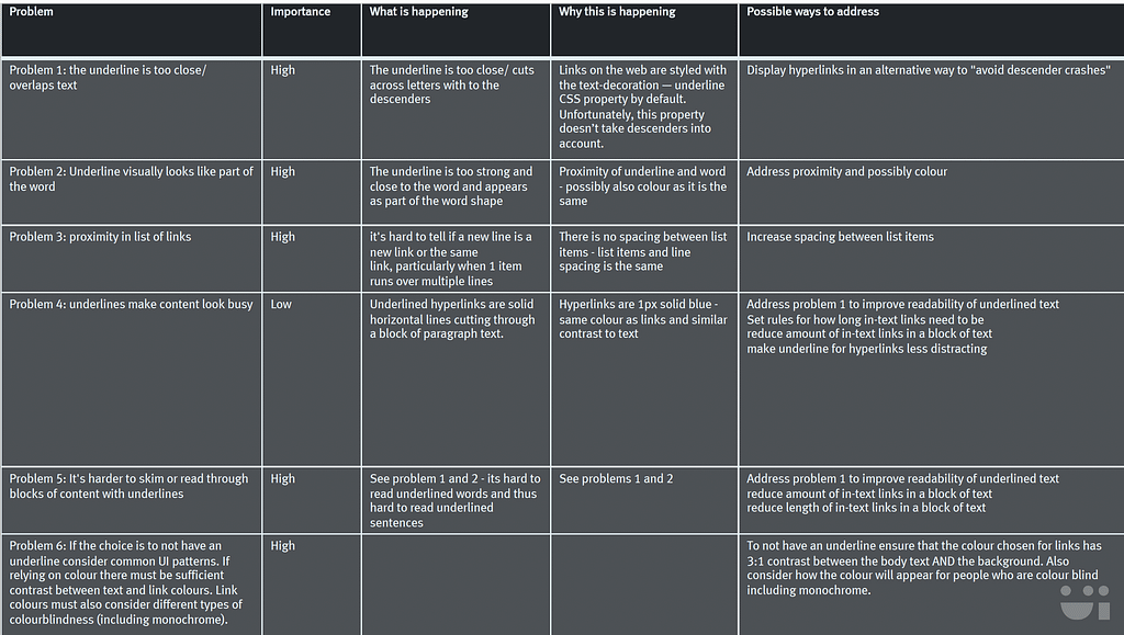
Matrix of all problems defined in the root causes list, rated by importance, why the problem is happening and possible ways to solve

Implementing inclusive design: applying atomic design principles to navigational components
Now armed with a comprehensive understanding of how underlines function in user interfaces and how people read, I was able to start designing solutions.
I employed the principles of atomic design to develop a base design and set of guidelines for all link states (default, hover, focus, visited, and active) that can be consistently applied to all navigational components such as in-text links, buttons, menu and navigation items, accordions, tabs, and so on.
The base design pattern
In my refined link design, I have prioritised accessibility and readability by retaining the underline while strategically adjusting its placement. The underline is shifted 5px (0.3em) below the baseline of the text, ensuring that it does not overlap with the descenders of characters like j, y, g, q, and p. This adjustment is achieved using the CSS text-underline-offset property.
Before using the CSS text-underline-offset property, it is advisable to verify if this property is supported by the web browsers used by your audience. You can do this on caniuse.com by searching for text-underline-offset.
By implementing this approach, I have aimed to maintain the visual indication of links, continued to ensure WGAC compliance, and minimised potential readability issues for diverse users, including those with dyslexia or visual impairments.

Does every link need to be underlined?
A link component should only be underlined if there is no other recognisable visual indicator or UI pattern that makes it clear that the component is a link.
Here are some scenarios for when and when not to underline a link component in the default state:
- In-text hyperlinks: Always underline in the default state to clearly indicate clickable content within the text.
- Primary and secondary buttons: No underline is necessary for the default state as there are other familiar UI patterns used to signify that these items can be selected.
- Tertiary buttons: As these buttons may resemble standard text it is strongly recommended that they need a distinct visual cue such as an underline.
- Links in multi-action cards: A distinct visual cue such as an underline is strongly recommended to differentiate clickable elements within complex components.
- Navigation links: As this is a familiar UI pattern, it does not necessitate the need for an underline at the default state.
The designs across states
Default state
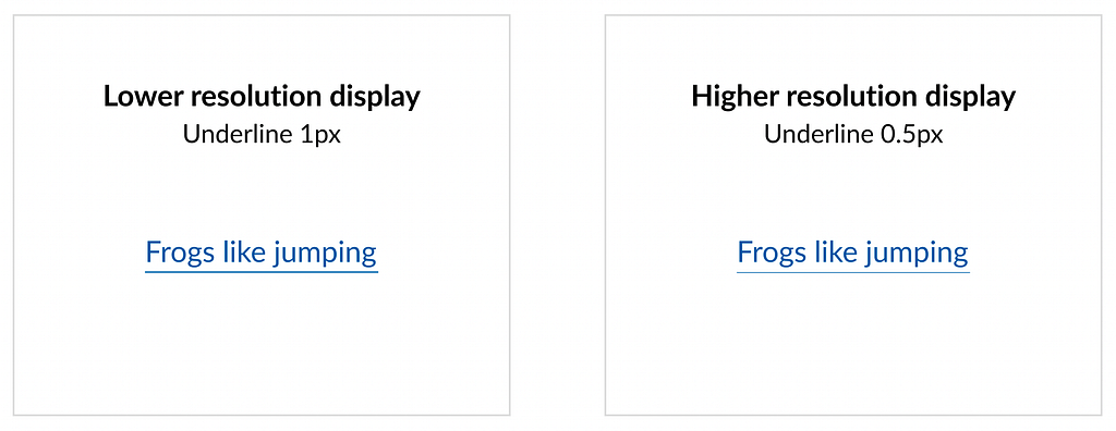
If a link is deemed to require an underline at the default state, the underline will have a weight of 0.5px (0.031rem). The colour of the underline will also be lighter tint of the link text colour (minimum contrast 4.5:1).
The purpose of using a thin underline weight with a light colour is to present the underline under the hyperlink in a more ‘muted’ way. This ensures that the underline is still noticeable but does not distract from the rest of the content.

Hover state
To emphasise the hover state, ALL navigational components are recommended to have a clear and recognisable UI pattern such as an underline on the hover state, even if they do not have an underline in their default state.
In my recommended pattern, all navigational components are to have an underline on the hover state.
In the hover state, the weight of the underline will increase to 2px (0.13rem), and the tint of the underline will also increase to be the same tint as the link text colour.
Increasing the underline weight and tint on hover ensures that the transition between the default state to the hover state (and back) is based on movement and not on colour change. Basing the transition between states on movement rather than colour ensures that people who are colour-blind or visually impaired can see the change.

Visited state
In the visited state, the link component will match the characteristics for default, hover, focus and active. For in-text links the link will be a different colour, indicating that this link has been previously visited.
Please note that there are exceptions to this guideline, such as website content related to sensitive topics like domestic violence where discretion is necessary.
Focus and active states
For accessibility purposes, it is strongly recommended that all link components have a focus state, such as a strong box around the link or a high contrast background.
Creating more complex link components
These rules and designs form the base of all link components; in atomic design this is known as an atom. To create more complex components such as buttons, accordions, tabs, cards, will require adding on top of these designs.

Progressive enhancement
The concept of progressive enhancement is evident in the weight of the underline in the default state.
In CSS, pixel size can vary depending on the resolution of the screen. On high-resolution devices, a single CSS pixel may span across two device pixels, so a half CSS pixel will cover one device pixel. Conversely, on lower resolution devices, a half pixel will round up to the nearest whole number. By utilizing a 0.5px width, we can maintain compliance with accessibility standards 1.4.1 Use of Color (A) and 1.4.3 Contrast (Minimum) (AA), while also achieving a sleek and aesthetically pleasing design.

Designing dyslexia-friendly navigational components was originally published in UX Collective on Medium, where people are continuing the conversation by highlighting and responding to this story.

Leave a Reply