Lessons from Loom, Canva & Otter.ai.

For some products, time to Magic Moment (also known as the Aha! moment or Activation moment) can be long.
Especially in enterprise Saas, where sales cycles can last months and months. However, what’s often missed is mini magic moments that can help users get to small nuggets of value before the main course.
In this article, we’ll run through three ways you can do this is your early user experience — onboarding specifically — to help users activate quicker and reduce churn.
We’ll see how GIFs, imagery, personalisation and various forms of social proof are used to get buy in for your product before users have even set foot on your home page.
Let’s go.
1. Get Buy-In With Social Proof: Otter.ai
Yes, it is likely that you have told people your value proposition on your landing page, but this need to be backed-up and re-iterated throughout the product experience.
One way to do that is use social proof:
Social proof is a convenient shortcut that users take to determine how to behave. When they are unsure or when the situation is ambiguous, they are most likely to look and accept the actions of others as correct. The greater the number of people, the more appropriate the action seems. — Growth.Design
It can come in many forms:
- Quotes from users
- Star ratings
- Reviews
- Awards
- PR logos
- User totals
- Satisfaction scores
- Client logos
Take Otter.ai for instance, it uses two forms of social proof as early as the sign up page. On registration, we see a quote from a user:
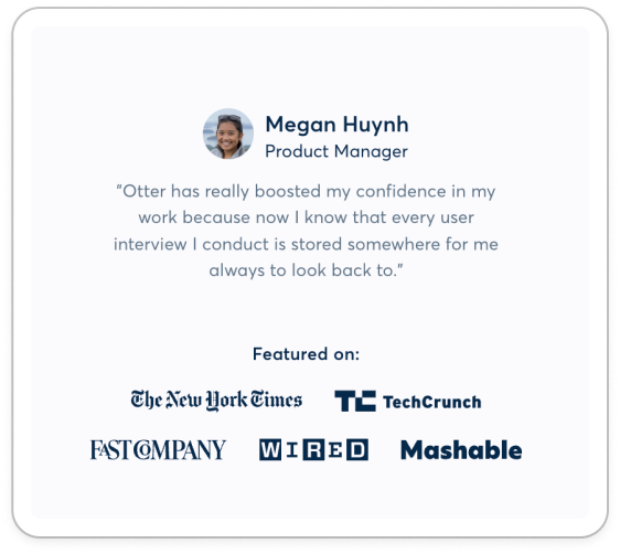
Megan Huynh
Product Manager
“Otter has really boosted my confidence in my work because I know that every user interview I conduct is stored somewhere for me to always look back to.”
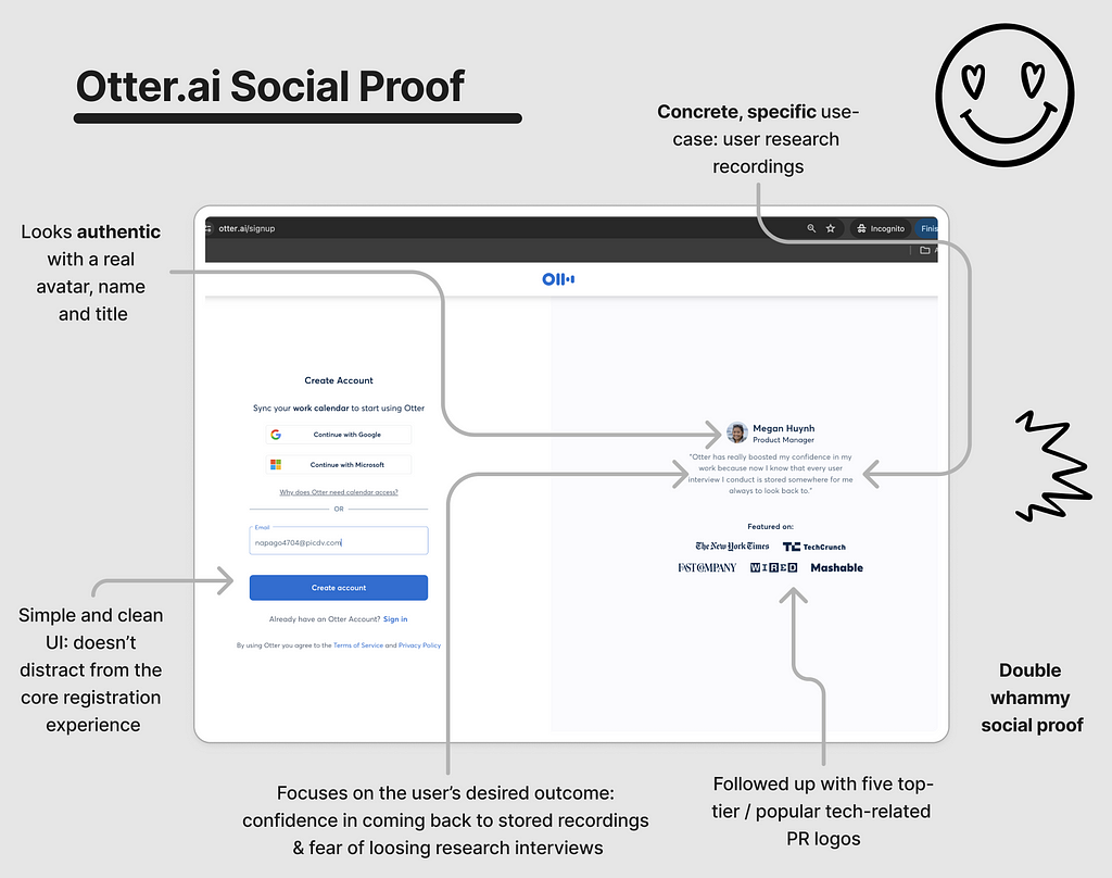
There’s even the user’s avatar to add an authentic feel. Within the copy, the customer pains and gains are clear: the fear of losing user research recordings and the desire to feel confident that they are stored safely.
Given user research can take resource to set up calls, prep and hold the interviews, no one wants to loose the recording. It is soul-crushing when you loose a recording (I’ve been there).
So this particular quote hits home for me.
Underneath, we see five PR logos from top tier and tech news outlets.
This double-whammy of social proof makes you feel as if you’re in good company and builds trust towards the product.
When using social proof, make sure you follow a few key rules:
- Make it specific: ideally outline a real use case in any quotes that is concerete and hyper-specific. No one likes waffle 🧇
- Make them authentic: you want to use real quotes where possible, it is hard to re-create authentic quotes. You should be speaking to users enough that you have some quotes spare.
- Make it subtle: you don’t want to detract from the core action on the page (here it is ‘tap CTA’). Often social proof is placed below the main module
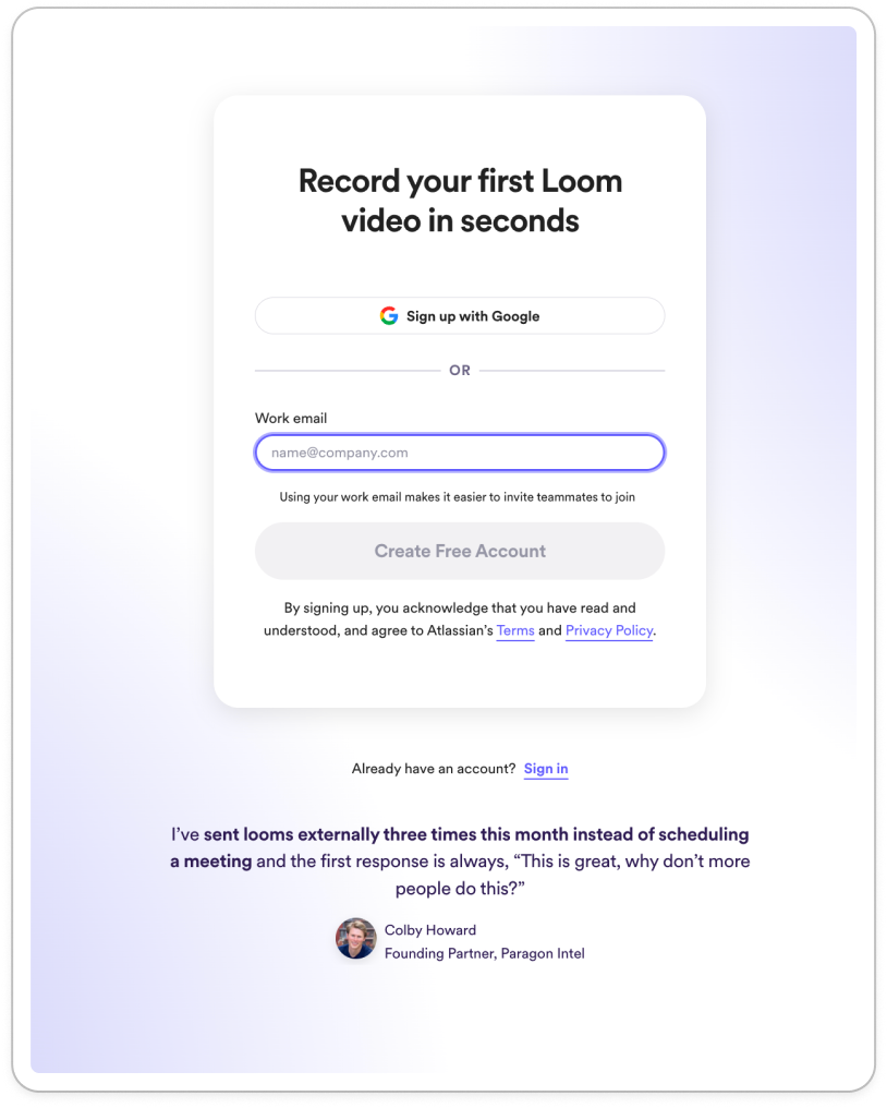
2. Personalise copy per cohort, like Loom
Even if it takes users a few days to activate in your product, you can use copy in the early experience to prompt the mini magic moments:
- This product has what I want
- This product is for me
- I can do a lot with this product
To do this, you need to first understand your customer personas, how they speak and what your persona-specific value proposition is.
Take Loom.
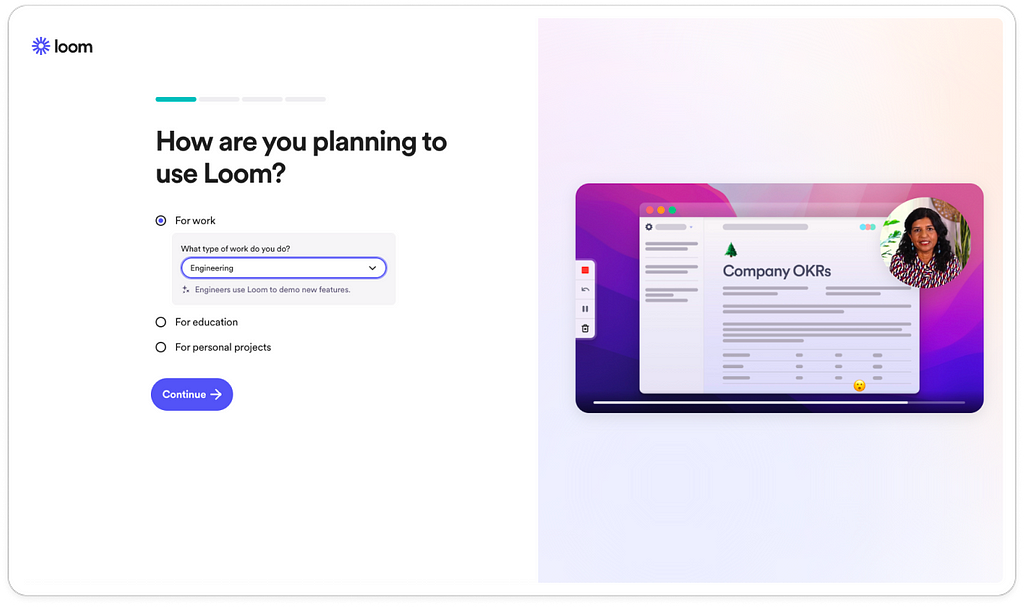
After registration, early in onboarding users are asked “how are you planning to use Loom?”
Then there are three options:
For work
For education
For personal projects
Tapping on ‘work’ I then see a drop down for different job areas, like product, engineering and marketing.
Then, if I tap on each individually I see a tailored value proposition under each:
✨ Marketing teams use Loom to promote new features
✨ Product teams use Loom to provide context
✨ Engineers use Loom to demo new features
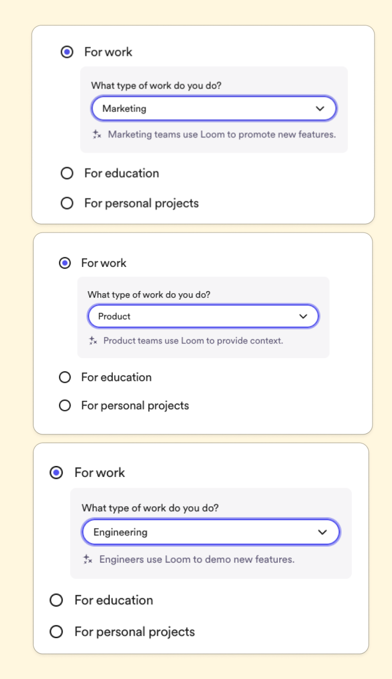
And the same goes for ‘work’ and ‘personal’:
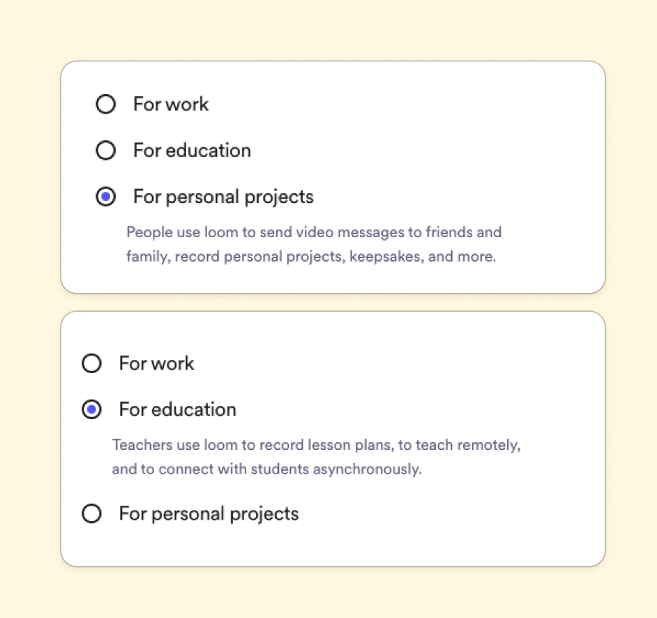
With this, even if users haven’t activated they are clear what the main use of the product is for their persona.
This, along with social proof, all builds confidence in the product and momentum to get through any friction of set-up tasks in onboarding.
3. Use imagery like Canva
Not everyone reads copy. In fact, very few people read copy fully.
In research on how people read websites, results showed that 79 percent of users scanned any new page they came across, whereas 16 percent read word-by-word.
We’re all busy and lazy, let’s be honest.
Which is why imagery needs to be used to re-iterate the value proposition and benefits of a product. Again, to create these mini moments where users think “I really see how I will be able to use this in my work” before they activate.
For instance, on the right on Canva’s registration flow (again SUPER early, way before activation) there’s an image showing how easy it is to design on Canva, reiterating their value propositions ‘design with ease’.
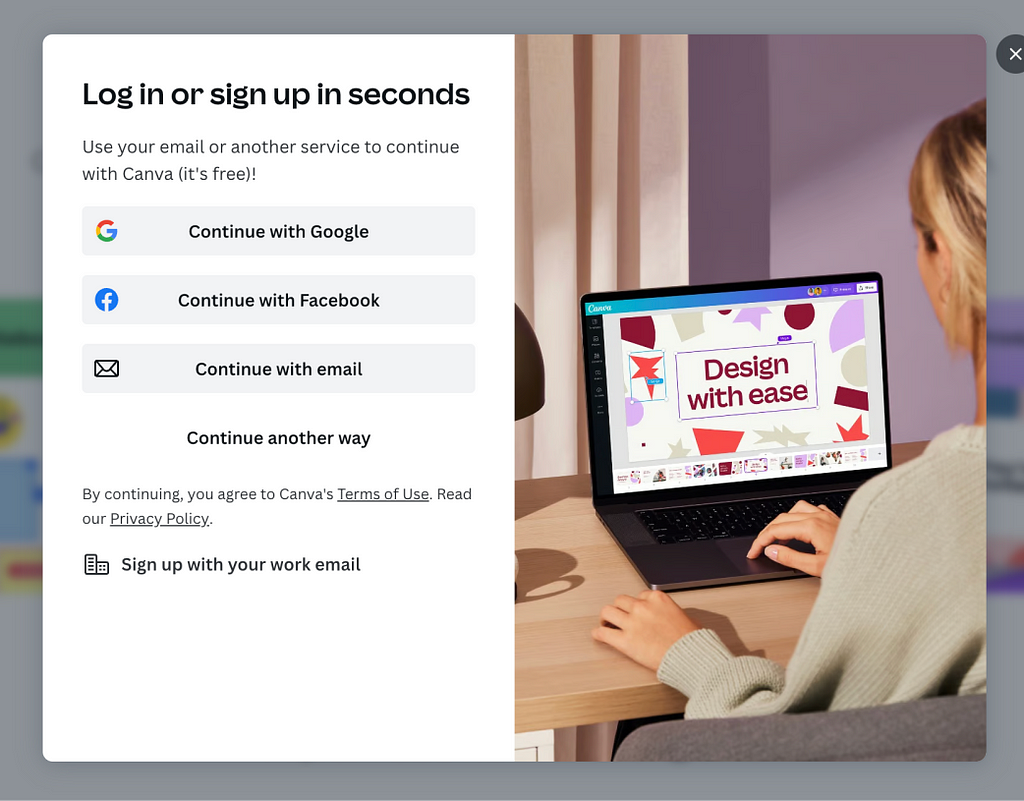
I almost feel as if I’m being slowly hypnotised — most people won’t consciously register this microcopy.
The image shows how easy Canva is — this person has no mouse, no snazzy design set up. A normal-size Mac. If you look super closely she’s also collaborating with two people on the file.
Tapping through to the personalised onboarding screens, imagery is personalised for different cohorts, showing how a total of 6 different user personas can use Canva.
For instance, students (note the focus on the value proposition of easy photo editing).
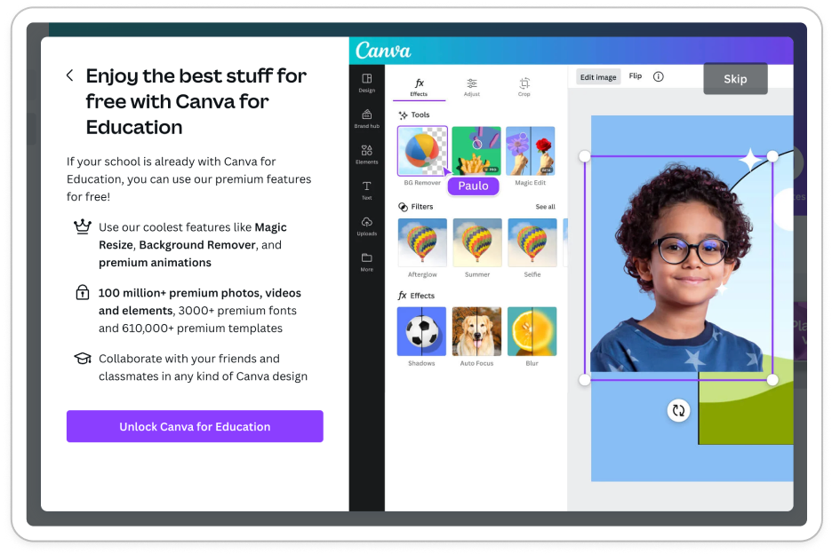
As well as students, imagery is tailored for large businesses (and instead, focusing on the value proposition of collaboration and clear branding of fonts and colours):
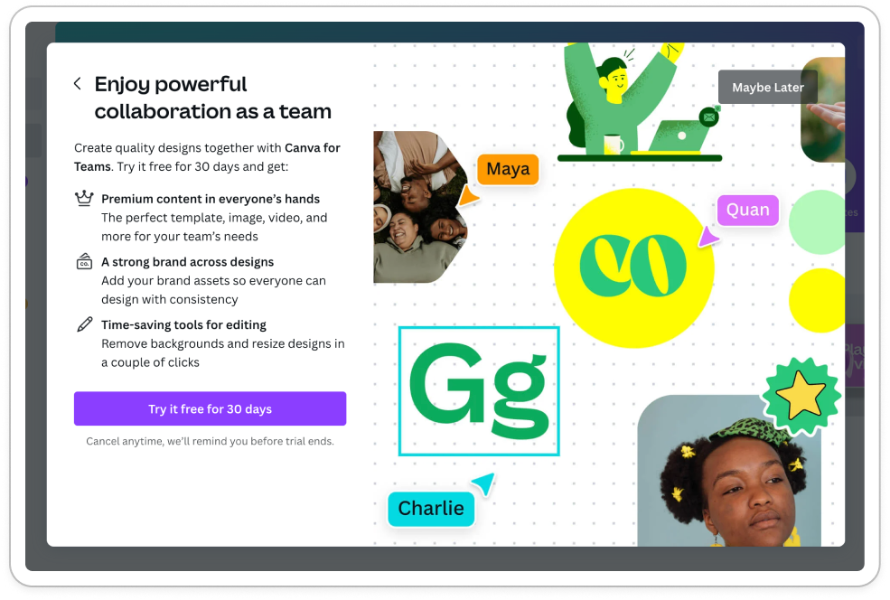
Even for Non-Profits, imagery is tailored to look like charity campaigns and posters.
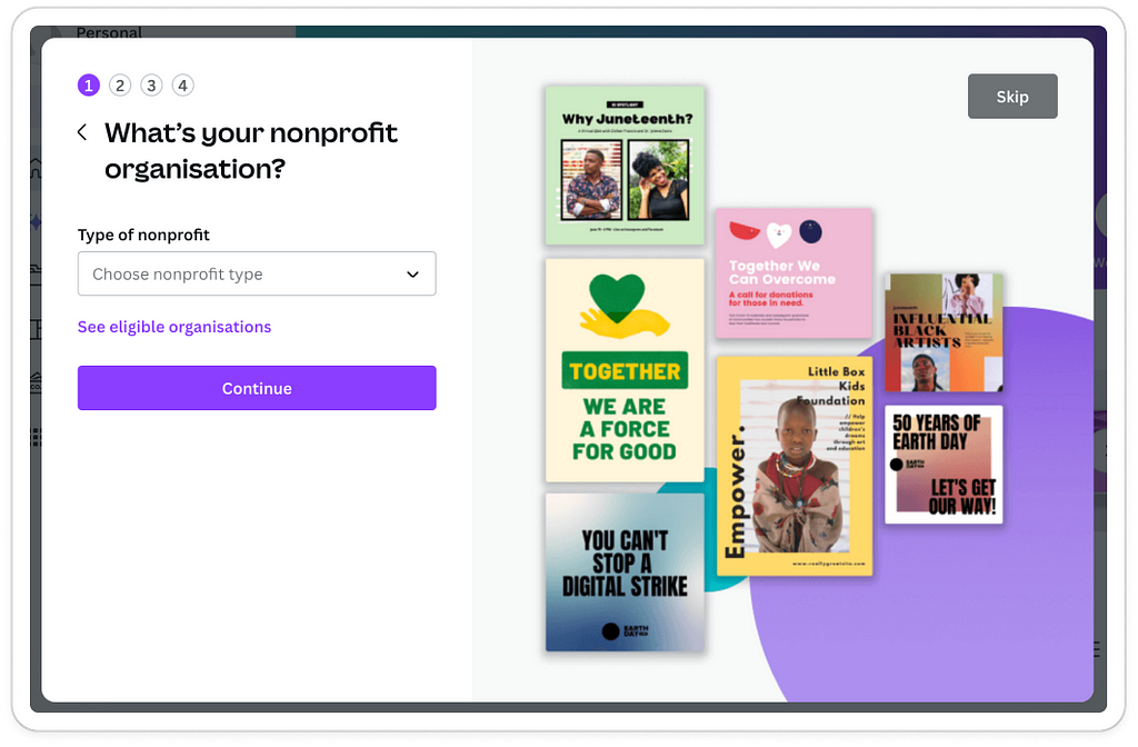
There’s more personalised imagery for small businesses, teachers and individuals — have a read of the full onboarding personalisation learnings from Canva if you want to see more.
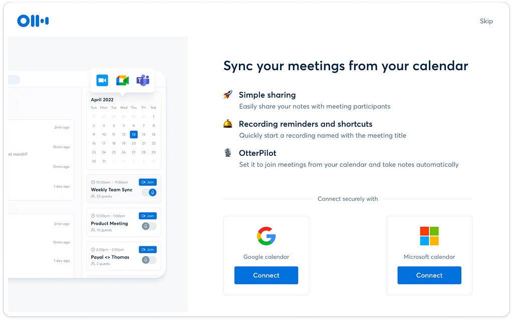
Looking to the others, Otter.ai and Loom also use imagery to provide mini demos and reiterate use cases.
What I like about otter.ai’s version is that it re-iterates the product benefits as well as uses imagery to show a sneak peak of how the activated product looks in practice.
With loom, I love the fact that the image is actually a GIF — it moves to help show the effectiveness of the product in communication & collaboration.

Like a mini, self-serve, on-demand demo.
🤌
In summary, don’t wait to activate
Activation doesn’t have to be long. You can bring it forward by building trust and awareness of your product with your target personas.
Here’s 3 ways to start this with your product:
- Use social proof during registration to portray core messaging (be creative with the types and combinations of social proof, you don’t have to limit yourself to just one)
- Use copy tailored for your personas to communicate hyper-specific and popular use cases for your product
- Use imagery & GIFs with micro copy, concrete product-usage examples and templates early in the product experience to show a sneak peak of what users are in for.
There’s so much more to explore with activation. It doesn’t have to be daunting but can be fun. And, as always, go back to your customers and what they need to motivate them through your product flow.
3 ways to reduce time to magic moment was originally published in UX Collective on Medium, where people are continuing the conversation by highlighting and responding to this story.
Leave a Reply