Ridge Racer Type 4’s UI/UX is a games design classic.
Namco’s Ridge Racer series of arcade driving games was always a successful hit for the originators of Pacman. It was an exciting cabinet racer with an incredibly fun and unique drifting mechanic that was addictive to play. The title was a centerpiece in any decent arcade you would ever find yourself in, but the time of the arcades was coming to an end for the advanced in home gaming. Sony’s releases of the PlayStation and the 3D technology it brought with it not only matched but also improved upon the arcade experience in your own home. This article is about how Namco, by moving the title to console, fashioned their loud and lairy arcade racer into a gaming-style icon in the 1998 release of Ridge Racer Type 4. This essay will look at how and why the Ridge Racer Type 4 is among the best illustrations of the power of presentation and UI design in gaming.
History
Before we explain how the UI of the Ridge Racer Type 4 was so effective, we must show you what was going on in the wider gaming industry at the time. Gaming was starting to take on 3D as the main technology with which to make games, and a lot of different technological developments were going on to not only physically build the 3d chips but how they worked and rendered the graphics. So with all this expensive exploration into 3D graphics tech having a coherent stylish interface was not a major factor in selling video games in mid-90s. The aim of the day was to always be about making the game always look impressive in the 3D world. This meant that there were a lot of extremely awful and garish user interface designs, particularly for the driving game market. It’s as if developers of some of these games (when there was time allocated to UI) felt pressure to make the presentation look as impressive as possible at every turn. They were quite possibly thinking that the more knobs and buttons on our UI, the more features our game has?


I think this was the case, as there was a technological arms race going on with the console manufacturers, those being Sony, Sega, and Nintendo, all with their own technological agendas. Whose machine was the most powerful? What could it do that the others could not? They then put the developers to task to impress and dazzle. It was all about how many pixels and polygons your machine could push, almost like a car enthusiast squeezing every drop of performance out of a clapped-out banger. Developers were metaphorically slapping “go faster stripes” and gaudy sports kits all over the lovingly engineered games.

As you can see, the style of UI for a lot of these games is so overly worked that it borders on parody; a bit if you were to see a character in a Hollywood movie or TV show “playing a game” and the special effect guys put these shots together. You can see there is a real lack of finesse and cohesion, too many typefaces, and chunky UI widgets that stylistically do not match each other even within the same screen space. These issues could all be solved with more emphasis on solid graphic design rather than dazzlement. User interface graphics can still be perfunctory and at the same time be aesthetically impressive. But this heavy-handed style developers were using was overnight out of fashion when Sony (who just were relatively new to game development) dropped the super stylish future racer Wipeout.

Wipeout is a key title in gaming art history, as it redefined how to approach the art direction of a title completely. Sony hired the renowned creative design house, Designers Republic, to create the box art, typography, team logos, and, of course, marketing materials. At the time, the Designers Republic was mostly known for its design contributions within the music and fashion industries, including the record label Warp (which even supplied music for the game). The studio created logos and artwork for the likes of the most cutting-edge musical artists at the time, such as Aphex Twin. This exterior viewpoint into gaming gave Wipeout and the PlayStation itself a sense of style and finesse not seen before in gaming. It really made other developers stop and think about the whole package of a title; every element requires an adequate amount of attention to make the experience sing.

The only problem with Wipeout was this new cool style was mostly happening with on marketing and box art, not as much as the in-game UI work (apart from typeface logos, icons, etc). Perhaps lacking the full treatment in and out of the game Wipeout was never less of a start in a revolution in UI aesthetics that developers worldwide took note of. Shortly after this release Sony created another driving title that helped pave the way for Ridge Racer type 4’s creative mark, Polyphony Studios Gran Turismo.

This was the first serious driving game on a home console, and it brought an earnest vibe to the experience. It used a neat and concise UI style that was mostly functionally driven, but you could see style liberally dotted throughout. Nice graphic design makes sure to use most of the screen space with the header/footer layout. You can see from the shots that there is a seed of inspiration that sets the tone of the Ridge Racer type 4 black/yellow color palette, although it is inverted. Gran Turismo, once more, was a positive development for game UI design; yet, as we’ve already mentioned, it was mostly function-driven, therefore it lacked ambiance and ultimately was not, was not as memorable. This brings us to the primary topic of this essay, Ridge Racer Type 4, but before we go too far ahead of ourselves, let’s take partake in a brief analysis of a few earlier series titles for reference sake.
Ridge Racer (1993) PS1

A popular game for the PlayStation 1 and a key selling factor for the system itself was Ridge Racer. In the 1990s, the ability to replicate the true arcade experience at home was a major selling feature of the PlayStation because, before the introduction of the Sonys powerhouse of a machine this was hard to do on the older consoles such as the SNES and to make a game in 3D? Impossible.
Rage Racer (1996) Playstation 1

Rage Racer was the first PlayStation-exclusive game in the series, and with its arrival, the developers needed to. It was difficult to figure out how a Ridge Racer game would feel outside of the arcade setting as Ridge Racer transitioned to a console-only experience. Rage Racer was an oddly somber departure from earlier games; it had a grungier and darker vibe. The user interface makes it clear that the series was in a bit of an aesthetic identity crisis, with vehicle schematics and graphs underlying a range of odd typography with a rock music aesthetic that was not quite gelling together. The game itself was great, but in its presentation, you could see an aesthetic mismatch from a game trying to be bold and eye-catching but no longer necessarily needed to draw attention to itself.
Ridge racer type 4

Players and critics alike praised Ridge Racer Type 4 when it was first released. It was both the resurgence of a PlayStation 1 gaming mainstay and something entirely different. Namco’s successful arcade racing template had been kept intact but with a new degree of polish and finesse for the king of arcade racers. UI-wise It had bounced back from the aesthetic limbo of Rage Racer with a bold and unclouded vision of what it is and what it is about. Let us look at some of the main UI elements that contribute to Ridge Racer Type 4’s unique and unforgettable appeal.


1. Simplicity
We mentioned Rage Racer previously and how the UI was a little confused, muddled and messy; to be honest, that was not a fair statement. Nearly all games, in particular driving games, were like this at the time. Always trying to outperform the competition, the louder the colors or the more knobs and sliders your UI had the more hi-tech your game was. Looking back after the Ridge Racer Type 4 release, we can now see how the opposite is true. Simplicity in the UI shown here outshines a lot of graphic design in gaming nowadays. Using beyond-bold sunshine yellow as the backdrop for fantastically precise screen layouts punctuated with bold black typography, the designs are stupefyingly simple. This simplicity made it an eye-catcher wherever and whenever it was being covered. By stripping back the clutter, the game is then focused on presenting the game rather than fanciful UI trinkets. Again, it is always about how UI design is the frame of a painting, and not the painting itself. Thematically complimentary but never obscuring the message or content of the game.


2. Motion Graphics
With this minimalistic style, it was down to the outstanding motion graphic work that helped push the production levels above simple screen layout. This level of polish on the presentation for a PS1 game was beyond anything out on the PS1, or any other console game at the time. Even with the limited hardware on the ps1 the graphics are nice, simple, and smooth. The transitions are of course extremely limited, but the screens are always synchronized up beautifully and flow between each other quite like a well-oiled machine. What is key about them is this flow, they have a rhythm that puts the user on a journey through the functional aspect of the screens toward the end goal playing the game itself.


3. Gourad Shading
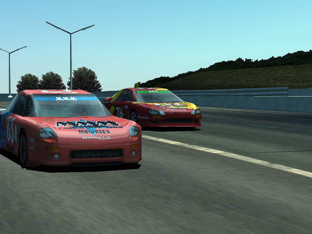
One technical choice by the developers that really enhances the game’s warm, fuzzy aesthetic is the choice to use Gouraud shading. Gouraud shading is a different type of method that 3D graphic engines use to work out how to light 3D meshes and render them. By using a lesser-used algorithm to shade the 3D environments and vehicles, the game’s visuals differ noticeably from other games that use the much more common Phong method.

This illustrates how stronger highlights are produced by Phong shading (which was the most widely used rendering technique at the time) than by Gourad shading. When using this more nuanced rendering method of Gourad, the highlights are leveled out, which produces more subtle tones and gives the Ridge Racer Type 4 its inherently warmer appearance. When the content of the world has this warmer aesthetic, you could argue it must influence the palette choices for other non-world content, even just to build a cohesive art direction.

4. Motif
We just picked apart three aesthetic elements of the Ridge Racer type 4 art direction that make up the UI style, but one element isn’t captured within that breakdown. What’s missing is that, to me, the most important presentation element that really ties the whole experience together is the motif. Now, generally speaking, a motif is normally something aesthetic in many cases that intertwines with the theme of the overall game (Okami and the Japanese brush stroke effect, for example).


Is the motif “racing team aesthetic” or “minimalistic graphic design”? really both way too vague and truly do not capture the essence of this game’s presentation. So at a glance, the Ridge Racer Type 4 doesn’t appear to have any formal visual motif to speak of. This motif But I think there’s something far more esoteric going on here; the motif is positivity.

So what do we mean by positivity? Everywhere you turn (sometimes literally) in this game, there’s an aspect of this motif present. Whether you’re racing, navigating a menu, or even talking to an NPC, this motif is present. An actual visual aspect of this motif that first catches your attention is the color yellow. The general palette of the game is warm, as we have described before, due to the use of gouraud shading. Add to this the full-screen use of yellow on the front end, and this drastically enhances the warm nature of the game.
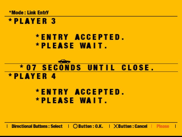
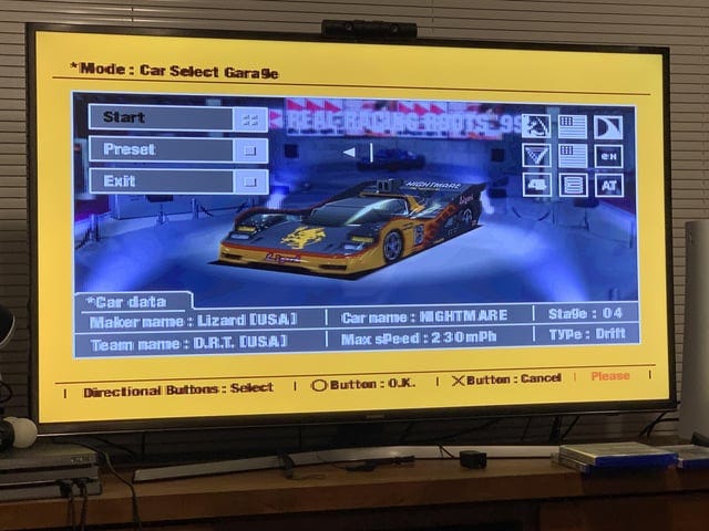
Now at face value, we can just go by color theory and explain that the shade of yellow being used is inherently positive. Yellow is connected to the sun and represents happiness, optimism, and enlightenment, according to psychologists. And if you agree with that judgment, it’s hard to argue that the heavy use of yellow is not at least part of the positive tone within the game. The times when the game is not yellow are to show transitioning to a loading screen or a game over screen. Although when you get where you are going from the transition, it’s as if the content itself is still basking in the screen burn from previous sunshine yellow.
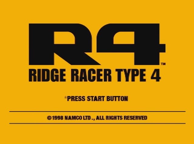
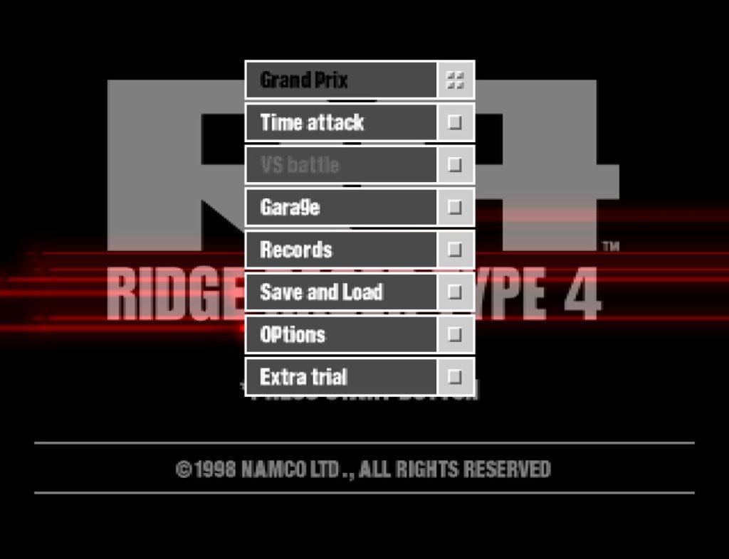
This is partially due to the motion graphics, which have an intriguing, subdued VFX that lies on top of the black-to-yellow fade. As you can see, the use of black is introduced as a pseudo-inverse system alert in the example above. The game has gone dark to alert the player to the requirement for system prompt engagement, loading, or some other player agency-related interaction. Although the psychological impact of the motif’s usage of yellow is readily apparent, there is more to it than just the color yellow. Let’s examine some of the more esoteric facets of the optimistic spirit that the game personifies.
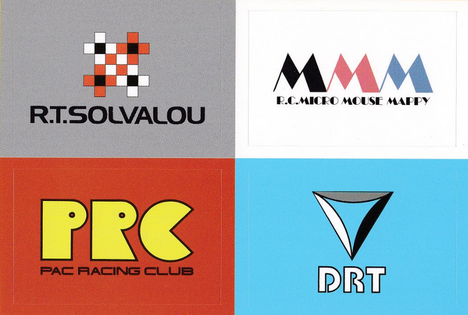


Positivity is also present when you interact with the npcs on the front end of the game and the application of the positive tone of the game. When you start a grand prix, you have a selection of different racing teams who all have different kinds of cars they race. You just pick one, and then the story begins for that racing team. The owners of the teams you drive the Grand Prix for have their own stories and reasons for setting up racing teams. There are no cut scenes that are used to show these NPCs, just a dialogue screen used in the front end to display a portrait of the driver (always with a yellow background) and a speech widget.

Positive narratives stem, for instance, from success and redemption stories. Following an accident that resulted in the death of another driver, one of the team managers is hesitant to return to the racing scene. He seems hesitant about you pushing yourself too far as you drive for his team. However, when you achieve a win, he starts to forgive himself for doubting you. Another team owner is also initially reluctant to push himself too far; he eventually reveals himself as the father of the racer who perished in that aforementioned collision. After you win the Grand Prix, he then manages to rediscover happiness in racing once more. The Japanese word “ikigai” combines the terms “iki,” which means “to live,” and “gai,” which means “reason.” This means that the term literally means “a reason to live.” It’s an idea that inspires people to live happy, purposeful lives by learning what really matters to them. All of the stories in the game reflect this idea, and interestingly, the color associated with this philosophy is yellow.


Now, even though this falls more into the narrative category of game design, I bring this up in relation to the user game motif because the entire tale is told within the UI screen space. These dialogue prompts have a unique design; they don’t fill the entire screen; they don’t even animate, but somehow they keep you engaged with the storylines. What I think helps tie it all together is the rather offbeat choice of having the NPC portrait within a yellow and black frame, which are placed over an actual rendering of, say, the garage or a meeting room. Instead of drawing you away to a full-screen image, it seems as though the designers intended to keep you immersed in the front end’s feel. I’m not sure if the choice to display it like this would have been prohibitively costly or time-consuming (full-screen 3D scenes or renders). By remaining inside the UI’s screen area and positive space, it enhances the story’s efficacy. And it compounds the feeling that the NPCs are talking to you directly, which in turn makes you feel like the driving force behind the happy outcomes of these interesting and uplifting stories. We don’t even end here with the positive motif, so let’s look at a few more of these positive aspects of this game’s UI.


Even in failure, the game seems to exude positivity. When you fail to win a race, a little voiceover and a jingle play are genuinely compelling. I have mentioned this before, but the game never really portrays a must-win scenario to the player; it’s far more about the feeling of racing than the actual feeling of winning a race. Another really beautiful touch is that you can also see in the starting card of the final race of the Grand Prix that the time is set at 15 minutes, just before the new year and the new millennium. In another game setting, this would probably have a sense of urgency around this deadline. but with the uplifting and hopefulness of the story beats, this deadline has much more of a romantic sense about it.
https://medium.com/media/ee4046ba462f4704b90fa29b12397c4c/href
I would be amiss if I didn’t mention the game opening sequence when it comes to talking about the game’s enchanting emotive qualities; it truly captures the uplifting, soulful experience of playing Ridge Racer Type 4. From the opening imagery, the gouraud-shaded colors glow, the vehicles seem to dance, and they gloriously sync to the vibe of the music. It’s a perfect blend of content, aesthetic, aural, and theme that fits the purpose so well that it’s undeniably magic in a bottle. Nothing else in the series has truly captured the essence of what Ridge Racer is really about in such a manner.


Ridge Racer Type 4 benefits from having one of the most legendary soundtracks of any game ever created, and is frequently declared as such by both ridge racers and non-ridge racers. A truly classic introductory sequence, simplistic in today’s terms but nearly ideal for its intended purpose. I could go on discussing this unique motif, but it’s time to get to the user interface’s impact on gaming as a whole.
Effectiveness

After the debut of Ridge Racer Type 4 a plethora of games in many genres were released that were undoubtedly influenced by its style. However, each major shift in the gaming industry almost typically begins small scale and quite often inside the same genre first. For example, the incredibly popular and really highly rated Colin Mcrae Racing for the PS1 was definitely a game influenced by Ridge Racer Type 4’s user interface design. One such game was Codemasters Colin Mcrae’s Rally released in 1998 which was a fantastic game but undoubtedly lacked coherent vision on the User interface side.

Colin Mcrae Rally 1 Pre RidgeRacer Type 4 has loads of fonts and loads of colors stylistically all over the place. Although functionally usable, there are a lot of things style-wise going on on each screen, to the point that they almost all look like they are from different games. It’s not a lack of effort or care that makes these screen designs not what they should be; it’s more of an incoherent vision for the presentation that lets the otherwise perfectly acceptable individual design choices.

Post-Ridge Racer Type 4, you can see and influence this Colin Macrae Rally 2.0 screen. Gone is the clutter; now we have designs that are clear, concise, and stylish. It’s almost as if they decided to do a colder color treatment of the whole Ridge Racer type 4 style. This example shows the immediate influence of ridge racer type 4s in this case with a content-first mindset powered by the application of focused graphic design. There were other titles impacted by the user interface designs by the Ridge Racer type 4, and we could examine more, but something more interesting happened in this case. The designs of the screens had an effect way outside of the scope of a normal user interface sphere of influence; they defined the visual style of the marketing and merchandise.

As a direct result of having such a clearly defined presentation style it’s a no brainer to use it on the box art, but what about the disc? What an inspired choice! You just need to find the correct font, color, and loose composition from the user interface to create Ridge Racer Type 4-themed graphics for almost everything. From the design of the disc, it has progressed to being used on 95% of all game merchandise. Every piece of official clothing has this look, while some only include the mascot Reiko Nagase with the logo (the remaining 5% probably, she has a lot of fans).

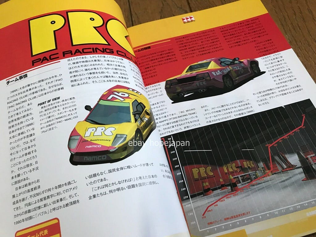
Guidebooks, t-shirts, and stickers are typical items produced when a game is released; nevertheless, the range of products was significantly greater due to the title’s enormous success. This is a tiny sample of clothing, toys, and cassettes. There is actually, to this day, a cottage industry of fans still making Ridge Racer Type 4 merchandise. Flip through Etsy or Ebay and you can still find new pieces of art or clothing popping up now. Not bad for an old game that isn’t classically known to be evergreen like Zelda, Mario, or Sonic. If you have a handle on the main elements of this style, you can nearly apply this to as many ways as you can imagine.


What’s so endearing about the Ridge Racer Type 4 style is that it lives on not only with game aficionados but also with new developers entering the gaming field. You can go on websites such as Art Station and Behance, and you can find redesigns of the user interface using the basic rules of what Ridge Racer Type 4 laid down. The greatest thing about these designs is that they never try to pick out flaws in the original or try and inject something that shouldn’t be there. This is so refreshing, as there is sometimes a desire for designers who seem to think they have solutions to questions that don’t need answering.
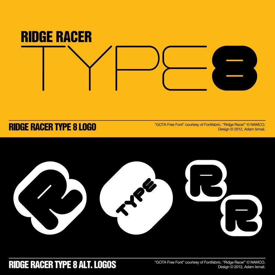
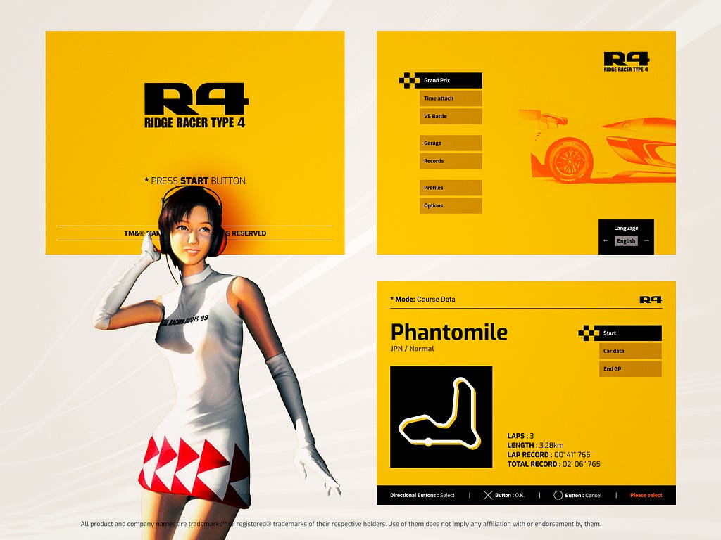

But when it comes to Ridge Racer Type 4, it always seems like fellow designers are paying homage to a true classic UI. I tend to think of it as when you see a live musician doing a cover of a classic track. At its bare bones, it sounds the same, but it has tweaks by the covering artists. It is also really fantastic to see these designs were done relatively recently; the game is over 20 years old. It’s incredibly respectful, and it really shows you not only the love for this game but also the impact it has had on gaming user interface design.
Final thoughts

Driving games are basically about getting your car from one location to another quickly, usually faster than a group of opposing cars. The presentation of that idea that these games will have can vary in style; some will be serious, like in Formula 1, while others will be considerably more absurd, like in Mario Kart. Fundamentally the lesser lack of player agency and expression due to the fact that you control a machine and not a fully articulated character, certain other aspects of the game can step up and play a greater part in expressing emotive themes. Ridge Racer Type 4 is one of the finest examples where the power of presentation is on full display. Without this example of the beautifully realized user interface, would the game be the same, or even mean the same to the player?


You can really argue that some of the things I have talked about in this article are stepping outside the realm of user interface design. True, maybe, but this example shows that a user interface can be more than the sum of combining a font, a color, and a widget shape. When all the parts of the game converge so perfectly in this manner, it becomes impossible to pull one part out of this construction without monumentally altering the experience. To me, this game also demonstrates the ability of motifs to tie together aesthetic, aural, and even functional ideas. These ideas are all working together in harmony to build a unique, singular experience for the player.
And this is where I start to think about the vibe of Ridge Racer Type 4; to me, it doesn’t seem to be like the other racing titles out at the time. In fact, it doesn’t even seem to feel like any of the titles in the same series. For example Gran Tursimo is seriously-minded, or, on the other end, like the original Ridge Racer, gaudy and goofy. Ridge Racer Type 4’s presentation style and vibe create a different atmosphere; it’s much more than just racing to win. There is an experience here that lacks judgment of the player and is truly a game around relaxation and flow state. And this makes me believe that that Ridge Racer Type 4’s true spiritual predecessor is Sega’s golden age arcade racer, Outrun.
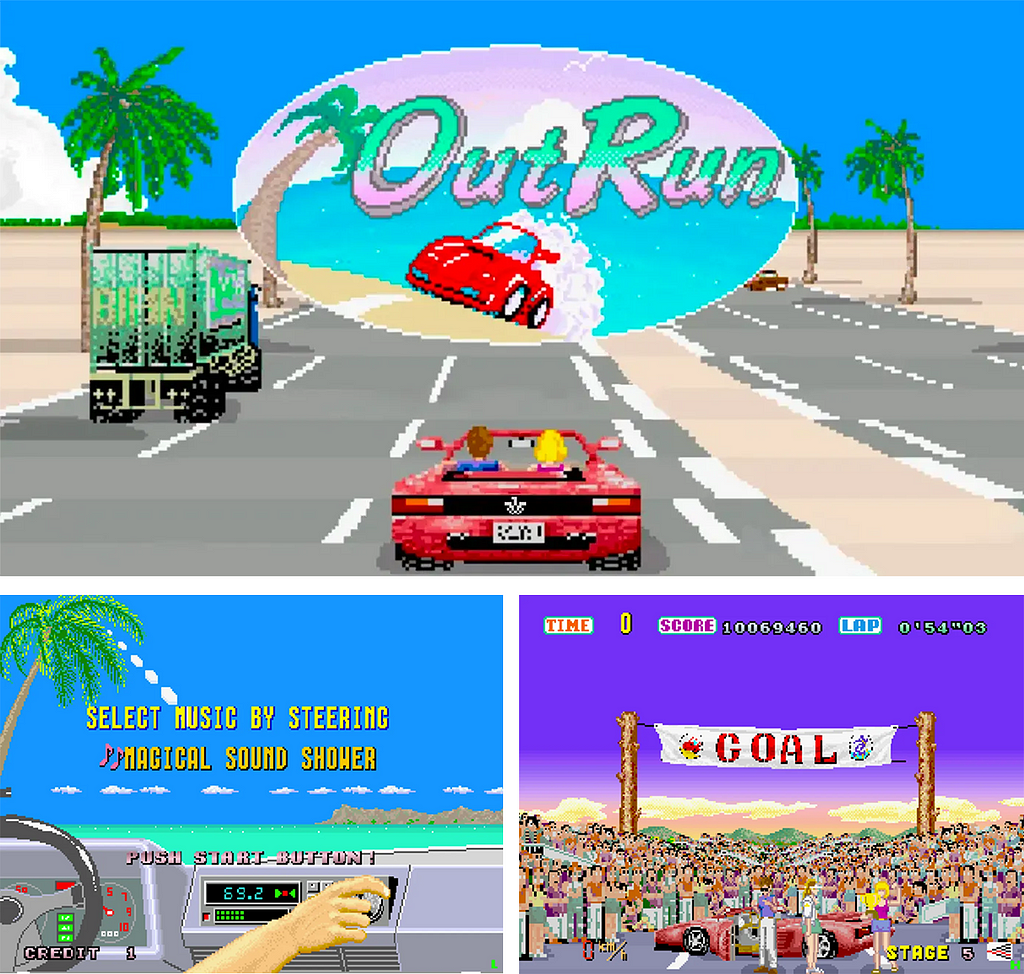
Outrun, released by Sega in 1986, was an arcade game that, at the time, was like Ridge Racer Type 4 and very much its own thing, even within the realm of arcade racers. It might be much more on the goofier and cartoony side aesthetically, but there were other elements about it that definitely inspired Ridge Racer Type 4. The driving style in the game had a Ridge Racer-style drift feeling, where smoothly taking turns and perfectly gliding from bend to bend felt great. Outrun also has an iconic soundtrack full of buoyant, cheerful tunes that create that laid back vibe where you forget the race and just enjoy the ride. And a first for video games: anywhere before you start the race, you can select the tune you want to race too, just like in Ridge Racer Type 4. I also have to enter, as my final piece of evidence in this case is in the Ridge Racer Type 4 introduction sequence.


In this sequence toward the end, the car is racing along a coast line, and Reiko Nagase flags you down for a ride. Coastline driving, positive tunes, and a girl by your side — surely this is an homage to Outrun? Both games capture a magical flow state for the player to experience when the graphics, mechanics, and music mix together at that perfect moment. Although unique in their own ways, both Outrun and Ridge Racer Type 4 share a positive vibe and a romantic sensibility about their gameplay.


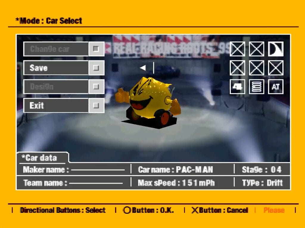
Ridge Racer Type 4 has the elements that must exist within a racing title: realistic locations, racing teams, and feasibly realistic automobiles. The presentation style does nothing but enhance this experience. It was stripped of any aesthetic noise or clutter so it could focus on the content and theme. But crucially, the style might be simplistic but never feels empty; its minimalism has a soul. The alchemy of all the technical, artistic, and design choices fused with the soundtrack to create a fantastic result that still influences designers to this day. Ridge Racer Type 4 is a true user interface masterclass.

— EDITORIAL AMENDMENT —
To do a blog post like this takes a while to do as you have to grab as much time with the game and look through old images to refresh your memory. But about ninety percent of the way through this piece, I saw something in this grainy, low-resolution photo. It was a gallery of shots from the front end sequence of the game, and one of the smaller images really caught my eye.
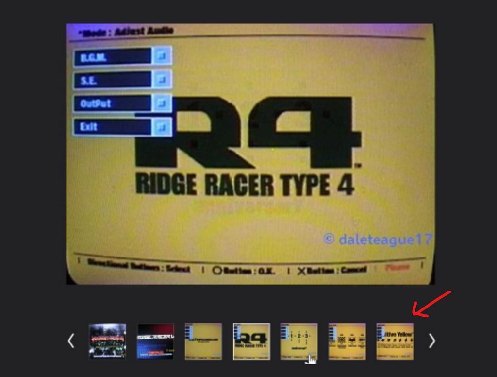
You can see here a still saying, “Positive Yellow” with color code data underneath. Obviously, I was quite surprised to see this, as at the time I was trying to argue my positive motif points. Although I did have second thoughts about using this reference, I thought it was some sort of fan mod of a Ridge Racer type 4 build. A quick note on this: there are many fan-related projects out there still today regarding this much-loved game, so I thought that was what it had to be. Was this some debug screen from a weird demo? Just to check for real that this was not a capture from some sort of fan project, I loaded up the game to check. And low and behold its actually in the original release itself!


During the background motion graphics sequence on this audio adjustment menu there’s a small half second section of the motion graphics that flash so quickly with multiple shots of different pieces of information. “Positive Yellow” is an actual term used within and about the user interface of ridge racer type 4, What a find! Proof positive that it was part of the mindset of the Games user interfaces motif. Although quite annoying as for a bit of fun for the article I had actually registered the shade of yellow used in Ridge Racer Type 4 in the color database.
Why did I do this? Well, I saw many fan-made bits and pieces out there, whether they were posters, t-shirts, or actual design projects. I went through a lot of them, picking the values of the yellow that was used, and it was a bit all over the place. So I kind of decided, with reference to official and non-official sources (which outnumber official uses of the color now), to define this shade as #FAB217. I also called the color “Real Racing Roots Yellow” this was of course before I saw this in the game reference to the color, which is named “Positive Yellow.” But I think I’m pretty fair in saying “Positive Yellow” is a little vague and I wanted to make it a bit more memorable.
Links to Check out
https://jalopnik.com/ridge-racer-type-4-was-the-definitive-racing-game-of-my-1845701913
https://www.feedme.design/why-does-ridge-racer-type-4/
https://archive.org/details/rrt4officialguide/page/n33/mode/2up
Analyzing UX & UI decisions in classic racing games was originally published in UX Collective on Medium, where people are continuing the conversation by highlighting and responding to this story.

Leave a Reply