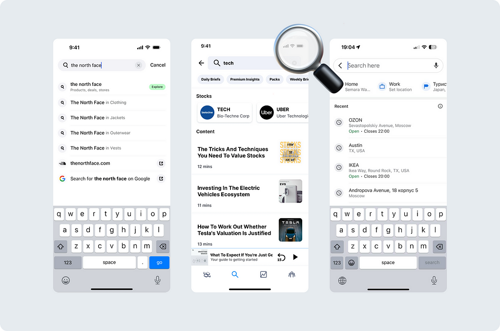
We (Ksenia Toloknova and Marina Sapozhnikova) work for Alfabank and are involved in designing patterns for our application. In this article, we will:
- Analyze various options for the search pattern
- Look into the guidelines
- Consider some UX mistakes
We’re going to try to help you choose the optimal search option for your mobile application.
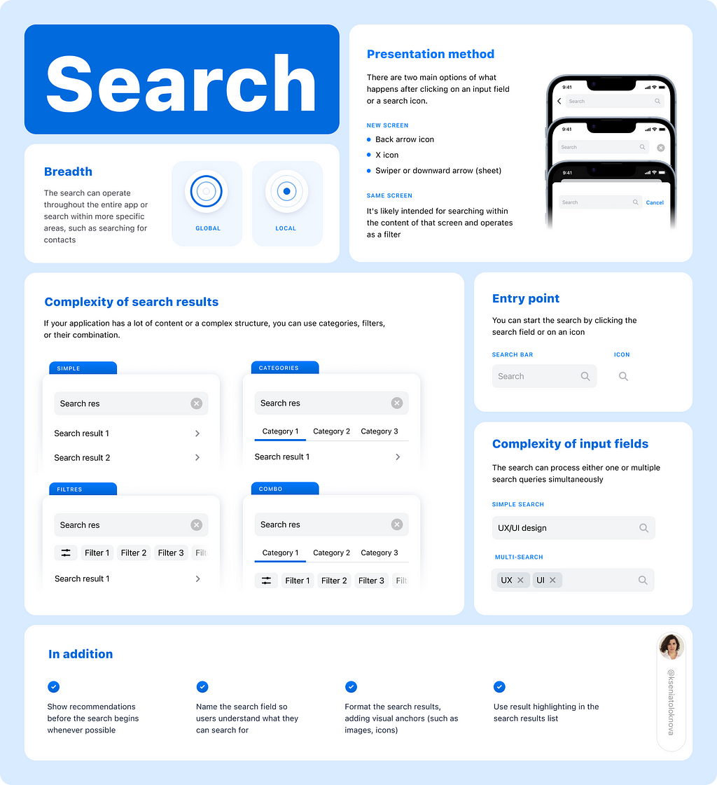
The Search is a flexible tool. It can work very differently depending on the context. To understand the topic better, we have outlined a list of principles according to which search can operate.
Principle 1. Entry point for search
The choice of the entry point and its location depends on the level of emphasis required in the search.
In the article by Suzanne Scacca for Smashing Magazine (2019), various entry point options are well outlined. Suzanne notes that the search can be positioned at the top and bottom of the screen. We want to add that as of 2024, the search bar may not only appear at the top or bottom. It can also be located within the screen.
Let’s consider three the most common options.
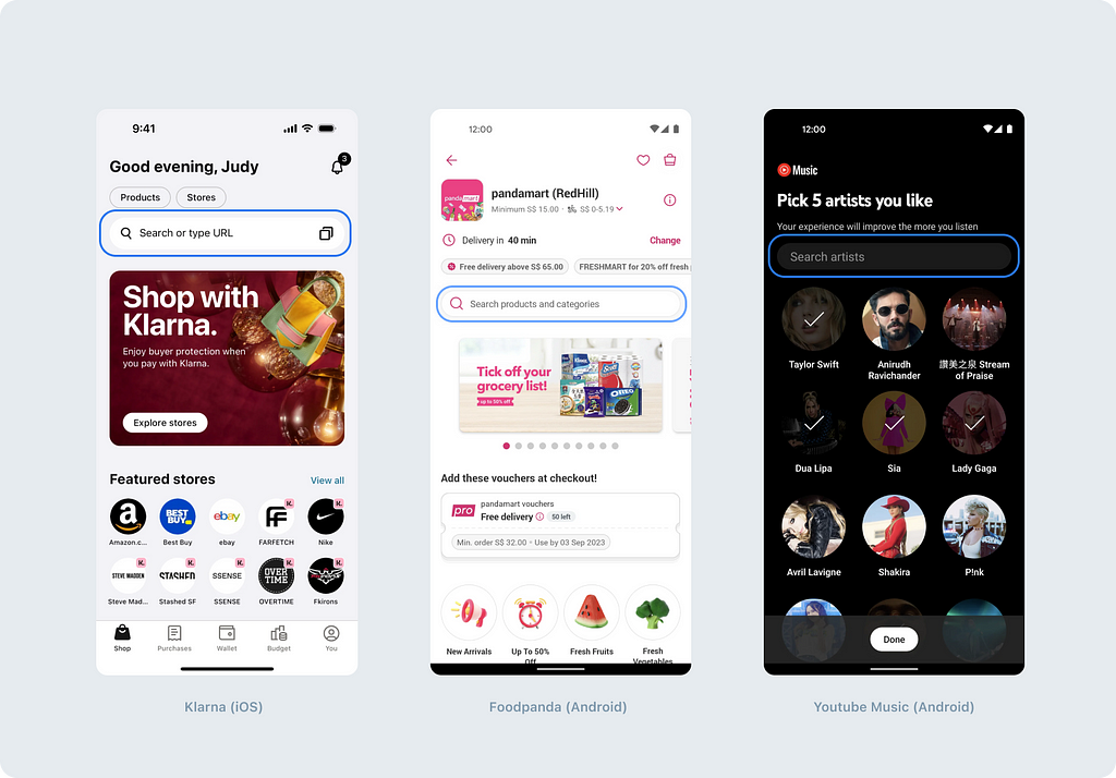
Search bar
This option is preferable when the main focus has to be on the search functionality. The search bar occupies significant space on the screen, making it more accessible to users. This is especially convenient in situations where the search is a key function or the primary way of interacting with content. Examples of such a bar can be found in apps like Google Maps, Airbnb, DoorDash, and many others.
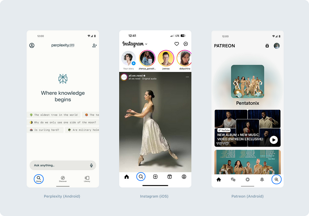
Icon in bottom navigation
Placing the search icon in the Tab bar (Human Interface) or Navigation bar (Material guidelines) provides access to the search function from any screen of the application. This option is suitable for applications where the search plays an important role in overall navigation, and users can quickly switch to the search regardless of the context. This approach makes the search function more easy to access. You may encounter it in apps like Instagram, Uber Eats, Apple TV.
It’s worth mentioning that the search field and the search icon in the bottom navigation can coexist on the same screen simultaneously.
Icon in top navigation
Using the search icon in the navigation bar is suitable when the search function is less prioritized or used less frequently. This option helps saving space on the screen and usually implies that users will first focus on the other aspects of the application before starting the search. In the aforementioned article, Suzanne recommends using this type of search if search is not the only important action in the application. Examples of apps where you can find such an icon quite often include Youtube, Youtube Music, Twitch.

The entry point for search can also be hidden. For example, it can be located in a dropdown menu. This option is suitable if the search is needed very rarely in your scenario.
The choice of entry point for the search should be justified based on the user’s needs and the characteristics of the application itself to ensure maximum usability and alignment with the overall navigation and design strategy of the application.
Principle 2. Breadth of search results
The search can be global or local. Both types of search have their advantages and are equal in demand.
Global search
Global search is necessary for applications with a large amount of content and serves as one of the navigation methods. It is not limited to any one type of content unless the application itself limits it.
An example of a global search can be found in the Google Maps app, where the search is the primary means of navigation. You can find everything you need through the search field — the nearest gas station, cafe, restaurant, or landmark.
Useful tip from developers: “Despite appearing as a separate screen, this search is implemented into a modal window. This can be visually understood by observing the screen’s appearance — it lacks the standard animation of appearing from the side.”
Useful tip from developers: “Implementing voice search is not difficult if it works simply as a word recognizer. The language in which recognition occurs depends on the phone’s system settings.”
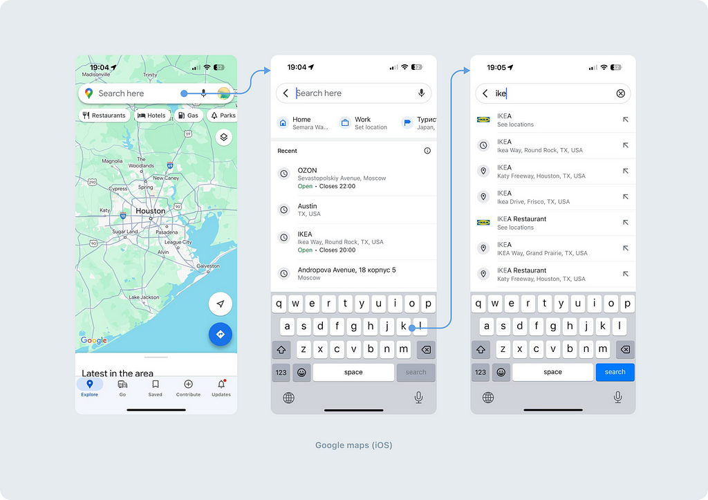
Global search is often available directly from the main screen of the application. In addition to Google Maps, such a feature can be found in Booking, Airbnb, Zillow, and many others.
Incorporate global search into your application if users may need to find something undefined or not entirely specific.
Local search
Local search makes it easier for users to discover relevant information within a specific context or area of the application.
An example of local search can be found in the Facebook app under the Friends section. Here, the entry point for search is indicated by a magnifying glass icon. By clicking this icon, a user opens the search by the list of people. This search is limited to the list of people, in other words — it’s local.
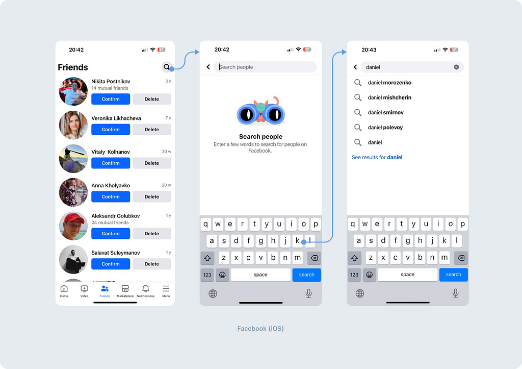
There aren’t any rules about which type of search is better. Both options are in demand depending on the user’s needs and application features.
Principle 3. Presentation method
There are two main options of what happens after clicking on an input field or a search icon.
New screen
Most often, the search opens on a separate screen that focuses the user on their search request. It’s worth noting that this screen can be either a full-fledged screen or a modal one. Visually, they will primarily differ by the exit point from the search scenario:
Back arrow icon, clicking on which allows the user to exit the search mode. This is usually used to denote a full-screen display, but sometimes such an arrow can also be placed in a modal view.
Х icon on the right or left. We’ll mention right away that this solution has a downside. We’ll discuss it below.
Swiper or downward arrow (sheet). Depending on the platform, the appearance of the curtain usually differs. In iOS, it typically appears as a full-screen sheet with a swiper and a darkened top, while in Android, it features a downward arrow in accordance with old Material guidelines (At the time of February 5, 2014, this is no longer in the guidelines).
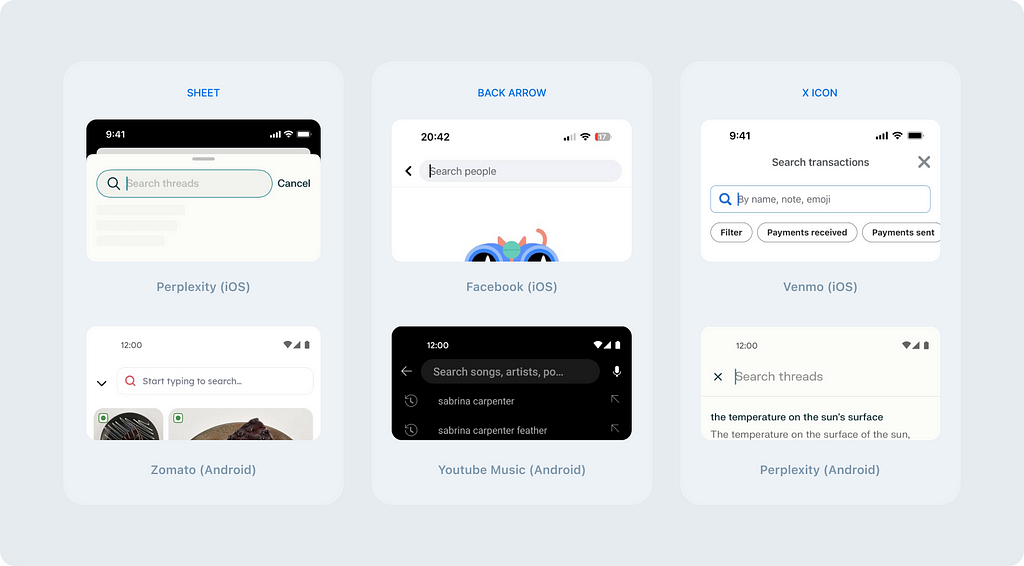
Same screen
If the search opens on the same screen, it’s likely intended for searching within the content of that screen and operates as a filter. An example of such a filter-search is found in the Telegram app. Activating the search within a channel can be done from the dropdown menu. Upon clicking the search, a search bar appears in the Navbar, filtering the content.
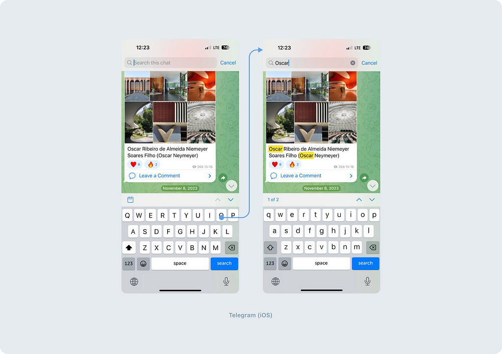
Suzanne Scacca: “Think about stores that have loads of comments attached to each product. If your users want to zero in on what other consumers had to say about a product (for example, if a camping tent is waterproof), the search function would help them quickly get to reviews containing specific keywords.”
The choice between a separate new screen and an on-screen search depends on the context of use. A separate screen may offer a more focused space for searching, while an on-screen search can be convenient for quickly filtering content without navigating to another page.
Principle 4. Complexity of search results
Simple display
Simple display is suitable for situations where the content is relatively uniform and does not require additional classification. It provides a linear display of results, which simplifies the perception of the information for the user.
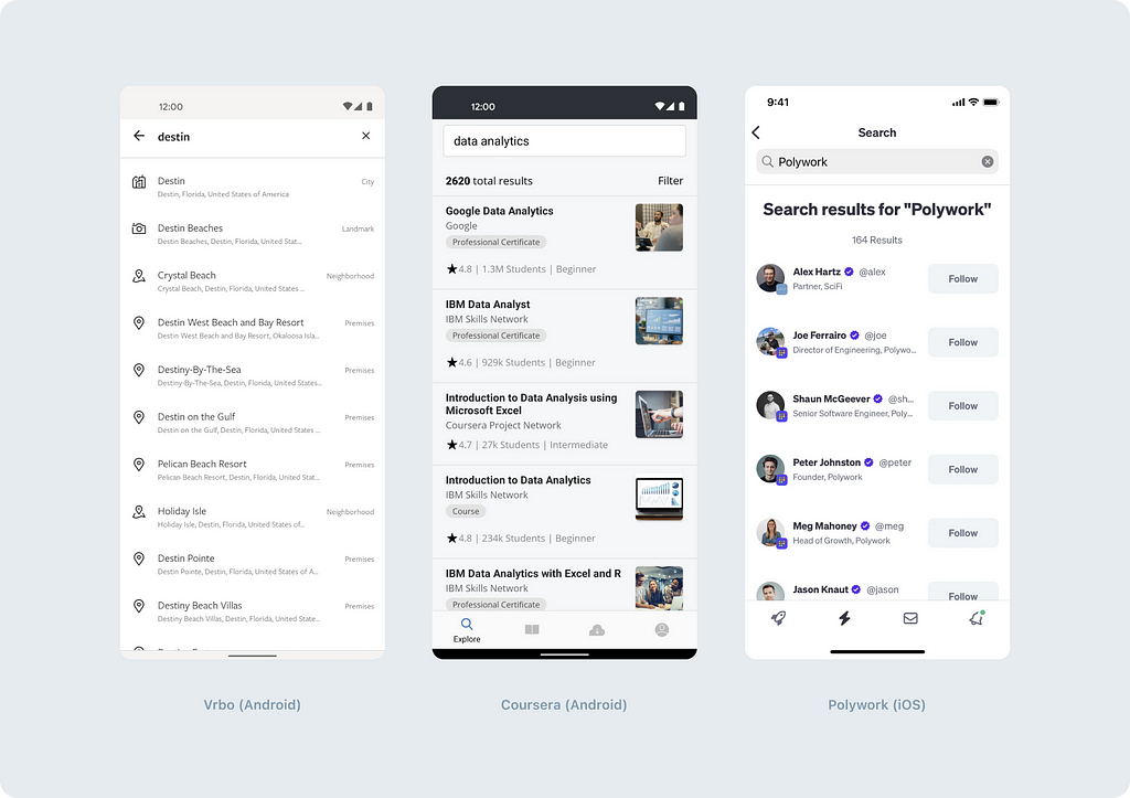
However, in the case of a large volume of content, a simple display may lead to difficulties in finding the necessary information due to oversaturation with the results.
Categorized and filtered display
If your application contains various types of content, consider adding categories, filters, or their combination. They provide a more structured approach to organizing results.
Categories allow users to find the desired information more quickly by focusing on their areas of interest.
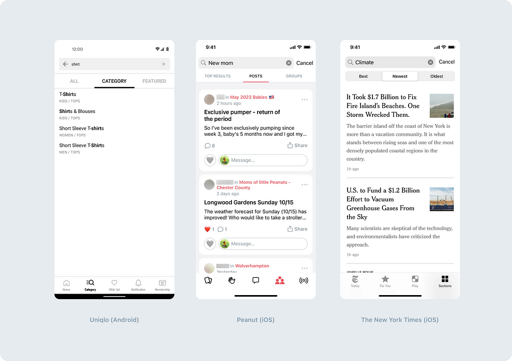
Filters, in turn, help narrow down the search and present results according to specific parameters such as a date, a content type, an author, and so on. Multiple filters can be used simultaneously.
“Use filtering to cut screen clutter,” recommends Catherine Dee in her article.
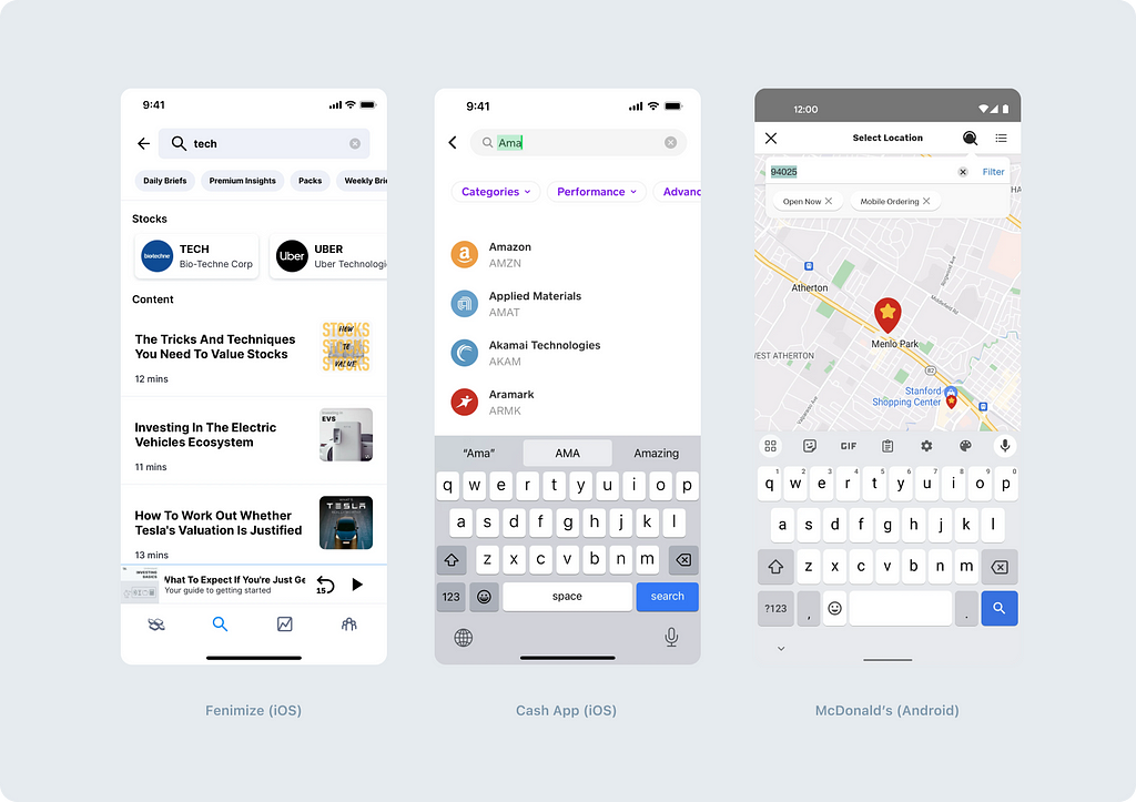
Another option is a simultaneous combination of categories and filters. If you decide to use such a complex option, make sure that your audience understands the formulations, as recommended by the Nielsen Norman Group: “Vague groupings and unclear labels increase cognitive load.”
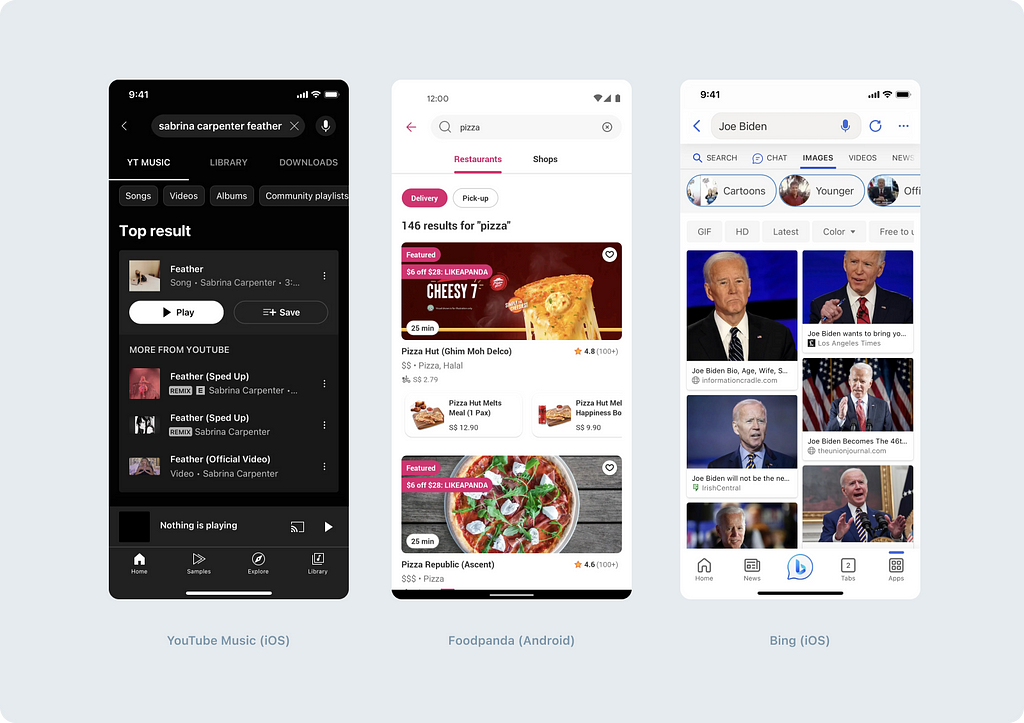
Sectioned display
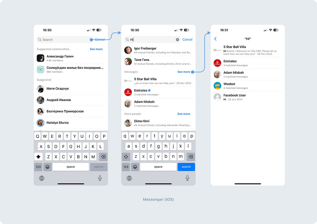
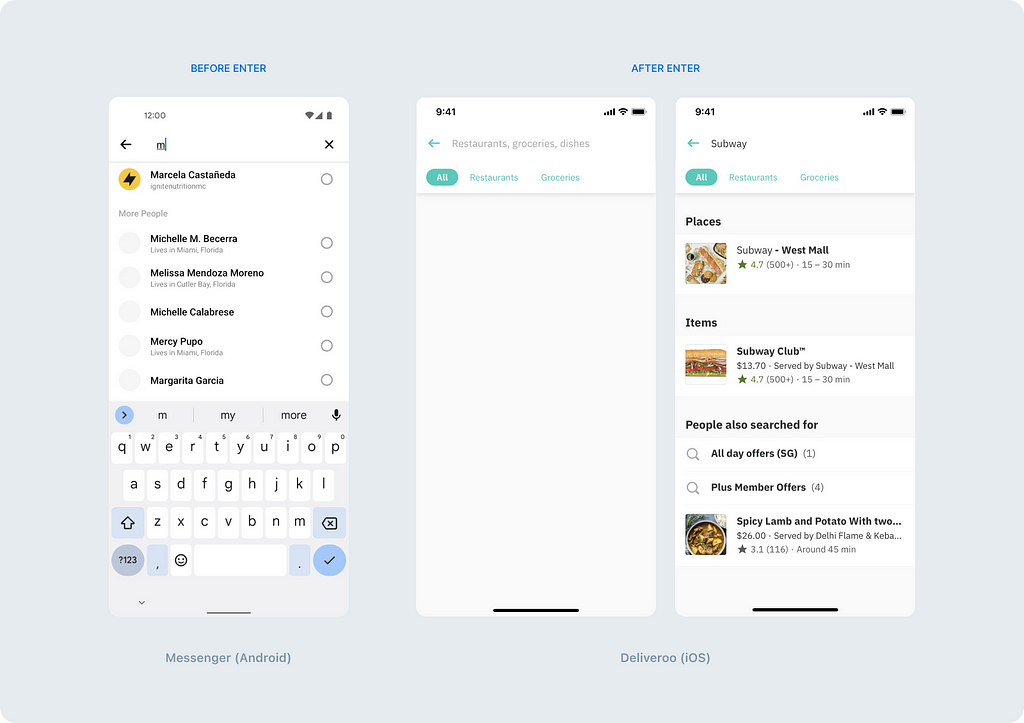
A less common but interesting option is a content display with sections. This type of display is implemented in Messenger. This option is suitable if you prefer to avoid introducing additional navigation, and if the content can be divided sensibly. Such categorization can help users reduce the time spent selecting the desired option, thereby enhancing the user experience according to B.J. Fogg’s Behavior Model.
Principle 5. Complexity of input fields
Simple search
A simple search field is the most common and familiar way for users to search for information in an application. It is a standard text field where the user enters keywords or phrases to search for. The mechanism of operation of such a field will be discussed below. Spoiler: consider how the user will exit the search mode.
Multi-search
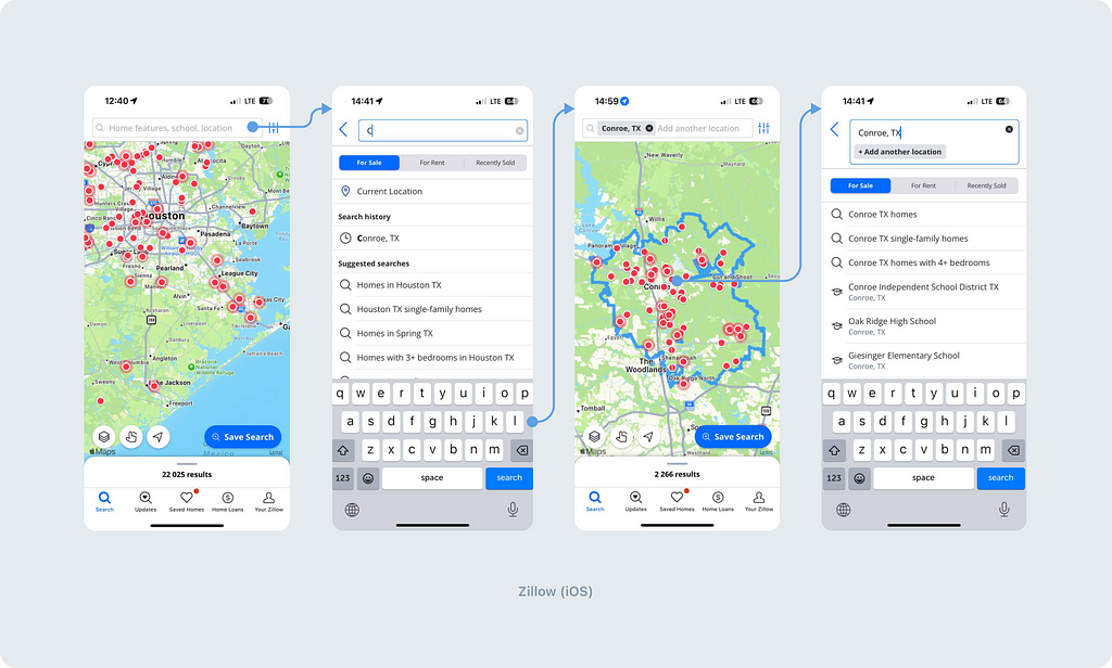
The multi-search allows users to process multiple search queries simultaneously. An example of such an approach can be found in the Zillow app, which allows users to search for real estate in multiple neighborhoods simultaneously. After selecting a neighborhood, it is automatically added to the search field as a tag. If necessary, the user can add another tag, by adding another neighborhood.
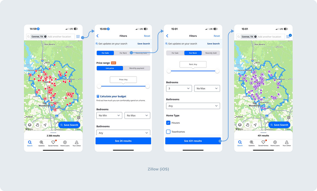
In addition to this, you can refine requests by clicking on the filtering icon.
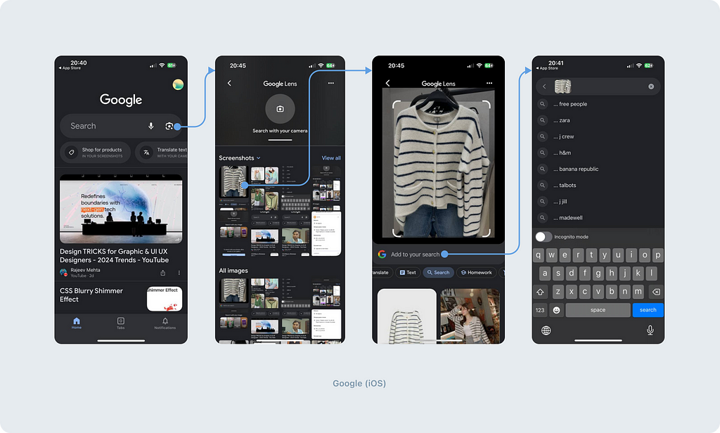
Another interesting implementation of multi-search functionality is done by Google. They have integrated search by both photo and text.
Implementing the multi-search requires additional functionality that allows users to manage multiple search queries simultaneously. This includes adding and removing tags, managing their order, and combining queries for more precise results. If you are designing such a complex search, it is important to consider all clickable areas, as there are many of them here. Here’s an interesting article on this topic.
It seems that we’ve covered the main typology. Once you’ve understood the type of search you need, it’s time to think about the details.
Canceling input and exiting search mode
When working with search functionality, we encounter two additional needs:
- Clearing the input field
- Canceling the entire search process
This implies placing two cancel actions close together. It’s important that these actions are clearly understandable by users, allowing them to determine which button performs the desired action easily.
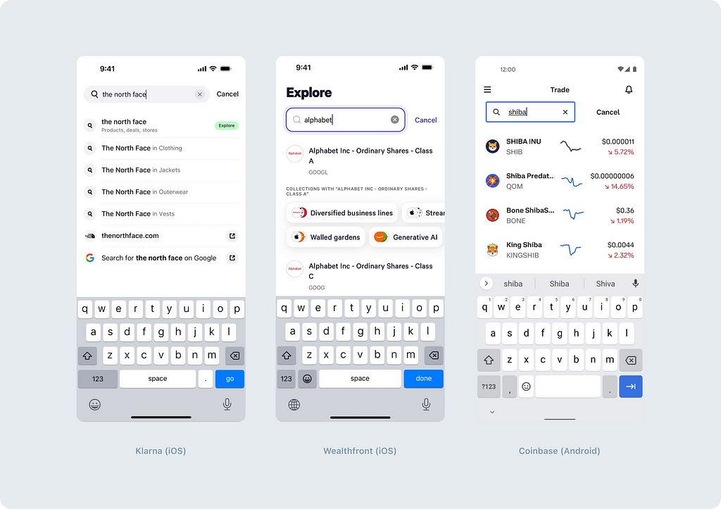
Option 1: Classic iOS approach
The iOS Human Interface Guidelines recommend:
- Using a clear button inside the input field to remove the input
- Providing a Cancel button to exit the search mode
This approach can also be implemented on the Android platform.
Option 2: Classic Material Design
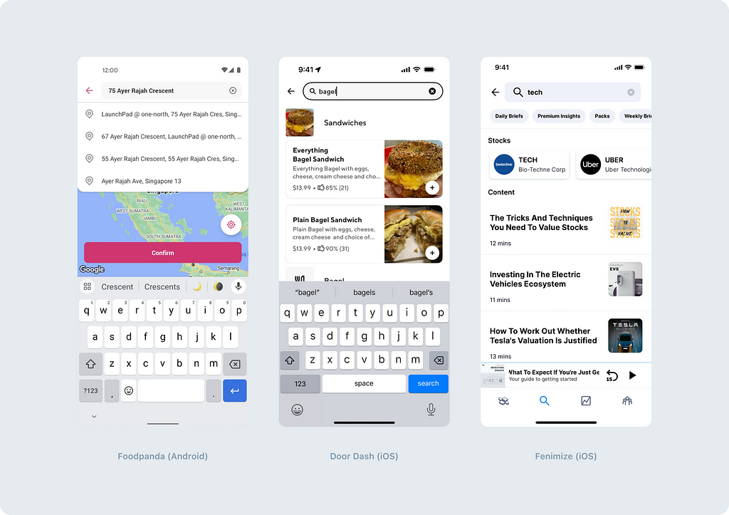
Material Design 3 (Android) offers:
- A clear button inside the input field to remove the input
- A back arrow to exit the search mode
This approach is often used on iOS as well, and there are several reasons for it. Firstly, the back arrow takes up less space than the Cancel button. Secondly, they are further apart with this arrangement, reducing the risk of accidentally tapping the wrong action.
Option 3: Double cross
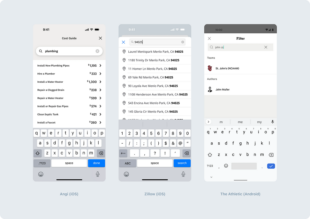
- A clear button inside the input field to remove the input
- Another cross to exit the search mode
In our opinion, this option has fewer advantages than the previous two. Firstly, it can lead to confusion, and secondly, the plenty of crosses may look unpleasant.
Additional options
Another option is to cancel the search by tapping in a free area. However, in most cases, it’s challenging to tap on a free area without accidentally tapping on another clickable element. When a person wants to close the search, they may tap on a free area and accidentally open a new screen.
Anticipating the question: “Can we make it so that tapping on the content area doesn’t open anything?” The answer is “No,” because users won’t be able to tap on the desired result if we prohibit this.
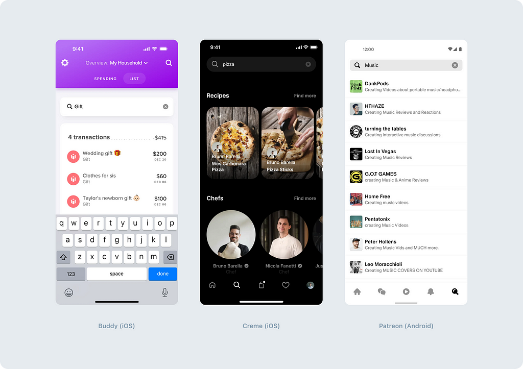
Another possible option is not to allow the user to erase entered values. Thus, the user would only be able to delete text character by character. Such a solution may evoke negative emotions, especially if the search is used frequently.

Search results presentation
The best practice is to present search results immediately after entering 1–3 characters. This allows users to reduce their efforts, making them more likely to find what they need faster.
Developer Tip: “To avoid querying the database immediately after entering the first character, implement a “listener” function that monitors typing speed. If there is a pause after entering the last character, it indicates that a request can be sent to the server.”
Another option is to display results only after clicking the search button. This approach is typically used when there are technical limitations, such as database load preventing immediate results display. We recommend using this option as a backup. If there is an opportunity to benefit the user before clicking the “Search” button, it’s worth exploring that potential.
Search results design
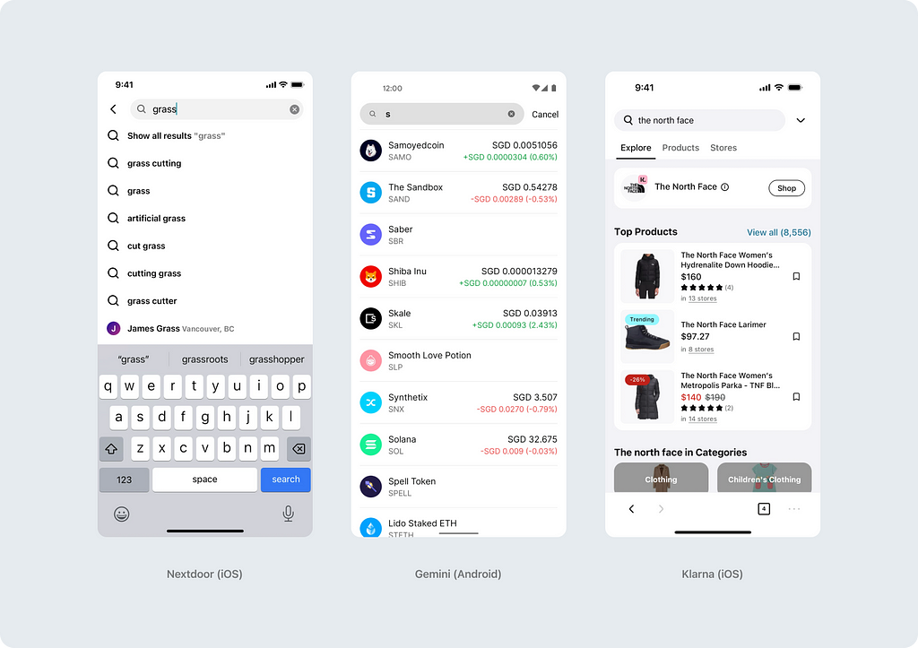
It’s important to consider not only their functionality but also their visual appearance when designing search results. The Search results can be simple text-based or more complex.
Simple text-based results are classic and the most common way of presenting search results. It consists of a list of text links that correspond to the user’s request. Sometimes, the list is complemented with icons.
Visually-complex results provide a more detailed presentation of search results. This approach allows users to fully understand the search results and simplifies the decision-making process. For example, search results may display image thumbnails, brief descriptions, ratings, or other metadata that help users assess the relevance and interest of each result.
Recommendations
Recommendations before entering a search query can be extremely useful. They can reduce the time users spend searching, improve usability and loyalty, and even serve as a tool for additional sales.
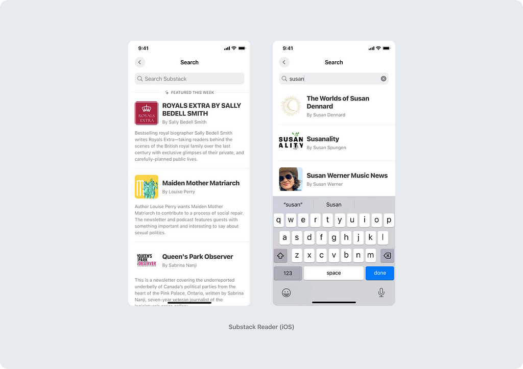
In addition to recommendations, you can also incorporate search history:
“Well-designed mobile interfaces follow a basic usability maxim: respect the user’s effort. Saved, Recent, and Popular Searches do this by making it easy to select from previous searches instead of retyping the same keywords or search criteria.” — as stated in the O’Reilly article (2014).
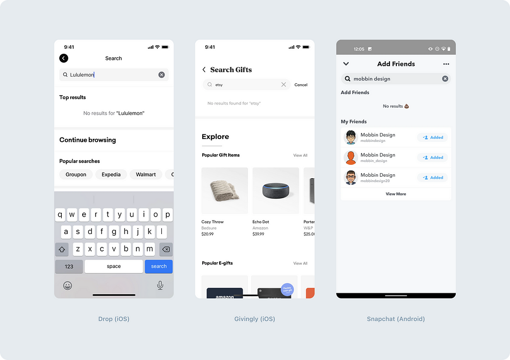
Moreover, you can also use recommendations in case of no search results. Instead of leaving the user with a dry “sorry, nothing found,” you can offer an alternative. This is exactly what the Baymard Institute recommend. Here are six options for information they suggest using on “no result” screens:
- Suggestions for the category to which the search query belonged
- Alternative queries
- Personalized recommendations
- Contact phone number, chat option, link to the help section
- Advertising
- Popular products and categories
What else is important to remember when designing input field functionality
Highlight search results
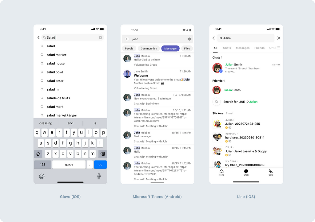
Adding highlighting to matching combinations with the search query is one of the effective methods to enhance the user experience when working with the search. It makes it easier for users to search among large amounts of information. Matching results can be highlighted by emphasizing relevant areas with color, boldness, or colored backgrounds.
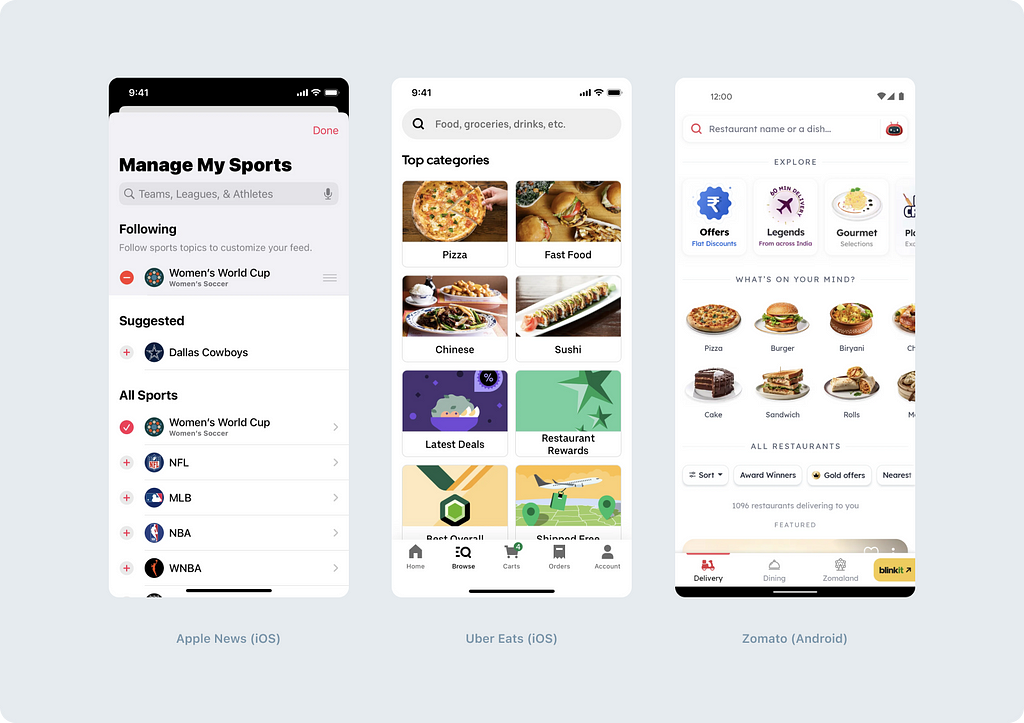
Name the search field so that it’s clear what can be searched
Here, we want to share recommendations from UX copywriting colleagues. The main point is to write not just “Search” if possible, but immediately specify parameters for which the search is performed. For example, “City”, “Author or book title”, “Cat breeds”, and so on.
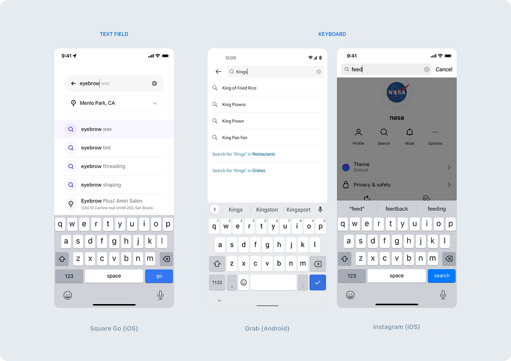
Think about hints while typing in the input field and above the keyboard
During our research, hints in the input field were encountered less frequently than others. The reason is that only one hint can be displayed in the input field at a time, while at the bottom, several can be displayed at once. Therefore, this method of hints is more supplementary than independent.
Hints inside the native keyboard are becoming more common. There aren’t usually many, but more than in the search field.
In conclusion, we would like to share several recommendations from the Nielsen Norman Group, who have compiled a list of ways to improve the search. Here are some of them:
- Manually enhance results for popular queries by placing them at the top of the search results list.
- Consider alternative terminology, especially if your content is specific to an industry or technical.
- Do not rely solely on the exact query; expand results with derivative words.
- Correct spelling errors (typos are extremely common, so all major search engines use spell correction).
- Ignore stop words. Stop words include functional words such as articles (“a”, “the”), prepositions (“of”, “for”), or conjunctions (“but”, “and”), as well as other frequently occurring words (“be”, “seem”) that are often used.
Wrapping up
Search plays an important role in modern applications, providing users a quick and convenient access to the information they need. When developing and designing search mechanics, it is important to consider the user’s needs, application usage context, and interface design principles.
Ask yourself:
- Should the search work across the entire application content or look for something specific?
- How should the search be opened in your case — on a separate screen or on the same one?
- Where should the search be located and how should it look like — should it be emphasized or is it a minor function in your scenario?
- Is simple search output sufficient, or should the segmentation of search results be added?
- Can search results be displayed immediately upon entering 1–3 characters?
- Can recommendations be added before starting the search and in case of no results?
- How will the user erase the entered text and exit the search mode?
- What should be written in the search field to help the user understand how the search works?
Only by considering all of these factors you can create a search system that is not only effective and functional but also enjoyable to use for the end user. We hope this article helps you create a truly good user experience.
Wishing you convenient interfaces and Stay tuned!
The author’s acknowledgment. The publication of this article would not have been possible without the support of my colleagues. I want to express my gratitude to all those who assisted with the article and contributed ideas. Special thanks to Rost Artemov and Igor Dolgov.
Mobile search: which pattern should you choose? was originally published in UX Collective on Medium, where people are continuing the conversation by highlighting and responding to this story.

Leave a Reply