Steam turns 20 years old, from pioneering days to a meme target, now poised for a game-changing update.

I have played games since I was a little kid, and at that time, games were sold and distributed on floppy disks and CD-ROMs (I’m feeling old writing this), and being honest, I don’t miss that time so much. Today we have digital distribution services, such as Steam, that make buying and storing so much easier…
Steam has reached its 20th anniversary, and it’s been quite a ride! From blazing trails as a pioneer to having an interface that felt stuck in the past and even becoming a meme target, now it’s gearing up for a game-changing update (pun intended).
A bit of context first:
Today, Steam stands as the largest digital distribution platform for PC gaming. The core function of Steam is to offer users a convenient means of purchasing both games and software through its online store. Upon purchasing a game, a software license is permanently associated with the user’s Steam account. This license grants them the ability to download and install the software on any compatible device an unlimited number of times.
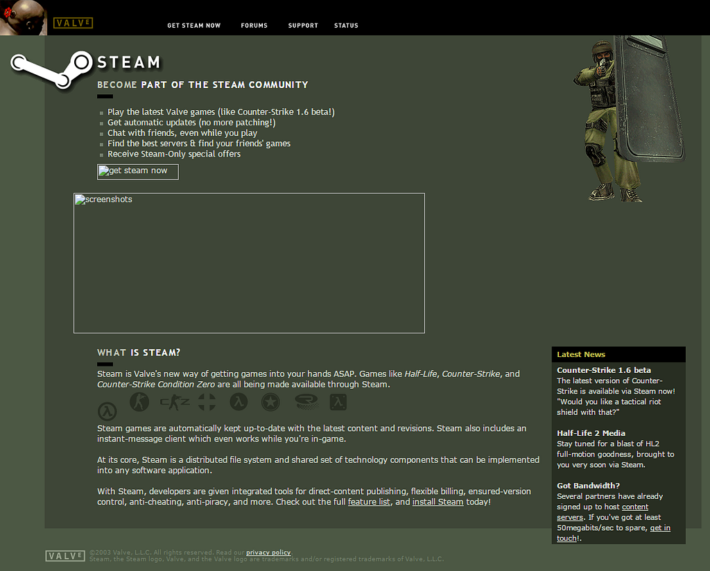
Steam, developed by Valve, is a digital platform for video game distribution that started in 2003 to facilitate updates for Valve’s own games. In 2005, it expanded to include third-party games.
The interface here was pretty straightforward, you land on a screen with some instructions on what is steam, link for support and forums and that’s it.

In 2007, Steam introduced DRM and community features like forums and user-generated content through Steam Workshop. It further expanded its offerings, introducing Big Picture Mode in 2012 and plans for SteamOS, Steam Machines, and the Steam Controller in 2013.
Things got a bit confusing as they added more features. The information architecture started to feel messy, and it became hard to find what you needed, especially with all the extra images, banners, and menus. Sometimes the naming was not very clear and the user needed to recall where things were on the last time they saw it.
In 2015, Valve entered virtual reality with SteamVR and HTC Vive. Steam Direct replaced Greenlight in 2017, simplifying game submissions. In 2018, Steam Link and Remote Play enabled game streaming. Steam faced competition from the Epic Games Store.
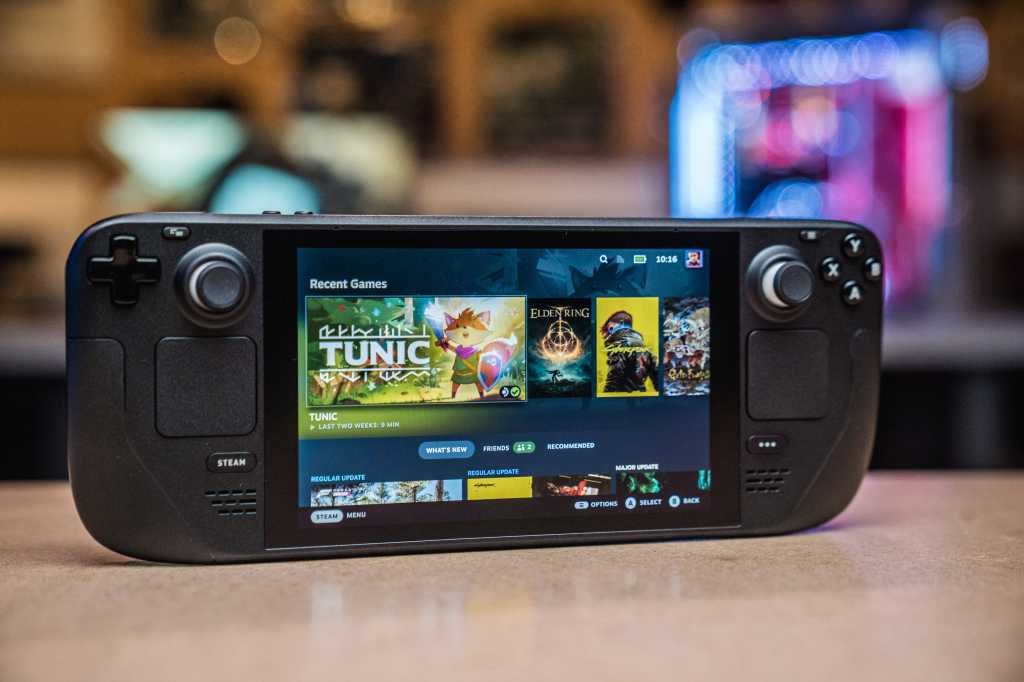
The Steam Deck, launched in 2022, is a portable gaming device for running PC games from Steam, featuring a built-in controller and touchscreen.
It also has its own interface and maybe it was one of the turning points for Steam future. Since they had to deal with a much smaller screen, it’s very noticeable they spent some time there polishing and redoing some of the flows and information architecture.

With the evolution and addition of new features, it seems Valve lost track of the interface and things started to be confusing, sometimes a bit messy and the performance was going down.
A lot of updates and no changes. But we have memes!
It became kind of a meme, every time you launch your Steam platform, it will update. You think that it will have something new, that something will improve, right? Well, not really.
The interface always looks the same, the performance is still kinda sufferable and people are not very happy. And when people are not happy, what do they do? Memes! (and complain)

A lot of users complained about the very confusing paths and flows to get to a feature. Since you could click on different buttons and it will lead you to the same thing, or even the names were not so clear.
Also, they complained about the performance, where it could take so much time to load the game page when you wanted to buy it, or even the home page with all the banners and “ads” going on at the same time, that the platform was suffering to render and show.
Talking about banners, the information architecture was very confusing and the amount of information you receive on the home page was overwhelming. So you didn’t know where to look exactly and it was very easy to get lost.
And I won’t even start with the problems on the mobile app. Imagine those problems but multiplied by 10 (at least), where the performance was almost nonexistent and the responsiveness was almost forgotten when designing it.
The silent and nice update
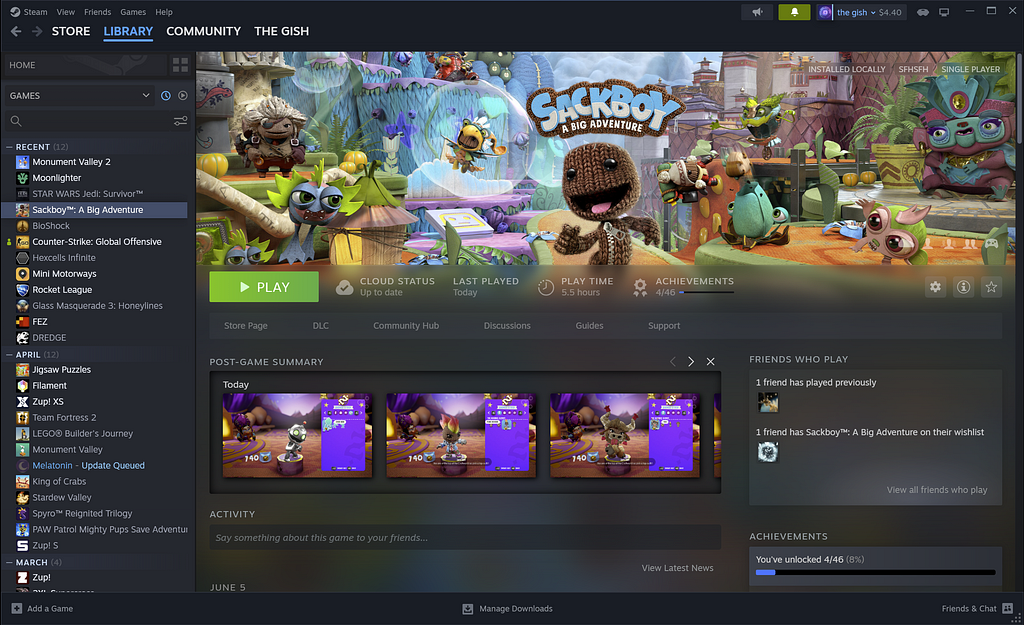
On June 14th, Steam released a major update. It introduces significant improvements to the Steam interface, with a particular focus on enhancing visual aesthetics and user-friendliness. This includes a comprehensive redesign of the desktop app’s menus, fonts, and color schemes, resulting in a more polished appearance for various elements such as the app’s header, footer, settings menu, and screenshot manager. Valve has also made notable enhancements to the notification system, where the top bar now exclusively displays new notifications, while previously viewed notifications find their place in a separate menu for easy access when needed.

With the latest update, the in-game overlay receives a comprehensive facelift and introduces several valuable additions. Notably, there’s now a practical notepad feature seamlessly integrated into the overlay. Furthermore, a newly introduced toolbar offers convenient access to various functions, including Steam Chat, game achievements, and a built-in web browser, among other options.
Also, the app’s web browser has undergone an update, and for users on macOS and Linux, hardware acceleration has been integrated to enhance overall performance.
What can we learn from it?
Every product starts its journey with room for improvement, a continuous process of refinement and enhancement.
Even when your product faces challenges and receives criticism, take a step back and carefully consider what your users are saying. Embracing feedback and thinking beyond your current perspective can be incredibly valuable.
Valve demonstrated that understanding your product’s audience and its inherent value can lead to significant rewards through rework. They didn’t merely revamp Steam’s visuals to attract users; they also dig beneath the surface, addressing long-standing issues that had been swept under the rug. Their users appreciated the commitment to making their ‘house’ truly inviting and nice looking
Don’t be so passionate about your product that you think everyone else is wrong and you product is perfect as is, be passionate enough to know you can always make it better.
With this update they show us that they worked very hard on that special point of listening to users:
- Identifying Pain Points: Users reveal where your product falls short, helping you address specific issues.
- Enhancing User Experience: Feedback improves usability, navigation, and overall satisfaction.
- Prioritizing Features: User suggestions guide feature development, aligning with needs and preferences.
- Bug Detection: Users report and identify issues, aiding in prompt resolution.
- Measuring Satisfaction: Regular feedback gauges satisfaction and informs customer retention strategies.
- Engagement: Engaging with users fosters loyalty and community around your brand.
And those points clearly led to Experience enhancements, based on some pillars:
- Collect Feedback Regularly: Establish multiple channels for feedback collection, such as surveys, user interviews, in-app feedback forms, and social media. Encourage users to provide feedback by making it easy and convenient.
- Analyze Feedback Thoroughly: Prioritize feedback based on frequency, impact, and alignment with user experience goals.
- Empathize with Users: Put yourself in the users’ shoes to understand their perspective and emotions related to the feedback.
Steam has clearly paid close attention to their audience’s feedback and made significant improvements to their product. A quick Google search for ‘Steam interface’ reveals numerous media posts praising Steam’s remarkable progress, firmly establishing them as a top player (this is the last game pun, I swear) in the industry.
That’s how Steam can be a good example for us, when we think our products are not doing so well, there’s always a solution. It can take a bit of time and a lot of effort, but surely the results are worth it.
References
https://www.pcgamer.com/steam-versions/
https://steamcommunity.com/games/593110/announcements/detail/3687931965598906185 )
Steam: the evolution of UI and UX in Gaming was originally published in UX Collective on Medium, where people are continuing the conversation by highlighting and responding to this story.

Leave a Reply