
Once called design handoff or design reviews, delivering information and context for development is crucial for bringing the design intentions to life. When looking at scale, for a design system to function without faults, Component Specs should cover it all.
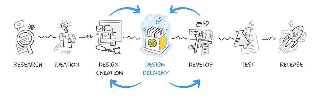
Over the years, I’ve worked closely with developers, product managers, quality assurance engineers, and other development contributors. All of these have helped me learn a lot about a product’s life cycle. By now, there is a paradigm on how a product’s development cycle should look like:
As Pelin Kenez, Co-Founder & CEO at Zeplin, puts it:
It’s where the “infinite possibilities” of Design Creation met the “bounded realities” of bringing the design to life.
This development cycle presents challenges in all its steps. In this article, I’ll talk about how the design delivery step, specifically in an area of what I call Component Spec, bundles up all the necessary information to craft a cohesive and comprehensive component set to be used as part of a product’s design system.
Common grounds
Often, beginner designers who are not yet familiar with the “laws of physics” in web and native app development tend to create product designs that showcase a flow. Their deliverables typically consist of a series of screens, ideally connected by a flow from start to finish.
Most of these designers don’t consider how their designs will be implemented, which is crucial. In my view, this awareness distinguishes junior UX/UI designers from mid-level ones. Eventually, not all of the designer’s wants and dreams can be realized in development — not just because they may be impractical with existing tools, but also because they often overlook edge cases and responsiveness. This can lead to reliability issues and unexpected behavior when the developed pages or components face real-life scenarios, interact with other elements, or encounter more content than they were designed to handle.
Creating designs that make sense inside the structure and limitations of web and native app development differentiates a junior UX/UI designer from a mid-level designer.
Reliability and unexpected behavior
Have you ever come across a website, SaaS platform, or product with obvious visual bugs? I certainly have, often remarking, “What poor development!” However, the issue usually isn’t with the developers’ decisions; instead, I believe it stems from a lack of clear design and product definition.
Such issues should not exist; they create roadblocks in the user experience, hindering the product’s ability to deliver value and increasing costs in terms of man-hours for the development team. Developers must identify the problem, correct the relevant code, test it, and then merge it into production. A significant amount of time is wasted on fixing these issues, particularly when they occur in reusable components. Proper design definition could have prevented this. When implemented at scale within a design system, these problems can be minimized, helping to avoid poor experiences and unexpected behavior across the product.
Delivery of information
In a typical design system, you’d find instructions for designers on when and how to use the available components in their designs, often providing edge cases, different variants, and copy guidelines. Designers, as consumers of the design system that need to use it, will face a set of rules and limitations that will help them while building designs, but that is just on the surface level. What about developers? They are also a type of design system consumer. They will take the design instructions and build the pages and screens with those components. Can the design document provide sufficient documentation when creating a new component?
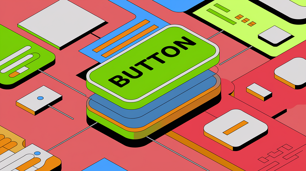
Consider one of the most basic, if not the first, components any designer will create in their design system journey — The Button.
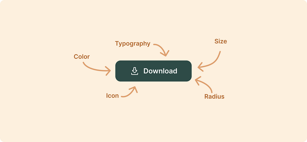
We must decide on a few characteristics of that button before using it as a shared component within our design system. Name a few: size, color, icon, radius, typography, padding, gap. That is even before we discussed different size variants or the actual button usage!
In the past, designers usually provided a static image that reflected the layout and size of the component. You can usually still find this kind of detailed image on beginner designer groups on social networks. Back then, that may have been fine, but today, it is far from a complete list of instructions for the development of a UI component.
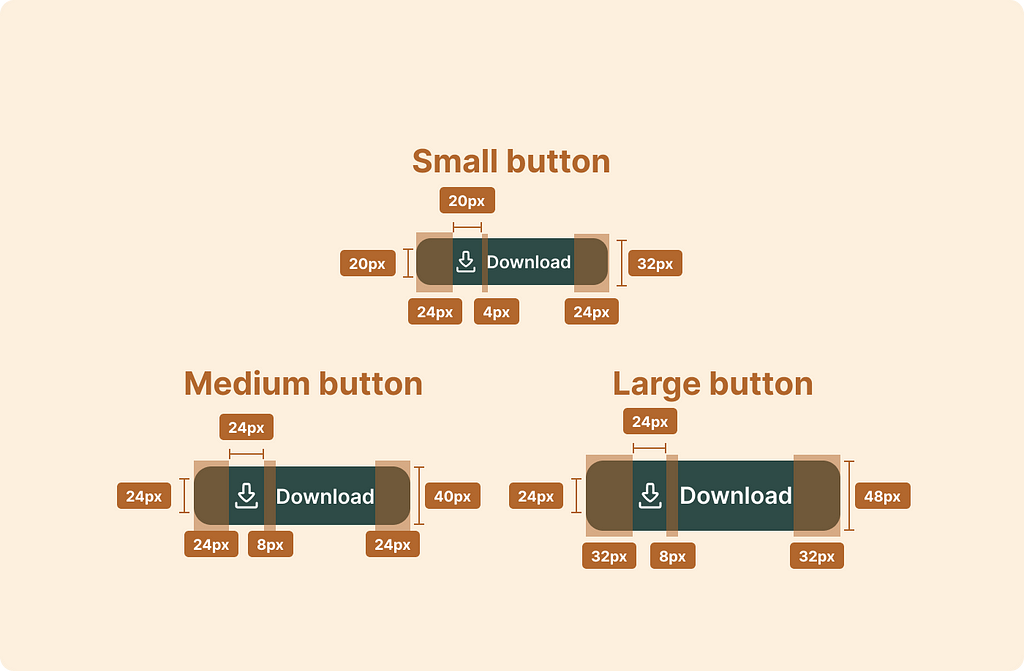
The example above contains the bare minimum needed. When a developer approaches the development, in this case, a button, they must define many other parameters. If the designer hasn’t defined them, where should the developer get them from? I’m writing this article in the year 2024, and fortunately for our developer, Figma’s dev mode can come to our help!
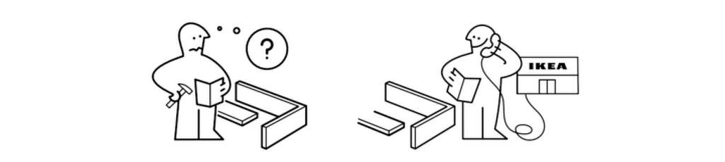
Like the confused IKEA man who can call the IKEA store for help, the developer can consult the dev mode properties panel to get (most of) the necessary instruction he so desperately needs.
Can’t Dev mode suffice?
While Figma’s Dev mode provides much information about a component’s layout, position, style, and typography, it will do its best to show relevant information for a developer to follow. By that, I mean that Dev mode doesn’t have all the tools, measurements, and capabilities to display code effectively. Seasoned developers will use the properties as a guideline but will prefer to write the code differently.
Undefined outcomes
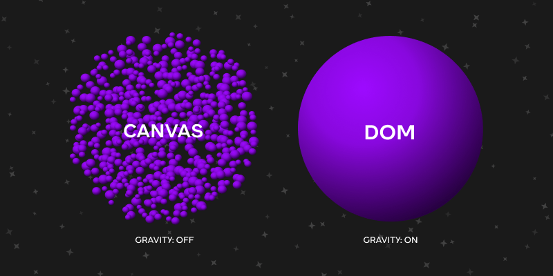
Designers might want (or even need) a canvas when they are messing around, trying things out, brainstorming, discussing, showing variations to stakeholders etc.
Erez Reznikov, Evolving beyond a canvas tool, Substack
As Erez Reznikov points out, designers thrive with the freedom of working on a “canvas” rather than being bound by the “gravity” of the DOM (Document Object Model) while exploring creative ideas.
Moreover, most UI design tools, by their nature, allow designers to create screens in a way that may lead them to overlook the need for their designs to function within the ‘laws of physics’ that govern web and native platforms. That is just how these tools work.
Designers may sometimes overlook the fact that their designs need to function within the ‘laws of physics’ that govern web and native platforms.
This fact may lead to poorly defined components, ending up in unpredictable edge-case behavior. For example, a typical button might look great in one state but lack the necessary adaptability when dynamic content is introduced. For instance, what happens when the parent container narrows, and the button no longer has enough space on the sides? Should it:
- Line break but keep the previous height?
- Adjust the height for more lines?
- Extended the text outside the borders?
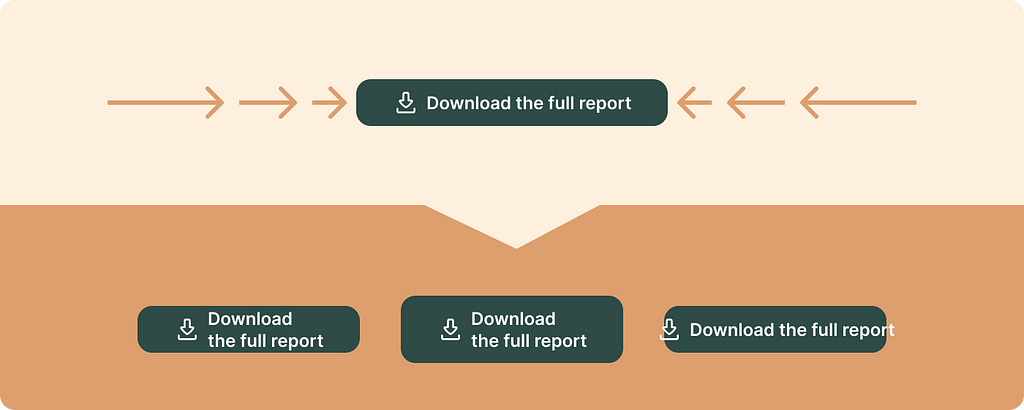
To resolve this unexpected behavior, I recommend implementing a rule that truncates the button’s text with an ellipsis and prompts a tooltip with the complete text on hover.

However, these definitions are not shown in Figma unless specifically defined by the designer and written explicitly. These definitions might be overlooked because the component was built on a canvas, where the constrains of layout may not be enforced.
When inspecting the button, Figma will provide information about its layout. Considering the padding and height properties, Figma tells us that the padding is padding: 0px 24px which means that it has 0px on top of a button and 24px to the left and right. The more robust way for this component to be written is with the padding-inline property since that component's height and the inner elements' position is already defined.
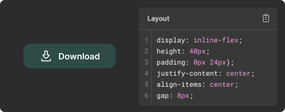
padding-inline is a CSS logical shorthand property that combines the padding-inline-start and padding-inline-end properties into a single declaration, creating space around an element’s content in the inline (left and right) direction.
— Joel Olawanle on css-tricks.com
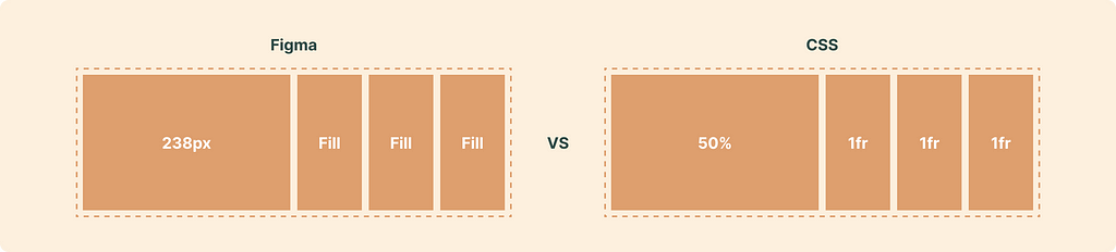
In addition to the above, designers may not utilize the full range of properties and parameters that real development offers. For example, Figma utilizes Auto-layout as a Flexbox Layout, allowing child elements to be fixed with px or set to fill or hug. Countering that, designers are not usually exposed to actual development, which limits their knowledge about other options; the CSS Grid Layout allows users to input px, percentages, or fr units, allowing for more control over the outcome of dynamic content.
Other maintainable CSS units are all of the relative units: em, ex, rem, vw, vh, vmin, vmax, %, and ch which I’ve written about here:
Optimal line length for body text (a Figma guide)
The above are examples of writing better code, within Figma and outside, adding to the fact that developers need better instructions for the intended design, specifically when creating a reusable component for the design system.
Creating specifications as a team
Going back to the confused IKEA man, the instruction manual sometimes tells you to team up with a friend and build the SMÅSTAD wardrobe together. Two can be better than one; in our case, a designer teaming up with a developer to share knowledge will result in better design system components.

Designers should learn from developers about their practices and understand how code works so they can design more robust components. When creating a shared language, the best way to communicate a design system component's definitions is through a specification document. While working at XM Cyber as a sole designer and later as the head of UX and design, leading a team of designers, I crafted a template for a document I like to call Component Spec.
Why use Component Spec?
TL;DR: If you’re starting with this section, here’s a quick recap: The Component Spec gathers all the essential details needed to create a complete and consistent component set for a product’s design system. This includes variants, edge cases, and limitations. By defining the component comprehensively, we minimize the risk of it malfunctioning or acting unpredictably with dynamic content.
What does Component Spec include?
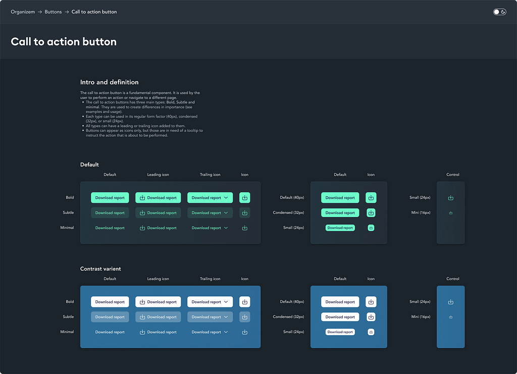
Definition and showcase
This section typically displays various states and variants of the component, accompanied by a brief explanation of its usage. The goal is to provide developers with the necessary context to understand how the component is intended to be used and to encourage them to suggest relevant adjustments if they have any input.
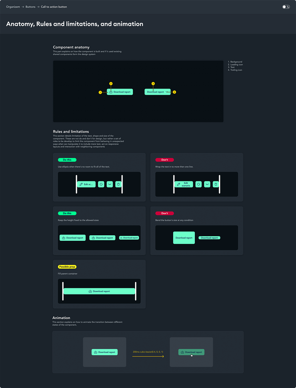
Anatomy, Rules & limitations, and animation
Anatomy — Starting with the most complex variation, the designer should detail the component's different parts and inner components (if any); this will be used as a reference in the limitations, edge cases, and tokens sections.
Rules & limitations—Components are expected to function within certain parameters, as outlined earlier. This section details those boundaries, including handling edge cases, empty states, errors, and text constraints. It also covers alignment, behavior within groups or arrays, and any other functional rules developers must enforce to ensure the component operates consistently and reliably across all scenarios.
Animation — Define as needed. Aviad Shahar wrote a guide for creating a timeline that makes sense
Keyboard accessibility
This section should outline the component’s keyboard interactions, addressing both accessibility requirements and shortcuts for power users. It should specify the navigation order for elements when using the Tab key or arrow keys, ensuring a logical and intuitive flow for keyboard users.
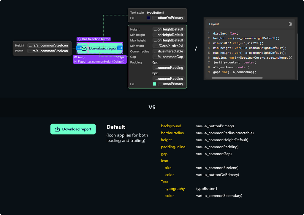
Tokens and variants
This section provides a detailed breakdown of the component’s measurements and values, ideally presented as design tokens. Begin with the default variant, documenting every property used. For subsequent variants, only note the changes or new properties, emphasizing the differences between variants while keeping the section concise. This approach ensures clarity while avoiding unnecessary repetition in what is typically a more comprehensive part of the document.

This example is full of design tokens from XMDS2, XM Cyber’s design system. which you can learn more about below:
Atomic design with tokens — The short version
The example below highlights the differences in CSS properties between Figma’s default layout and my suggested arrangement. Organizing the layout this way improves readability. As noted earlier, some properties may appear differently than how a developer would implement them: padding: 0px var(-a_commonPadding) vs padding-inline: var(-a_commonPadding) . When concerning text length, character length with the fr unit.
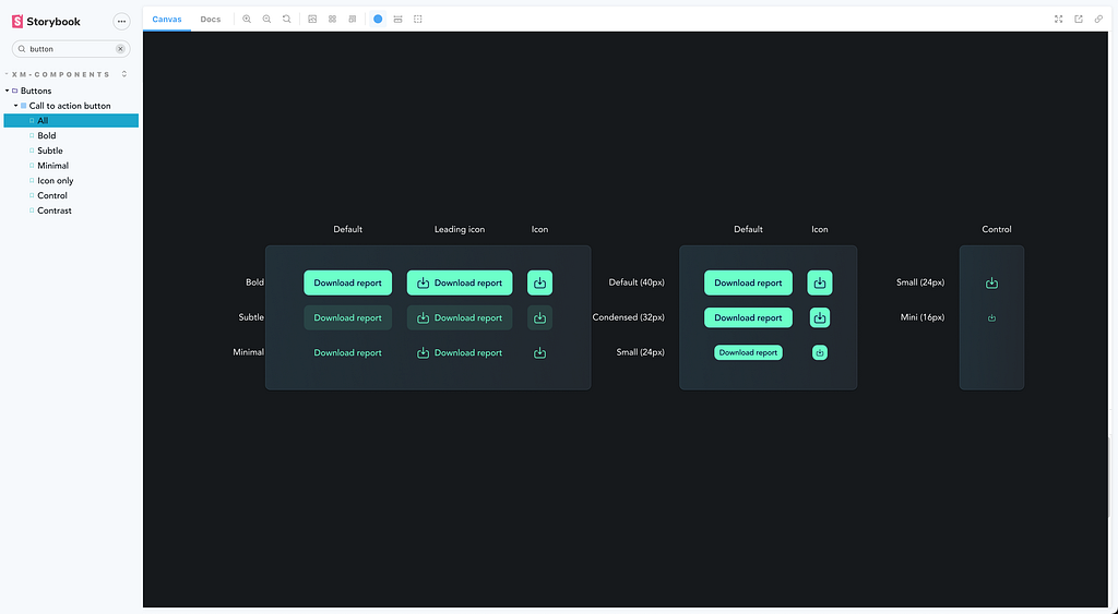
Storybook
Finally, the component should be thoroughly documented within your front-end documentation system, with Storybook being the most widely used tool today. It’s recommended to create an interactive showcase of the component’s key variants, allowing for easy exploration and testing of its functionality.
What have we learned?
In this article, we’ve learned how important it is for us to have a solid Component Spec in our design system, as it acts as a crucial link between our design and development teams. It highlights the need for us to think about how our designs will work in real-world situations, especially regarding dynamic content. By working closely with developers, we can create clear documentation that explains how components should function while keeping in mind any technical constraints. This teamwork helps ensure that our components are not just visually appealing but also flexible and reliable in various user interactions, ultimately improving the user experience and reducing development headaches.
Main takeaways
- Managing unexpected behaviors: A well-defined Component Spec is crucial for minimizing unexpected behaviors in components and ensuring they operate reliably with dynamic content while addressing variants, edge cases, and limitations.
- Bridging design and development: Effective collaboration between designers and developers is essential, as designers must understand technical limitations while developers rely on clear specifications to build components.
- Defining component parameters: Designers need to outline all relevant parameters — like size, color, and behavior — to eliminate ambiguity and guide developers in implementation.
Component Spec: the design system component delivery was originally published in UX Collective on Medium, where people are continuing the conversation by highlighting and responding to this story.
Leave a Reply