Discover the most effective behavioral design frameworks, learn how to drive daily active user growth and retention, and gain practical insights for developing sustainable, ethical strategies that keep your products engaging without becoming exploitative.

Behavioral design frameworks
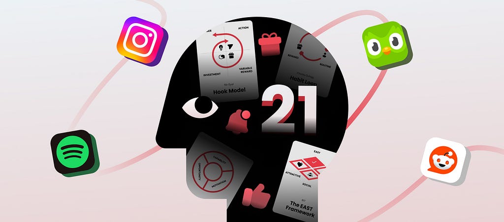
Some of the most popular and influential behavioral design and habit-forming models:
- The Hook Model, developed by Nir Eyal: Consists of four steps: Trigger, Action, Variable Reward, and Investment. It explains how to build habit loops by leveraging rewards and user investment.
- The Habit Loop by Charles Duhigg: Habits form through Cue, Routine, and Reward cycles.
- The EAST Framework by Behavioural Insights Team: Make behaviors Easy, Attractive, Social, and Timely to increase engagement.
- COM-B Model by Professor Susan Michie and her team at UCL: Behavior depends on Capability, Opportunity, and Motivation.
- BJ Fogg’s Behavior Model (FBM): Behavior happens when motivation, ability, and triggers align. Simpler actions and well-timed triggers increase engagement
- The Nudge Theory by Richard H Thaler and Cass R Sunstein: Small, subtle changes in design can guide user behavior without limiting choices.
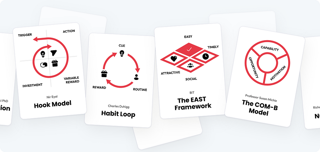
Finding patterns and commonalities
When examining these models, it becomes evident that they share core components related to user behavior, motivation, and habit reinforcement. By identifying these commonalities, I have developed a unified formula.
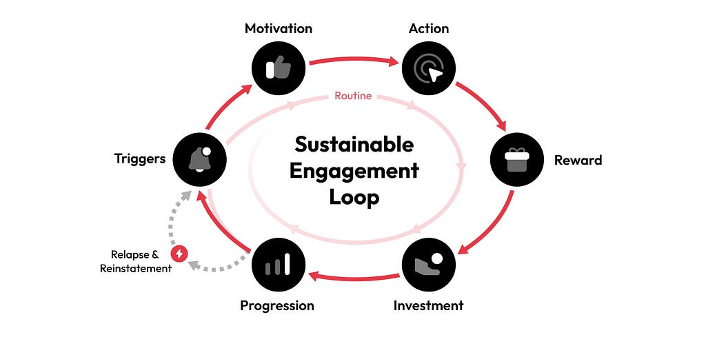
The Sustainable Engagement Loop is a behavioral model designed to foster long-term user engagement through a cyclical process that builds and maintains habits. This model revolves around six key stages:
- Triggers: External or internal cues prompt users to take action.
- Motivation: Users need sufficient motivation to respond to the trigger.
- Action: The desired behavior or action is performed.
- Reward: A meaningful or variable reward reinforces the action, encouraging repetition.
- Investment: Users invest time, effort, or resources, increasing their commitment.
- Progression: Users experience growth and advancement, which fosters ongoing engagement.
The model also accounts for Relapse & Reinstatement, addressing moments when users disengage. Through well-timed triggers and reminders, users are encouraged to return to the loop, re-establishing the habit.
Creating effective triggers
A well-designed trigger is the foundation of any successful engagement loop, making the crucial difference between users taking action or losing interest.
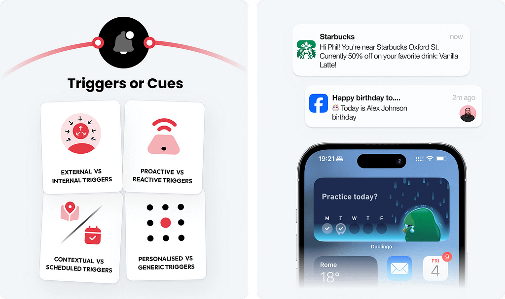
- External triggers, such as notifications, reminders, and visual cues, prompt users to take action, especially in the early stages of habit formation, while Internal triggers, like emotions such as boredom, anxiety, or excitement, drive users to engage with the product without needing external prompts.
- Proactive triggers are initiated by the system without any prior user interaction, while Reactive triggers are responses to user behavior, designed to prompt further engagement based on their previous actions.
- Contextual triggers are based on the user’s current situation, such as location or activity, prompting actions relevant to their environment, while Scheduled triggers occur at pre-set times, nudging users to engage based on a specific time frame or routine.
- Personalized triggers are tailored to individual user preferences, habits, or behaviors, while Generic triggers are broad, one-size-fits-all prompts that are sent to all users, regardless of their specific context or needs.
✅ 1. Ensure timeliness and balance trigger frequency
Triggers should appear precisely when users are most likely to act, as poorly timed or excessive triggers can cause frustration, notification fatigue, and disengagement, making it crucial to strike the right balance to retain users.
(ex. Duolingo’s home screen widget sits on the user’s home screen, providing a constant but non-intrusive reminder to continue their language learning streak.)
✅ 2. Prioritize personalized and value-driven triggers
Personalized triggers are significantly more effective than generic ones because they cater to the user’s specific needs, preferences, and habits. Triggers should always provide value, and it’s essential to avoid sending trivial or unnecessary notifications that could lead to user disengagement.
(ex. Starbucks’ notifications are tailored to individual purchase history and preferences, offering personalized deals or timely reminders.)
✅ 3. Leverage internal triggers over time
The goal of external triggers is to eventually help users develop internal triggers, where emotional or psychological cues (e.g., boredom, anxiety) drive engagement without needing a push from the system.
(ex. Over time, Instagram conditions users to check the app habitually, driven by internal triggers like boredom, curiosity, or the fear of missing out (FOMO))
Motivating users to engage
In behavioral design, motivation and ability are critical elements for ensuring that triggers lead to action.
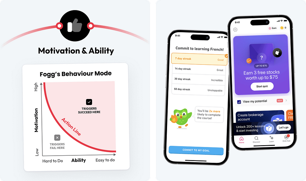
- Two types of motivation drive user engagement. Intrinsic motivation comes from personal satisfaction or enjoyment, while extrinsic motivation involves external rewards like points or reminders.
- User ability can be classified into several types, including cognitive ability (mental effort), physical ability (ease of interaction), time availability (how much time users have), financial ability (cost of action), effort & skill (required knowledge or effort), etc.
✅ 4. Highlight the reward (Cost-Benefit)
Ensure that users can perceive the benefits of completing an action as significantly outweighing the effort required. This increases the likelihood that they will take the desired action.
(ex. Nudge to Get 3 free stocks valued over $75 after completing a quiz in the Bloom app)
✅ 5. Nudge users to make small early commitments
Encourage users to make small, low-effort commitments early in their journey. This helps to build accountability and intrinsic motivation.
(ex. Duolingo prompts users to commit to a learning streak and provides choices that give users a sense of autonomy)
✅ 6. Balance intrinsic and extrinsic motivation
Combine external rewards like points or badges with intrinsic motivators, such as personal satisfaction or skill development. While extrinsic motivation can drive short-term engagement, intrinsic motivation fosters long-term commitment and loyalty.
(ex. Nike Run Club users earn extrinsic rewards like trophies and badges for completing runs, while the sense of personal achievement and progress as their fitness improves provides intrinsic motivation.)
Effortless and nearly instinctive actions
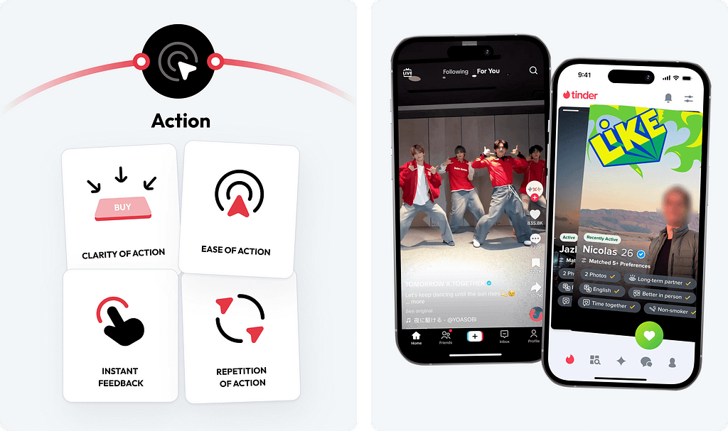
Action is the core outcome of every carefully designed element. It’s not just about what users do; it’s about how easily they can perform that behavior.
✅ 7. Design for single-task focus
The most successful products often guide users to focus on one primary action at a time. By reducing distractions and presenting a single clear task, users are more likely to follow through on an action.
(ex. Amazon’s “Buy Now” button streamlines the purchasing process by allowing users to instantly complete their transaction with a single click)
✅ 8. Provide instant feedback
Reinforce user behavior with immediate feedback, such as success messages, animations, or progress updates. This reassures users that their actions are recognized.
(ex. Tinder’s swipe interface centered around a single task provides instant feedback with each swipe. Additionally, the use of variable rewards keeps engagement high, as users don’t know when they will receive a match)
✅ 9. Encourage frequent repetition for routine actions
Repeating actions frequently helps engrain them in users’ minds, turning behaviors into almost automatic routines. By designing actions that can be easily repeated, you build habits that make user engagement feel natural and seamless over time.
(ex. TikTok encourages frequent repetition through its infinite scroll feed, where users repeatedly swipe up to view new content. This simplicity, combined with instant feedback and variable rewards — since users never know what video will come next — makes the behavior almost automatic and highly engaging over time.)
Reinforce user actions with rewards
Rewards incentivize users to continue engaging with a product by providing immediate gratification or a sense of accomplishment.
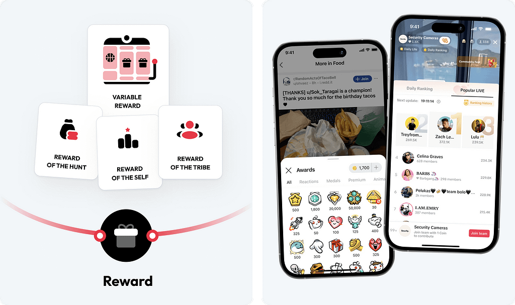
- Behavioral conditioning — a concept, used in both psychology and animal training, explains how behaviors can be shaped and reinforced through rewards (positive reinforcement).
- Fixed rewards provide predictable and consistent reinforcement after a specific action, while Variable rewards introduce an element of surprise, tapping into the brain’s dopamine system to create stronger engagement and anticipation.
- The three types of rewards are Hunt rewards, which satisfy the desire for resources or information, Self rewards, which fulfill personal mastery or achievement, and Tribe rewards, which provide connection or validation from others.
✅ 10. Leverage the power of unpredictability
Offer unpredictable rewards to keep users coming back, as the uncertainty of the outcome creates excitement and anticipation.
(ex. Games like Fortnite or Overwatch, use loot boxes that offer random rewards. Players don’t know what items they’ll receive when they purchase or earn a loot box, which keeps them excited and coming back for more)
✅ 11. Gamify the experience with points and badges
Gamify user experiences by offering points, badges, or trophies that users can earn through repeated actions. This satisfies the desire for resources.
(ex. Reddit uses badges and awards that users can earn or give to others for valuable contributions. These badges not only encourage frequent participation but also create social validation, making the experience more engaging.)
✅ 12. Create social rewards through competition or recognition
Reinforce user behavior with immediate feedback, such as success messages, animations, or progress updates. This reassures users that their actions are recognized.
(ex. TikTok excels at this by providing real-time feedback in the form of likes, comments, and rankings on popular content. Users receive instant recognition through likes and comments, and their engagement is further driven by the competitive element)
Investment makes users less likely to abandon the product
Driven by psychological mechanisms like the sunk cost fallacy. The more time, effort, or resources users invest in a product or platform, the more committed they become.
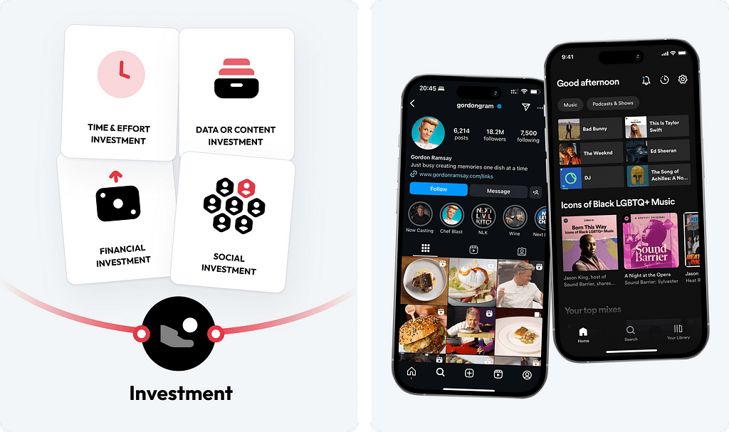
- Time & Effort Investment. Time is a valuable resource, and when users spend significant time learning or engaging with a product, they become more attached to it
- Users who make Data or Content Investments, such as uploading photos, sharing videos, or logging fitness data, develop a sense of ownership over their creations.
- Social Investment, occurs when users build relationships, following, communities, or social validation within a platform
- When users spend money on a product or service, they feel a stronger commitment to using it, driven by the desire to get value from their Financial investment.
✅ 13. Encourage small initial investments and content contribution
Prompt users to make small, easy-to-complete actions early in their interaction, such as filling out a profile or selecting preferences. Encourage users to contribute content, whether it’s uploading videos, writing reviews, or posting photos.
(ex. Instagram encourages small initial investments by prompting users to set up profiles and follow accounts. It also drives early engagement through easy content sharing, and over time, social investment in building a follower network makes it hard to switch to other platforms.)
✅ 14. Enable personalization and customization
Allow users to personalize or customize their experience, such as creating playlists, setting preferences, or organizing content
(ex. Spotify allows users to personalize their experience by creating custom playlists, setting preferences, and organizing their music library based on their favorite artists or genres.)
✅ 15. Create opportunities for long-term investment
Help users engage in long-term investment, such as building something over time (e.g., leveling up characters, unlocking achievements). A tiered rewards system where users gain access to better rewards or features the longer they engage.
(ex. Booking.com uses a tiered loyalty program, Genius, where users unlock better discounts and perks the more they book and engage with the platform.)
Give users a sense of growth and accomplishment
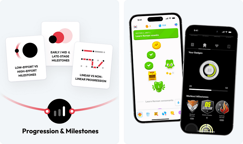
Progression is the ongoing advancement a user experiences while interacting with a product, and milestones are key achievements that mark that progress. Unlike short-term rewards, which offer immediate gratification, progression and milestones provide long-term satisfaction, driving continued engagement.
✅ 16. Display a visible progression path
Design a clear and visible roadmap, helping users visualize their journey and motivating them to reach the next stage.
(ex. Duolingo displays a language learning path with clear milestones that users aim to reach, giving them a sense of accomplishment and clarity about what’s next.)
✅ 17. Offer tiered milestones and celebrate them
Implement tiered milestones that provide increasingly valuable rewards or recognition as users advance. Celebrate key milestones in a user’s journey, providing positive reinforcement when users reach significant achievements.
(ex. Ladder rewards users with tiered milestones, like completing workouts, and badges that build a personal wall of achievements. This visual display of progress, combined with celebratory messages, keeps users motivated.)
✅ 18. Incorporate dynamic difficulty ramping
Gradually increase the difficulty of tasks or challenges as users progress. This keeps users in a state of flow where tasks feel achievable but challenging enough to remain interesting.
(ex. Headspace gradually introduces more advanced meditation techniques and longer session durations as users become more comfortable with the basics.)
Ethical considerations for designing addictive products
Many of the strategies shared here leverage psychological behaviors that are often outside users’ conscious control, making certain products highly addictive. While some of these engagement loops lead to positive outcomes (such as learning a new skill or improving fitness), others can have negative consequences, leading to compulsive, unproductive, or harmful behaviors like Doomscrolling. This places a significant ethical responsibility on design teams to ensure they use these tactics responsibly, balancing engagement with the well-being of their users.
✅ 19. Avoid doom-scrolling and limit variable reward abuse
Limit infinite scrolling and avoid overusing variable rewards like unpredictable likes or comments. These design patterns often used to increase engagement, can lead to compulsive behavior by constantly serving new content. Incorporate features that encourage users to take breaks
(ex. Instagram helps prevent doom-scrolling by incorporating the “You’re All Caught Up” feature, which notifies users when they’ve seen all recent posts from the accounts they follow.)
✅ 20. Mitigate social validation traps
To avoid fostering unhealthy competition and social comparison, platforms should reduce the emphasis on likes, shares, and comments as primary indicators of success. By designing experiences that prioritize meaningful engagement over quantitative metrics, platforms can encourage healthier interactions
(ex. BeReal limits social comparison by only allowing users to post once per day within a two-minute window. )
✅ 21. Provide transparency and algorithm control
Be transparent about algorithms and recommendation systems while also providing clear insights into time spent on the platform. This allows users to manage their content and engagement more mindfully, promoting healthier interactions.
(ex. YouTube lets users see why certain videos are recommended and adjust their preferences. They can disable specific recommendations, clear watch history, and use “Time Watched” insights to monitor daily and weekly usage, promoting healthier viewing habits.)
21 UX strategies to maximize user engagement without exploitation was originally published in UX Collective on Medium, where people are continuing the conversation by highlighting and responding to this story.
Leave a Reply